Vesna. Rebranding a Doll Factory with 80 Years of History
Brandson (TSN) was tasked with more than simply updating the packaging. A more complex business challenge had to be solved: in a stagnating category, where the birth rate is falling and cheap imports exert price pressure, to turn a doll manufacturer into a brand that parents are consciously willing to pay more for.
We conducted an audit of the company, the market and the audience, developed a brand legend and a verbal and visual brand concept, and adapted it to five doll ranges. As a result, Vesna received a unified identity system that sets it apart from competitors and works to turn an incidental purchase into a conscious choice.
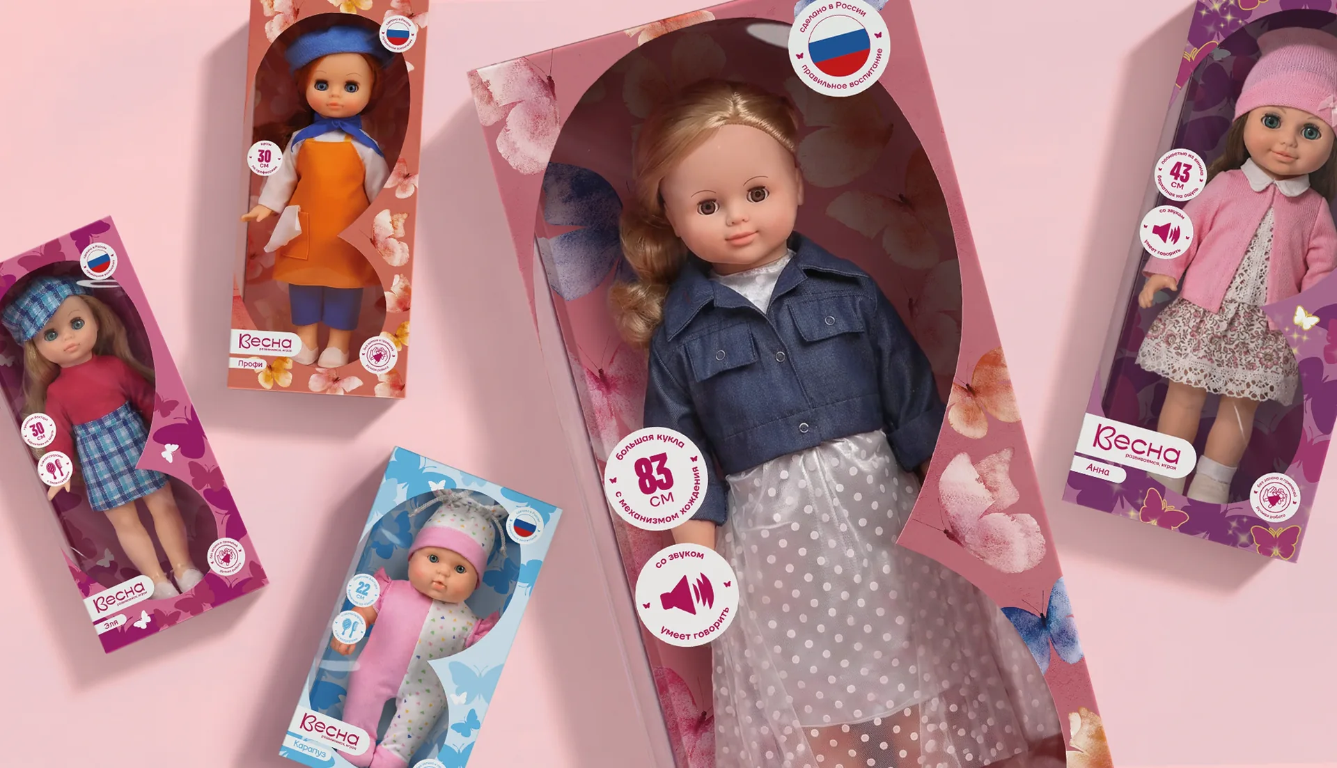
The Vesna toy factory in Kirov has been operating since 1942 and produces over a million dolls a year. More than 1,200 product names, from classic plastic and vinyl dolls to dolls with articulated joints. Production is certified, and the products are sold through distributors, in the Detsky Mir chain and on the largest marketplaces.
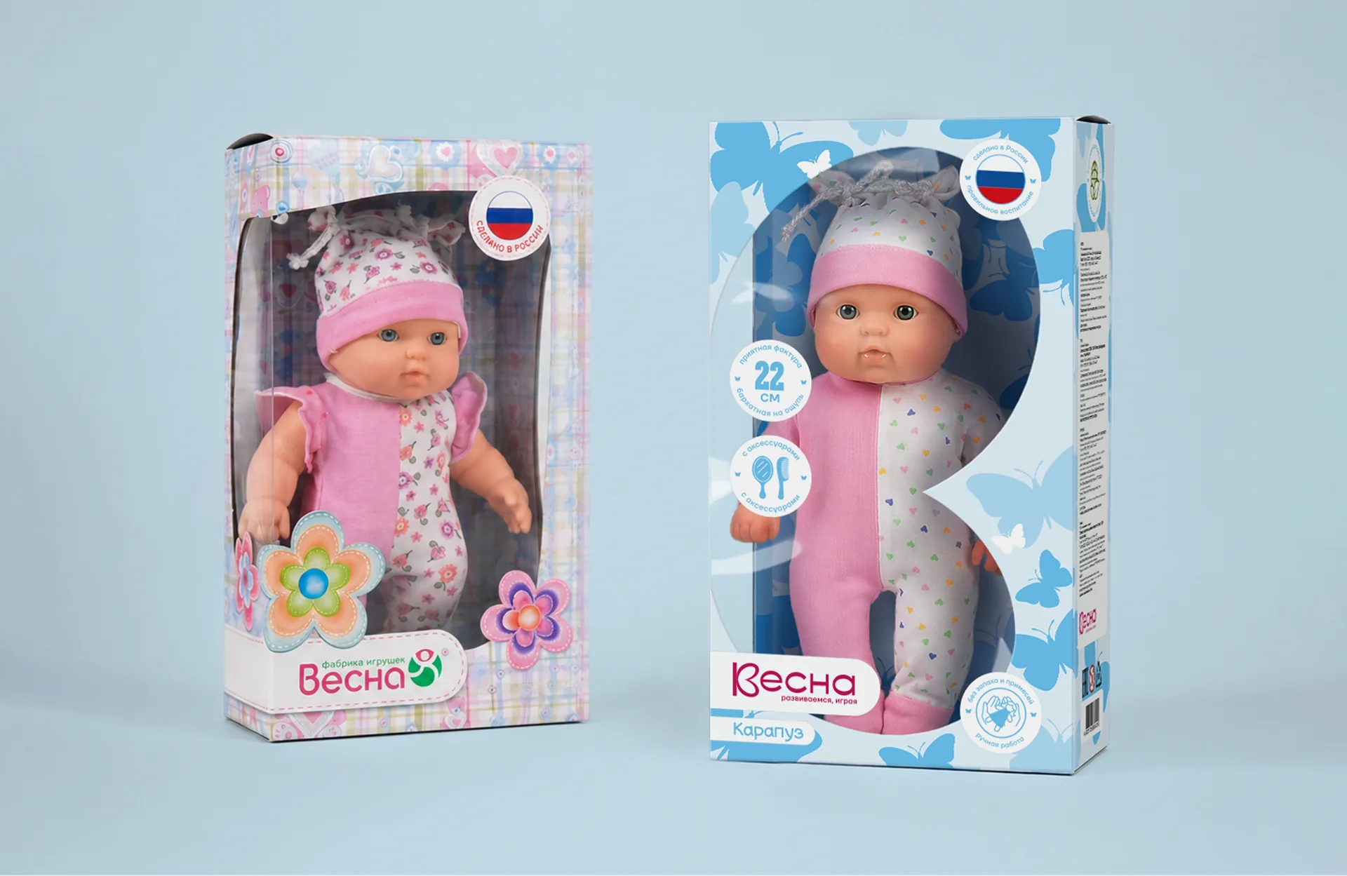
At the same time, the trademark itself remained barely noticeable to the consumer: on the packaging the doll was lost behind a profusion of stickers, typefaces and poorly readable messages, and the brand was not perceived as anything more than “yet another doll manufacturer”.
The category is structurally shrinking: the birth rate is falling, and the period during which a child plays with dolls is getting shorter every year. This means that growing together with the market is no longer possible – share has to be won.
The company’s main competitor is not Russian brands but cheaper dolls from China. Vesna could not and did not want to compete on price. The only way to retain and grow its share was to compete on meaning: to explain why a child needs a doll at all, and to do so convincingly right from the store shelf.
Our task was to grow the Vesna trademark into a strong brand that would work with equal confidence in both offline retail and online.
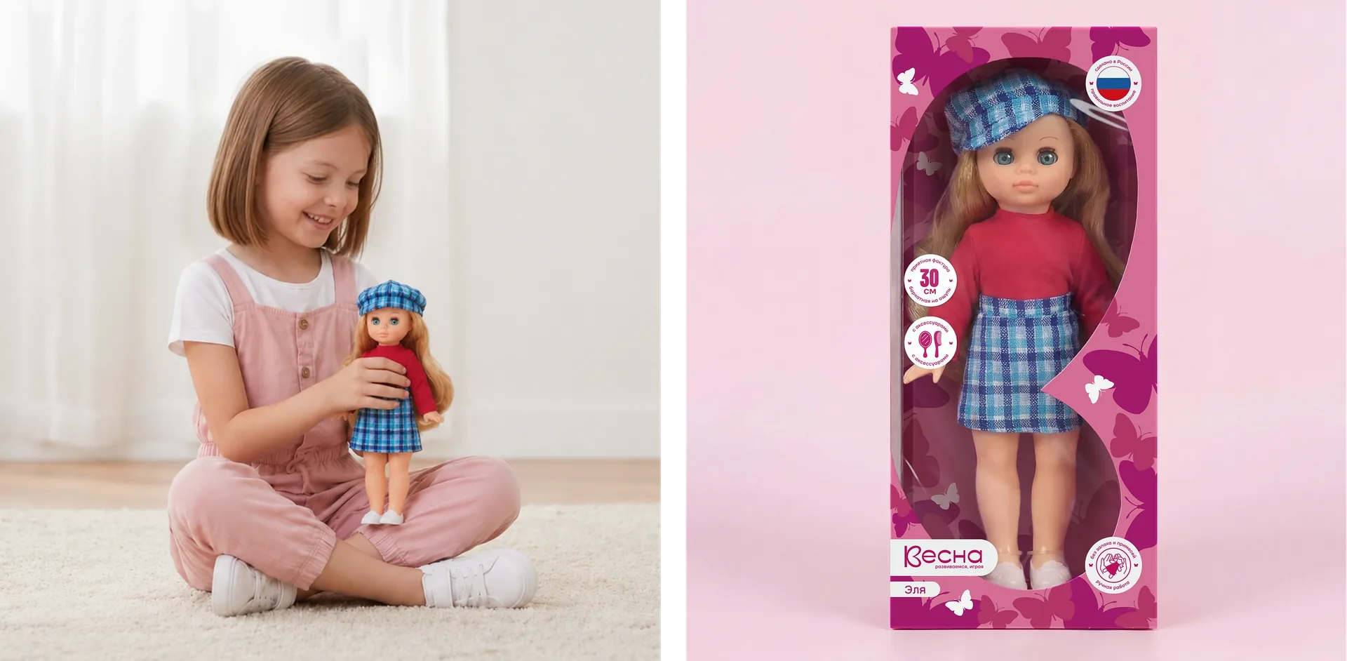
We began with a comprehensive study of the market, the brand and the vision of the decision-makers, as well as a competitive analysis. In parallel, we conducted in-depth interviews with representatives of different segments of the target audience: from parents of girls aged one and a half to three to grandparents.
The interviews yielded several key insights. Children like dressing dolls up and getting surprises – a secret outfit or accessory in the packaging enhances both the developmental and the emotional effect of the purchase. We found that for both child and parent, the doll’s hair is one of the main proxy indicators of quality. Everything is judged through it: how “real” the doll is, how pleasant it is to the touch and whether it is worth buying. The difficulty of constructing play scenarios is one of the key barriers across the entire doll market, which means that additional accessories and methodological prompts are not just a nice bonus but the solution to a real problem.
This revealed something important: fighting YouTube for a child’s attention is pointless. It is far more effective to embed the brand into an existing consumption pattern – and make video part of the brand ecosystem.
No less important was the demand for collectability and for the brand’s Russian origin: parents are consciously willing to support a domestic manufacturer as opposed to imported dolls. The pastel aesthetic typical of children’s products was working against the brand’s objective. Children read it as the code of products for babies, not as an object of play. This meant that the visual language had to shift from “cute” to “desirable”.
Based on the audit, we formulated a brand legend about how Vesna dolls help parents make communication with their child warmer and more alive. Through playing together with a doll, a parent can gently, without lecturing, pass on values and norms of behaviour to the child, while the child learns new skills in an engaging way: caring for others, empathy, independence. The brand’s right to speak about this seriously comes from its more than 80-year history and its reliance on modern pedagogical knowledge, which underpins the methodological materials that accompany the dolls.
The descriptor “Growing Through Play” anchored this idea at the level of everyday communication, and a set of functional and emotional claims was built around it – from “Made in Russia” and “Recommended by Psychologists” to “Harmonious Development” and “Helps Shape Personality”.
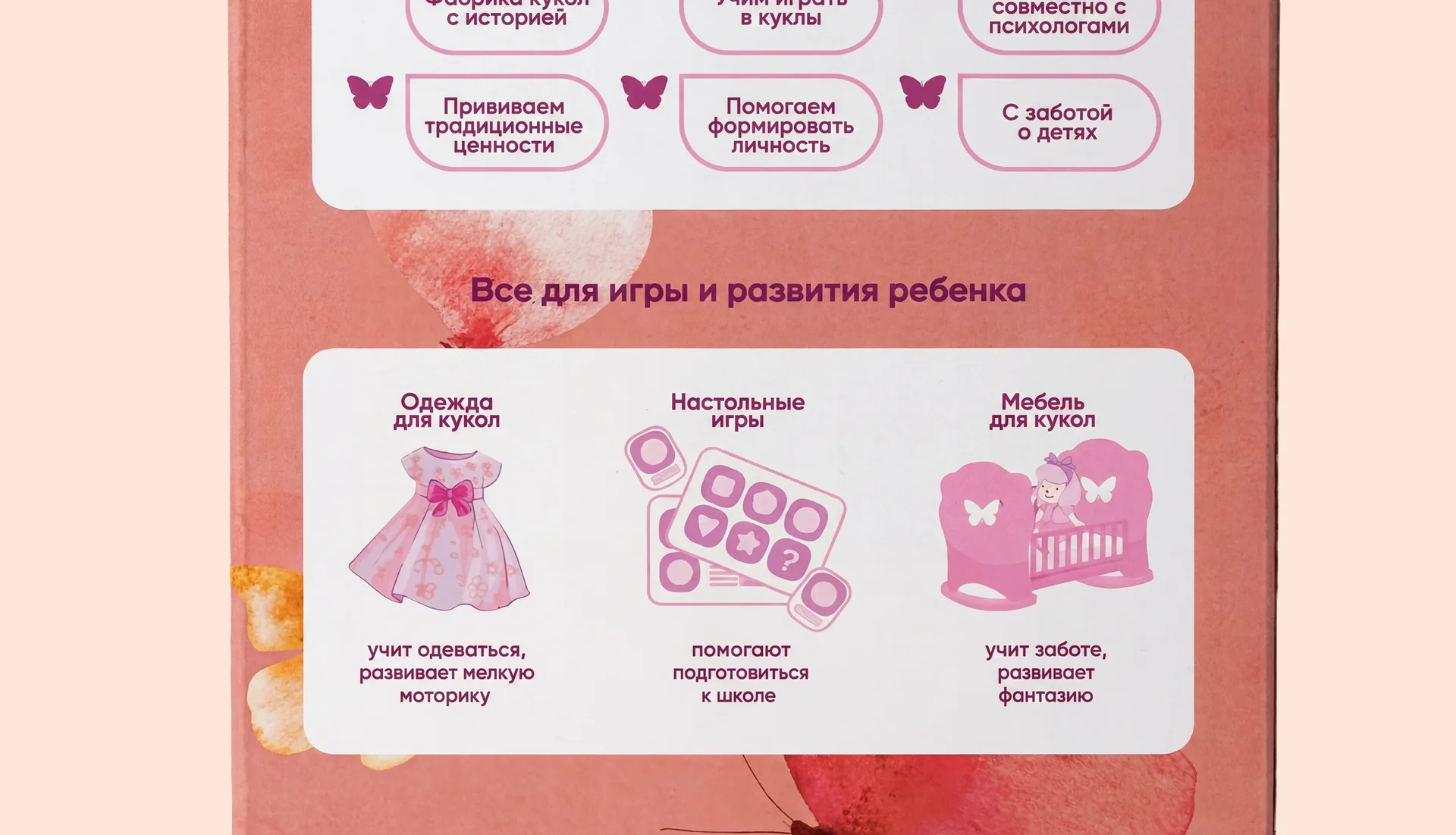
On this basis we developed a standalone brand concept. It is built on the image of a butterfly and a heart: the metaphor of a “chrysalis” turning into a butterfly plays on both the double meaning of the Russian word (kukolka – a little doll and a chrysalis) and the very idea of a child growing up and developing, while the symbol itself also alludes to the name Vesna (“Spring”).
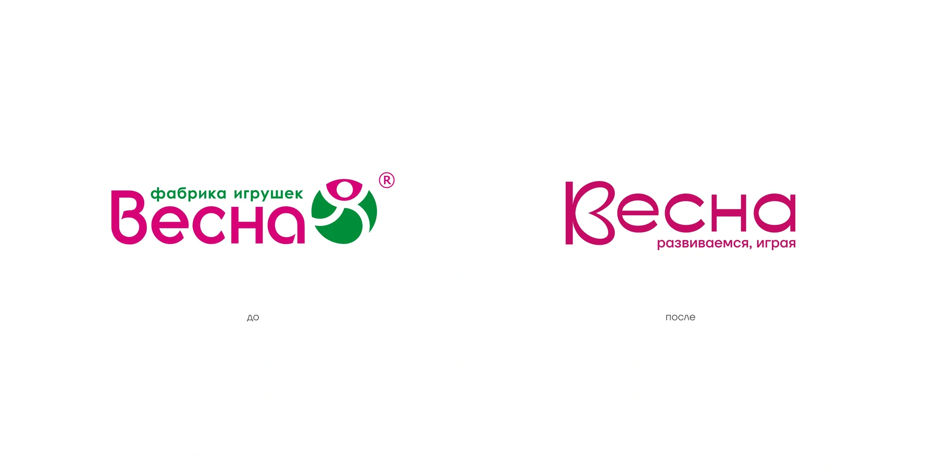
The logo was reworked within the chosen concept: the monogram based on the Cyrillic letter “В” was turned into a stylised butterfly silhouette – recognisable, light and more modern than the previous mark, yet retaining a connection with the familiar brand. The descriptor “Growing Through Play” took its permanent place next to the logo.
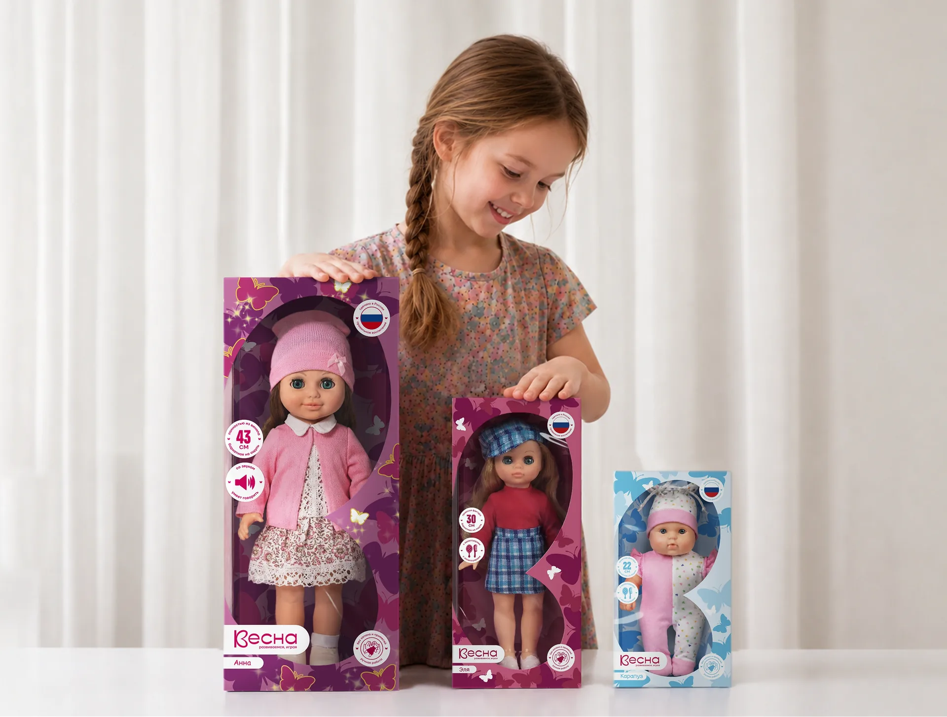
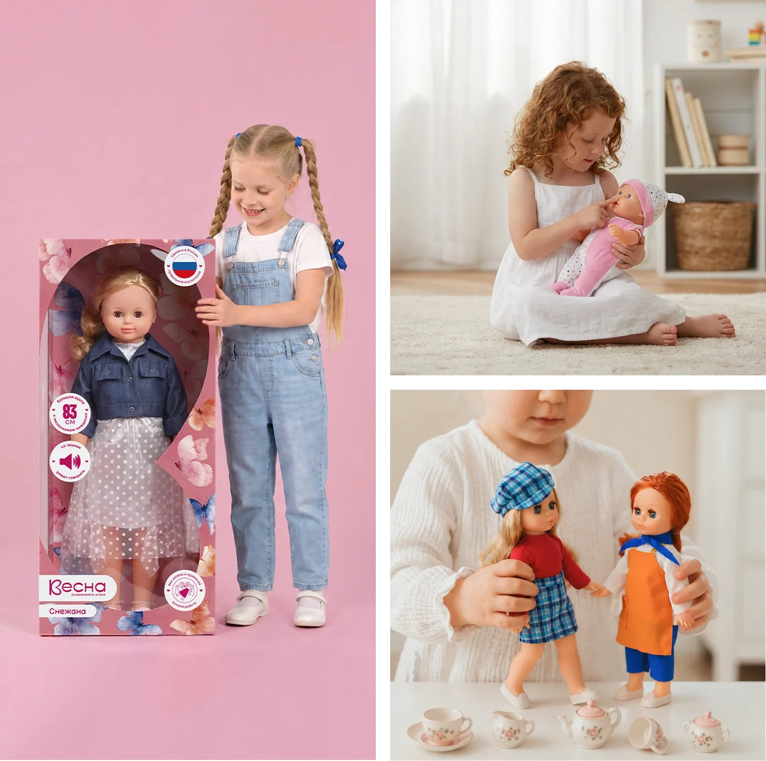
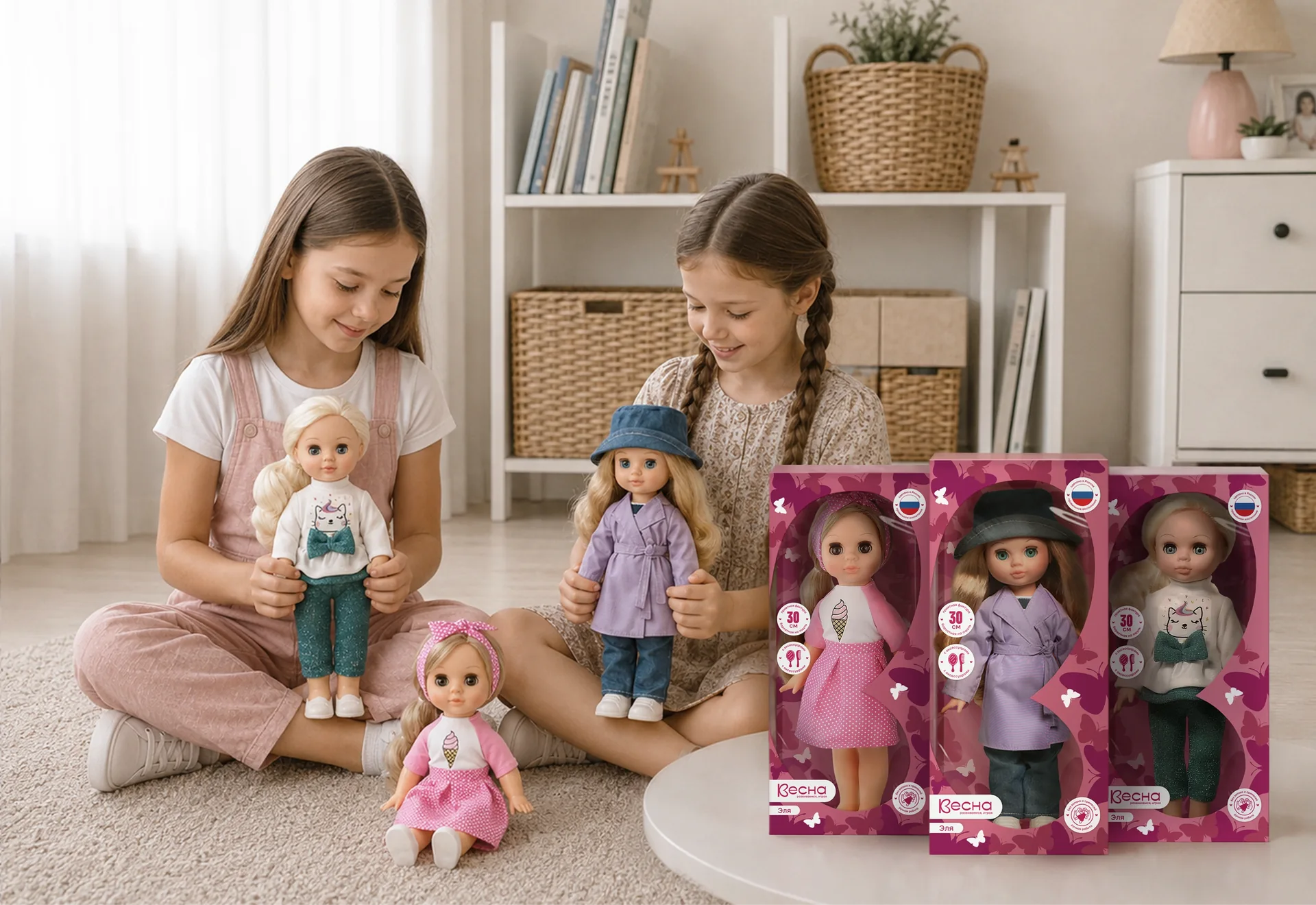
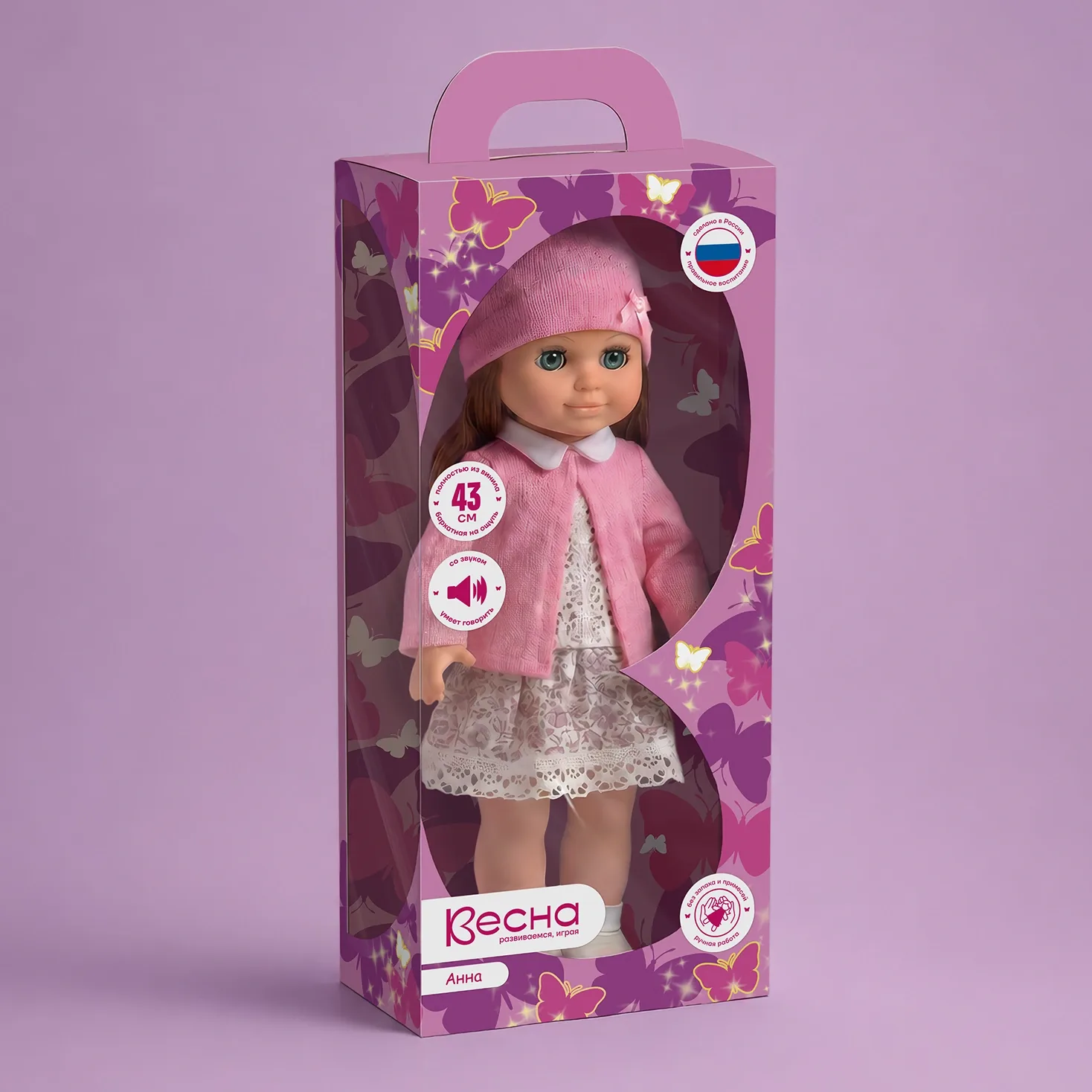
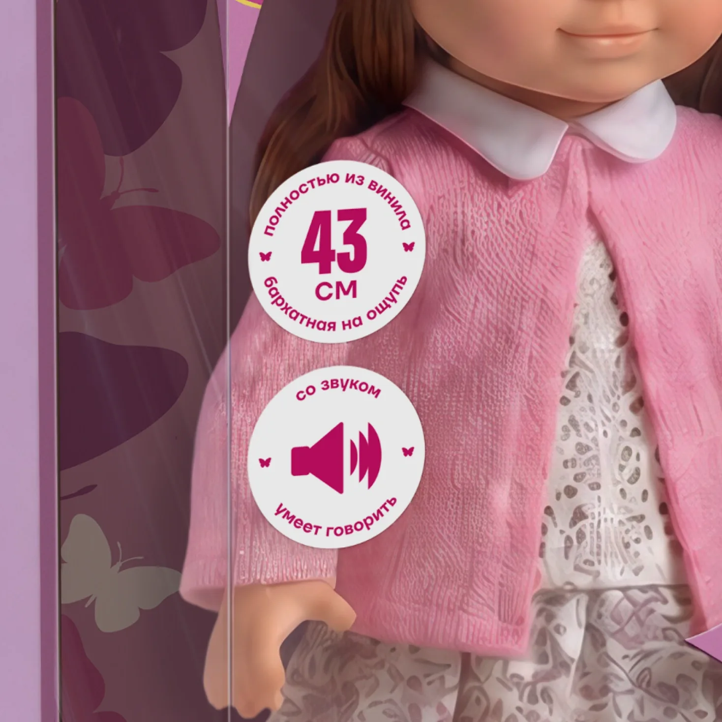
The concept was then adapted to five doll ranges, each with its own objectives and its own audience. Each received its own set of claims and stickers, assembled for the specific product: for some ranges the emphasis is on the additional accessories included, for others on the material and tactile properties of the doll, and for others on the “can talk” function. At the same time, all the ranges remained part of a single system thanks to a unified mark, typeface and packaging construction principle. The visual system was built on the principle of brand architecture: a single master brand core + variable product layers. This made it possible to solve two problems at once – to increase brand recognition and to preserve distinguishability within the ranges.
The packaging itself went through several rounds of refinement based on the client’s requirements: the doll must be fully visible and well lit through two open windows in the packaging – front and side – and nothing must cut off the figure or shade the face. The colour of the packaging and pattern was chosen to support the doll in any outfit rather than compete with it. The claims are laconic, easily readable and free of visual noise.
What the client received:
— Strategic positioning that makes it possible to compete on brand value rather than price.
— A scalable brand system for 1,200+ SKUs without loss of integrity.
— A new packaging architecture that works simultaneously in two environments: on the shelf and in digital-first retail.
From a trademark that was dissolving among its competitors, Vesna has turned into a brand with a clear story, a recognisable mark and a system that works with equal confidence both on the shelf of a federal retail chain and in a product listing on a marketplace.