Plague Brew. How we brought craft beer to the retail shelf
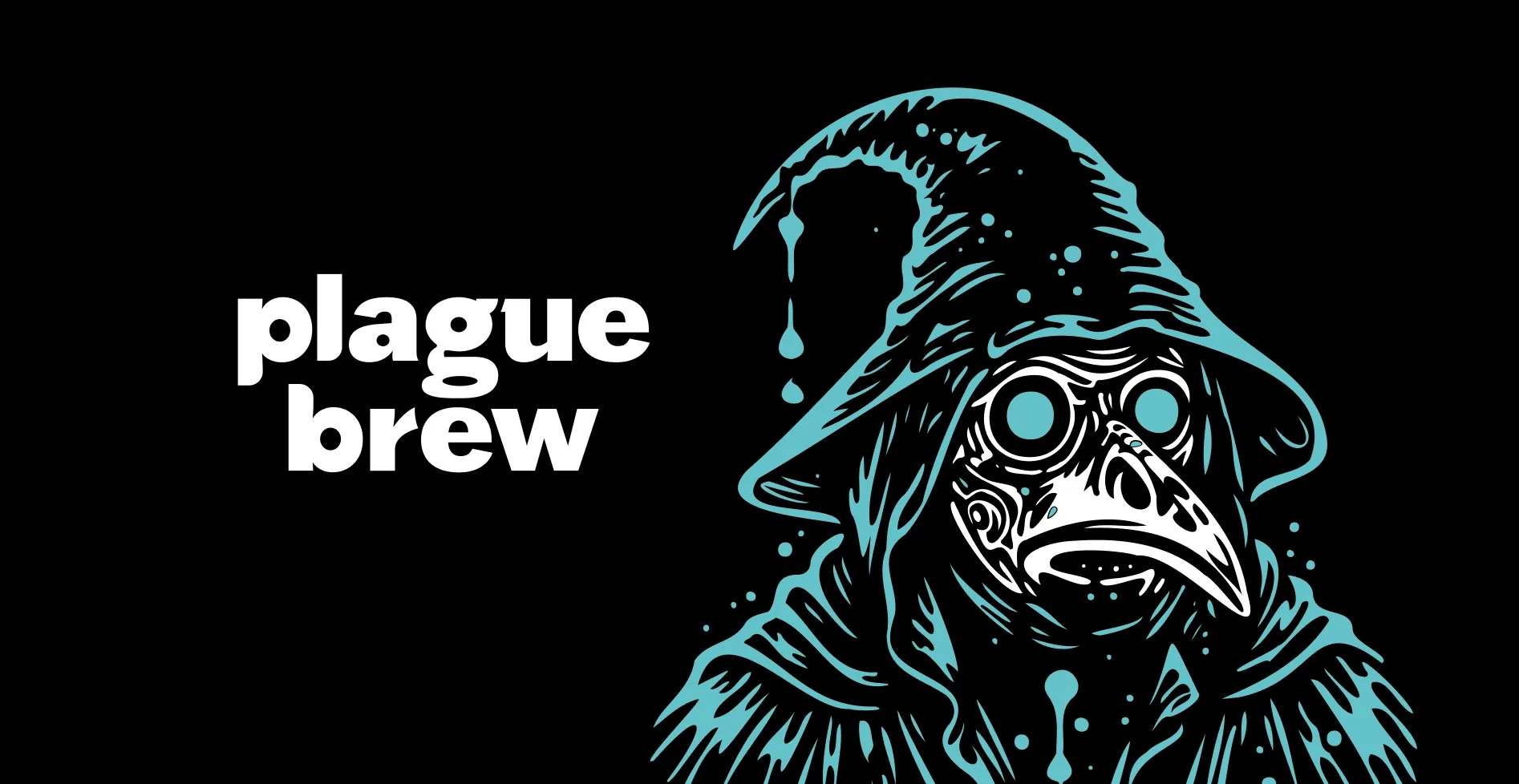
Brandson (TSN) was tasked with systematising the assortment and developing a corporate identity for a brand that, by the start of the project, had released more than 400 beers but was facing a blurred perception and difficulties in managing its product portfolio.
Our job was not simply to bring order, but to create a system that would allow the brand to reach the shelves of retail chains while staying true to its experimental nature.
Plague Brew is a brewery from St. Petersburg that has been constantly refreshing its range with new releases since 2020. The client currently produces more than 700 beers. The brand’s portfolio includes classic lagers and India pale ales, historical styles, mushroom and tomato goses, strong dark ales, ciders and meads. Over the years the brewery has earned a reputation as an experimenter, but by the start of the project it was facing two key problems.
The first was the unpredictability and lack of structure in the assortment. Distributors and partners did not understand which items were always available to order and which were one-off experimental brews that would disappear within a month. A price list containing several hundred SKUs only made matters worse: for every beer, additional information had to be sought to understand how to sell it. This hindered growth in volume and expansion into large retail chains.
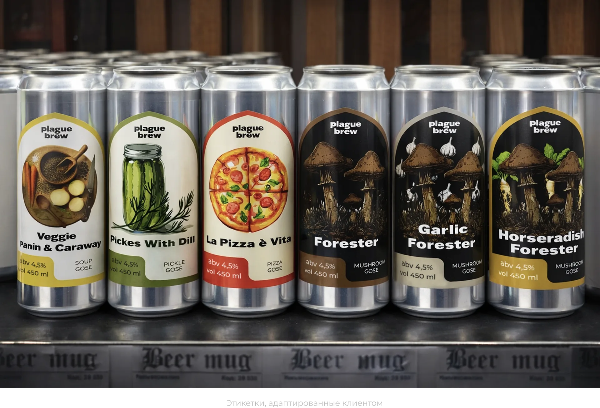
The second was the brand’s persistent association with a single niche. Because of the success of the mushroom gose line, many partners and consumers perceived Plague Brew exclusively as a “mushroom brewery”. This created a barrier for all the other products: classic styles, historical ales and hoppy India pale ales were perceived as uncharacteristic of the brand and sold significantly worse.
The main goal of the project was to reach the shelves of retail chains. This required not only bringing order to the assortment, but also creating a visual system that would make the brand recognisable and understandable to a broad audience.
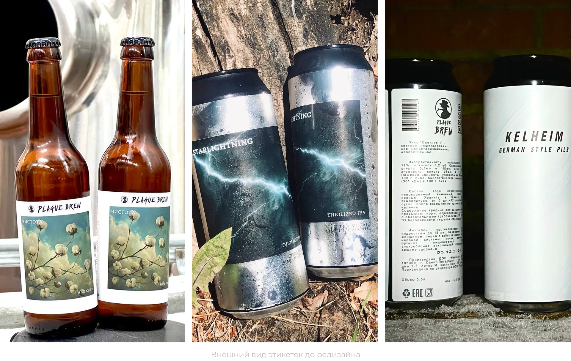
The work began with comprehensive research. We conducted a shelf audit, analysing how craft beer is presented across different sales channels. This was followed by a series of in-depth interviews with representatives of the B2B and B2C target audiences to understand the real barriers and drivers.
During the interviews, partners and consumers pointed to the same problems:
— The assortment is unpredictable: it is unclear which beers are permanent and which are seasonal or experimental.
— The price list is overloaded: it is hard to navigate, and additional information has to be sought for every beer.
— The brand is associated only with mushroom goses; the other products get lost against this background.
— The labels do not create a unified visual image.
An analysis of the competitive environment, including data from Untappd (the consumer beer rating platform), showed that in terms of unique check-ins Plague Brew lagged significantly behind the market leaders, even though the rating of the beer itself was quite high. This confirmed that the problem lay not in the quality of the product but in its presentation and the manageability of the assortment. To enter retail chains, it was necessary not only to systematise the portfolio, but also to create a visual language that would work on the shelf.
Based on the data collected, a strategy was developed to address two main tasks:
1) Make the assortment manageable and transparent for partners.
2) Create a unified visual image that would allow the brand to stand out on the shelf.
Large-scale work was carried out to systematise the assortment: hundreds of items were analysed, and their roles and place in the portfolio were defined. The result was an assortment matrix that divides all beers into three categories:
— Core items — beers that are always in stock. This is the core of the assortment that partners can rely on.
— Seasonal items — beers released for a particular time of year.
— Experimental items — new releases and limited brews that may either move into the core range or leave the market.
This system solved the problem of predictability: distributors now understand what to expect from each item and can plan their purchases. And for consumers it created the opportunity to find “their” regular beer without getting lost in the stream of new releases.
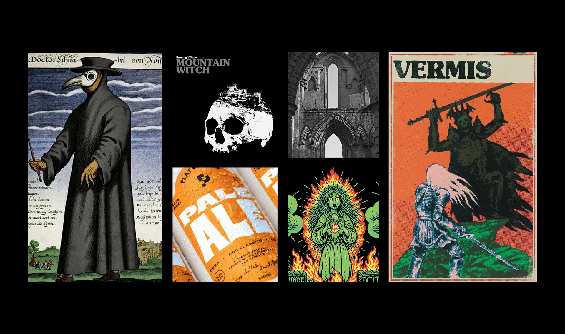
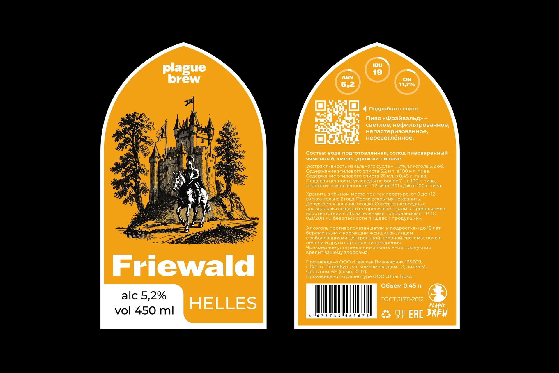
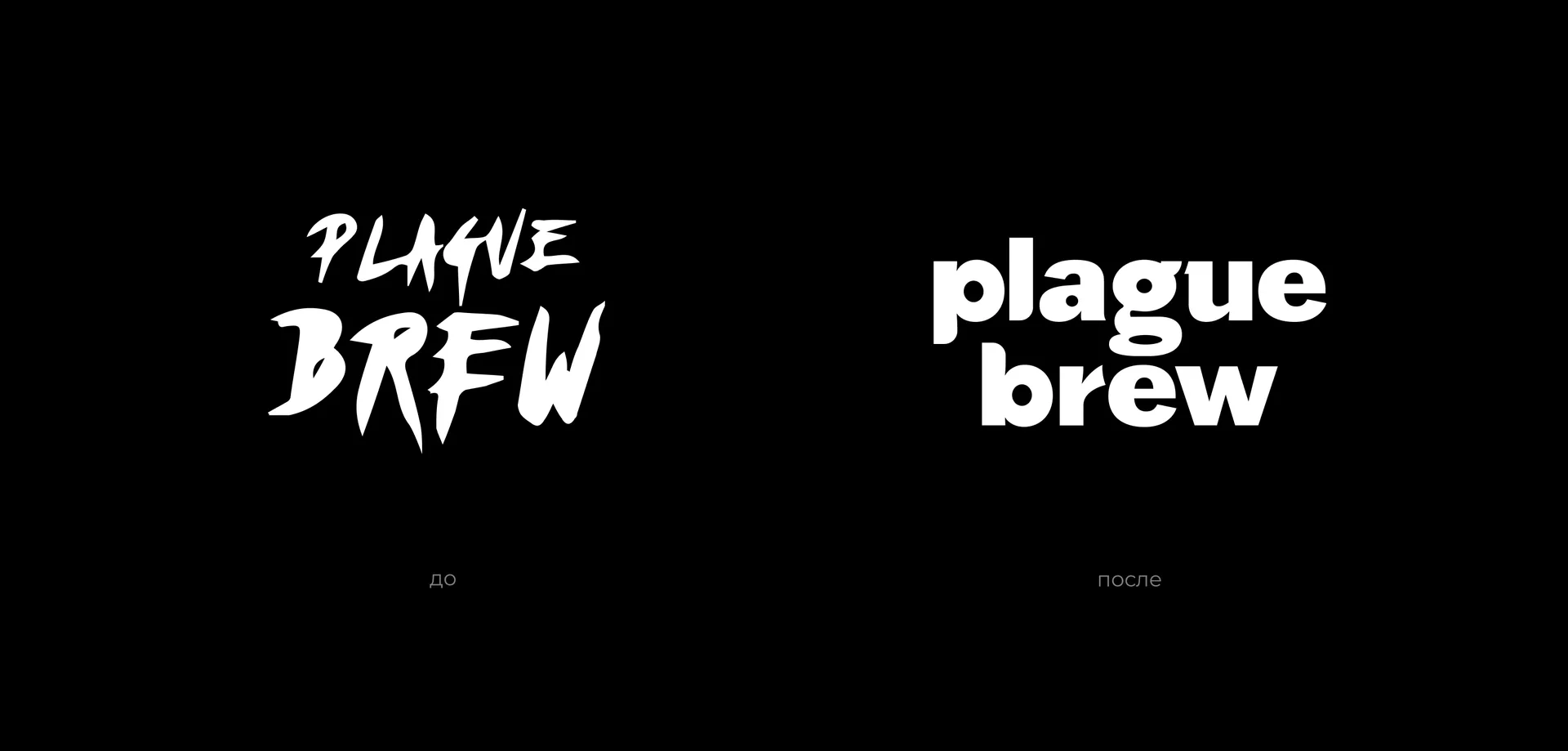
The visual identity was reworked with the need to stand out on the shelf while maintaining brand recognition.
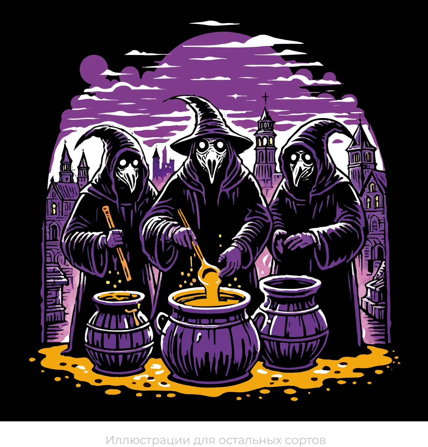
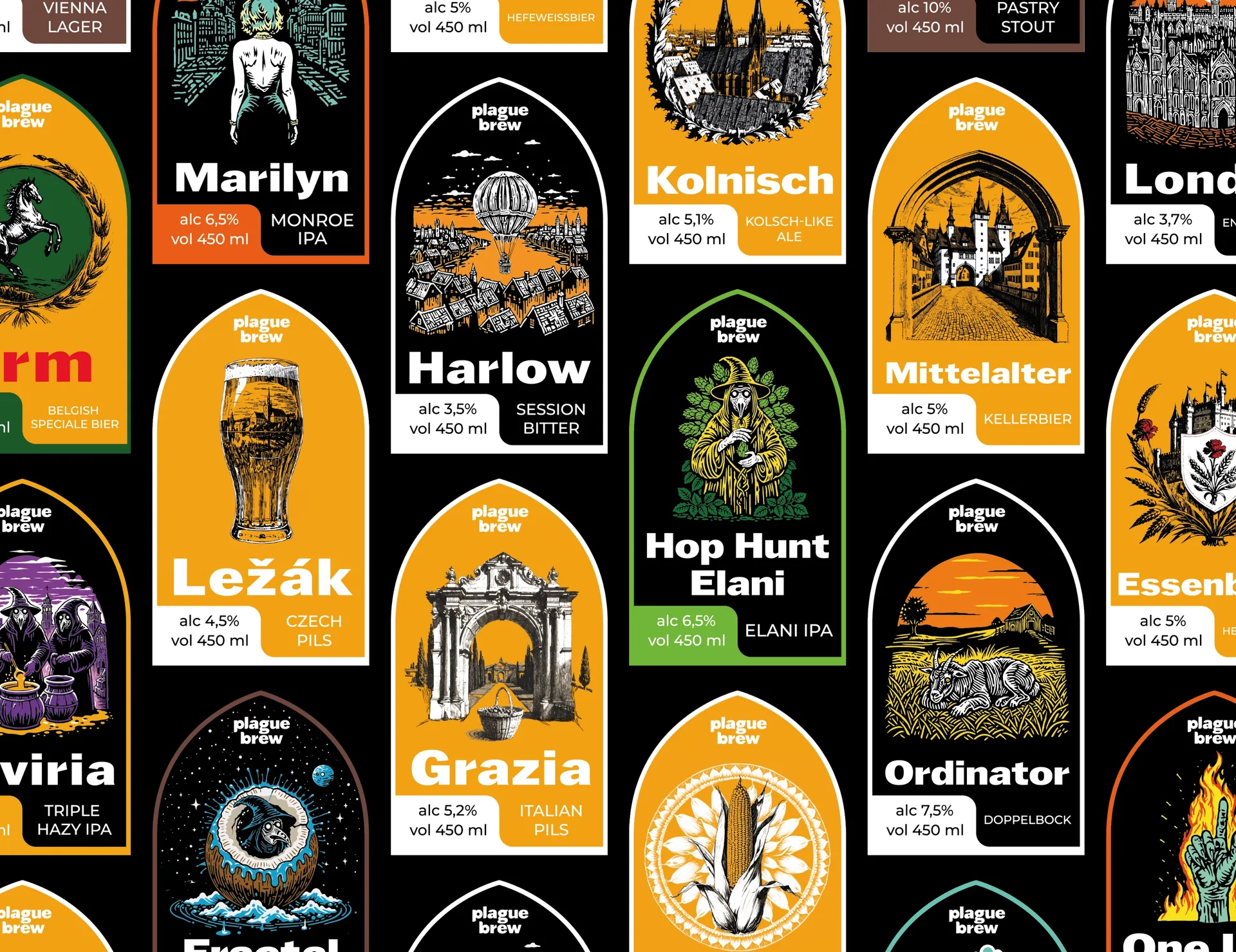
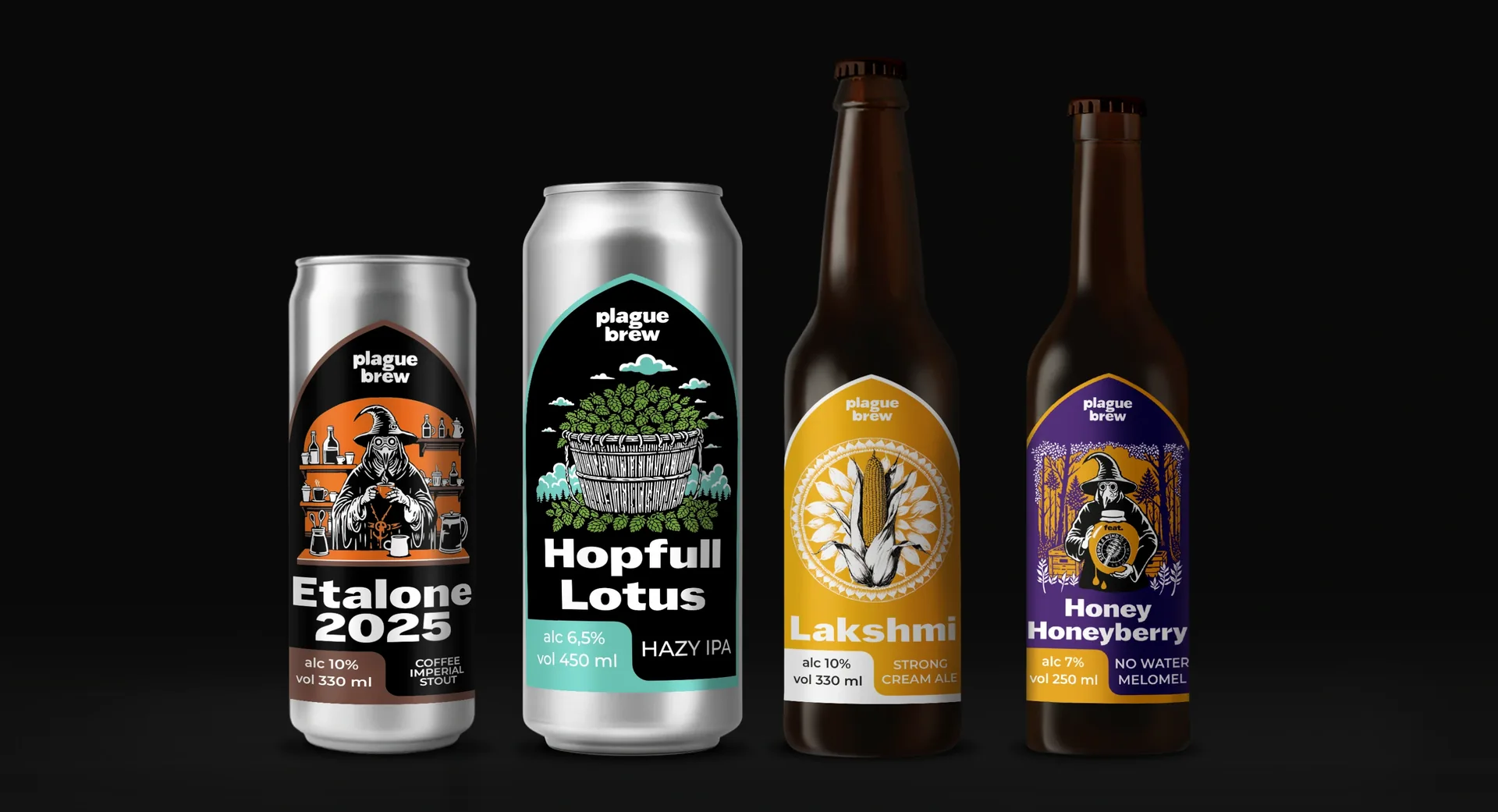
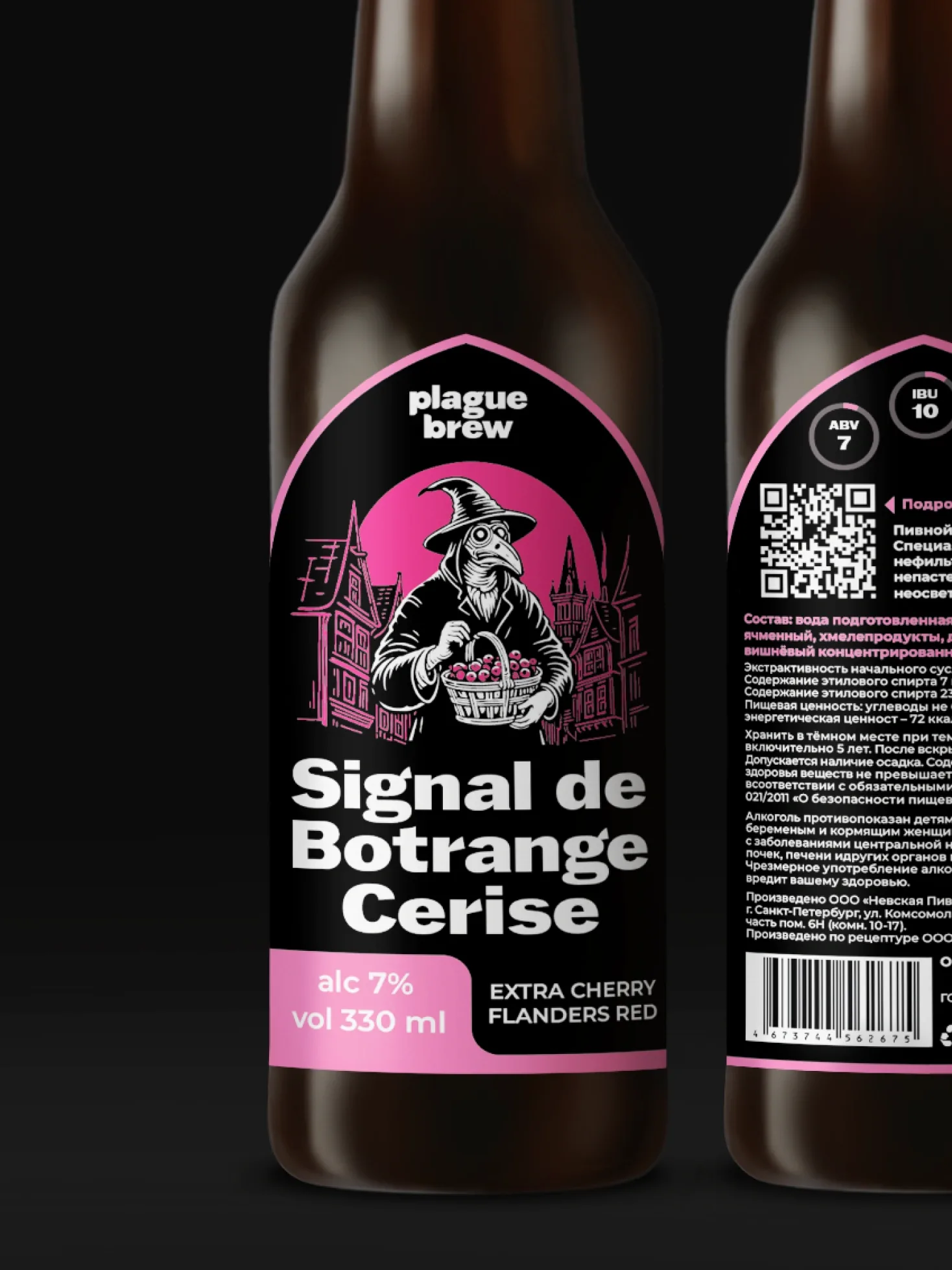
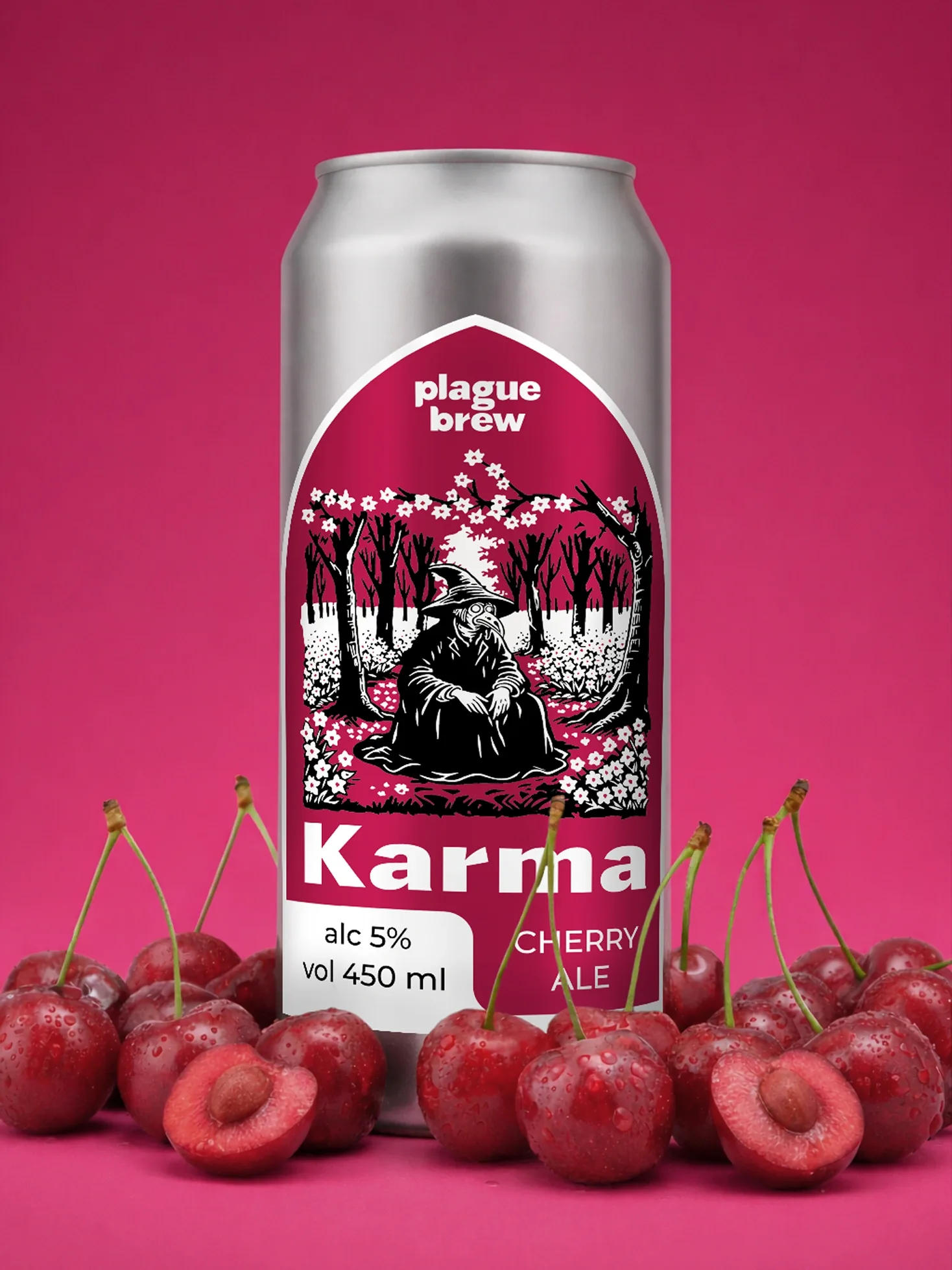
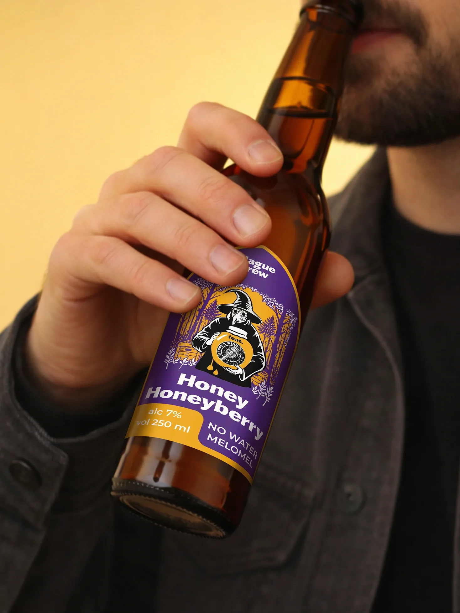
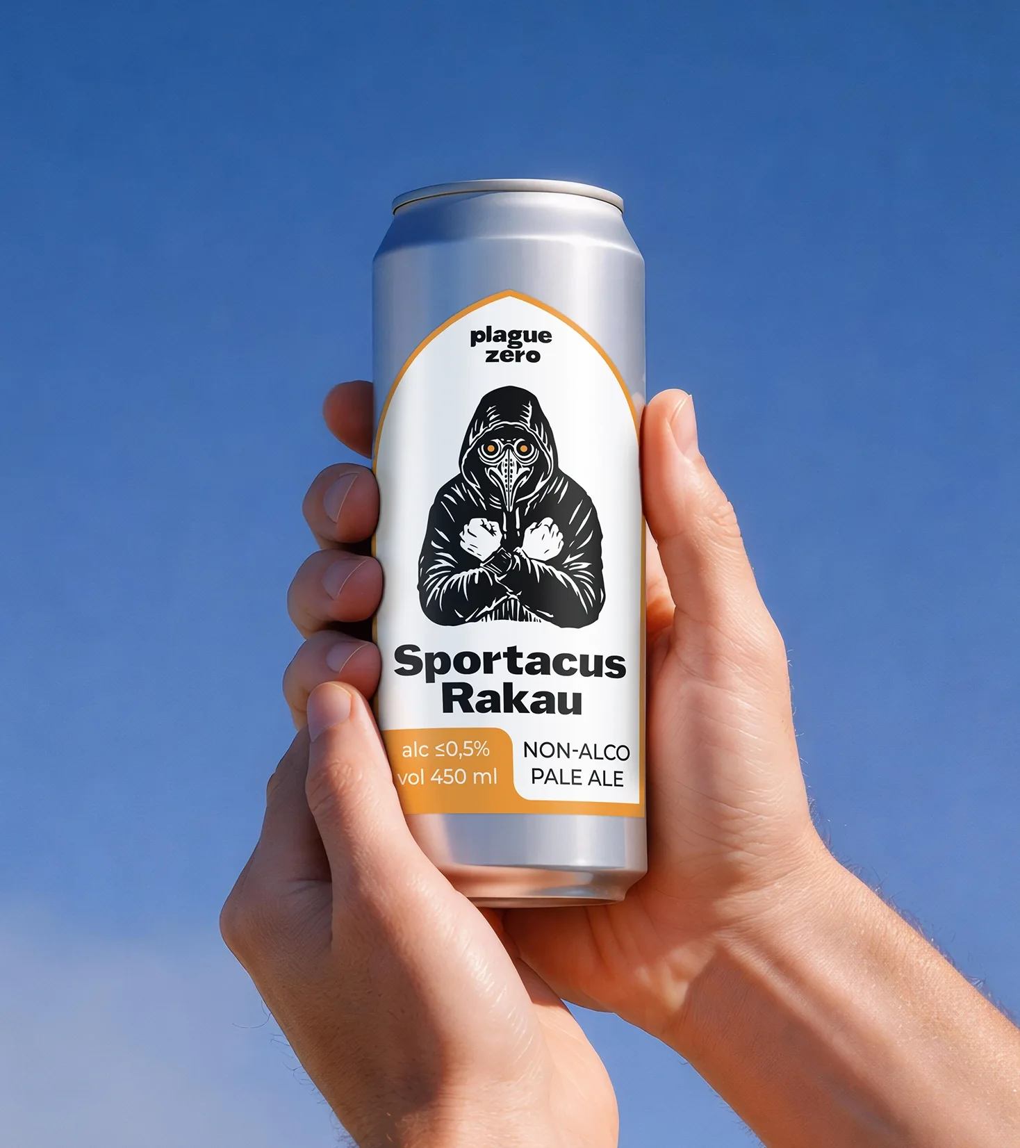
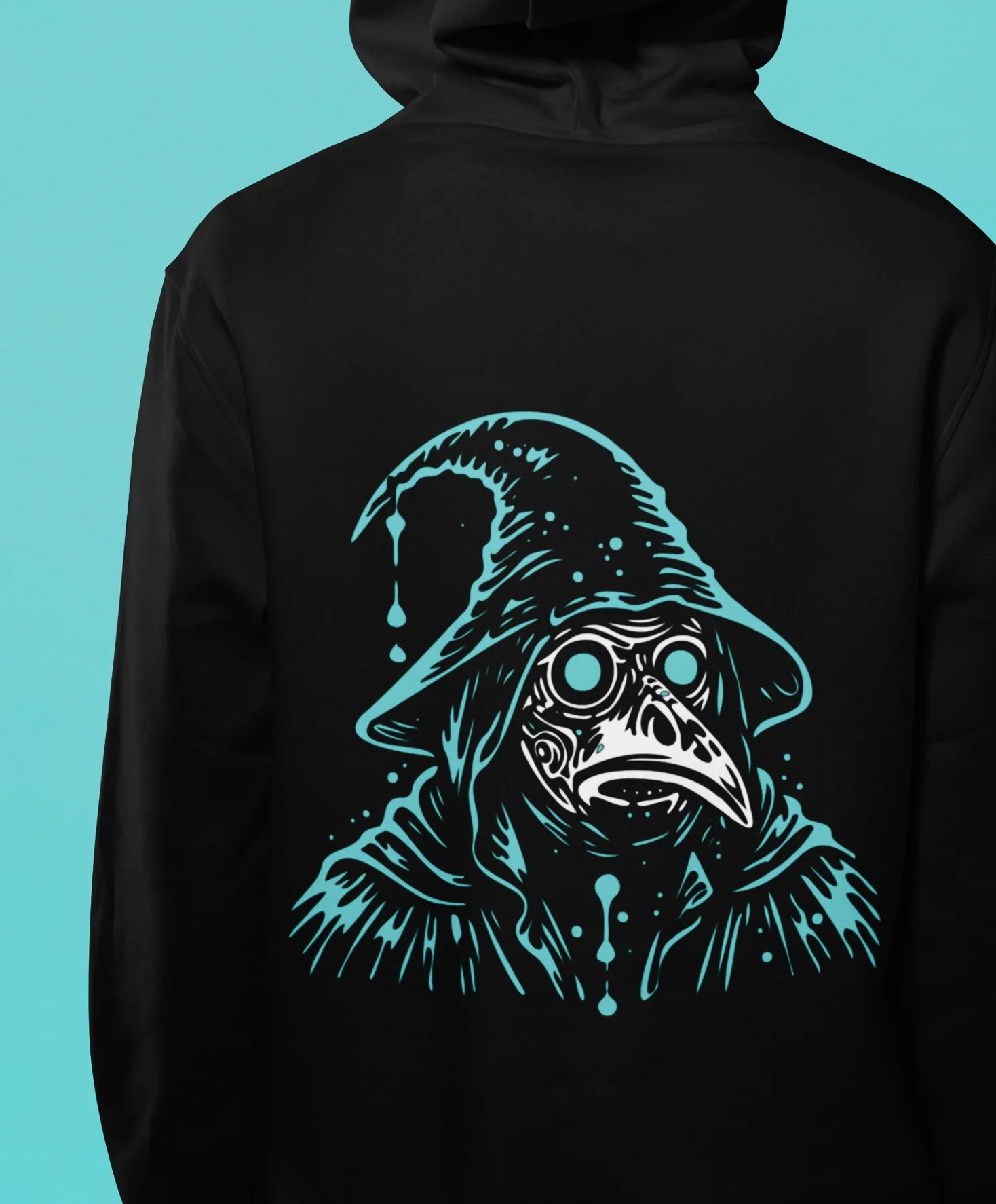
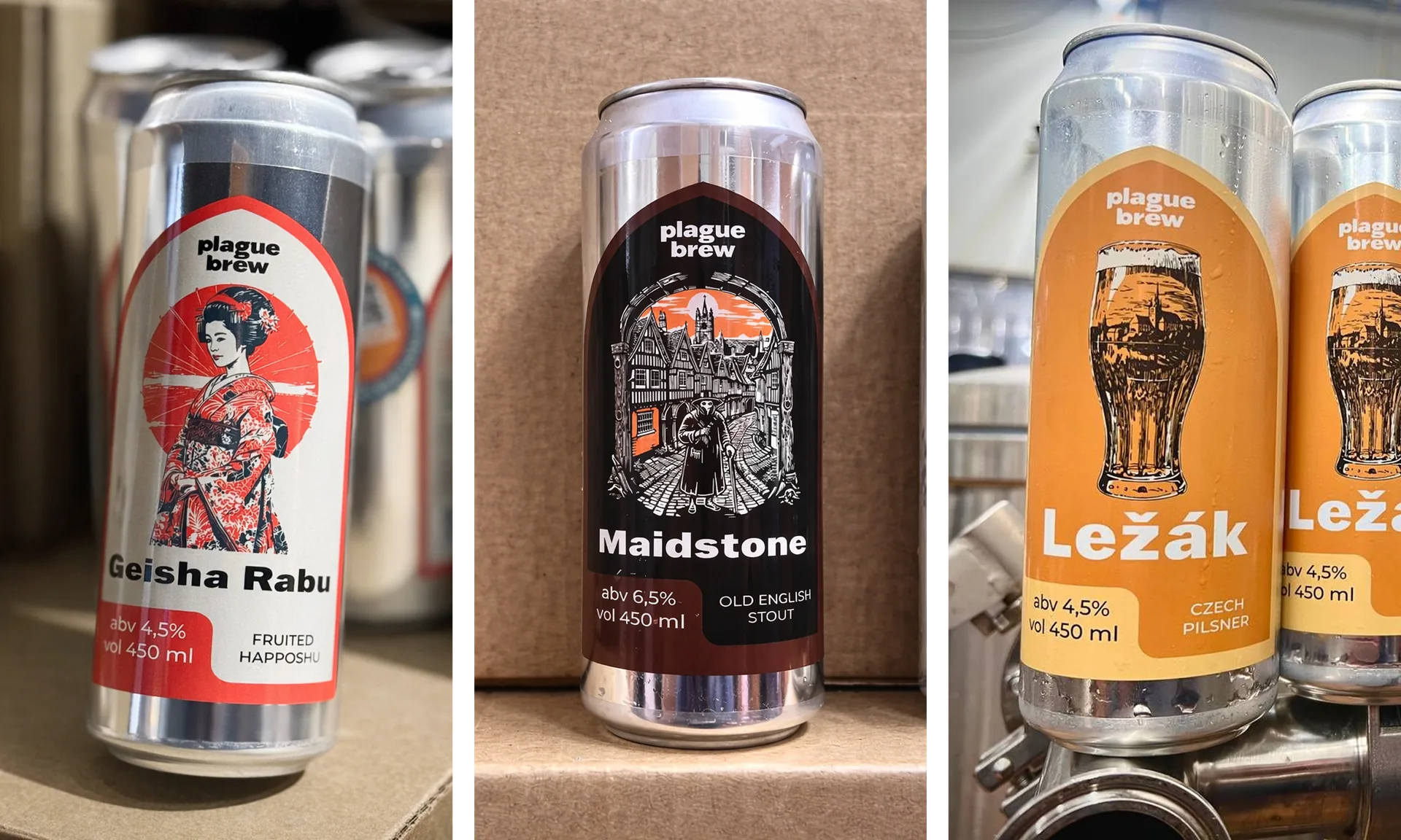
The Plague Doctor character had been part of the brand from the outset. Our task was to modernise him while preserving his recognisability. He remains unchanged on every label, placed inside a Gothic arch.
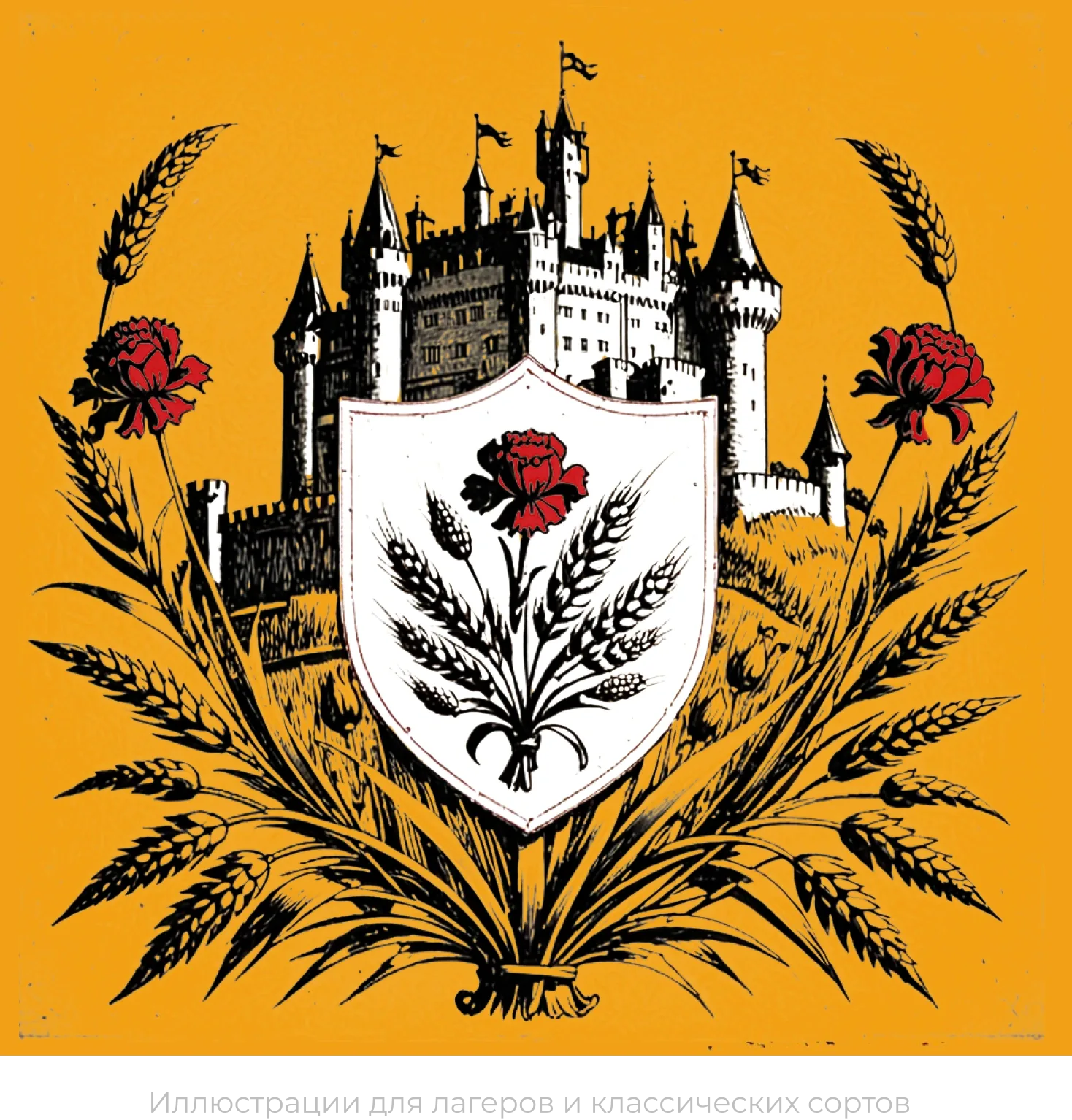
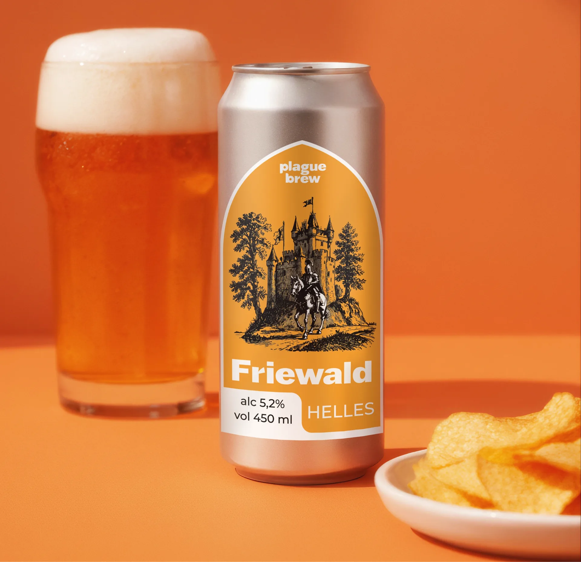
The visual concept brings together medieval engravings, psychedelic posters and elements of old role-playing games. This mix preserves the brand’s historical depth while conveying its readiness to experiment. For classic lagers the artwork is executed in a more restrained, graphic manner; for experimental items, in a brighter, more psychedelic one.
To make navigating the assortment intuitive, a colour system was developed based on the beer category:
— Pale styles (lagers, wheat beers) — light, yellow tones.
— India pale ales/American pale ales — light but contrasting, emphasising the vividness of the flavour.
— Dark styles (stouts, porters) — dark, black.
— Sour ales — acidic, vivid colours.
For mushroom, soup and tomato beers, colours are selected individually but within the unified style.
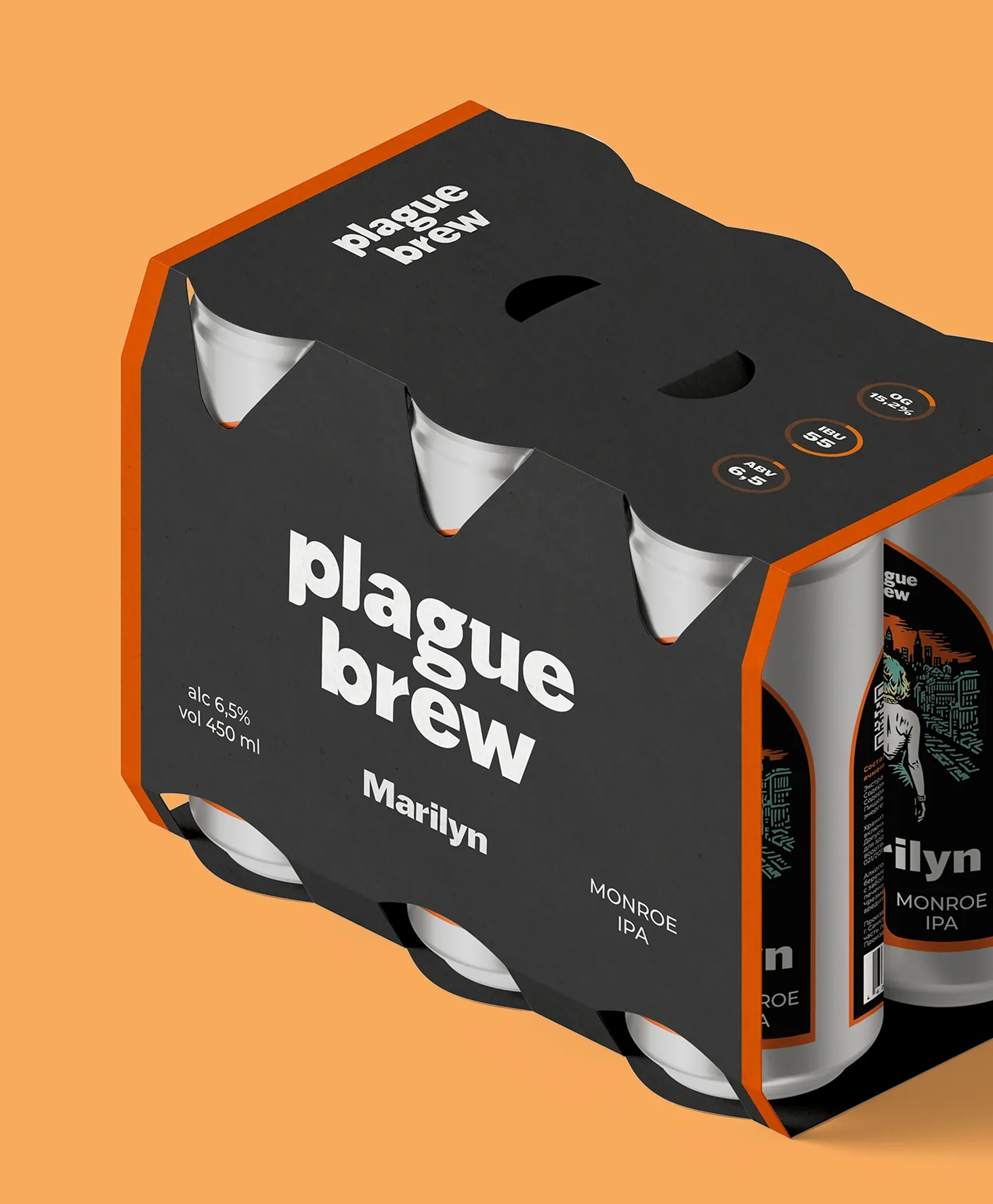
A flexible layout system based on the Gothic arch was developed. The shape of the label and back label is fixed, ensuring a consistent brand structure on the shelf. The back label carries a QR code leading to a detailed description of the beer, allowing consumers to obtain additional information without overloading the label itself.
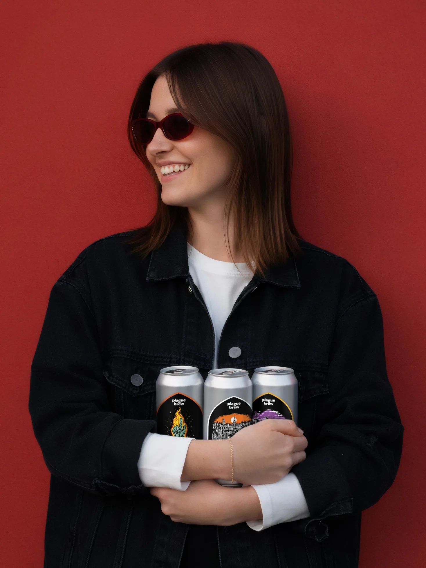
The result is a coherent, manageable system. The systematised assortment matrix made the product portfolio transparent for distributors and made it possible to build relationships with retail chain partners. The visual concept united all the beers, creating a recognisable image on the shelf. Clear rules for colour unification and layout made it possible to turn hundreds of unique names into a single system while preserving the brand’s core value — its diversity and its ability to surprise.