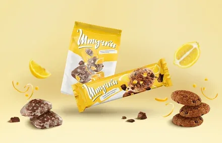
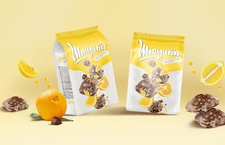
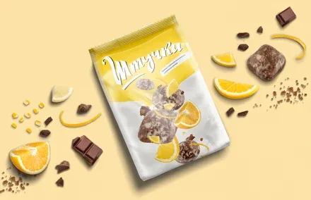
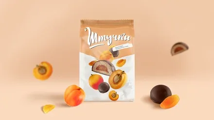
Concept development for Shtuchki cookies for Lyubimy Krai
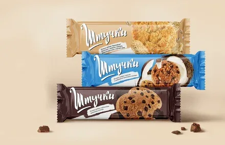
Lyubimy Krai is the largest producer of cookies and gingerbread in North-West Russia. More than 20 years after the company was founded, its products are sold in 55 000 stores across Russia and supplied to key retail chains: Pyaterochka, Okey, Auchan and Karusel, as well as to 17 countries of the CIS and Europe. Its products are present in 98 Russian cities with a population of more than 100 thousand people.
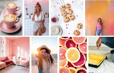
Lyubimy Krai is the largest producer of cookies and gingerbread in North-West Russia. More than 20 years after the company was founded, its products are sold in 55,000 stores across Russia and supplied to key retail chains: Pyaterochka, Okey, Auchan and Karusel, as well as to 17 countries of the CIS and Europe. Its products are present in 98 Russian cities with a population of more than 100 thousand people.
Lyubimy Krai owns the Shtuchki trademark, a cookie brand that can be proud of its high quality and wide range of flavours. In 2019, the cookies won a gold medal in the "Best Product" competition at the Prodexpo exhibition. The quality was high, but there was one problem: brand positioning. The visual imagery of the Shtuchki packaging did not evoke strong emotions in the target audience: the brand was not memorable and was hard to find on the shelf. So Lyubimy Krai turned to the Brandson agency for a rebranding. The goal of the updated platform was to bring vivid colours into the consumer's life and offer moments of delicious relaxation in a world of routine.
The following tasks were set for developing the new concept: come up with a creative solution (the overall look of the packaging), refine the brand mark, update the colour and graphic scheme and unify the typography, and apply the principle of SKU systematisation for a single trademark.
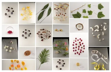
The research identified the core of the brand's target audience: a young woman. How can her profile be described? She has a dynamic, demanding job that requires constant concentration and being "switched on". She always follows fashion trends, and when shopping she is guided mainly by the satisfaction of emotional needs: she wants something bright and original to emphasise her individuality. She is an individualist, and her whole life depends on her alone.
It is evident that the target audience is interested in balance: both rational and emotional brand benefits are required. The key insight: "My life is dynamic, and how I wish I could find a minute for a sweet snack that would give me moments of relaxation and vivid emotional sensations."
This balanced insight became the basis of the new positioning.
The previous design was overloaded: there were many superfluous elements that barely fit on the front panel. The concept was based on a retro style: it
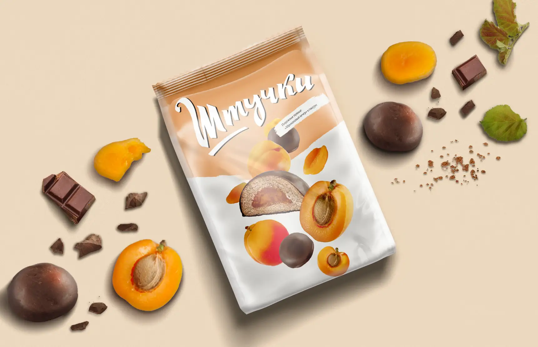
received heavy emphasis while the other imagery was left unattended. The cookie packaging did not highlight the key elements that activate the taste buds: pieces of fruit and quality chocolate. It was decided to remove the brand character, which did not resonate with the brand's target audience of active, busy
people.
The new positioning had to show that Shtuchki is, every time: first, a new vivid and rich sensory experience; second, a break for some time to yourself; third, a way to entertain yourself and swap the dull and unemotional for the bright and intense.
A Shtuchka is a universal product that brightens up any situation, and you never know which Shtuchka will be next.
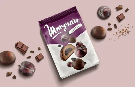
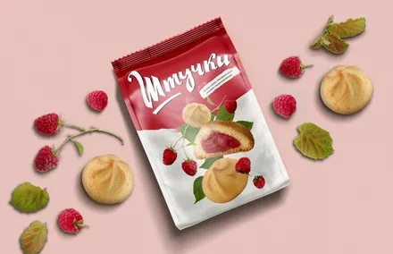
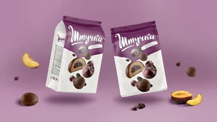
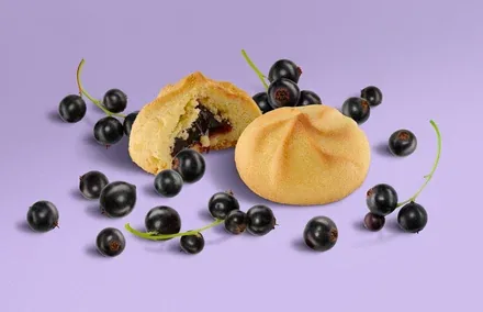
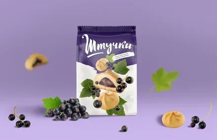
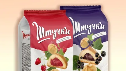
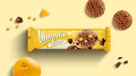
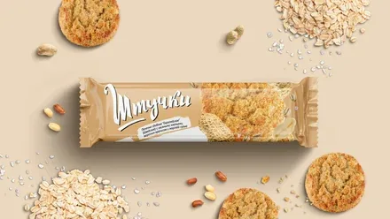
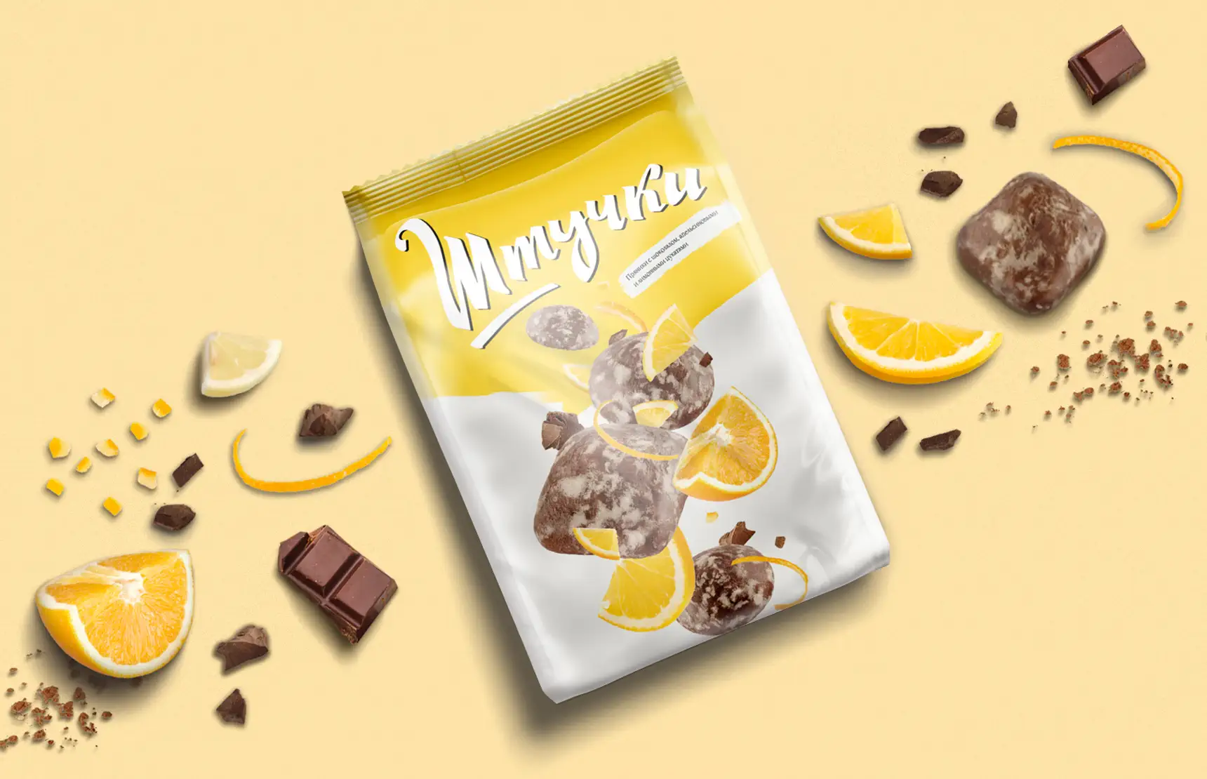
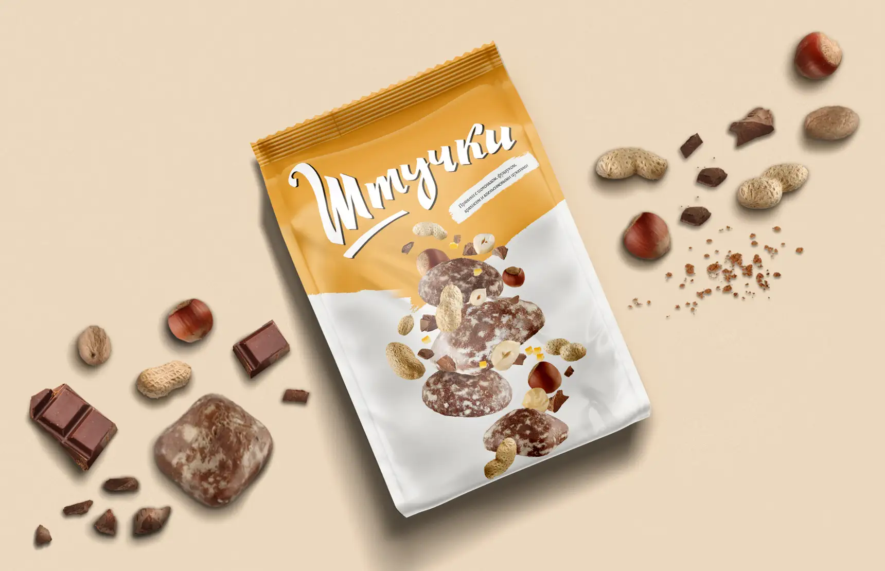
In contrast to the previous presentation, we created the updated concept "Colouring Life". Shtuchki are multifaceted, interesting and unusual in their flavours; every bite brings joy into our lives, colouring dreary weekdays with new emotions and sensations.
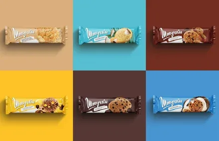
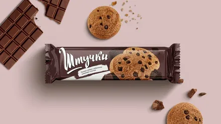
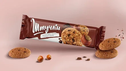
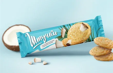
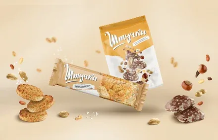
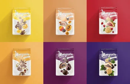
The wide range of flavours made it possible to emphasise the diversity of "colours". That is why the new food zone takes up 50% of the front panel, highlighting one of the brand's greatest strengths. The composition is built on the principle of a double helix. The sizes of the key markers in it are somewhat exaggerated, which achieves greater dynamism and adds visual contrast. The packaging for each flavour has its own unique and fitting colour palette.
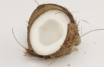
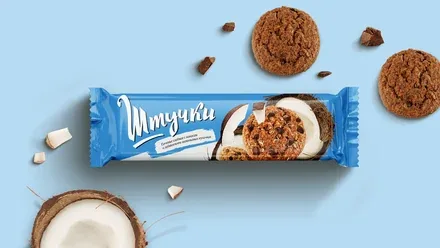
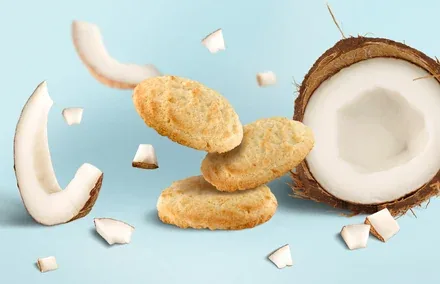
For example, coconut-flavoured cookies evoke associations of relaxation: holidays, the sea, palm trees with coconuts. It sometimes happens that the client brings their own adjustments to a project. In this case, the packaging options we developed served as a concept, allowing the client to make the final decision on the visual image of Shtuchki themselves.