Branding for the Vyborzhets agricultural holding

We faced two tasks: to update the brand platform and to create a new image for the Vyborzhets company that would bring its mission to life.
We carried out extensive work on segmenting and assessing the market and developed a strategy that precisely defined the character and scale of the brand.
Once again, we were reminded of how important it is to reflect simple human emotions in a brand.
Read the full case study for details!
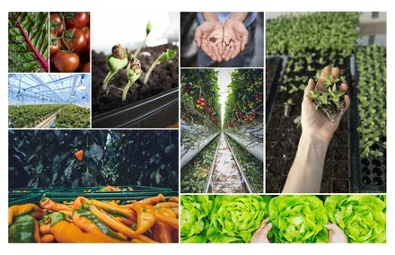
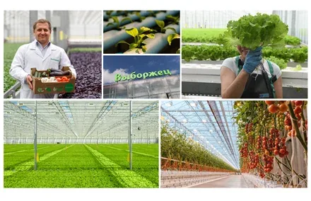
The Vyborzhets agricultural company is the largest supplier of vegetables and fresh herbs in Russia's North-West region. Fresh vegetables are this producer's formula for success. Vyborzhets was the first in the region to grow leafy greens using a new technology. Under this technology, the plant goes on sale with its root system intact, which keeps it looking fresh for much longer.
The greenhouses grow lettuce (4 varieties), basil, celery, sorrel, parsley, dill and cilantro. The total greenhouse area under vegetables is 28 hectares, of which 12 hectares are under glass and 16 hectares under film.



Since 2000, Agrofirma Vyborzhets CJSC has ranked among the 300 best agricultural enterprises in Russia.
Overall, Vyborzhets projects a pleasant image: the freshest, most natural and healthiest produce money can buy. It has become a direct synonym for high-quality agricultural products in Russia.
However, the brandline and corporate identity needed to tell the story of high-quality products that can rightly be considered a source of national pride, in order to make the product stand out on the market.
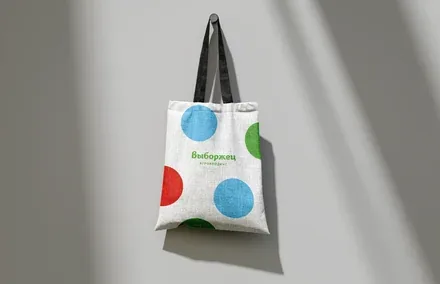

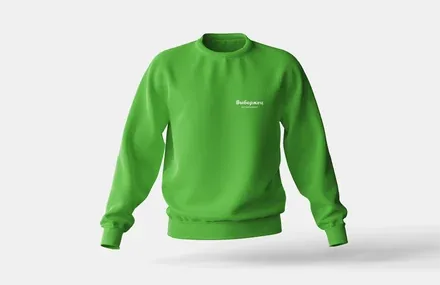
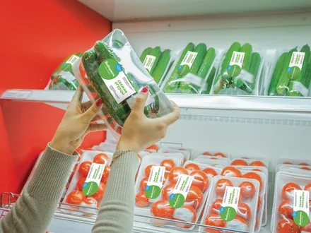
We decided that this technologically advanced and responsible, yet conservative company was lacking simple human emotions. It was especially important to show consumers that the company's produce is made not by machines but by people who genuinely care about what they create.
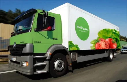
Warm, homely colours and a fresh, eco-friendly palette evoke a feeling of joy and bring to mind the real taste of vegetables. And a meticulously developed brand book helps Vyborzhets employees tell customers more clearly about the wonderful product hiding inside the branded packaging.
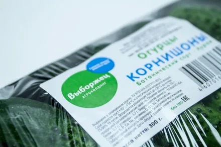
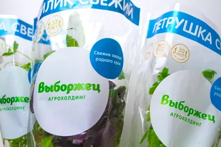
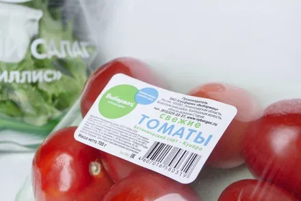
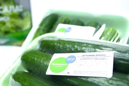
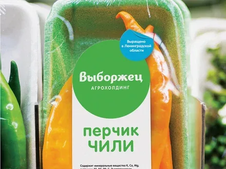
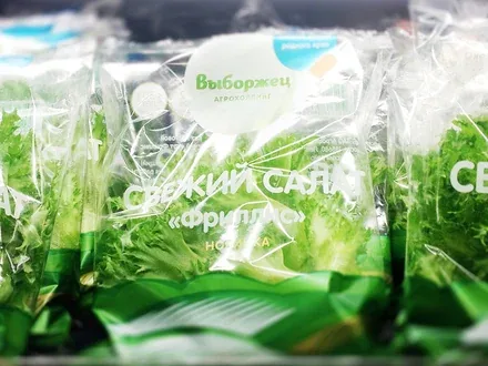
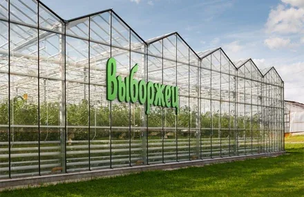
The core idea of the corporate identity is homegrown, quality produce, just like from your favourite family garden. Warm, homely colours and a fresh, eco-friendly palette evoke a feeling of joy and bring to mind the real taste of vegetables. We also developed branded signage for the greenhouses and other buildings of the agricultural holding.
As a result, the holding's products were listed in 13 retail chains, and revenue growth for 2021 reached 15%, with revenue totalling RUB 3,573 million.