Premium BSPB: the bank's updated programme
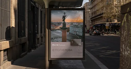
Bank Saint Petersburg is growing with confidence, and to strengthen the bank's market position we rebranded its Premium programme. Read about the details of the programme update in our case study!
Earlier, in 2020, the Brandson agency (TSN) carried out a complete rebranding of Bank Saint Petersburg. A strategy for promoting and developing the brand over the long term was developed. The bank's image was significantly transformed. Honesty, a human touch in communication, visual elegance and verbal lightness became the priority. BSPB began to develop the image of a guide, a "genius loci", in its positioning.
Bank Saint Petersburg is one of the largest banks in the North-West region of Russia and the third-largest bank in St. Petersburg. After the rebranding we carried out, the bank strengthened its position and continued to grow actively in St. Petersburg, Kaliningrad, Novosibirsk and Moscow. The bank's assets are constantly increasing: in 2023 the bank accumulated 97 billion roubles in net assets. In 2022 BSPB posted a record-high profit of 47.5 billion roubles, and the bank's shares rose 39% since the start of the previous year, compared with an 11% rise in the MOEX index.
The company's success needed to be consolidated in order to attract specific reference groups and increase visibility on the market over the long term. Whereas Brandson had previously developed comprehensive development strategies for the entire bank, the time had now come to rebrand the bank's Premium programme.
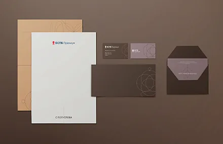
The agency team conducted a major study of the market and target audience to determine BSPB's development trajectory. To create a unique and vivid positioning of the programme for the premium segment, we developed verbal and visual attributes and a brand book. So that BSPB could use our work without difficulty, we adapted it to the key brand touchpoints.
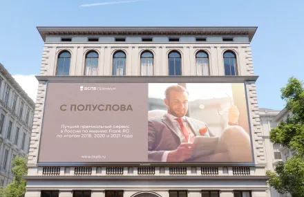


We identified the key problem of Russian banks: insufficient service support. In unstable times, demand for service quality grows. A bank is not only a place for financial transactions, but also the main helper in improving the client's quality of life.
Clients are loyal only when they are cared for. Bank Saint Petersburg has traditionally, over many years, provided its clients with high-quality, high-level service. We recommended that BSPB place the emphasis precisely on this significant distinguishing feature of the bank. BSPB is not just an adviser, but a true friend.
The core of the target audience is men over 45 who have established a full family. They are busy with their affairs, while BSPB provides all-round support for a comfortable life.
Russian banks use identical styles. A monochrome palette and images of successful bearded men are used in the communication of a great many financial products. Thanks to our recommendations, BSPB is one of the first to speak of its clients as multifaceted personalities.
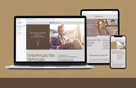

Based on the audit, the Brandson (TSN) strategists shaped the brand's character. BSPB becomes the most "human bank". The new policy emphasises the client's unique lifestyle. The world is moving down the path of digitalisation, while at BSPB a human concierge is "the new luxury".

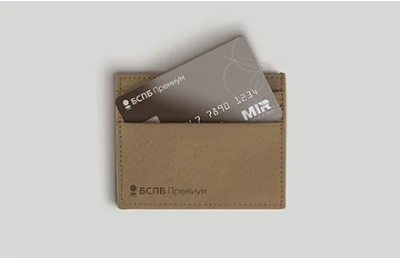


The Brandson (TSN) designers proposed several visual concepts. In the end, for the premium segment, it was decided to develop the "Key" concept.
The key is the central element of the visual concept. It is a symbol of entry into a secret club, of comfort and professionalism. The client feels their high status and the dynamism of life.
BSPB is the key to comfort. The client draws enjoyment and inspiration from life. Comfort is expressed in the opportunity to work with professionals who do not need to be asked twice. Above all, comfort is trust without worry, understanding at half a word.
BSPB becomes the key to a world of excellence and human possibilities!