Being a team with SMP Bank
SMP Bank is a large universal private bank offering its clients a wide range of modern banking products and services. The bank had carried out work to update its brand mission and values.
Our task was to create a unified visual image for use in the bank's overall image communication and in its HR activities.
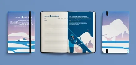
The agency team was tasked with creating a cohesive visual image of the company's updated mission and values for further use in the bank's overall image communication, as well as in the internal and external communication of its HR function.


Analysis of the information provided by the client, together with a study of the market and its trends, showed that many banks pay little attention to the visual communication of their brand mission and values.
Banks rarely choose illustrative imagery as a tool for expressing brand values, which became an additional factor differentiating SMP Bank from its competitors.
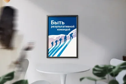
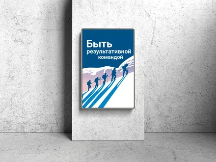
The conceptual solution for building a cohesive image of the bank was to express its imagery through the personification of the bank's values.
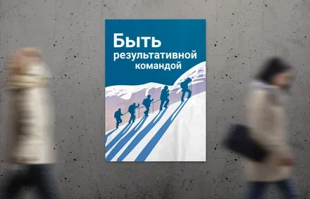
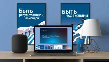
Thus, for example, "being an effective team" means valuing the personal contribution of every employee, "being useful" means being useful to you personally, with your interests in mind, and "being reliable" means being a personal source of support in your personal circumstances.
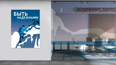
It was decided to express the new meanings through the metaphor of the North. On the one hand, the North means cold, harsh living conditions, long winters and difficult weather; on the other, it means people you can rely on and landscapes that are beautiful in their austerity and scale. It stands for reliability, dedication to the cause and to the people you share it with.
To reflect the character of the bank and its employees, simple and clear imagery was used in a muted colour palette. The bank's corporate colours perfectly reflect the colour palette of the northern latitudes, while large-scale typography helps convey the value embedded in each illustration.
The simplicity and clarity of the language of the conquerors of the North is expressed in the size and crispness of the typeface, its lack of serifs and its emphasis. Highlighting the verbs helps convey that the bank's employees are people of action.