Bank Saint Petersburg, branding, finance
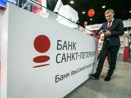

Work on the rebranding of Bank «Saint Petersburg» began in May 2011. The reason for the brand refresh was the adoption of a new strategy under which the Bank, a recognised leader in corporate banking, placed its bet on developing the retail segment.

The research carried out by the Brandson agency included an analysis of the results of qualitative and quantitative studies of the target audience, in-depth interviews with market experts and the company's ideologists, and a comprehensive brand and HR audit.

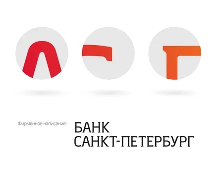
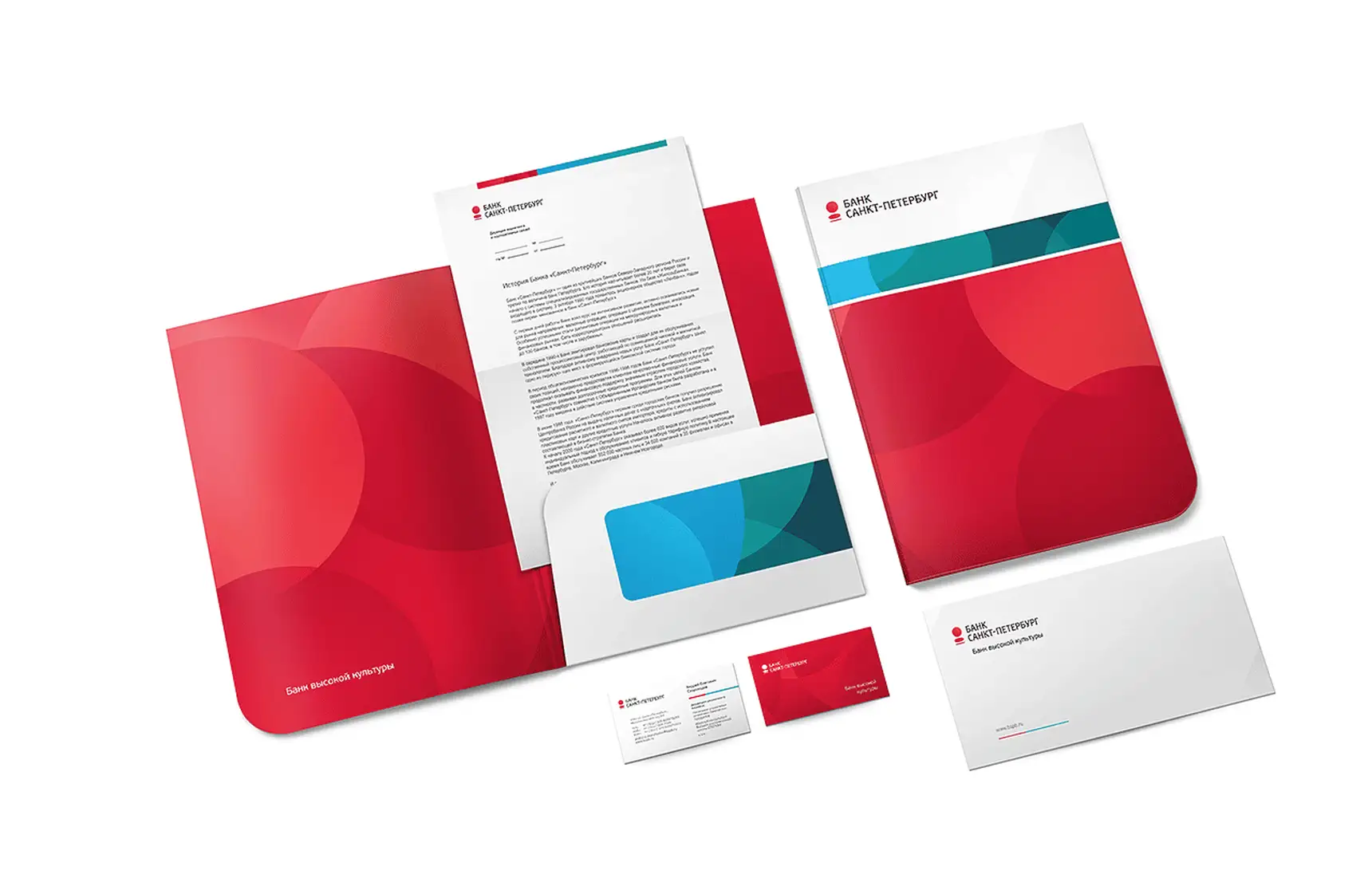
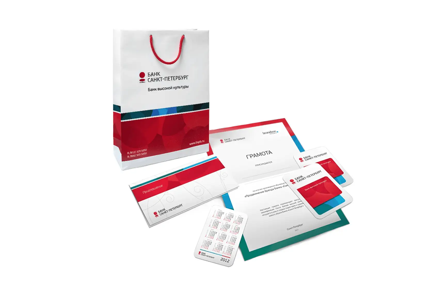
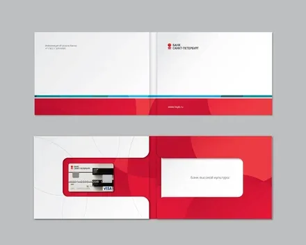
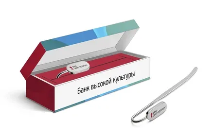
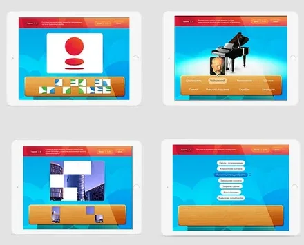
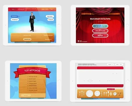
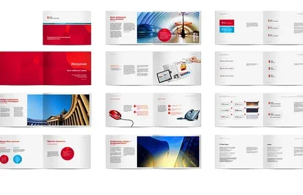
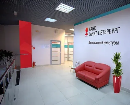
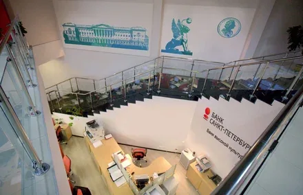
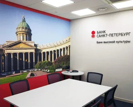
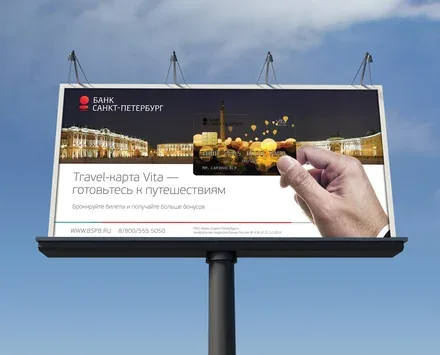
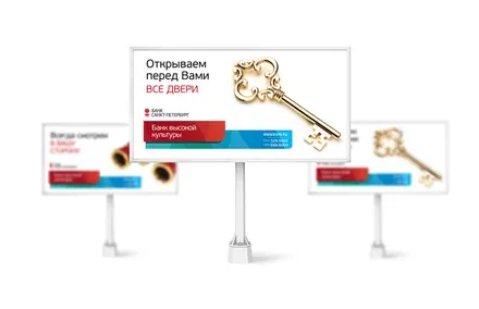
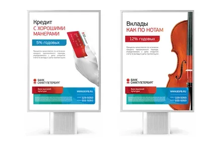
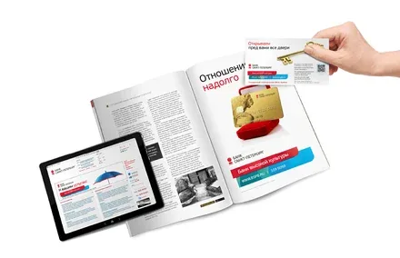
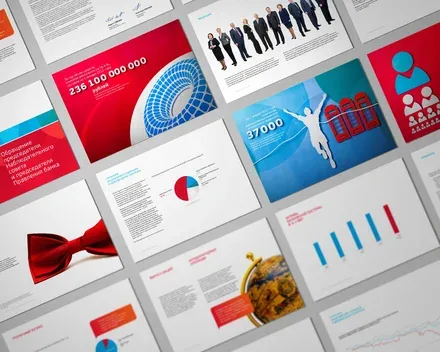
The results of the in-depth analytical work showed that awareness of the bank was high, but consumers did not understand the service advantages that Bank «Saint Petersburg» was ready to offer. For this reason, it was decided to keep the existing mark and change only the ways of communicating with the customer. After the restyling, the bank's logo also began to look more modern: the mark became three-dimensional and legible, and the wordmark, thanks to the introduction of a concise typeface — more recognisable. The primary colours of the bank's corporate identity became palettes of light blue, turquoise and red tones, with the implementation of one part of the bank's logo – the circle, which gives the image uniqueness and expands the range of colour solutions. Each colour of the proposed palette reflects a particular image of Saint Petersburg. The light blue colours emphasise the refinement of the Northern Capital and its residents. The aesthetics of the turquoise tone speak of a light touch of aristocracy. The red of the new style serves as a symbol of stability, quality and reliability – of both the bank and the city as a whole. Printed materials, business cards, folders, envelopes and brochures incorporating elements of the new corporate identity became an indispensable attribute of the corporate culture. Significant changes affected the bank's service policy: new service standards and corporate values were developed, in the spirit of which its new positioning was also formulated — «A Bank of High Culture». This message brings together the image of Russia's cultural capital and the high quality of service that elevates Bank «Saint Petersburg» to the level of a leader among the other players on the banking market. All further communication with the consumer is built on this core idea. A unique design of bank cards was developed for Bank «Saint Petersburg», reflecting the proposed concept as precisely as possible and conveying the advantages of cultured banking service. As the Brandson agency's ten years of experience in developing and implementing brands show, any external changes will prove insignificant unless changes take place within the company at the same time. The agency's specialists therefore faced the task not only of refreshing the image of a well-known bank, but also of «infecting» its staff, who would have to bring the changes to life, with the new idea. Employees received a new, meticulously designed uniform. Brandson's specialists paid close attention to the visual side of internal communications: stylish accessories and branded merchandise were produced, and a corporate desktop wallpaper design was proposed. An interactive viral FLASH game was also created for the bank's employees, aimed at instilling the corporate values. The game is hosted on the Bank's corporate portal with restricted access. A modern brand book was created, vividly describing the strengths of Bank «Saint Petersburg», along with a detailed toolkit for working with the new corporate identity. The brand message – a dedicated HR programme for rolling out the brand. Presentations and training sessions that prepared selected bank employees for further work not only on passing on knowledge about the brand, but also on sustaining that knowledge in their daily work. The next stage of the rebranding was external communication with the consumer, the mechanisms of which were developed by our company. The bank appeared in its refreshed image both online and beyond the virtual world: image and product advertising campaigns were launched. At the heart of the bank's success – the painstaking work of its employees. We wanted to convey this sense of attention to detail, of meticulous work on every single element. To do this, we used handmade paper appliqués to show what wonderful results can be achieved through diligent work. More about the annual report