No smoothing over the edges: branding for the rating agency RA Expert

Our task was to refresh the brand's visual image in connection with internal structural changes.
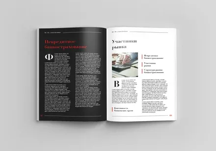
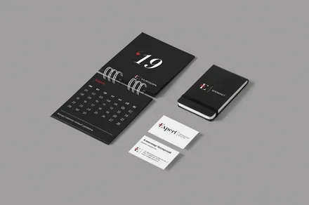
We developed three options for an updated visual concept for the Expert RA brand, taking into account the company's strengths and specifics, the competitive environment and current visual trends, and created a brand book containing the rules for applying and using the corporate identity elements.
We share the details in the case study.




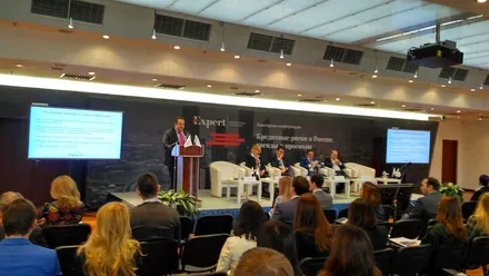
The credit rating agency Expert RA was founded in 1997 and is today the oldest and largest Russian rating agency. Expert RA is not only the undisputed leader of the rating services market, but also one of Russia's largest analytical centres.



The main competitive advantage of any rating agency is trust in the information it provides, which is why we decided to place the emphasis on the honesty and transparency of the company's communications. The values that guide the company are professionalism, a systematic approach and strict objectivity. The truth matters more than how we feel about it.
The Expert rating agency does not try to smooth over the sharp edges where ruthless analysis is required, analysis that ultimately serves the greater good and helps draw the attention of both client and investor to problem areas.


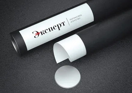

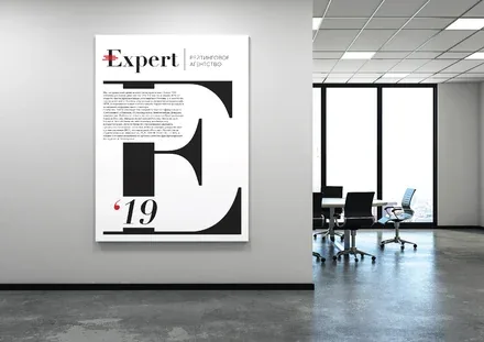
The agency's new identity concept engages several triggers at once that are associated with reliability and transparency.
First, a concise visual style stripped of everything superfluous: three classic corporate colours harmonise with a rich red, making the logo stand out without overloading it.
Second, a classic "business" typeface shows respect for the roots of the rating industry, which emerged in the USA at the very beginning of the 19th century. The serifs improve legibility and help increase brand recognition.
The three red stripes on the capital letter are unambiguously associated in clients' minds with analytical data and charts. The cool colours of the photo style likewise proclaim the value of a clear mind, unclouded by emotion.