Development Bank of Kazakhstan
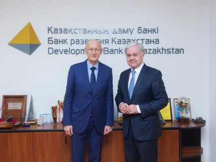
In the financial market, image and recognition among clients play a vital role: a bank must inspire trust and interest from both borrowers and investors. It was with precisely this task that the Development Bank of Kazakhstan approached us, wishing to emphasise its significance for the development of the economy as a state-owned first-tier bank through comprehensive branding.
Our team developed a unified visual and verbal language of communication, including a unique brand line that combines the Bank’s innovative spirit and its values, as well as a logo and pattern that emphasise its stature and innovation. Read more about the strategy and solution in the case study!

The goal of refreshing the Development Bank of Kazakhstan’s brand was to break away from a negative image that ran counter to the Bank’s key strategic initiatives – developing the economy of Kazakhstan, attracting foreign investors and financing larger-scale projects. On the eve of its anniversary, the company’s management decided to substantially change not only its internal but also its external policy in order to achieve its new goals and objectives more effectively.
The main objective of the brand refresh was to build the image of an innovator opening up new horizons for the country’s development.


Work on rebranding the Development Bank of Kazakhstan began with expert interviews with top managers and with the company’s potential borrowers. The interviews showed that borrowers were daunted by the complexity and intricacy of the procedures required to obtain a loan. We analysed the factors driving competition in the investment market and identified the key criteria for choosing a bank.
The market audit demonstrated how difficult it is for DBK to compete with second-tier banks due to objective factors of the market environment. Our team concluded that the Development Bank of Kazakhstan had not yet unlocked its potential for attracting compelling, economy-shaping projects, but that it held key advantages: access to resources, recognition and the backing of the state.
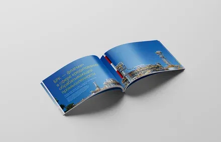



In developing the bank’s positioning, two strategies were proposed: the first was to compete with second-tier banks, and the second was to emphasise the status of the Development Bank of Kazakhstan as a state-owned first-tier bank playing its own distinct role in the development of the national economy. In the end, the second path was chosen, as it aligns with all of DBK’s new strategic initiatives.
A creative bank that fosters the country’s economic growth through effective partnership with borrowers and co-investors.

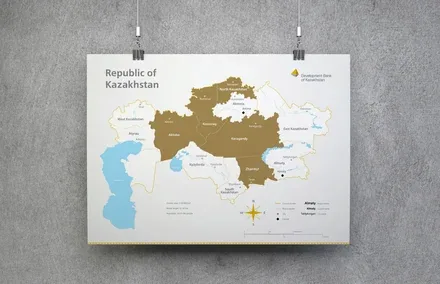

The new positioning is reflected in a unique brand line developed by our team. “Course for Prosperity” supports the brand idea – the icebreaker of the financial market, clearing the way for ambitious new projects.
Based on the chosen strategy, it was decided to move away from the bold visual styles of second-tier banks and instead preserve continuity and reflect the achievements of past years.
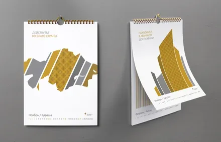
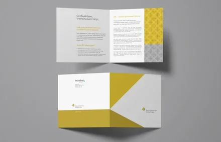
The bank’s new logo is a four-colour graphic mark that reflects its focus on the interests of the state. One of the key elements of the visual style is the brand pattern, which emphasises such characteristics of the bank as leadership, innovation, openness and stature.
All corporate identity applications, including the calendar, are aimed not only at the internal but also at the external audience, conveying the 12 principles the Development Bank of Kazakhstan adheres to in order to achieve its goals, improve the country’s investment climate and ensure the financial well-being of its people.