Rebranding of Russian Standard Bank
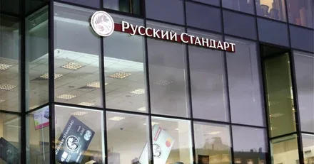
Russian Standard Bank was founded in 1999. Today the bank is one of the leading universal financial institutions specialising in retail banking. Over the years, Russian Standard Bank has created and introduced new consumer standards for financial services.
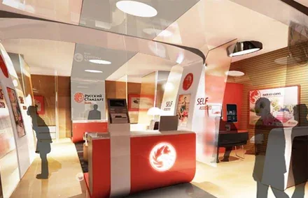
The key idea is that an open, innovative and friendly space should make using the bank’s financial tools as comfortable as possible. The project was implemented in line with a concept that was adapted to the bank’s various branch formats.
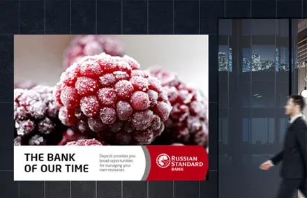
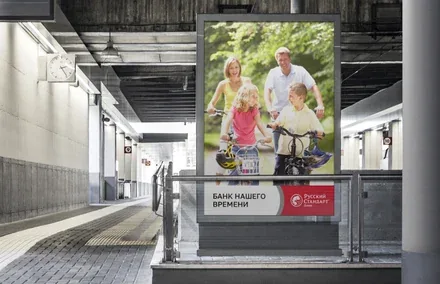
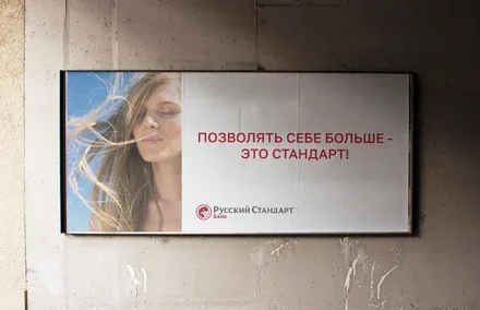
The goal of the rebranding was to adjust the positioning and image of the bank, which had set itself the task of transforming from a credit monoliner serving mainly low-income groups into a universal bank attractive to all segments of society.


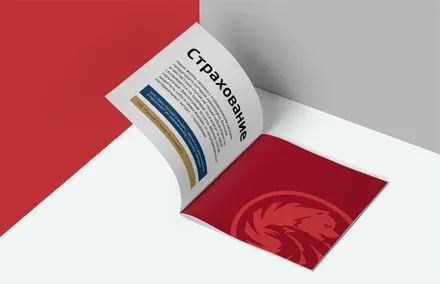

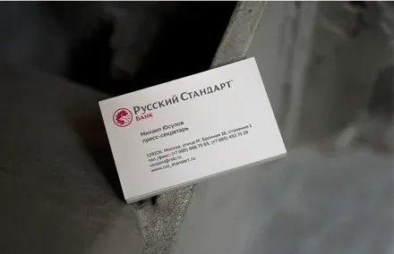
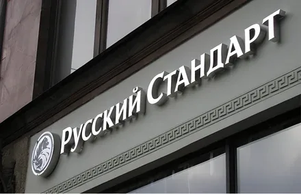
The logo was restyled, with several versions developed at once: colour, black-and-white, in Russian, in English, in two lines and in three lines. At the same time, the overall idea of the mark, in which two vital images intersect – the bear (the unofficial symbol of Russia) and the eagle (a symbol of statehood and power) – remained unchanged.
It was equally important to emphasise national identity: the fact that Russian Standard Bank is precisely “Russian” is essential to understanding the meaning of its work. To be rightfully proud of one’s homeland, one must put into practice the standards of a new Russia that will allow the country to become stronger and more successful.
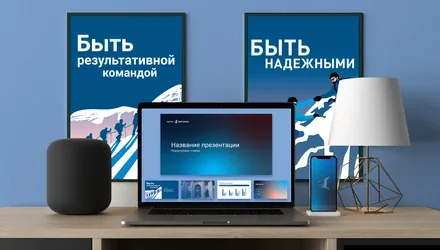
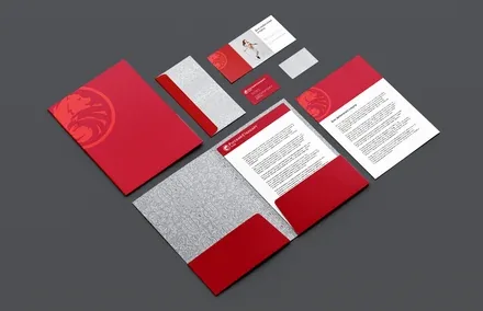
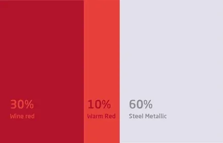
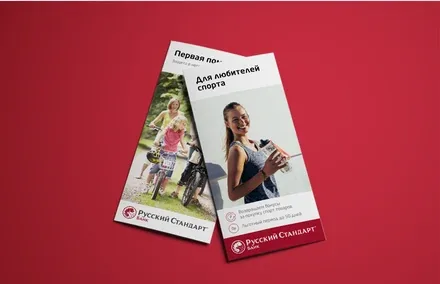
The bank’s corporate identity also required an equally delicate adjustment and underwent a number of changes. The main one is a new colour palette, developed on the basis of the brand platform.

Each of the new colours carries a specific meaning. Dark red symbolises solidity, power, warmth, wealth, determination and a number of other important qualities. These meanings are set off by a metallic grey, which stands for progress, speed, professionalism and technological sophistication.
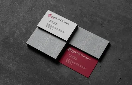
To emphasise the bank’s individual character and increase its recognisability, the agency’s specialists proposed introducing an original ornament as an element of the corporate identity, echoing the traditional Russian patterns once used to decorate fabrics.
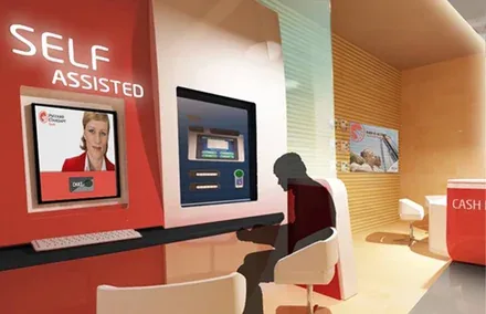
The most important stage of the work was the branding of the bank’s branches, covering both the overall design and the detailed development of self-service points. This work was carried out jointly with Brandson’s Italian partner, CREA International, a leading global expert in physical design.
Every nuance was considered in the course of the work – from the movement of customer flows inside the premises to the interface of the touch-screen monitors and the operating logic of the 24-hour ATMs. At the same time, the corporate identity, successfully integrated across a variety of touchpoints, received a bold and striking embodiment.
The key idea is that an open, innovative and friendly space should make using the bank’s financial tools as comfortable as possible. The project was implemented in line with a concept that was adapted to the bank’s various branch formats.