Garant Invest. Relaunching the brand in the business segment
Brandson (TSN) was tasked with relaunching the brand of a real estate developer that has been operating in Crimea for more than 25 years and, since 2023, in Moscow, St. Petersburg and the Leningrad Region. Despite the high quality of its construction, the company remained practically unknown. The old identity was associated with the economy segment, there was no unified corporate identity, and the website did not function as an effective sales tool.
We carried out a rebranding, developed an identity and created a multi-page website. The brand now has a visual language befitting the business segment and a fully-fledged entry point for a demanding audience.
Garant Invest started out as a general contractor for the city of Sevastopol, then moved into real estate development. In Crimea, the company delivered the projects Tsarsky Bereg, Yuzhnaya Riviera, Legenda, Briz and Sakura. Each of them is a boutique project with individual architecture and a gated territory. In parallel, the developer acted as general contractor for the Roshchino Residence project in the Leningrad Region, a premium resort complex. Since 2023, Garant Invest has expanded into the regions, delivering projects in Moscow, St. Petersburg and the Leningrad Region.
As its geography expanded and its ambitions grew, the brand remained in the shadows. Its communications looked outdated and did not match the real level of its projects. The affluent target audience expected a different quality of positioning.
We had a clear objective: by the start of the season, to build a coherent, recognisable style and create a website that sells not square metres but a way of life.
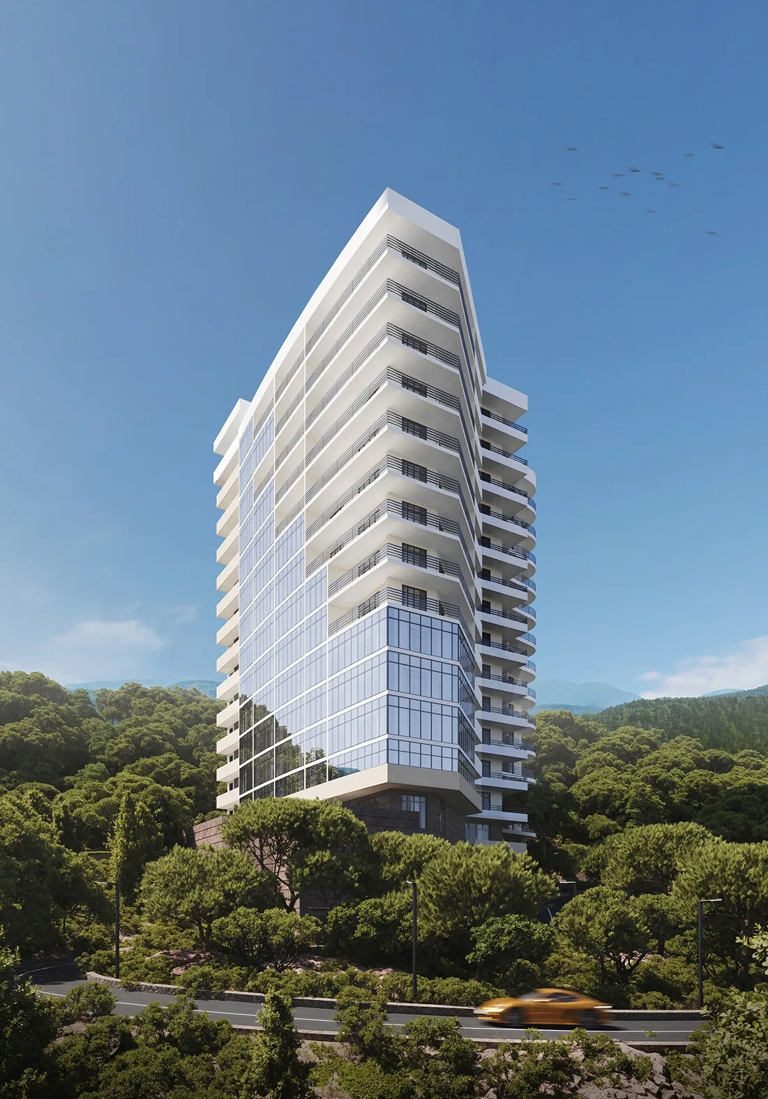
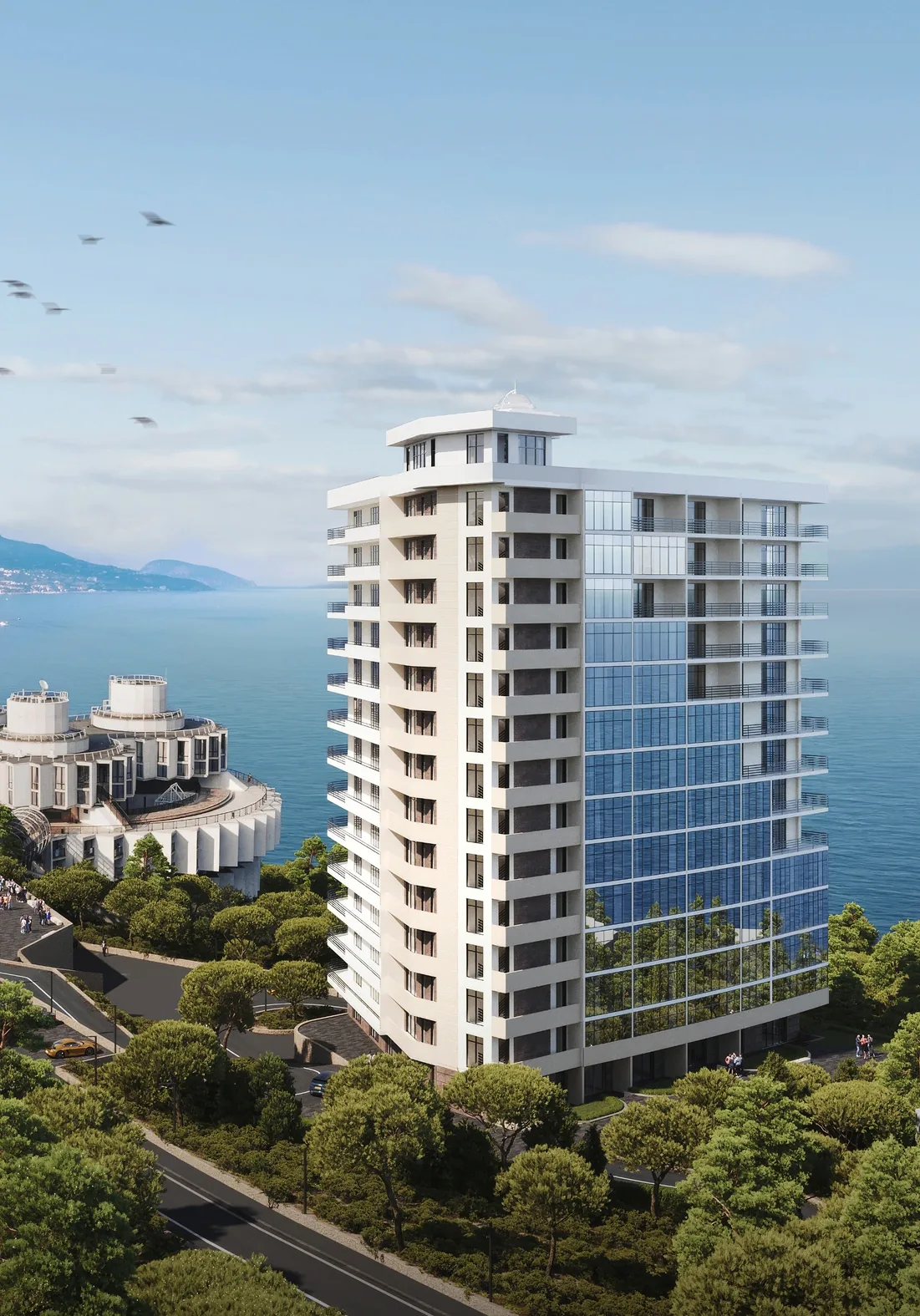
We started with in-depth interviews. The key insight: the company has a pronounced character, bold and willing to take on projects that others turn down. Difficult terrain, seismic activity, high risks are not a reason to back off, but a challenge.
Thoroughness is not an empty word. The company has a thorough understanding of construction processes, from design to handover. Decisions are made quickly, but each one rests on precise calculation and in-house expertise. This combination of daring and engineering responsibility became the basis for the brand.
"The company's DNA is its character. If we convey it, we will hit the mark."
Market analysis showed that in Crimea most developers bet on investment property: buy, rent out, earn. This creates intense competition and a flow of random tenants. Garant Invest chose a different niche: seclusion and privacy. Its complexes are "worlds unto themselves", where apartments are not rented out by the day.
The niche turned out to be almost unoccupied. Differentiation from competitors not through loudness, but through character, selectivity and attention to detail.



Based on the insights, we formulated a brand platform that became the foundation for all visual and verbal solutions.
— Positioning: a developer of "oases", for those who seek a holistic quality of life. It is a rejection of the race for quick investment returns in favour of conscious, long-term comfort.
— Brand essence: a bold perfectionist. A striving for perfection without fear of experimentation. The company sees opportunities where others see difficulties.
— Brand character: bold, ambitious, refined, selective, thorough.
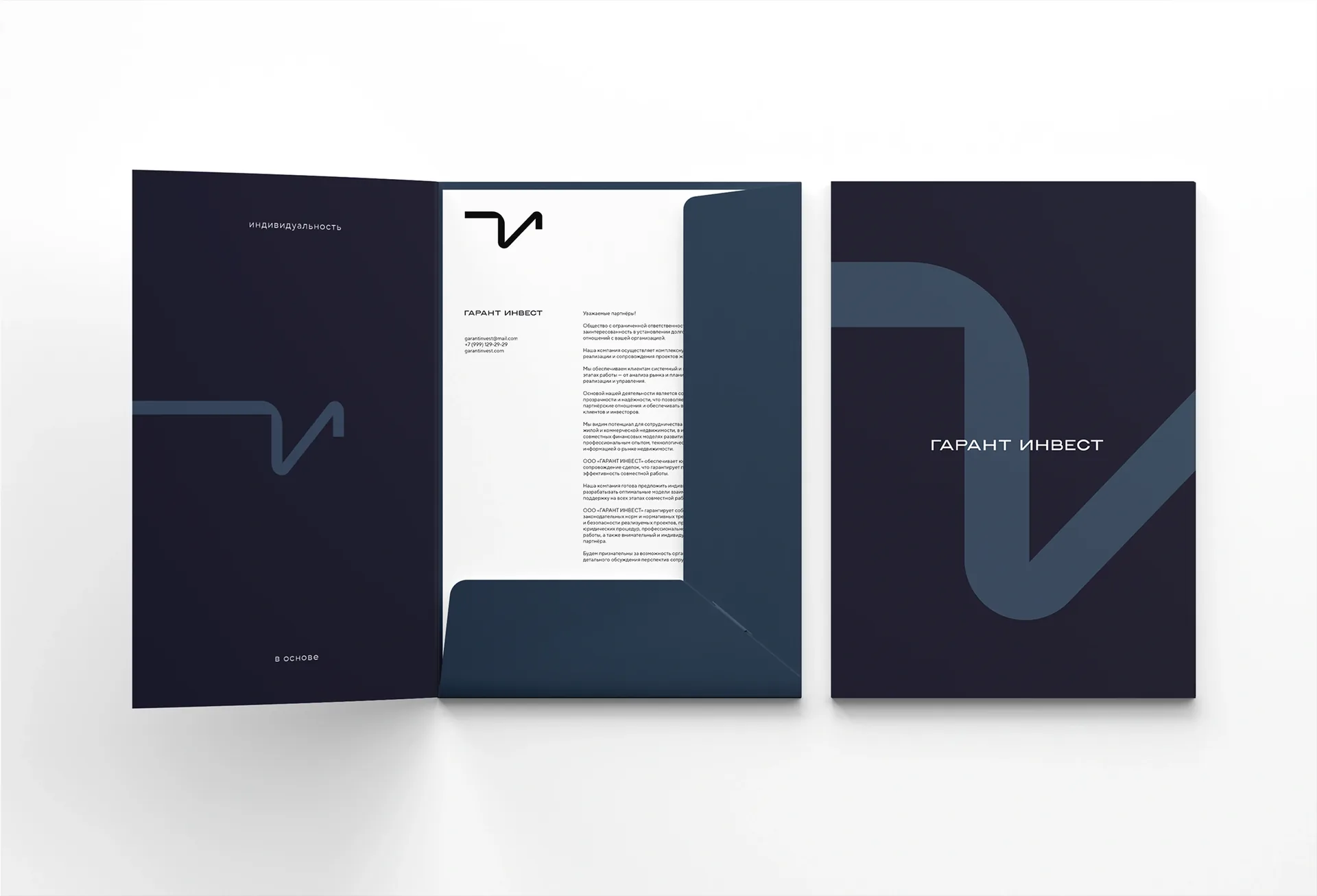
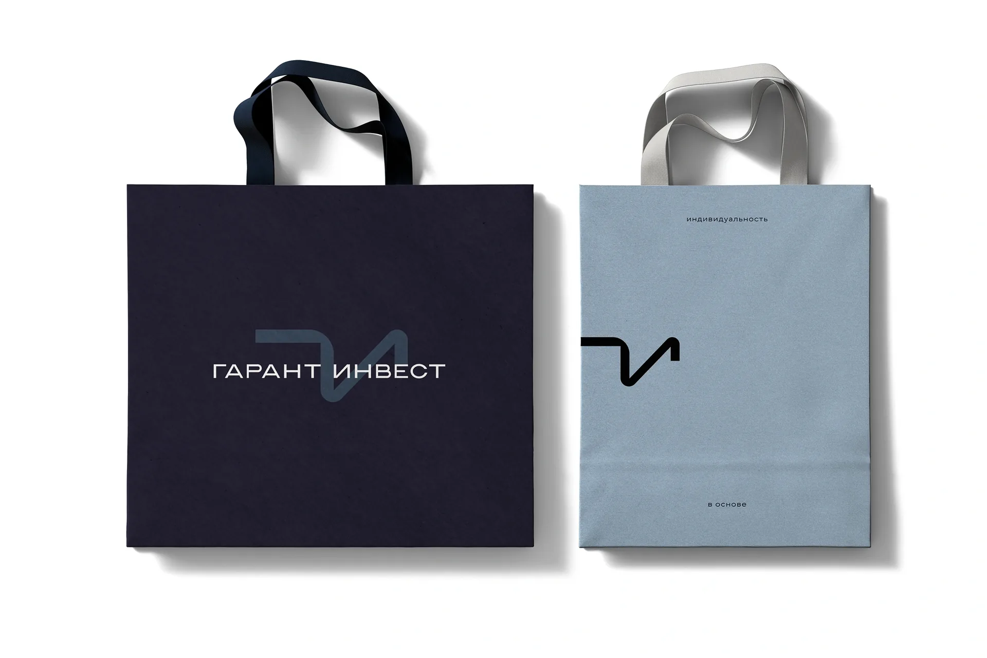
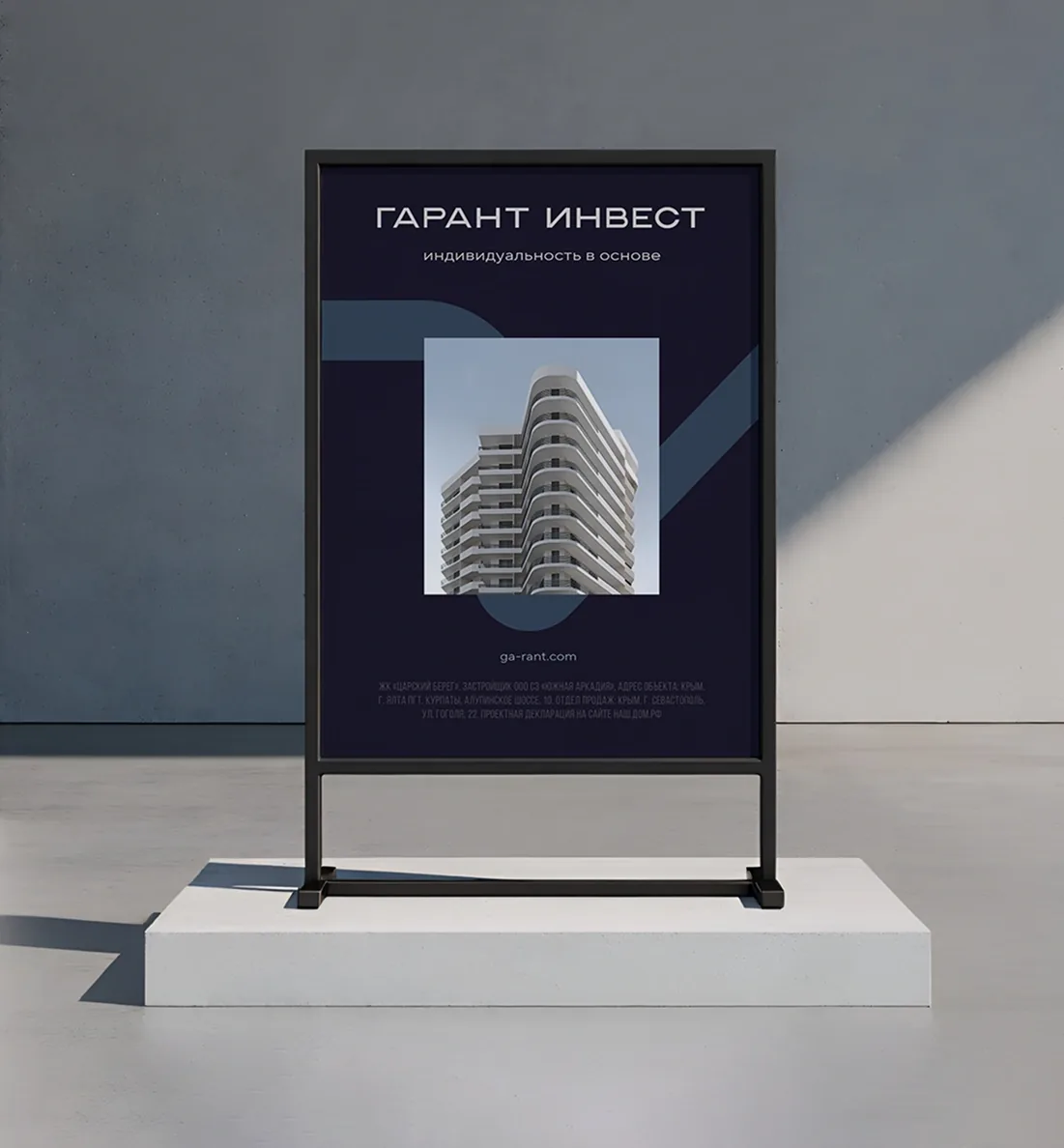
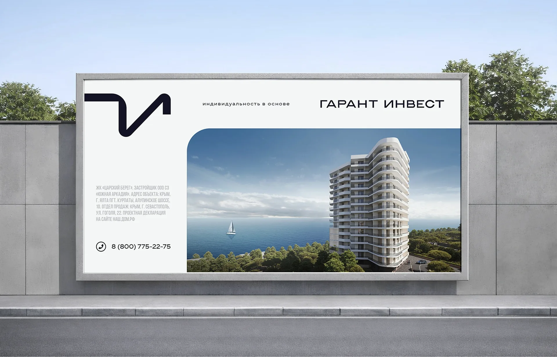
Verbally, this resulted in a clear system. The main brandline is "Individuality at the core". It sets the tone and works across all key touchpoints. Primary and secondary slogans were built around it. Together they rest on a single platform of meaning without becoming repetitive.
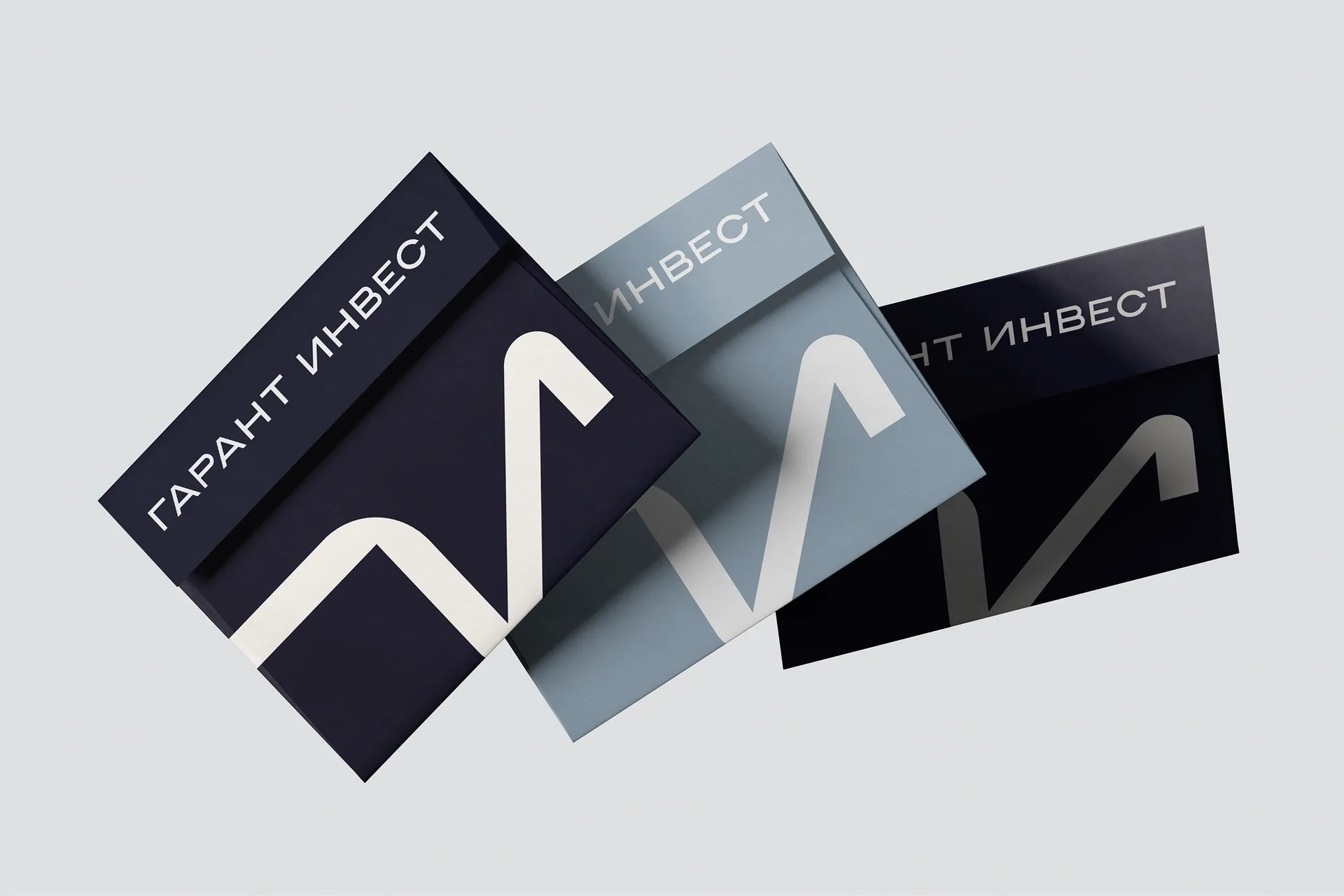
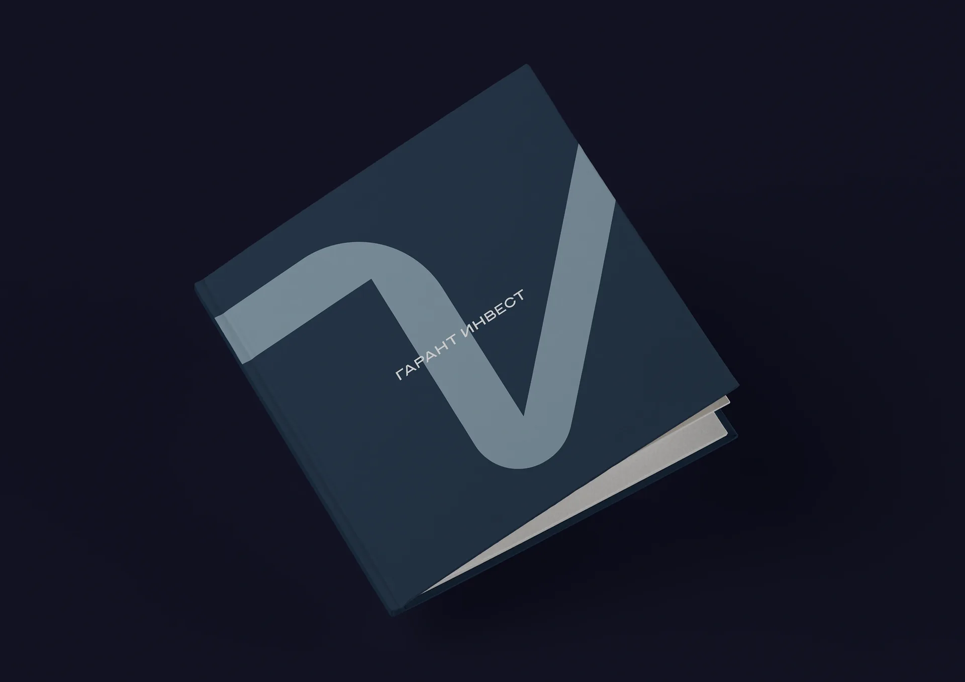
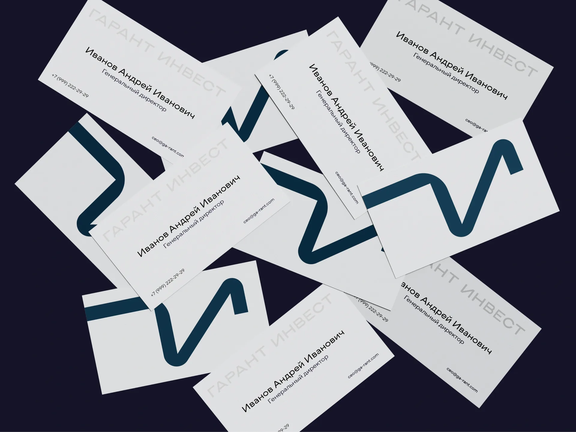
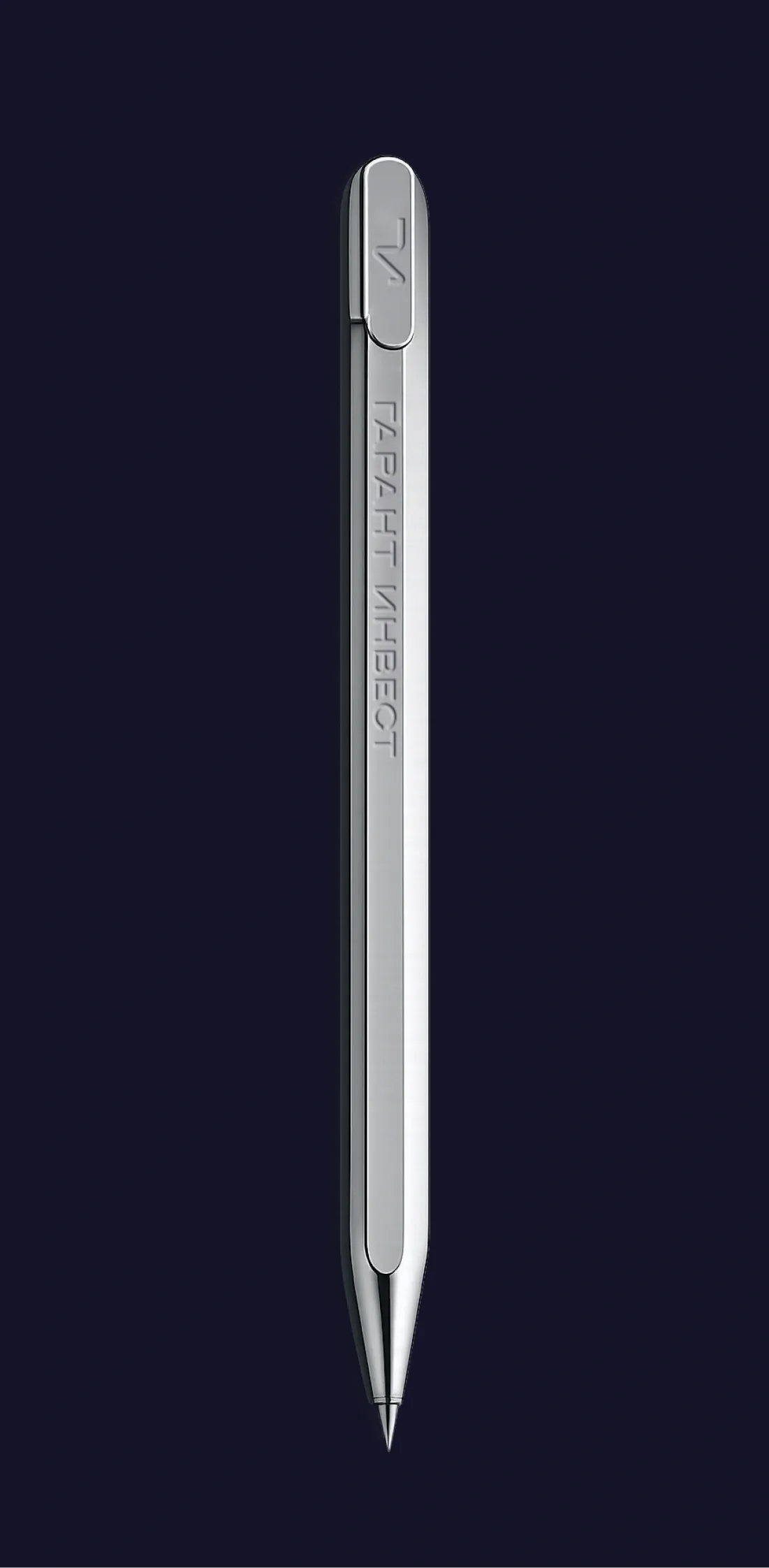
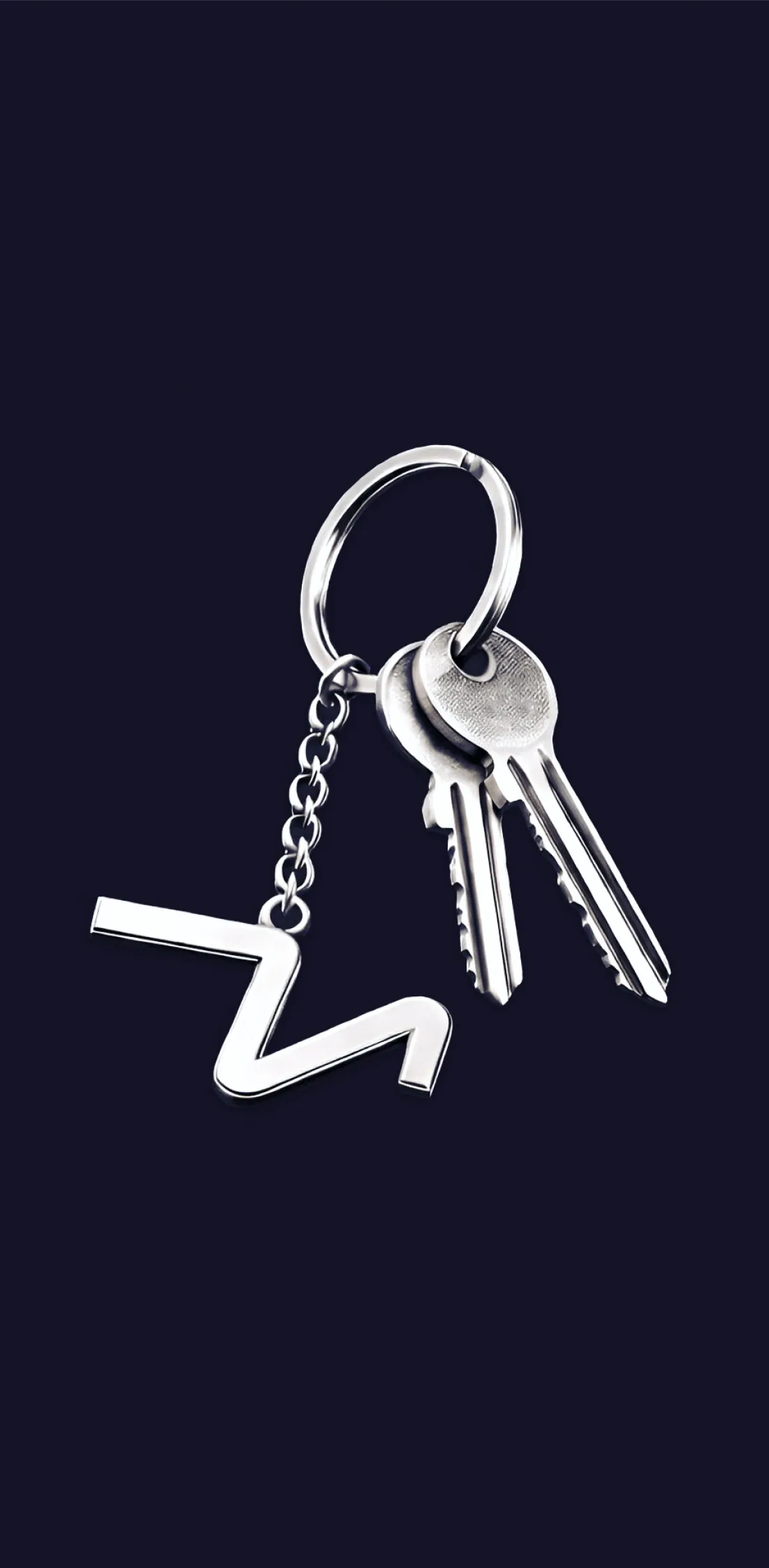
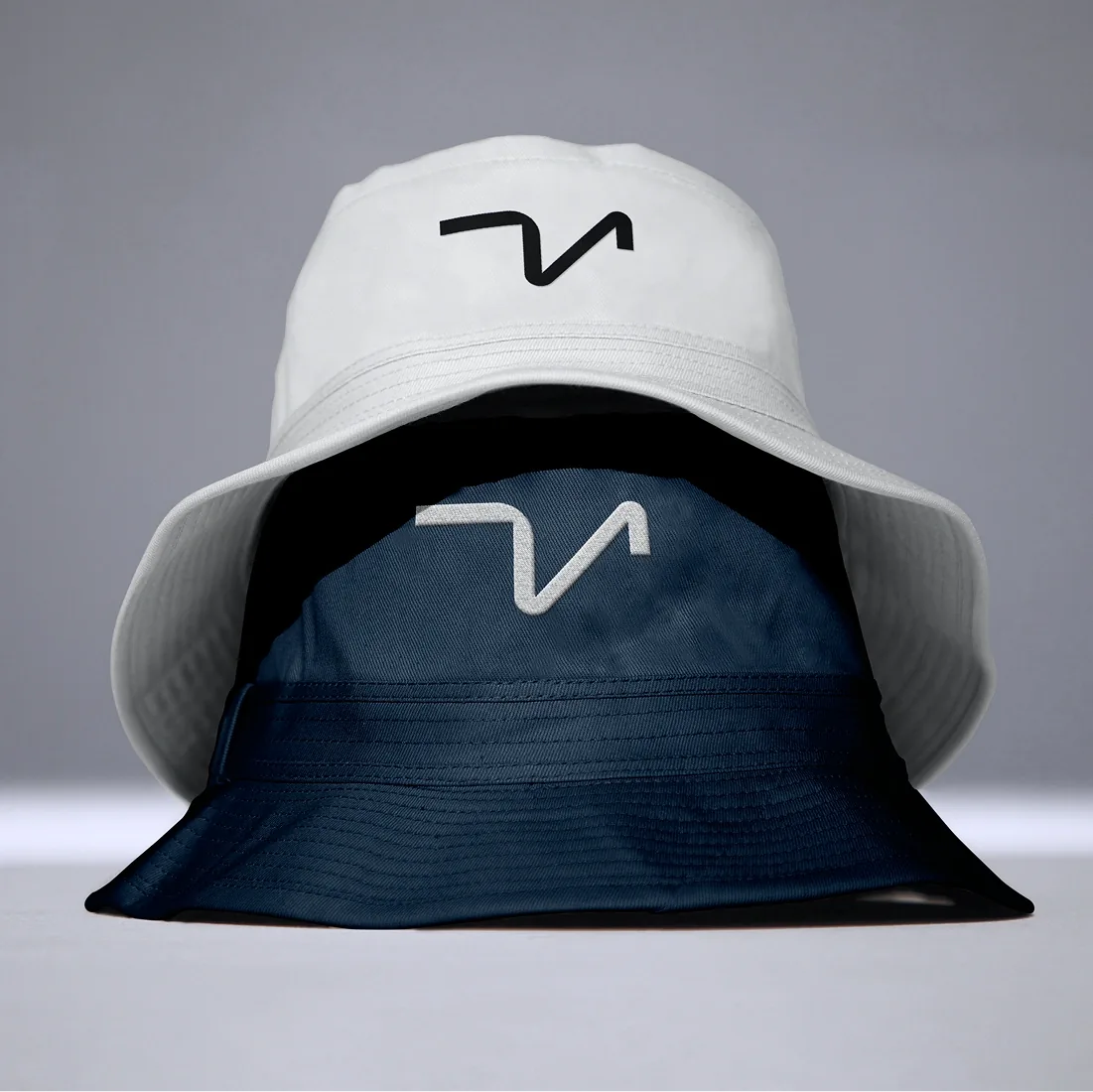
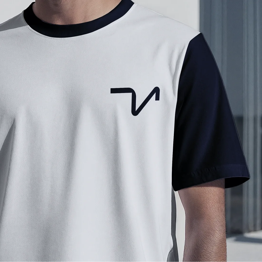
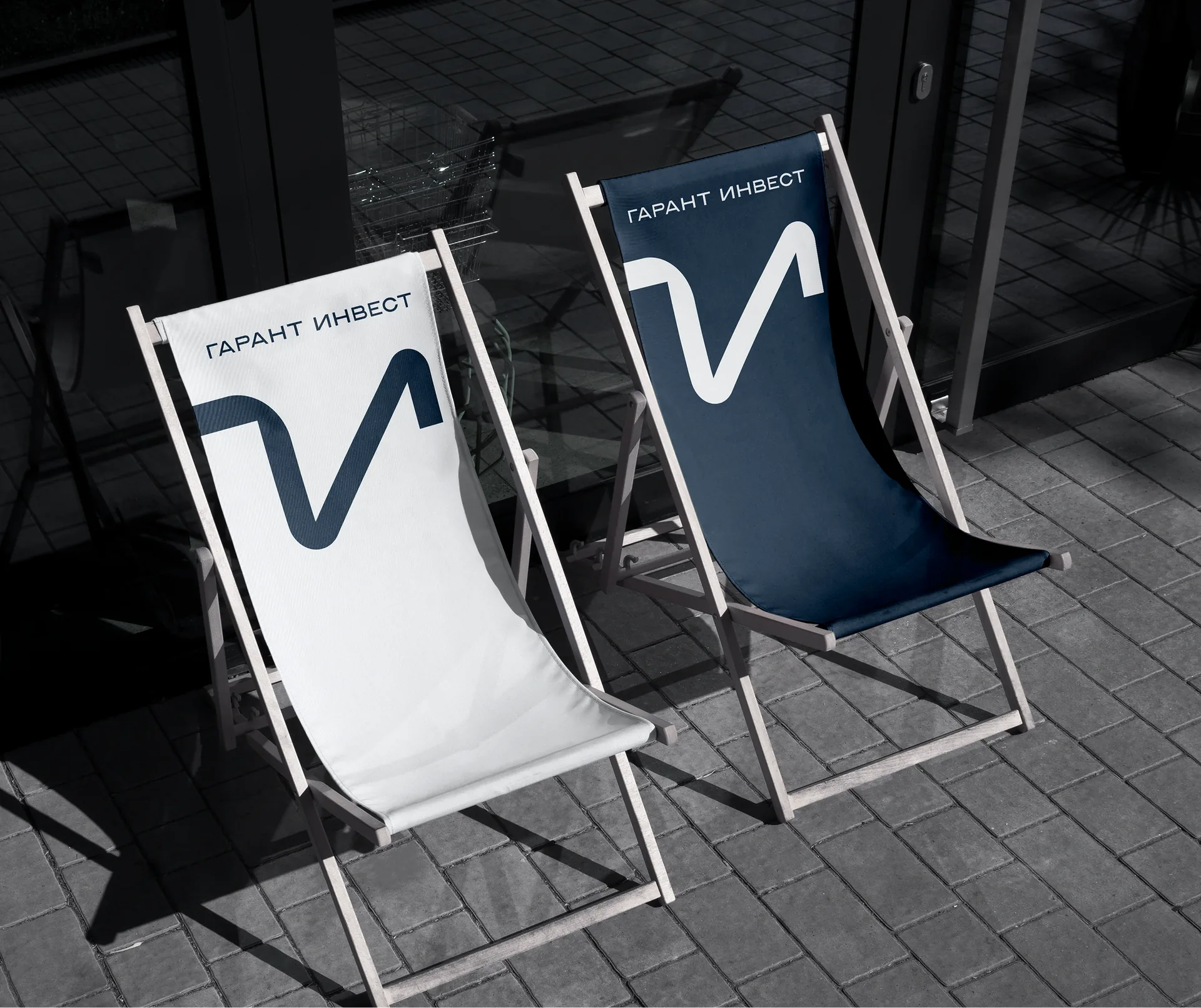
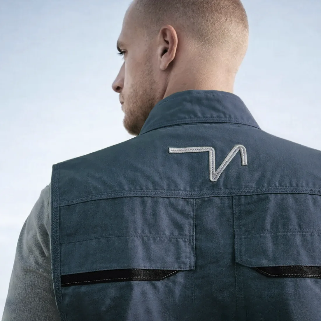
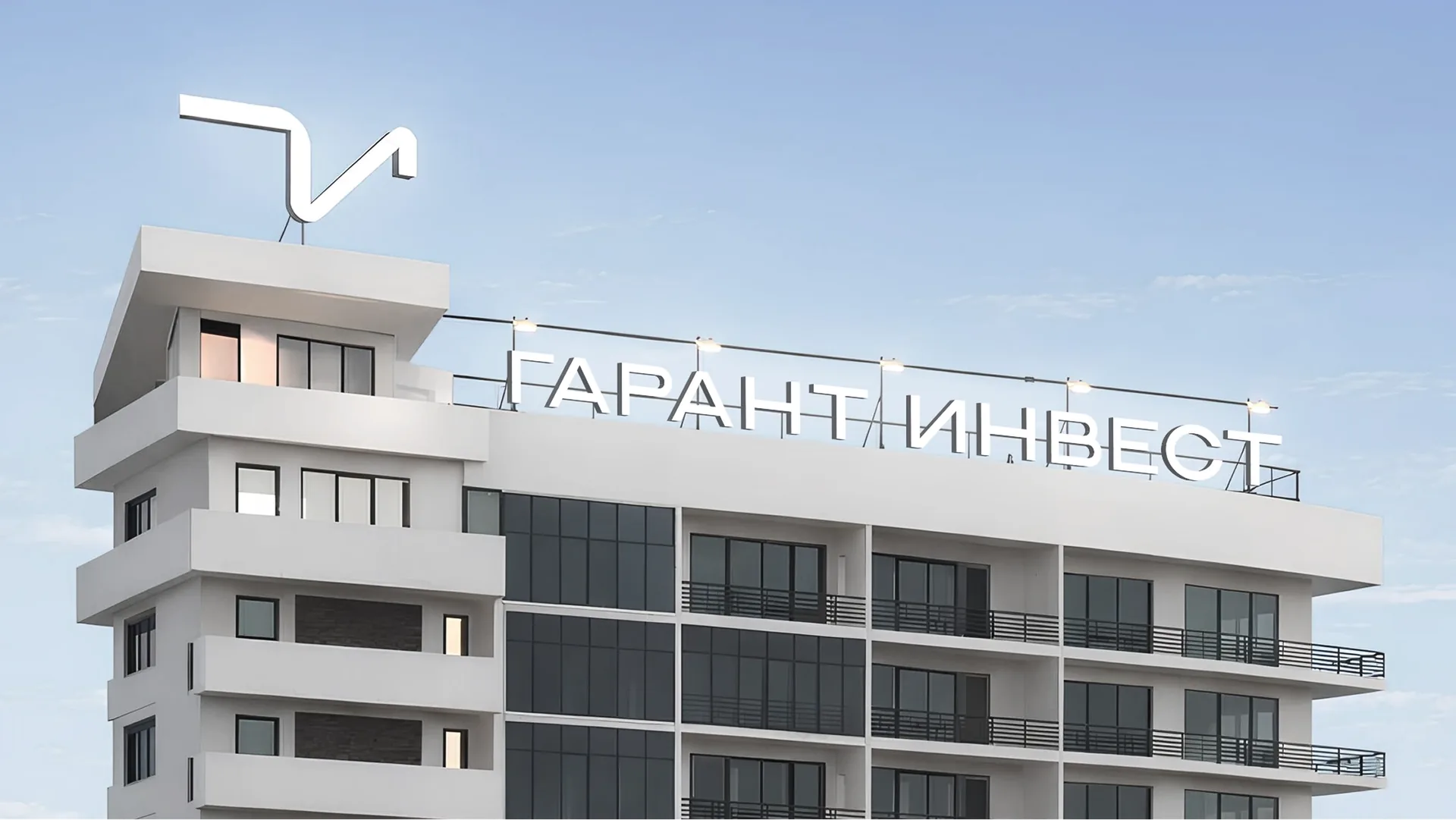
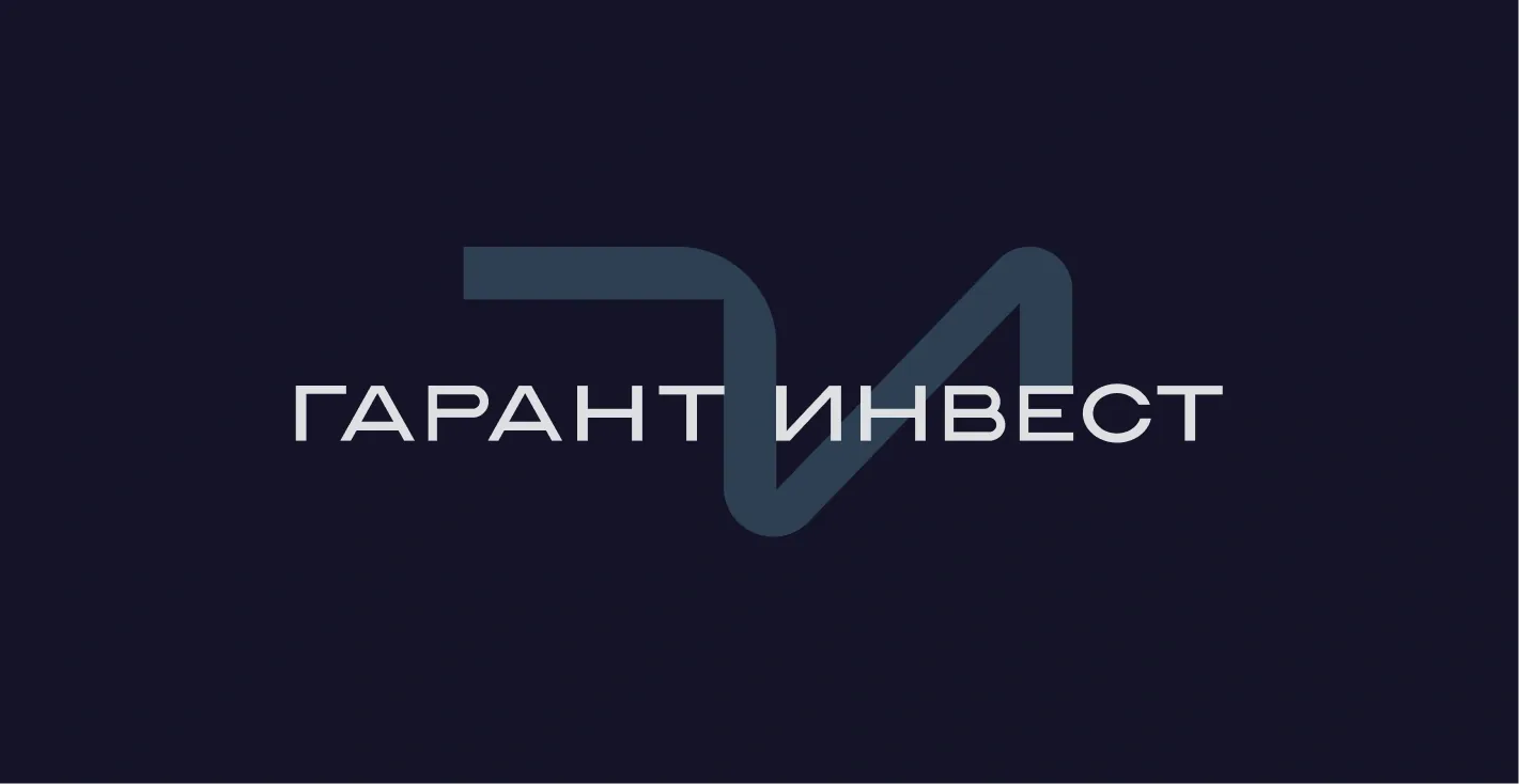
The mark is built on the stylised Cyrillic initials "Г" and "И" (G and I), whose forms create the recognisable image of a seagull. It is a symbol of freedom, the sea and resort aesthetics. The mark maintains continuity with the old logo while acquiring a contemporary feel.
The typeface is a clean grotesque with horizontal extension, without excessive monumentality or heaviness.
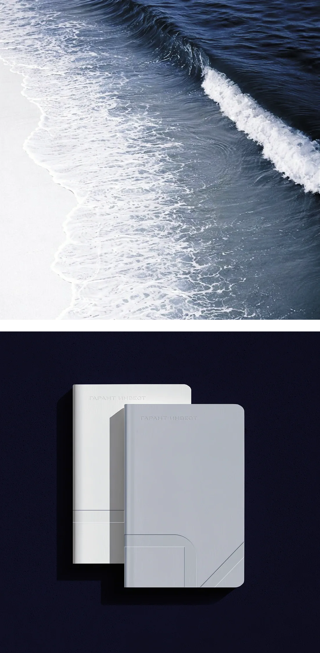
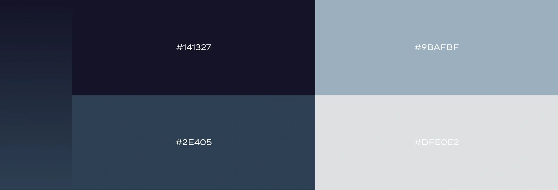
The colour palette is built on a combination of deep, medium and light shades of blue and grey:
— Deep blue: reliability, professionalism, a connection with the sea.
— Light blue-grey: freshness, airiness, a sea breeze.
— Neutral grey: visual balance, purity, modernity.
Together, the colours form an image associated with a resort atmosphere, stability and purity. No brightness, only restrained premium quality.
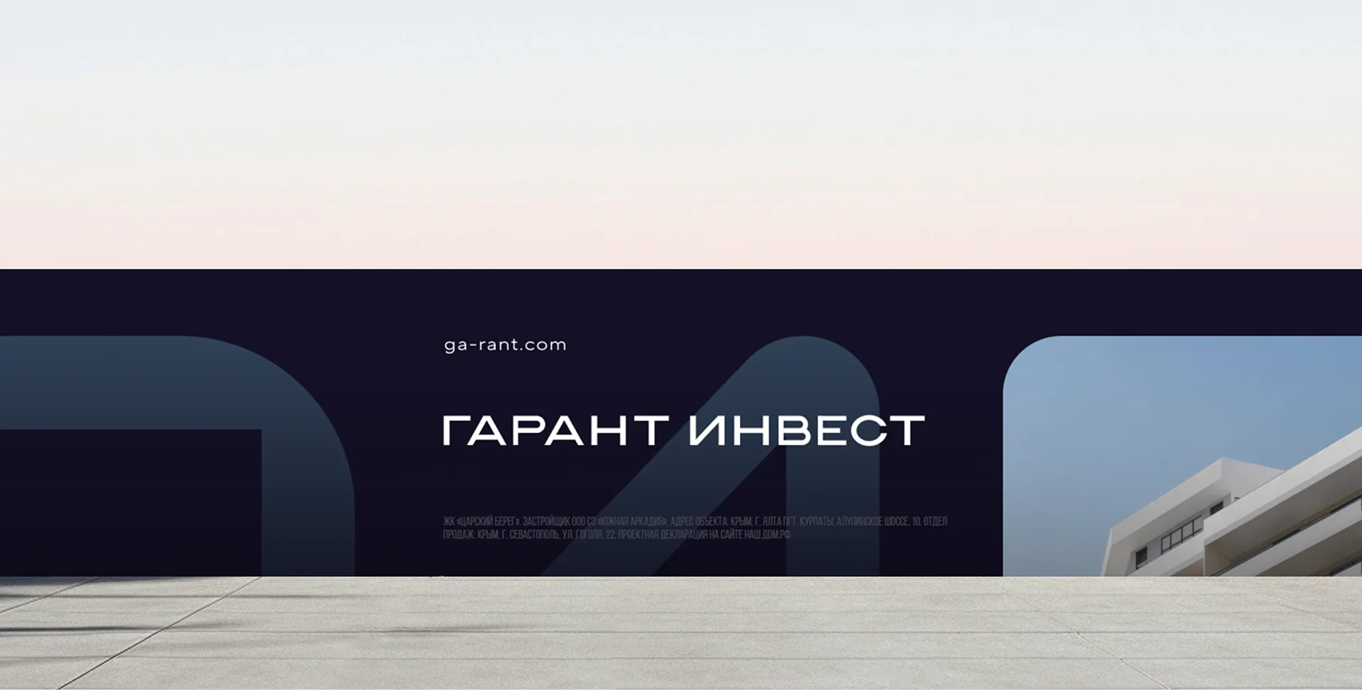
The brand graphics are built on cropping the seagull mark. It becomes a recurring element across all touchpoints, from business cards to construction site hoardings.
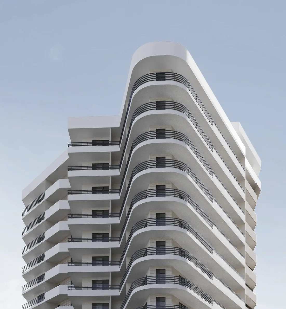
The photo style was built around the idea of "modern resort living", without postcard saccharinity. Three categories: architecture, people, nature.
We developed a multi-page website in the corporate style. The home page is built around the brandline "Individuality at the core", the axis of meaning that runs through everything. The navigation is transparent, the structure logical. Visually, the site is minimalist, with no excessive animation or garish banners: it should not be louder than the brand itself. As a result, the Garant Invest website became not just a showcase but part of the brand system.
What the client received:
— A brand platform ready for scaling.
— An identity that works in the business segment: bold without pomposity, premium without shouting.
— A website as a sales channel that informs, engages and converts.
The brand has ceased to be "just another developer". It is now a developer of residential oases with a Crimean soul, with clear positioning, a recognisable style and an environment you want to stay in.