House on Varkausa: setting a course for a new life
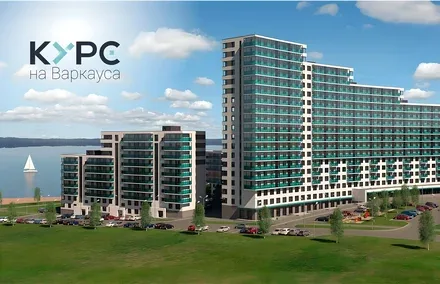
House on Varkausa is a high-tech residential complex in Karelia. A smart home system, energy-saving materials, a residents' app, a lake view from the window and original design solutions will attract the attention of those looking for an apartment in the very heart of the city.
One of the project's advantages is its own grounds, where a park is planned. Our team studied the real estate market of the Karelia region as well as the target audience, and concluded that the new housing would be in demand primarily among young people. It was for them that the new brand of the residential complex was created.
Barents Group has been operating successfully in the residential and commercial construction market of Petrozavodsk since 2005. Today Barents Group is working on a major investment project to build a high-quality, modern residential complex on the Varkausa embankment on the shore of Lake Onega. This is a prestigious place to live in Petrozavodsk and part of the "City by the Water" urban planning concept for the waterfront, developed by Scandinavian and Karelian architects.
We were tasked with developing the name and brand of the new residential complex, showcasing its advantages in the context of its location and linking them to the ideology of Barents Group, which is focused on using modern approaches and tools and on meeting Northern European quality standards in both spirit and form.

House on Varkausa is a high-tech residential complex consisting of six brick-and-monolith buildings of varying height. A smart home system, energy-saving materials, a residents' app, a lake view from the window and original design solutions will attract the attention of those looking for an apartment in the very heart of the city. A significant advantage of the project is its own grounds, where the company plans to create a park for residents. The Brandson team studied the real estate market of the Karelia region as well as the target audience, and concluded that the new housing would be in demand primarily among young people.
Historically, the site of the future development was a sandy beach where an ancient human settlement was discovered: the tools unearthed by archaeologists date back to the sixth millennium BC. The bridge between the ancient settlement and a modern living space became a phrase by science fiction writer and futurist Arthur C. Clarke: "Any sufficiently advanced technology is indistinguishable from magic".
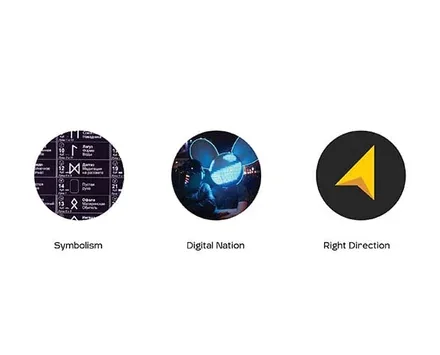
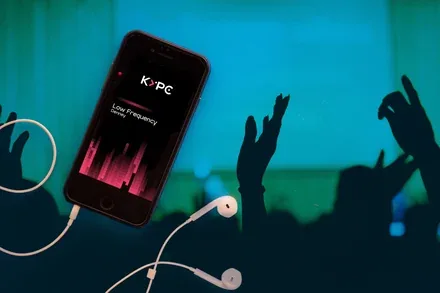
The environment of the young generation is a world where space magically responds to every thought and every movement of the body. A heartbeat, captured by a sensitive sensor, becomes a pulse in the flow of information; the web of communications creates a cosmos of its own, and the constellations of rave lights immerse you in the atmosphere of ritual dances, freeing you from the dictates of everyday life. We are not so far from our ancestors when we encode our emotions with graphic symbols. This idea led the development team to combine the aesthetics of neon and pixel art with runic signs. The waterfront location and the shape of the complex, reminiscent of an ocean liner, in turn gave the impetus for the verbal formula: "Course for Varkausa".
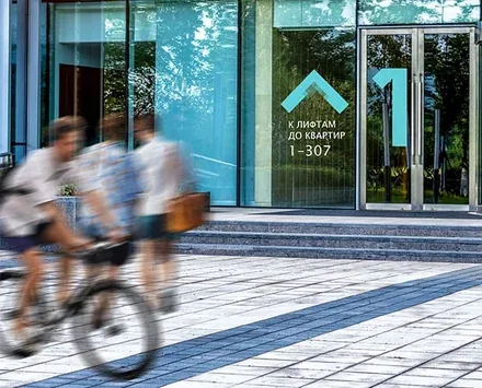
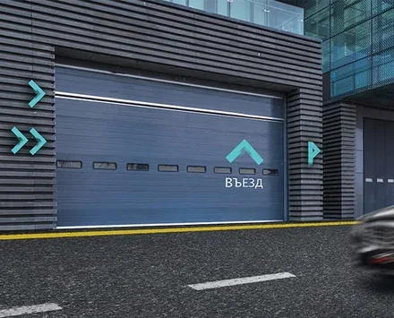
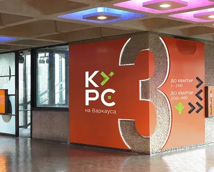
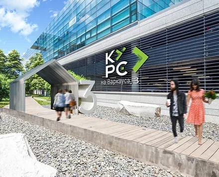
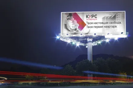
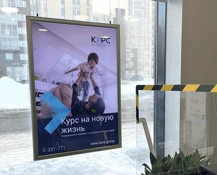
It was decided to keep the reference to the street where the building is located in the name, since this location is highly desirable for many buyers. The Course became a direction of movement and a fertile basis for further copywriting. "Stay on Course!", "Choose your Course!", "A Course for the young family": all the slogans are highly memorable and charged with the energy of change, of moving towards something better.
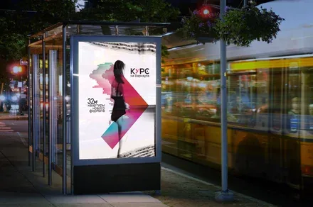
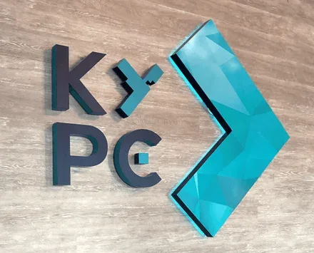
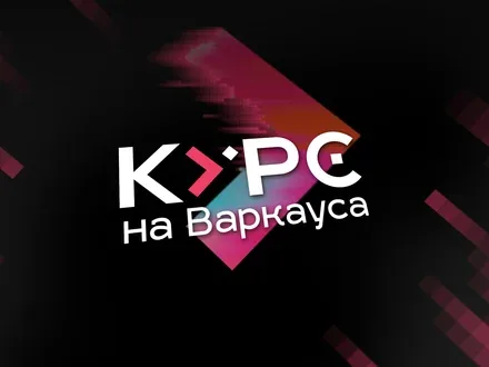
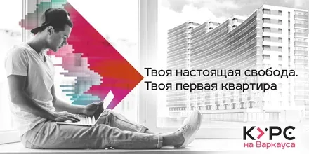
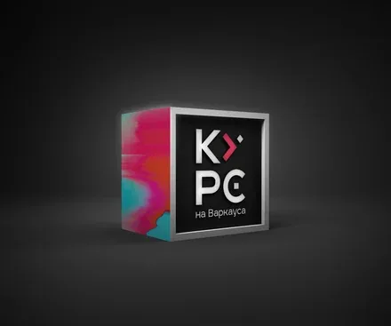
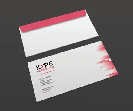
The letter "U" (У) in the logo turned into an arrow and served as the basis for a set of symbols denoting the various opportunities for future residents. The strict lines of the technogenic style are rapidly transformed by a glitch effect and break down into constituent elements resembling electrons. The concept's key colours, rich burgundy and velvety black, draw attention with a riot of colour against the restrained palette of the northern urban landscape.
The specialists of Brandson Branding Agency set out to turn the complex's identity into festive fireworks in the night sky and the shimmer of the northern lights, mesmerising with its smooth transitions of tone. The project for Barents Group absorbed a love for the North and a creative charge that can inspire the residents of Petrozavodsk to discover hidden reserves of positive emotions and enthusiasm.