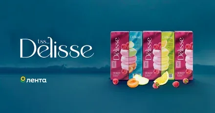
Datacraft. How we built an ecosystem and brand platform for a craft beverage business accelerator
Brandson developed the brand portfolio architecture and created from scratch the parent brand Datacraft for the beer producer Nevskaya Brewery. We audited Nevskaya Brewery's existing projects and developed the brand portfolio architecture. This made it possible to unite disparate projects, giving them a single strategic foundation and updated positioning.
Nevskaya Brewery is a group of companies that brings together a number of craft brewing projects, a number of beer brands and its own bar-restaurant.
We audited Nevskaya Brewery's existing projects and developed the brand portfolio architecture, creating a new umbrella brand, Datacraft: an aggregator of the entire value chain for creating various brands of alcoholic and non-alcoholic beverages, including placing production orders and supporting producers at different stages. In essence, a marketplace for craft beverages.
Want to brew a beer with the aroma of porcini mushrooms or a lemonade with ginger and passion fruit? Datacraft is the place for you!
Over its few years of existence, the company had become a landmark player on the craft scene, but ultimately faced the challenges of growth. Seven business lines existed without a single logic, which created confusion for partners and distributors and hindered scaling.
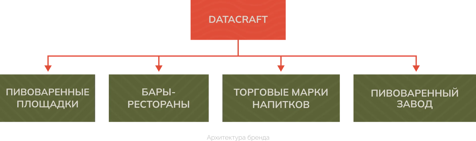
The key decision was to create a separate partner brand, since none of the existing ones could take on the role of a unifying centre. The new architecture needed a strong B2B brand capable of becoming the core of the ecosystem and a business accelerator for the craft beverage market.
This determined the further direction of the work: to build the new architecture, a number of key questions had to be resolved.
Our objectives were:
— To conduct a comprehensive audit of all business lines and identify the links between them.
— To build the brand architecture and define the role of each project in the portfolio.
— To develop a strategy, name and identity that reflect the synergy of the brewing craft and IT expertise.
— To create a system that will be perceived as a serious partner for business while retaining the creative energy of craft culture.
We conducted in-depth research into the market and the company's internal processes, and spoke with distributors, partners and the target audience.
Requirements identified:
— Simplicity and clarity of positioning for external partners.
— Integration with the existing creative environment and projects.
— Universality and flexibility for scaling and adding new brands.
— Emotional expressiveness that makes the brand attractive to creative entrepreneurs.
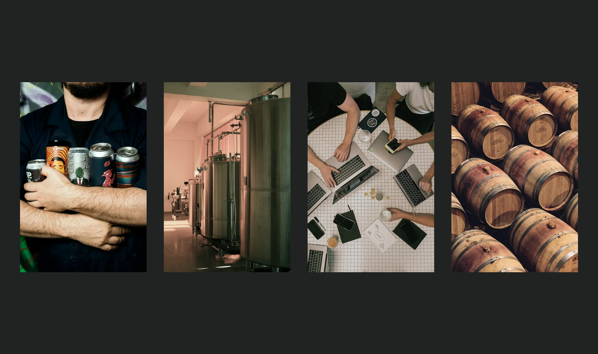
Based on the analysis, we shaped the parent brand Datacraft, defined its role in the overall architecture and developed the positioning of Datacraft as a developer of the beverage industry: a strategic player that shapes the market and grows its participants.
This strategy was embodied in the brand platform:
— Mission: To help businesses focus on what matters most by simplifying their work with IT.
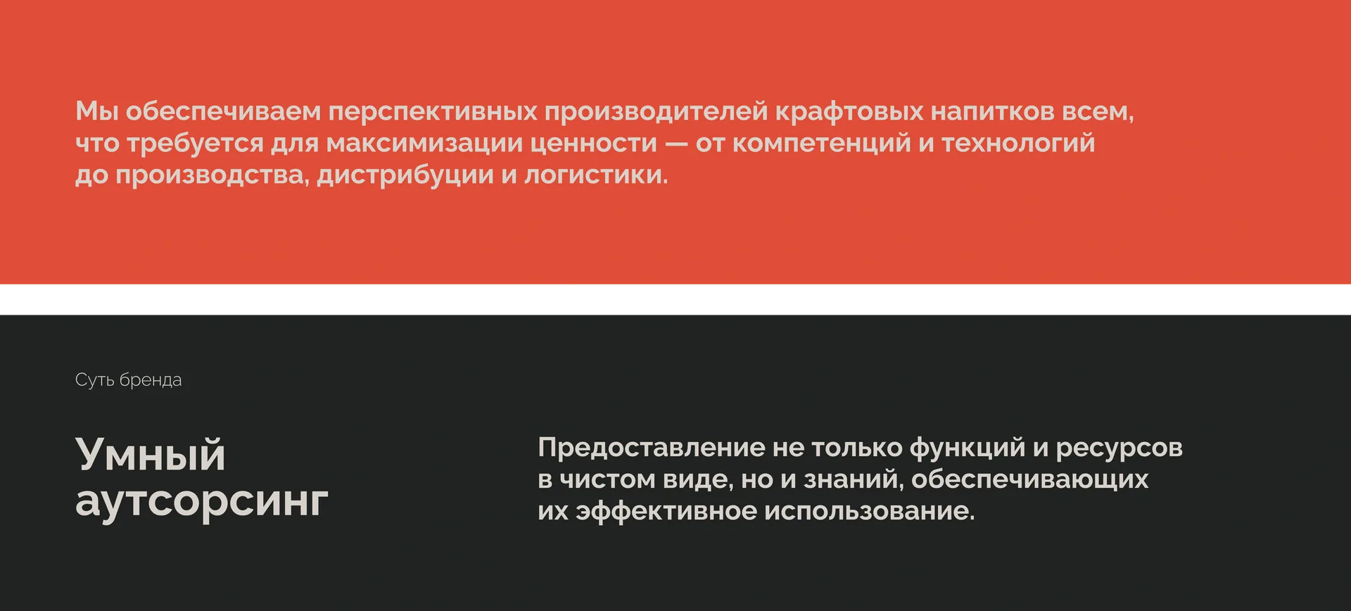
— Brand essence: Smart outsourcing. Providing not only functions and resources in their pure form, but also the knowledge that ensures their effective use.
— Positioning: A business accelerator for the craft low-alcohol beverage market.
"We provide promising craft beverage producers with everything they need to maximise value, from competencies and technology to production, distribution and logistics. With experience in creating successful craft brands, we have broken this process down into clear modules and are ready to offer them to our partners."
The core approach was to combine minimalism, functionality and industrial aesthetics. The brand had to become the structuring foundation for the ecosystem without suppressing the creativity of the projects within it.
"We created not just a new brand, but a working ecosystem. Datacraft is an architecture that allows all of Nevskaya Brewery's projects to grow at the same time, each in its own direction."
— Irina Chtetsova, Brand Director, Brandson (TSN)

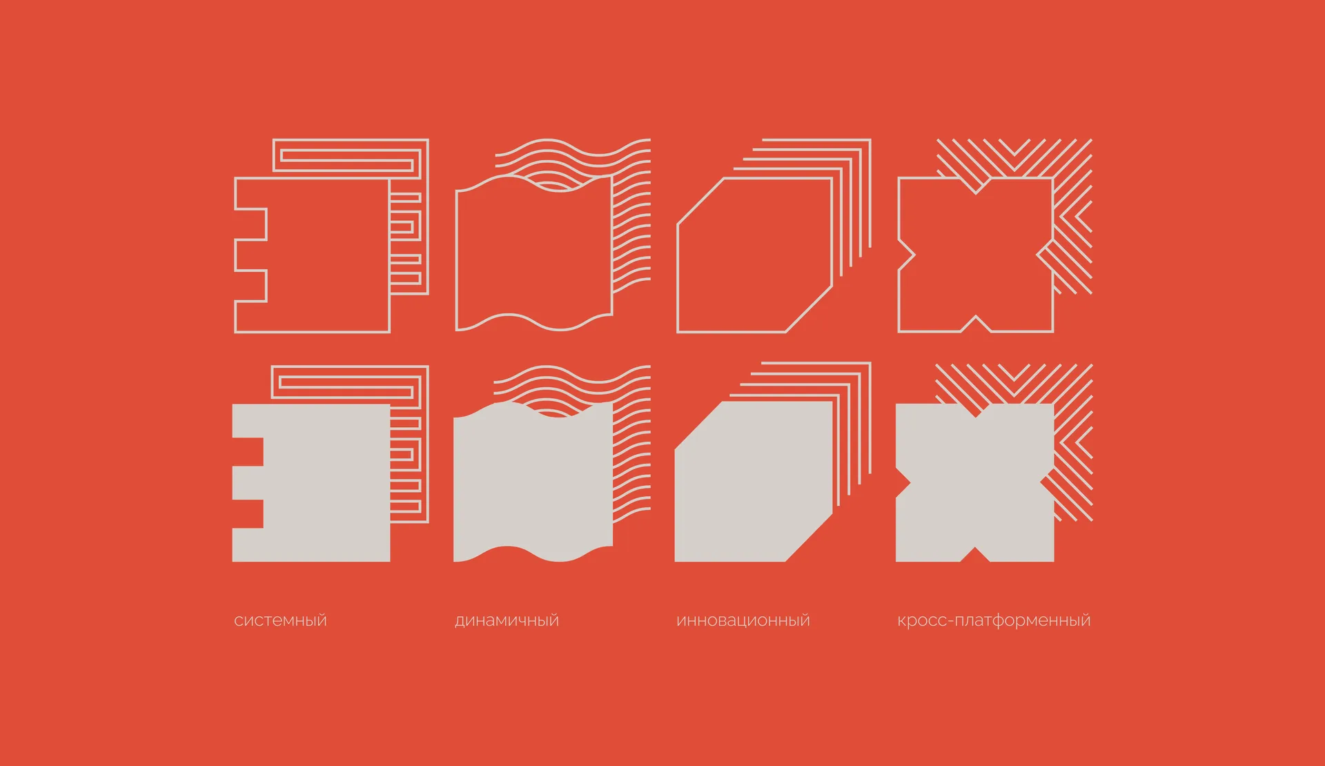
We built the brand on a combination of technological rigour and industrial references.
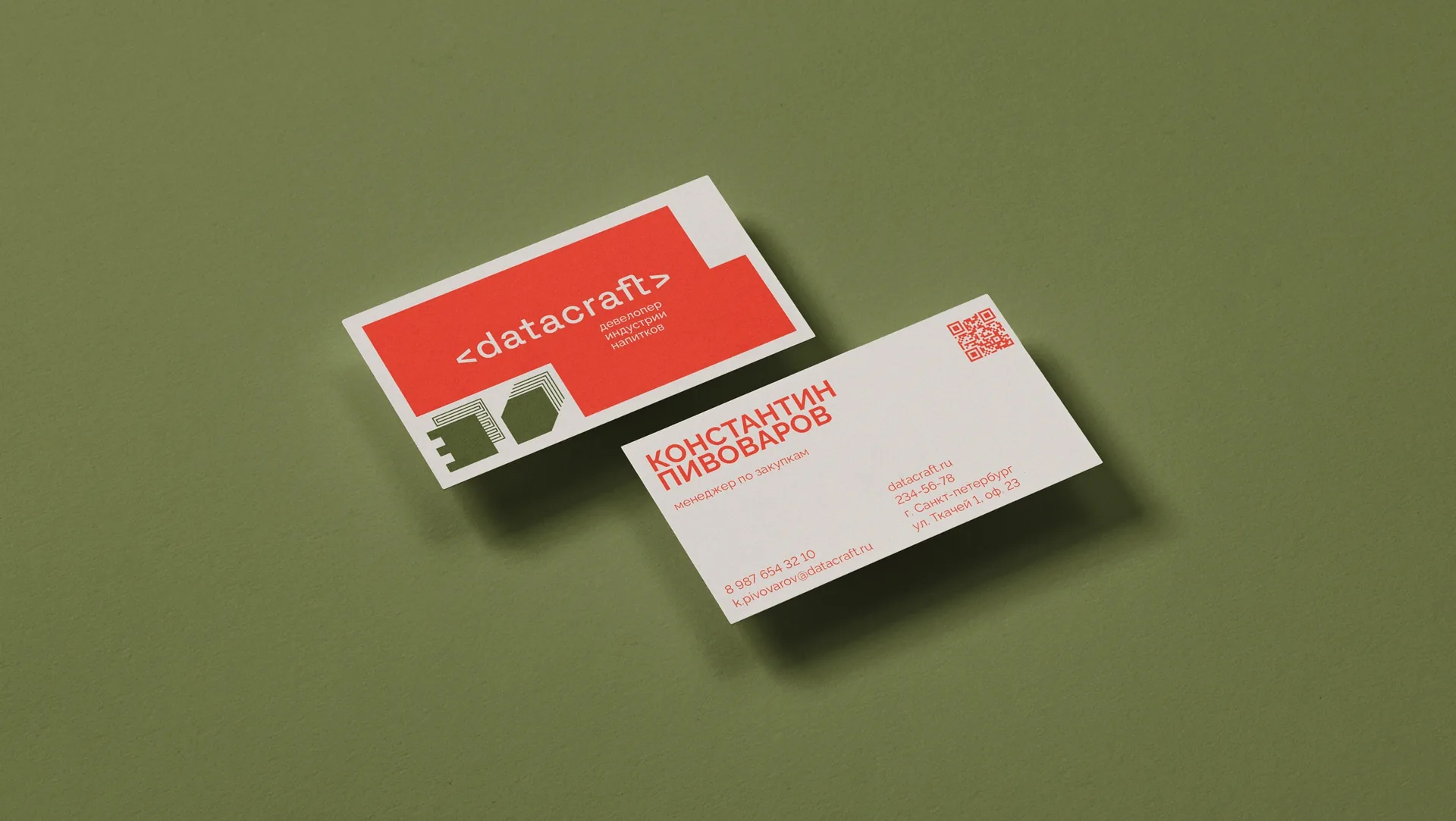
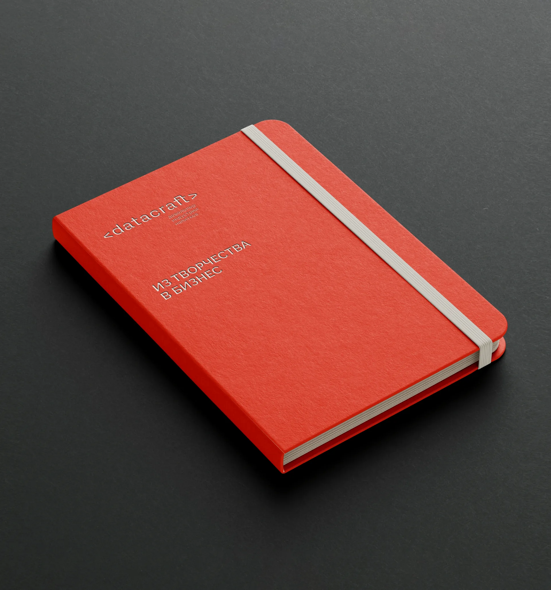
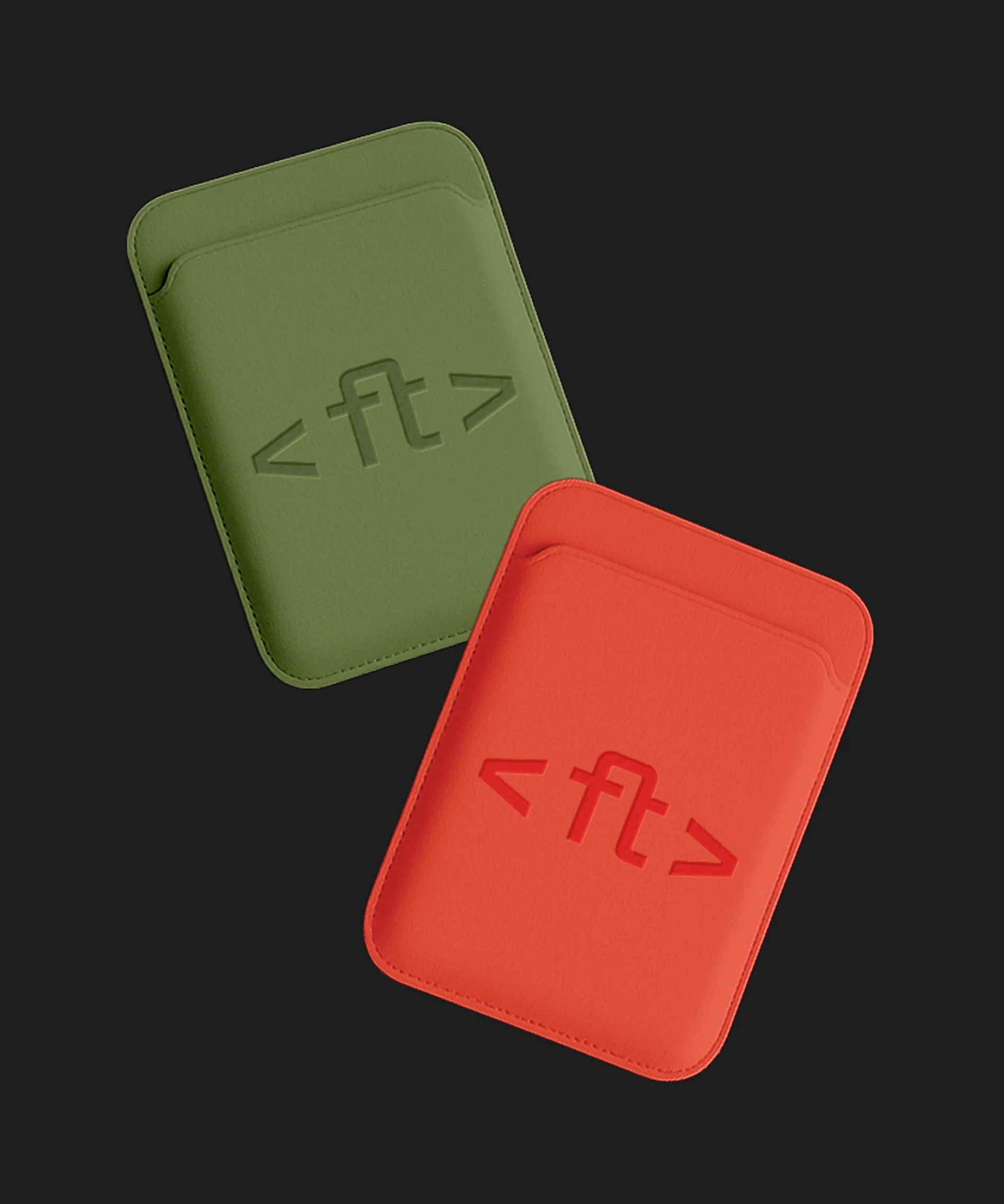
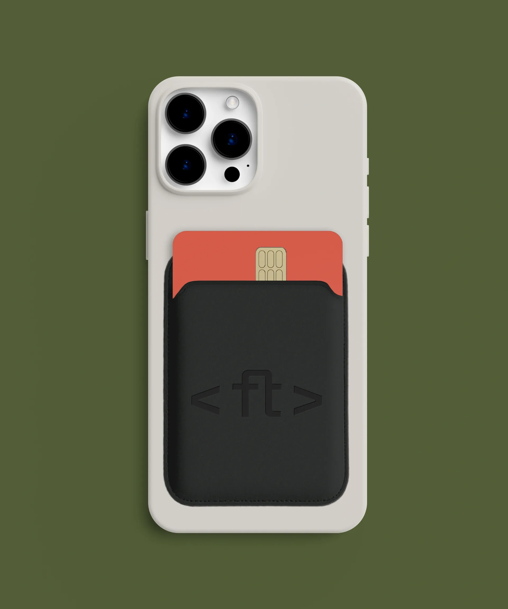
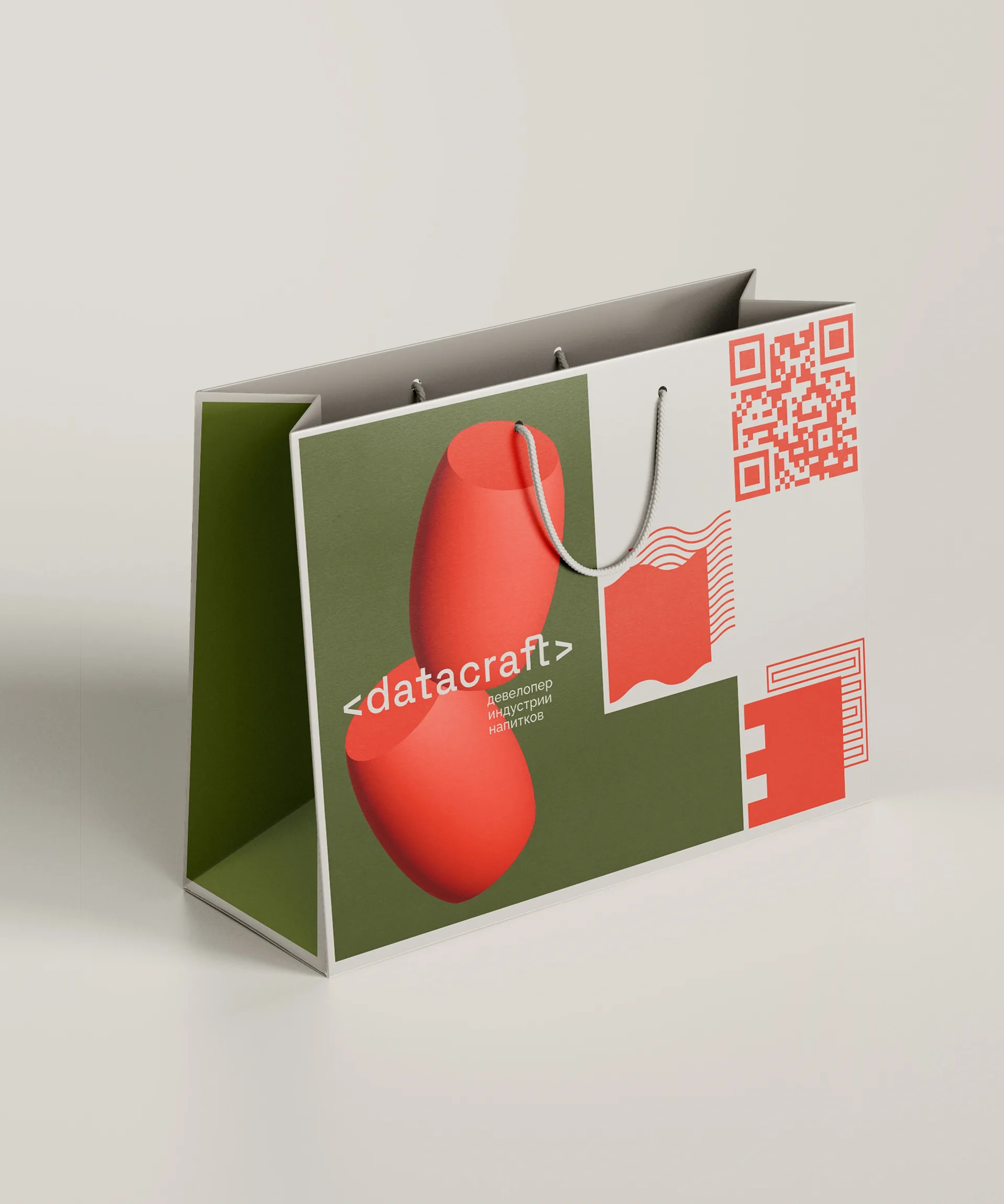
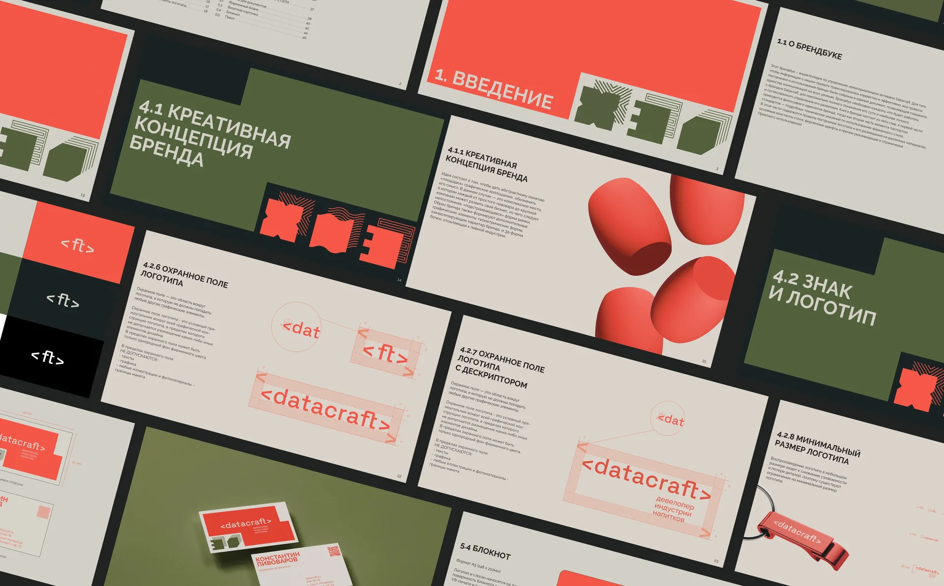
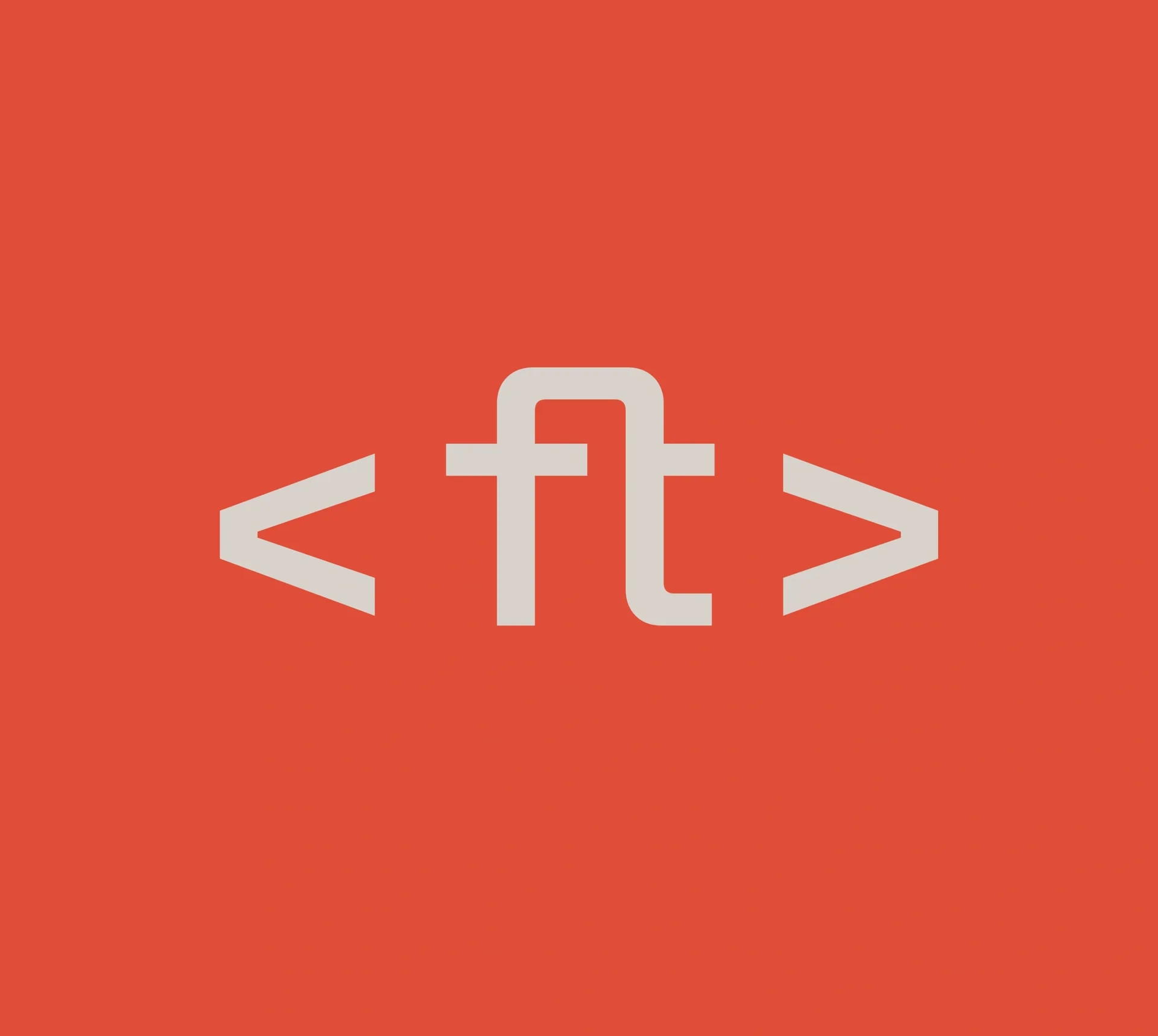
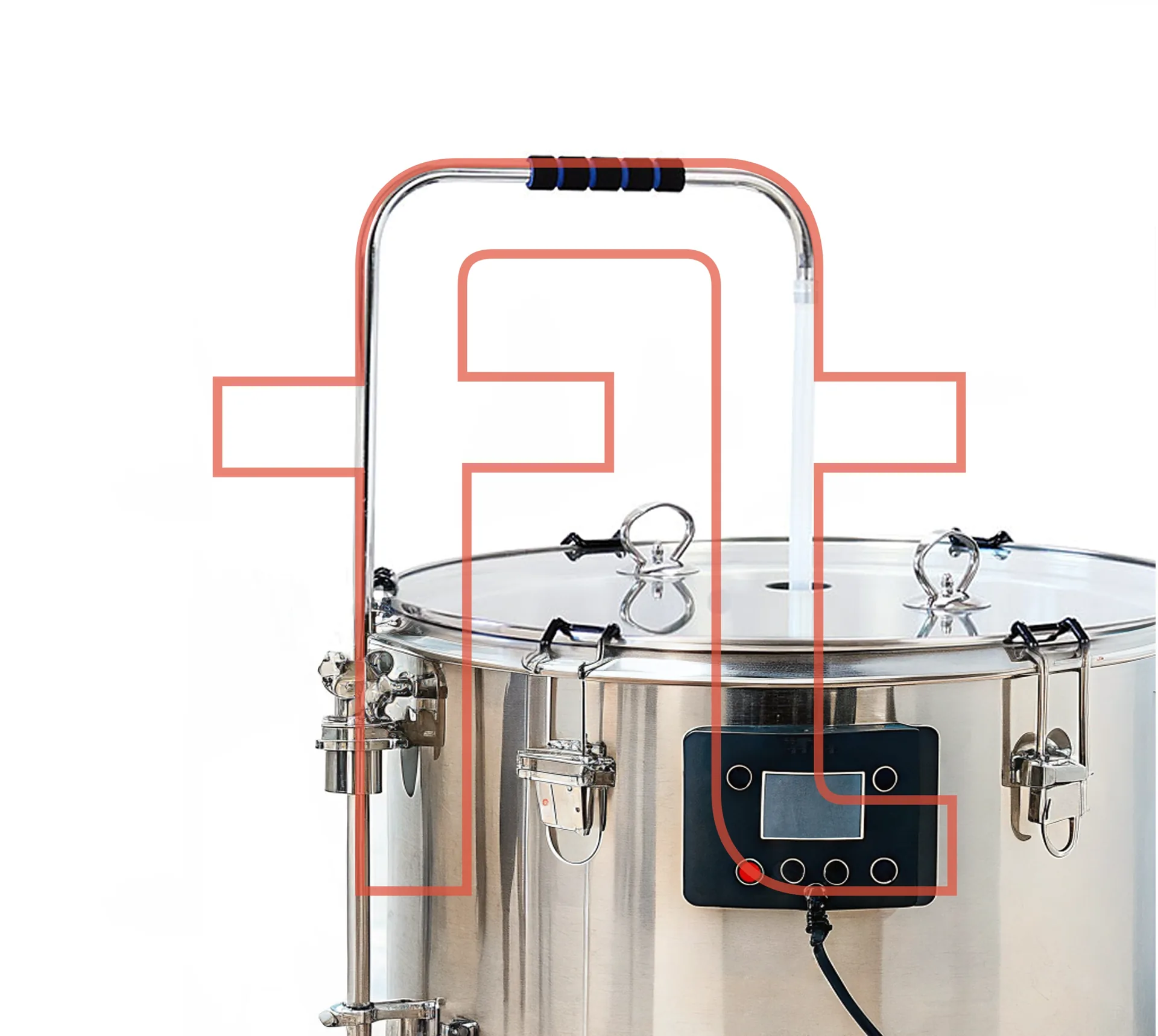
The logo is set in Space Grotesk, a typeface with a technical character and a nod to the monospaced fonts typical of the IT industry. The letters f and t are joined into a ligature symbolising support and partnership, and their shape also recalls the vessel used in brewing beer.
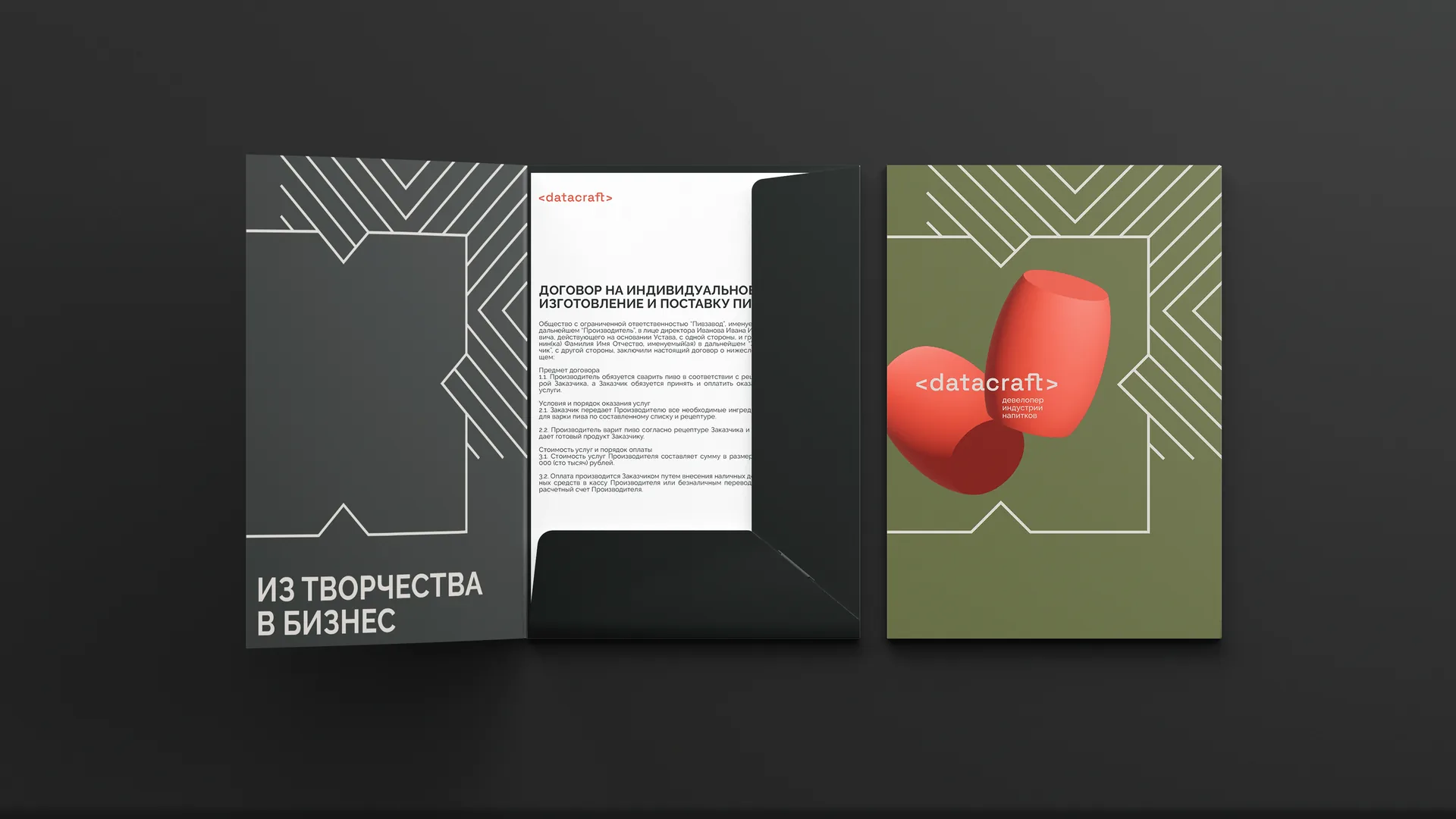
The main graphic element is an adaptive frame. Its "adjusting" shape visualises a flexible platform that scales to the needs of any client. Additional elements, including the 3D shape of a barrel, maintain the connection with the industry while giving the system a digital, technological spirit. The pattern elements symbolise the brand's character and are used to convey its values without having to rely on text or photography.
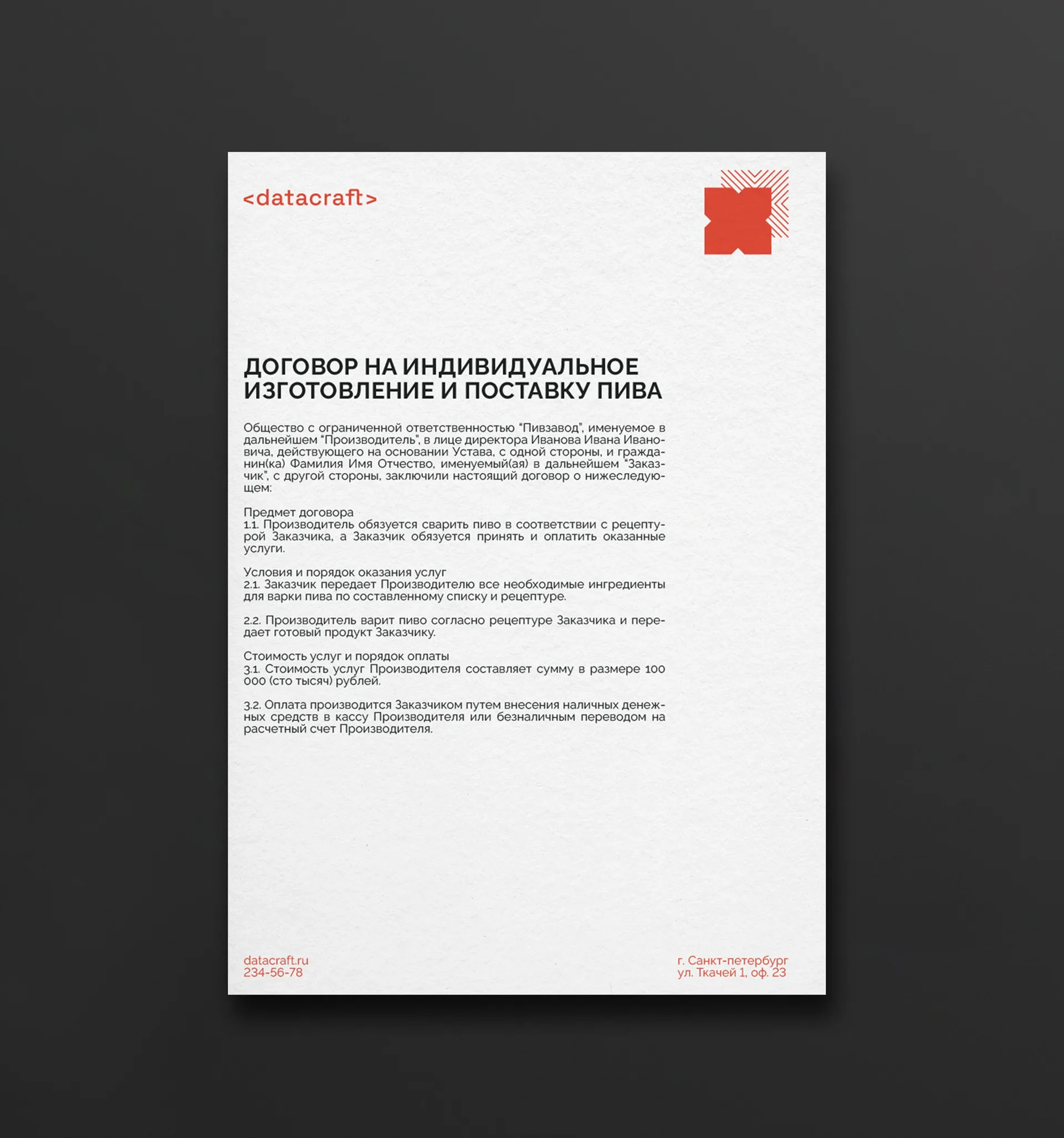
The colour and typographic solution is kept in a restrained yet contrasting palette to emphasise the technological nature and seriousness of the platform. At the same time, the plasticity of the forms and the variety of graphic elements create visual interest and hold the attention of the creative audience.
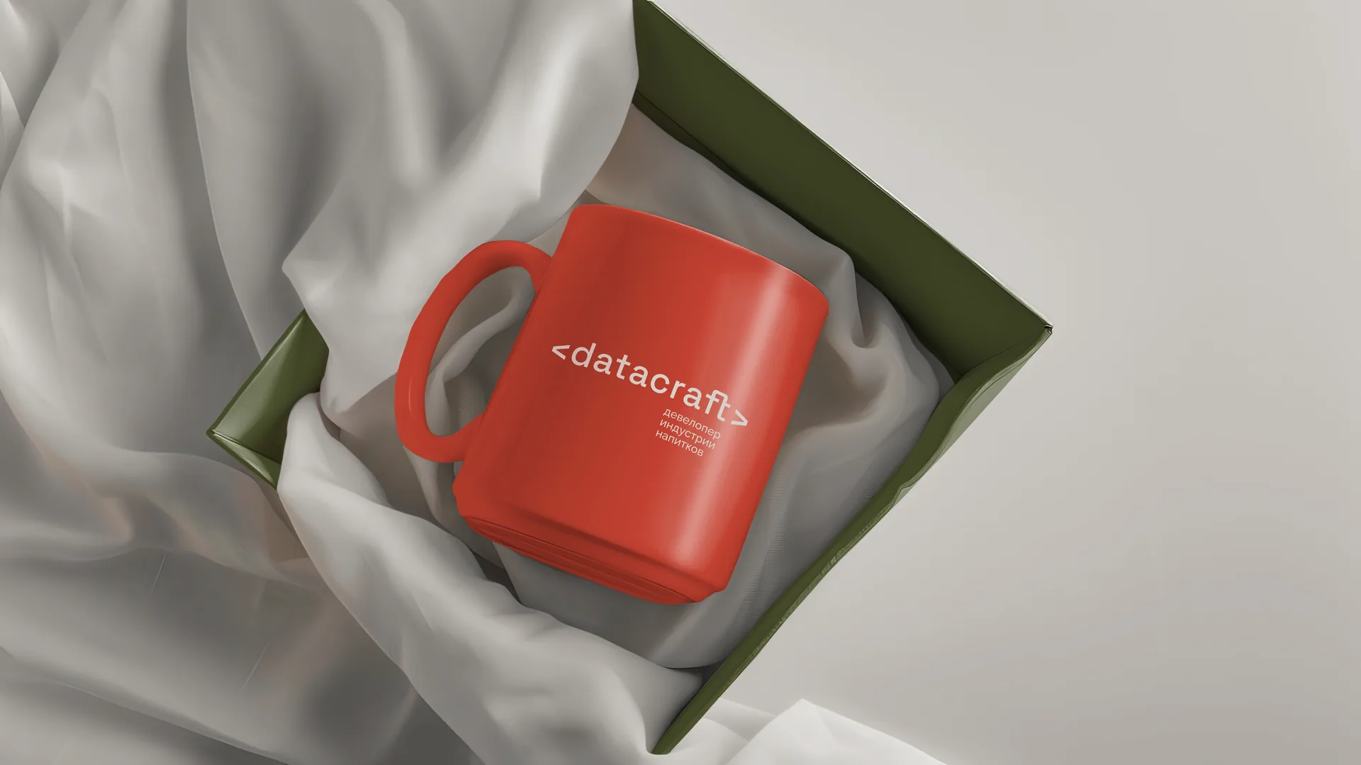
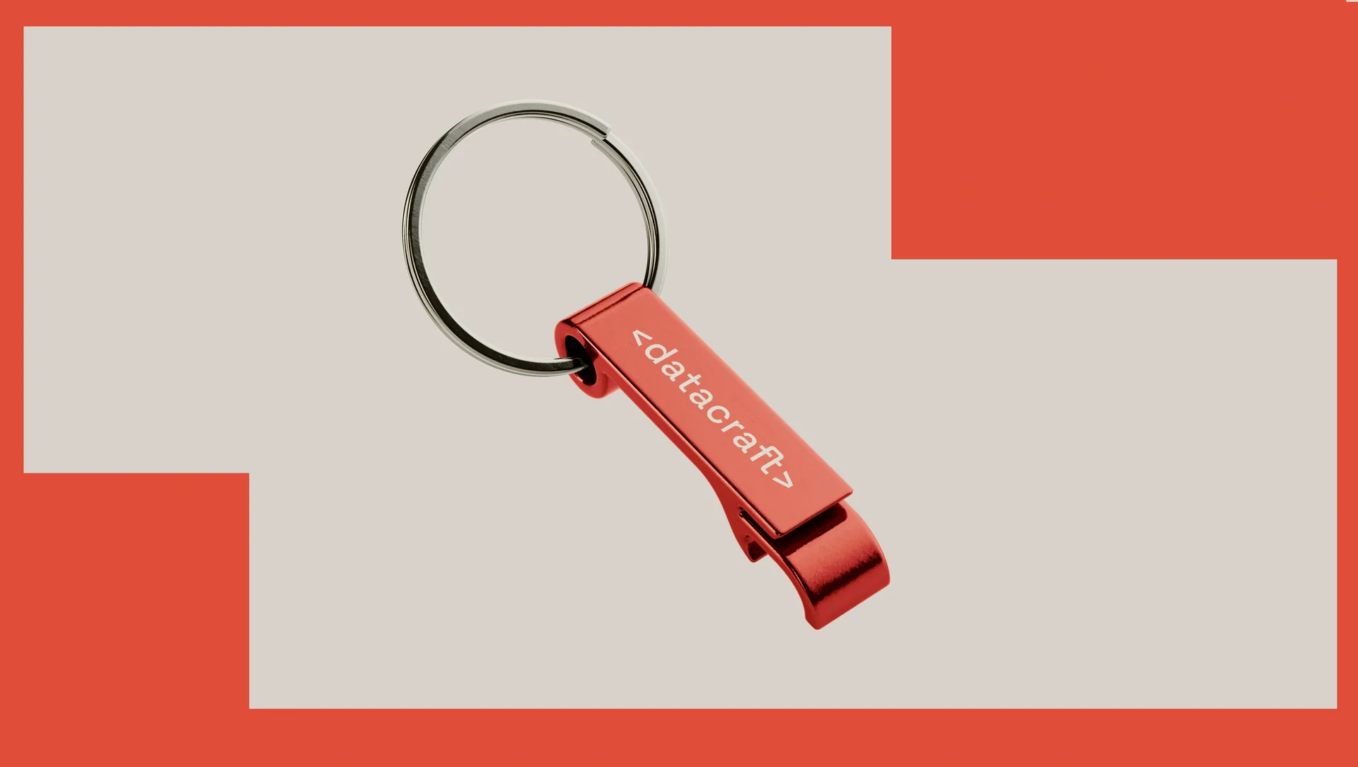
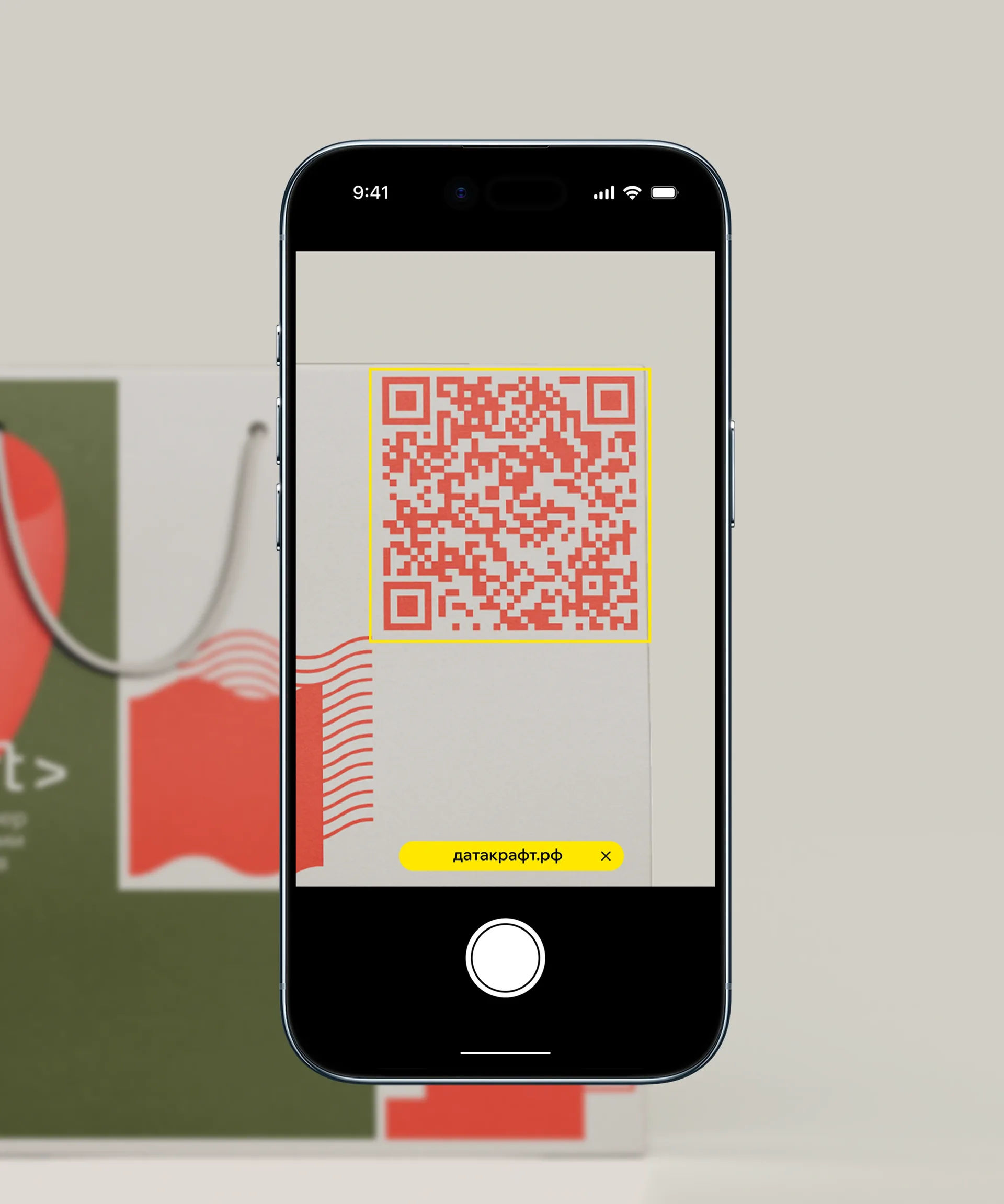
The system was adapted to all key touchpoints, from the website and presentations to merchandise, with a particular emphasis on digital integration. This created a solid foundation on which we continued to work, developing the individual brands in the portfolio in a unified manner.
The platform became an assembly point for expertise, technology and creativity, offering partners a new standard of collaboration: from a creative idea to a stable business.