Rebranding of the German IT integrator Deutsche Telekom

In the IT services market, the trend towards globalisation is more pronounced than in other industries: "code" specialists increasingly work in international teams, creating truly innovative solutions for business. That is why the Deutsche Telekom division, already established in the Russian market, decided to consolidate its international status for further, closer work with colleagues abroad.
Read the case to find out how we supported the rebranding of Deutsche Telekom and ensured the implementation of the updated corporate identity elements!

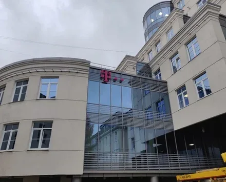
Deutsche Telekom IT Solutions (formerly T-Systems) provides information and telecommunications services in the B2B segment. DT IT Solutions is a strategic division of Germany's Deutsche Telekom and has been successfully doing business in Russia since 1995.
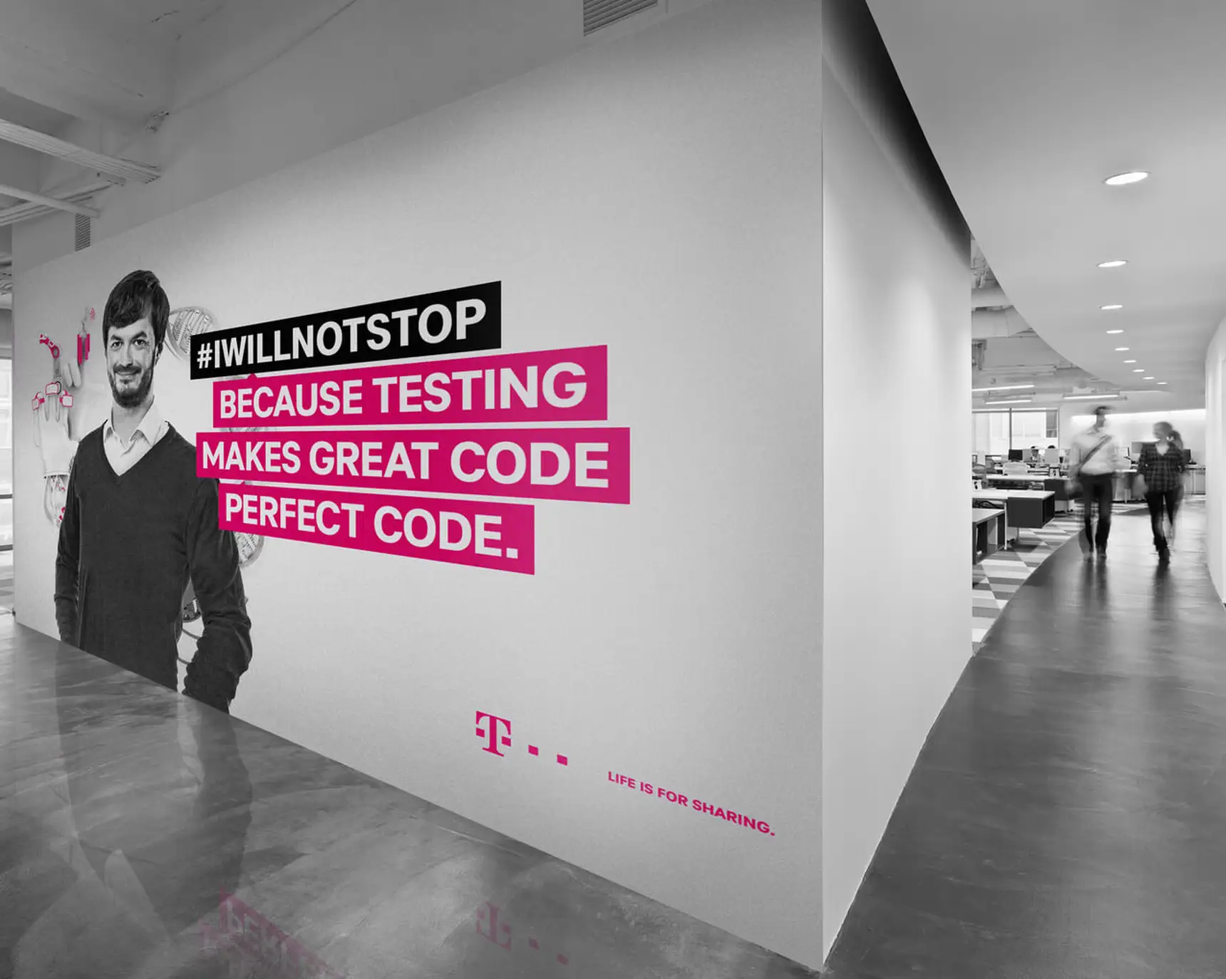
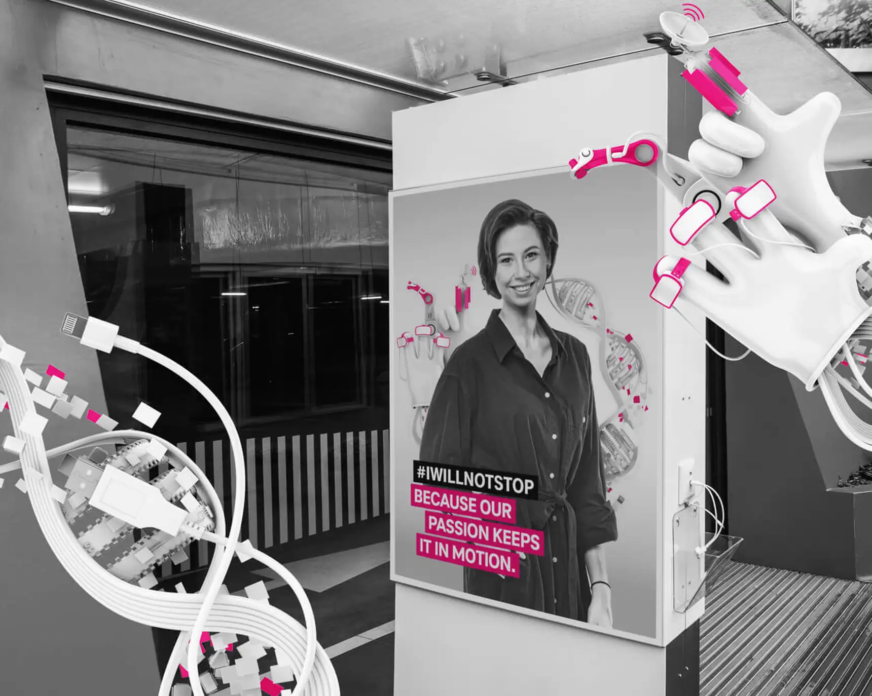
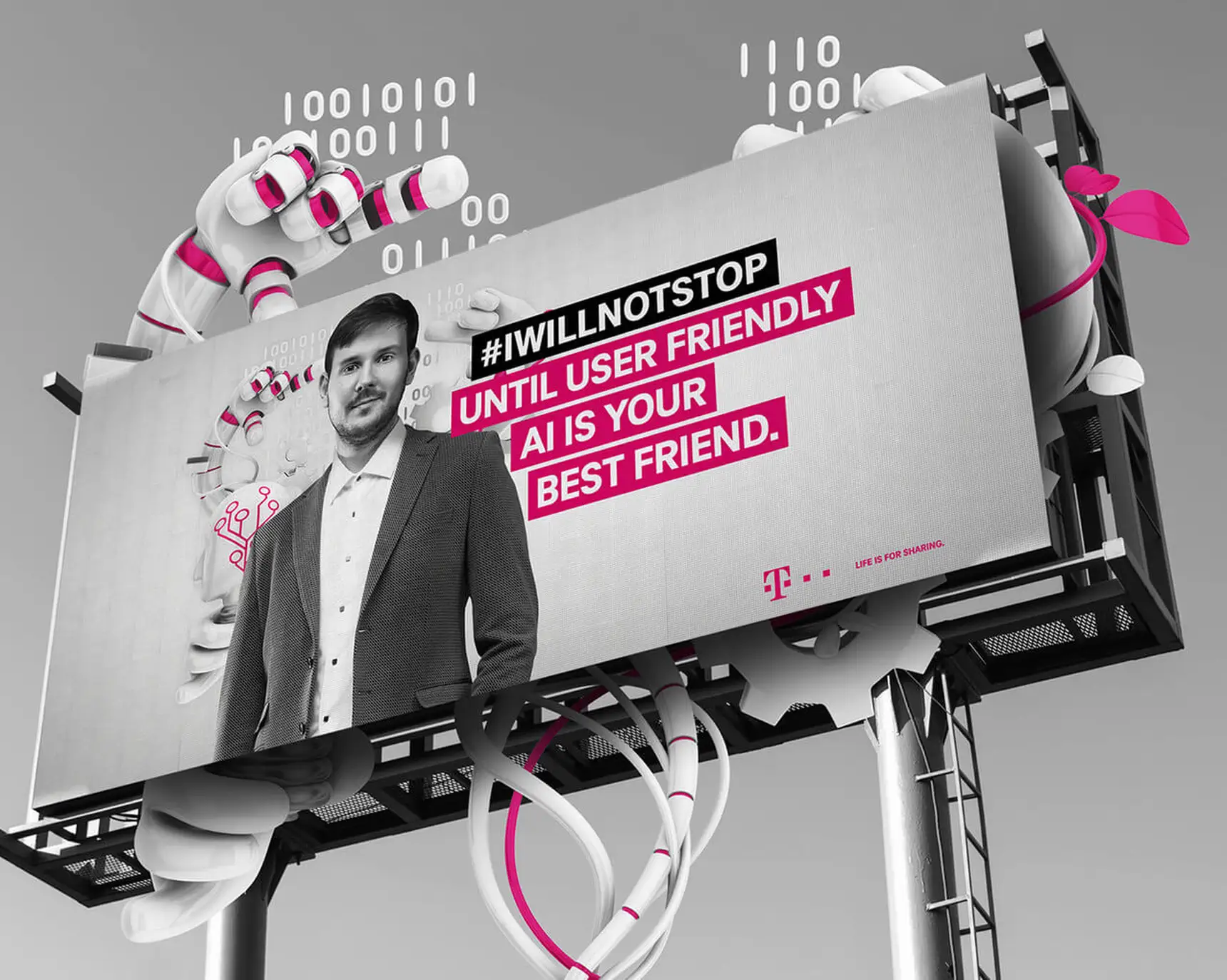
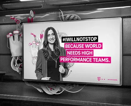
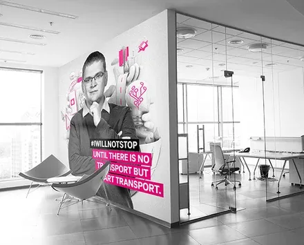

The Brandson team analysed the brand's competitive environment and identified the main emphases in the communications of IT companies in order to build the most effective interaction with current and potential employees. Based on analytics and in-depth interviews with the brand's ideologists, the agency's specialists identified the reasons for the current dissatisfaction with communications and the prospects for development, and on the basis of the results obtained, the vector for further development was determined.
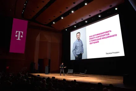
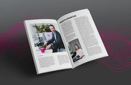
The rebranding brought openness into the company's communications, which set it apart in the traditionally reserved IT industry and strengthened the creative competencies needed to create unique and innovative products.
Deutsche Telekom's Western management style brought functional changes to the company's management style and helped optimise current processes at all levels and bring them up to benchmark standards of external and internal interaction.
One of the main goals of the rebranding was to create the image of an independent player rather than merely a service contractor, since this insight could be traced in the information field of the Russian IT market.
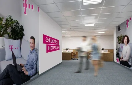
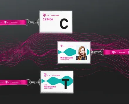
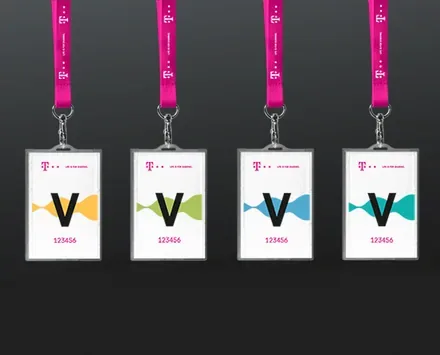
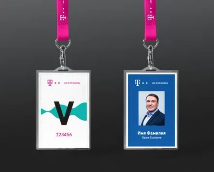
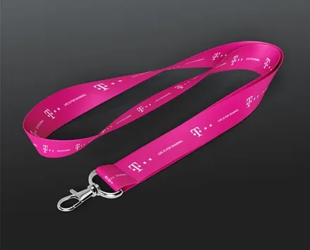
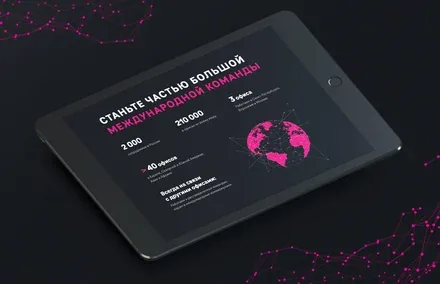
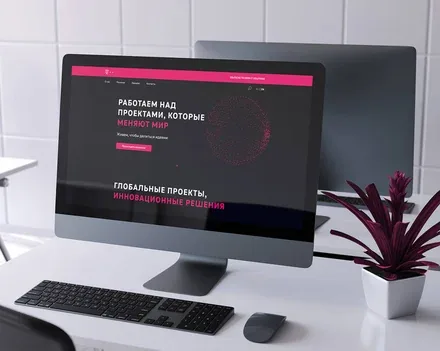
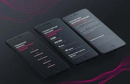
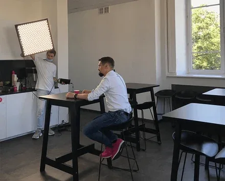
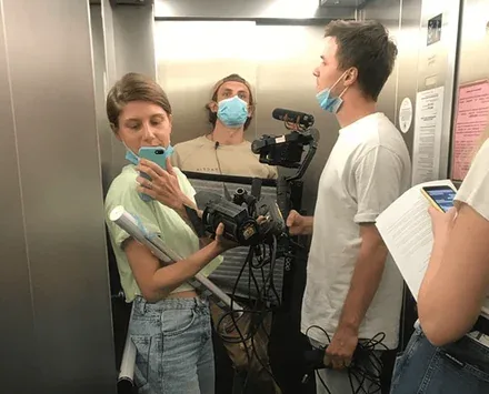
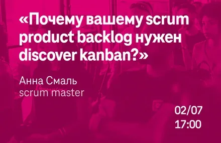
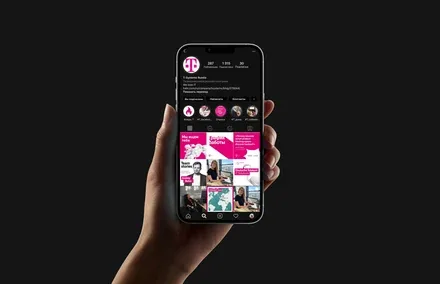
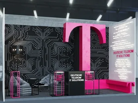
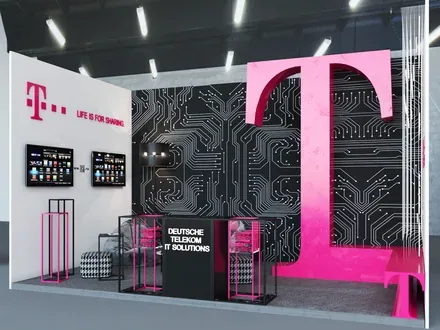
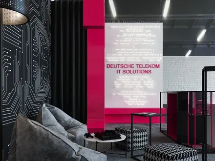
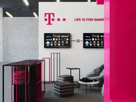
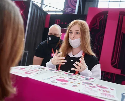
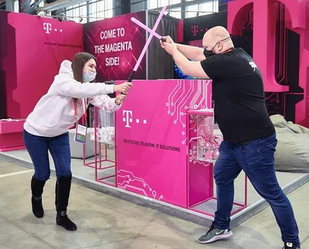
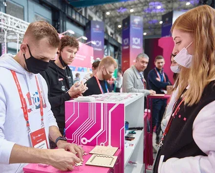
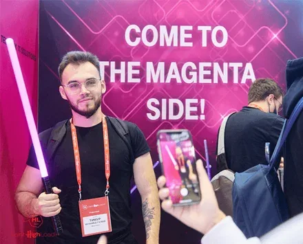
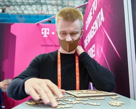
We supported the rebranding and ensured the implementation of the updated corporate identity elements on the division's social media, in the interior and exterior of its office, and also updated the website, bringing it in line with the company's refreshed positioning.
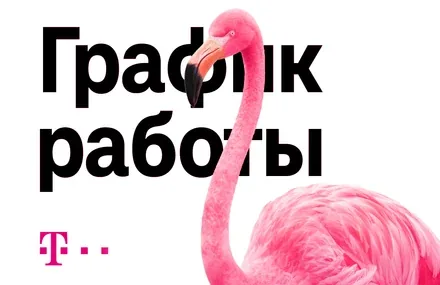
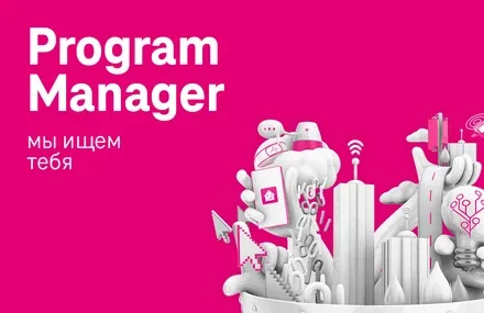
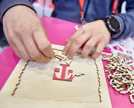
DT IT Solutions retained the corporate identity elements it shares with the parent brand – the letter "T" in the logo and the corporate colour "magenta" – as well as its characteristic ease of communication, which is rooted in a European worldview. The simplification of visual communications follows the contemporary trend towards minimalist patterns, whose laconic strokes and forms reflect the solidity of the company's activities and the serious expertise it provides.