Nexa Intelligence: International Branding at the Intersection of Tradition and Innovation

Nexa Intelligence is a UAE-based company providing back-office services to oil traders around the world. Our task was to develop the image of a modern, highly expert, innovative company in the traditional energy market. We created an international brand that speaks of experience and reliability in the language of dynamism and progress. Read more in our case study.
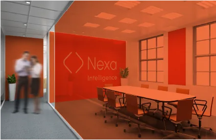
Nexa Intelligence approached us for help in developing its positioning, logo and corporate identity.
The company provides a wide range of services – from strategy and business development to IT integration and administrative support. It was important to create a high-tech brand that would resonate with the conservative audience of the energy industry.
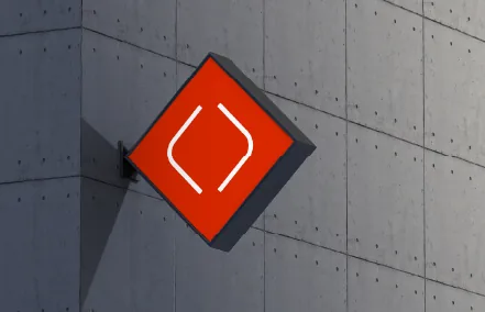
Brandson (TSN) strategists conducted a market and competitor audit to identify points of parity and differentiation. The analysis showed that competitors often resort to direct associations with fuel in their identities. However, the qualities of a team that are especially important for the industry’s rather “closed” audience – experience, a systematic approach, safety of approach and reliability – were rarely communicated by them. It was these that we decided to emphasise for emotional differentiation in the positioning.
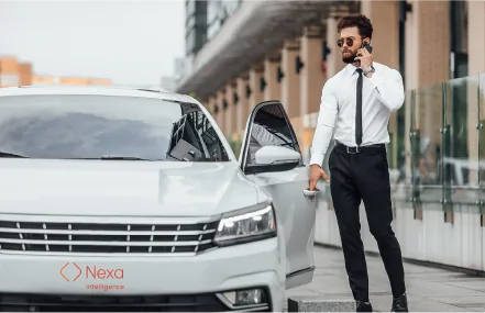
The Nexa Intelligence brand had to do more than simply announce itself as a new market player – it had to demonstrate, through its visual identity, mastery in managing a business that is so complex and so important for the economy. We placed our bet on the dynamism and innovation characteristic of the IT sector, without forgetting experience, expertise and a systematic approach.
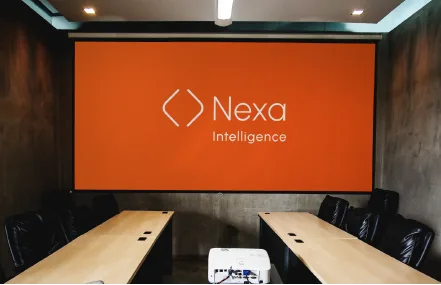
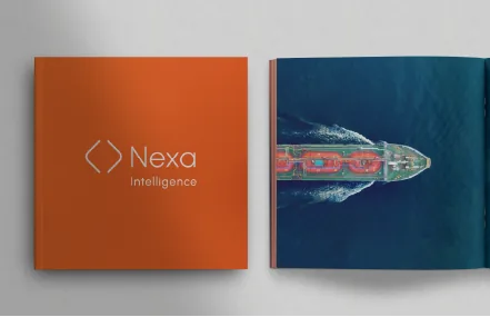
Brandson (TSN) designers made fiery orange the brand’s primary colour. Here it not only reflects the connection with the energy sector but also conveys a striving for progress and the use of cutting-edge solutions. The graphic element in the logo symbolises a reliable and secure back office where information is protected. The lines inside the logo face each other but remain open, speaking of Nexa Intelligence’s flexibility, care for the client and individual approach. The laconic, modern typefaces Urbanist and Roboto emphasise technological sophistication and progressiveness.
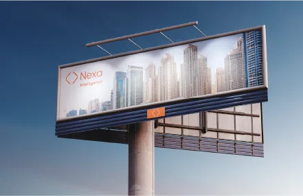
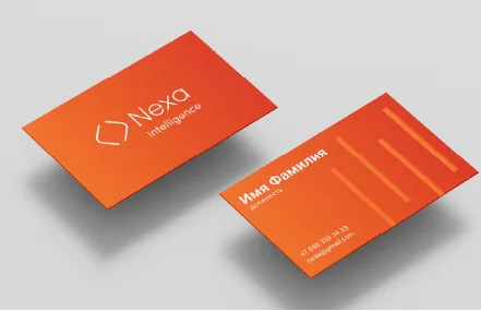
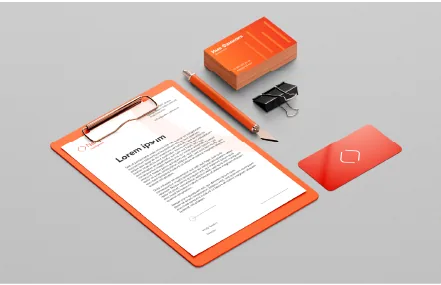
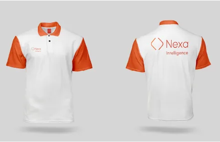
We created a flexible visual identification system and compiled a guidebook. In it we set out the rules for using the graphic elements, selected harmonious colour combinations and adapted the logo to various touchpoints. Two versions of the logo block were also developed – with the “Intelligence” descriptor and without it – to ensure brand recognition in any format.