Petroglobal: a course for the Middle East. A new brand in global oil trading
We are actively expanding our portfolio with international cases; in this case study we tell how we delivered one of them.
Petroglobal is a company headquartered in Dubai (UAE), an international brand capable of operating effectively in today's conditions. Systematic and technological, yet flexible and innovative for such a conservative market.
Petroglobal approached Brandson (TSN) to create an international brand with a focus on the East, as well as the countries of Africa and Latin America. We needed to define the direction of positioning and develop the brand's visual image, creating effective differentiation from competitors. Our branding was also required to increase the company's market value.
The audit structure included several key blocks: analysis of competitors, of the market's stylistic trends, and benchmarking. In the course of the research we also held a strategy session to identify the stylistic directions visually closest to the team, and organised a joint brainstorming session. As a result, we identified the key values, target audiences and the brand's core mission: contributing to the stabilisation of the Russian economy under sanctions.
The Brandson (TSN) strategists recommended that the design team build on the identified values: flexibility, systematic thinking and reliability. It was also important to convey the expert character, the extensive international experience of the staff and the company's well-developed business contacts.
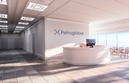
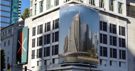
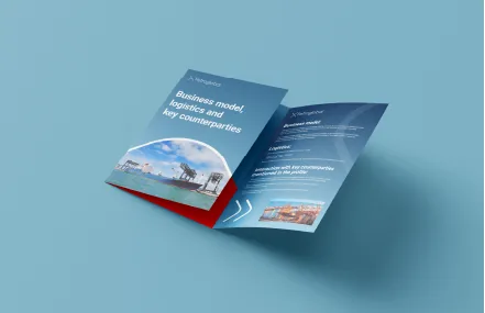
The idea of openness and business connections was taken as the basis of the visual concept. The corporate identity had to clearly convey the essence of the brand embedded in its name. Petroglobal is a company with extensive experience in oil trading, capable of effectively establishing contacts between buyers and sellers all over the world.

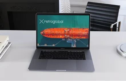
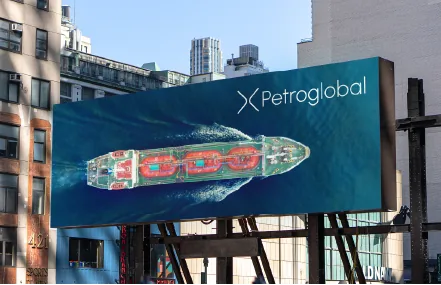
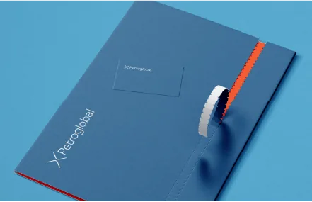
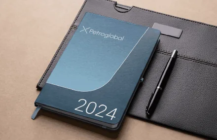
A unique symbol resembling a crossroads appeared in the logo: an image of strong connections. The open symbol speaks of the prospects and the large scale of Petroglobal's operations. The company has a unique character in the conservative petroleum products market: it is technological and innovative. That is why we considered it important to convey an associative link with the IT segment in the design. At the strategy session stage, colour codes were developed to help the company visually differentiate itself from competitors.