A step towards technology with Dipaul
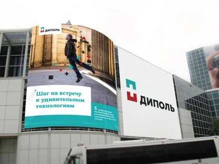
Dipaul is rightly regarded as one of the leaders in the market for electronics and electronic components. Its key areas of activity are the supply of process equipment and materials for electronics assembly, as well as measuring and testing instruments. Experience, its own production facilities and a professional team allow the St. Petersburg company to compete successfully with Moscow-based and regional players.
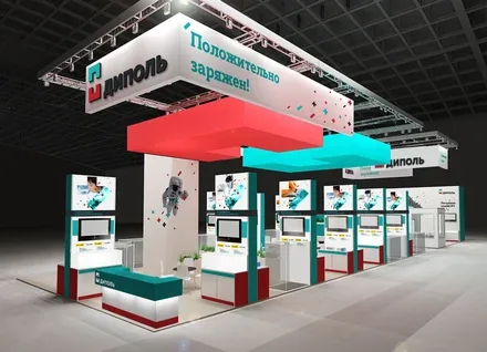
The company's strategic goal for the coming years is to become the leading industry integrator and the number one knowledge provider. Dipaul sees its mission as training and educating specialists who will help the Russian electronics industry remain competitive and develop effectively.
To bring all of this to life, a strong and recognisable brand is needed. Although the company has an established reputation, many also point to the obvious obsolescence of its image, which had not changed since it entered the market and is now completely outdated. The graphics of the logo and the rigid, blocky Soviet-style descriptor did not match the company's innovative activities. The task was to carry out a comprehensive rebranding that would help create a new image of the company in line with its long-term brand strategy.
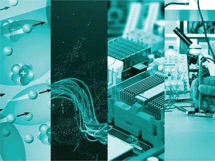
In the course of the brand audit, we found that Dipaul effectively trains its clients in the latest technologies and is ready to offer a tailored solution and take on an unconventional task. The character of the Dipaul brand is comprehensively described by six key characteristics: European, powerful, evolutionary, trustworthy, dynamic and comprehensive. These attributes form a distinct image of a leading company that applies a "Western", client-oriented approach in its work and successfully overcomes any difficulties that arise.
The research revealed that the lack of a unified corporate identity and the archaic nature of the graphic constants were just the tip of the iceberg. Perception of the brand was hampered by a "gap between the external image and the internal substance". In other words, the company's system of verbal and visual identification did not fully convey information about its values and advantages.
The brand audit also showed that the company was known mainly as an importer of equipment. Partners and customers were unaware that Dipaul could provide turnkey solutions and deliver the best training services in the country, for which there is stable demand.
Magnetism (in particular, the magnetic dipole) is one of the manifestations of levitation in nature. That is why the corporate identity is built around people, ideas and various real-world objects levitating in space, which take on new meaning through the introduction of innovation. The meaning of this device is as follows: Dipaul does not merely supply new solutions, it also creates technologies that help fill the space around us, making our lives easier, brighter and richer.
A clear understanding of the brand philosophy became the basis for updating all verbal and visual communications, with the exception of the name, which already enjoyed good recognition. Although the brand's key values are precision, rigour and restraint, we found a visual language capable of embodying these qualities while remaining rich and emotional.
The new brandline is positively charged and carries a very specific meaning, since the key factors determining the choice of a partner in the electronics industry include not only the expert knowledge of the company's specialists, but also their attitude towards clients.
The new logo is formed from two magnets that create the counterform of a plus sign between them. Red, "knowledge", and blue, "technology", together create a new quality: a positive charge (made explicit in the brandline), the key emotional characteristic of contact with the brand. The mark fully reveals the company's positioning: strict geometry (to design), the combination of two elements (mutual support and comprehensiveness) and a readiness to multiply knowledge (the open field between them)
.
The updated corporate identity embodies the idea of dynamics: a continuous flow of magnets floating in space emphasises that Dipaul, thanks to its high level of professionalism and knowledge, can easily solve any task. At the same time, interaction with the brand will bring positive emotions.