The infinite inspiration of Dmitrovskoye Nebo for LSR
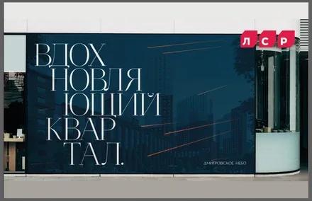
Infinite inspiration embodied in the stars. Brand development for a business-class residential complex by LSR, the country’s leading construction holding.
The conceptual foundation – the multifaceted “The sky is the limit” – combines freedom of thought, action and human potential.
“LSR Group” traces its history back to 1993 and in just under 30 years has become one of the country’s leading construction holdings, long and firmly established among the TOP-3 largest real estate developers in Russia by construction volume. As part of the development of its Moscow business, the company has launched its sixth project in the region – the business-class neighbourhood “Dmitrovskoye Nebo” in Zapadnoye Degunino. At present the complex consists of two 32-storey towers; the project will be scaled up in the future, with a planned development area of 30 hectares.
To promote a large-scale project effectively in the Moscow market, a brand had to be developed that would attract attention and differentiate the product from competitors in the location. The agency team audited the project and the market, conducted a competitive analysis, and developed a brand platform as well as a verbal and visual brand identification system.
Turbulence in the real estate market dictates new rules of the game: more and more developers are transforming their projects to cut costs, and fewer and fewer buyers are deciding to purchase an apartment.
In April, for example, the number of registered shared-construction agreements (DDU) in Moscow fell by 35%. However, despite the sharp drop in demand across the city as a whole, demand for apartments in the north of Moscow grew by 10%. The promising Zapadnoye Degunino district is becoming a genuine centre of attraction both for active young people and for the family audience. Its unique location between two metro stations, surrounded by parks and bodies of water, makes it possible to build a variety of life scenarios.
At the same time, the competitive landscape is homogeneous: projects in the same location exploit just two approaches to promotion – the functional and the integrated. And while the functional approach is clear and relevant for many developers, positioning residential projects as self-contained multifunctional spaces is beginning to outlive itself in the Moscow real estate market.
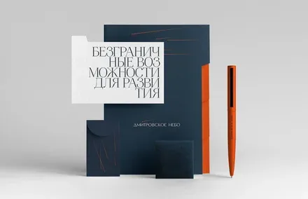
The project’s key strategic milestone was rethinking the role of integrated developments in the lives of Muscovites. The name of the neighbourhood, inspired by its sky-reflecting architecture, became an additional factor influencing the positioning: “Dmitrovskoye Nebo” (Dmitrovskoye Sky) is a project that literally reflects your possibilities. “The only limit to your possibilities is the sky” – that is the artistic rendering of the expression, which combines freedom of thought, action and human potential.
The conceptual foundation of the project is the multifaceted set expression “The sky is the limit”. The kite became the brand’s metaphor. Why the kite? Firstly, it is a symbol from childhood – discovering the world, freedom of thought and growth, and testing the limits of how high a kite can fly. It is also time spent with family – confidence and peace of mind. Secondly, a kite is unity in dichotomy: “control” on the part of the person flying it, as a reference to the feeling of home, and the freedom of flight, as an association with constant growth.
Thus, having emerged on an industrial site and intended to ennoble it, the residential complex becomes a new stage in the development of the district.
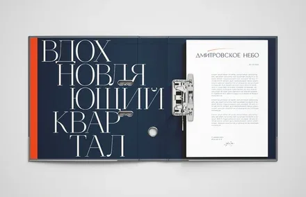
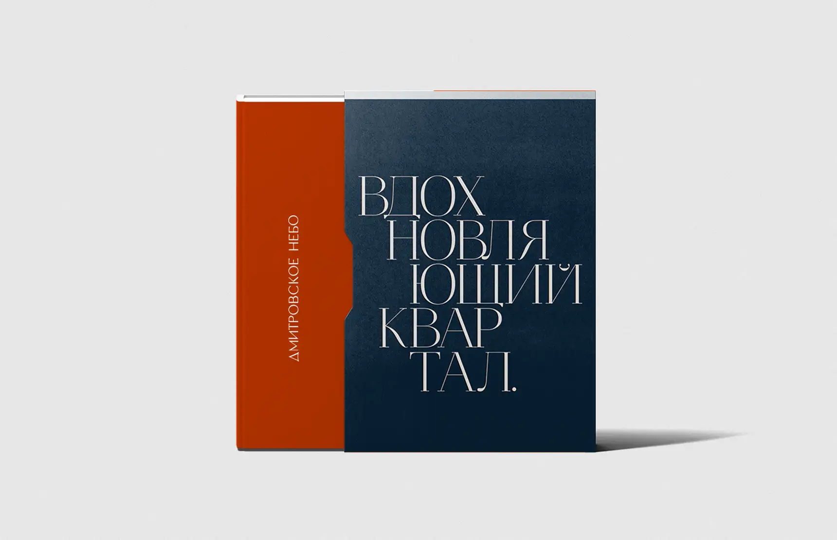
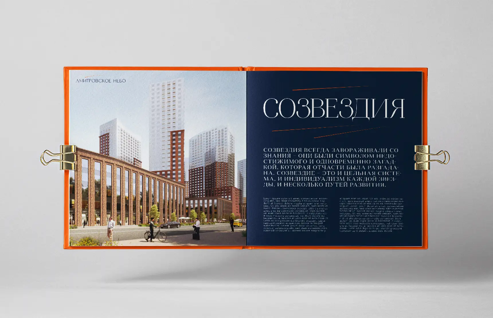
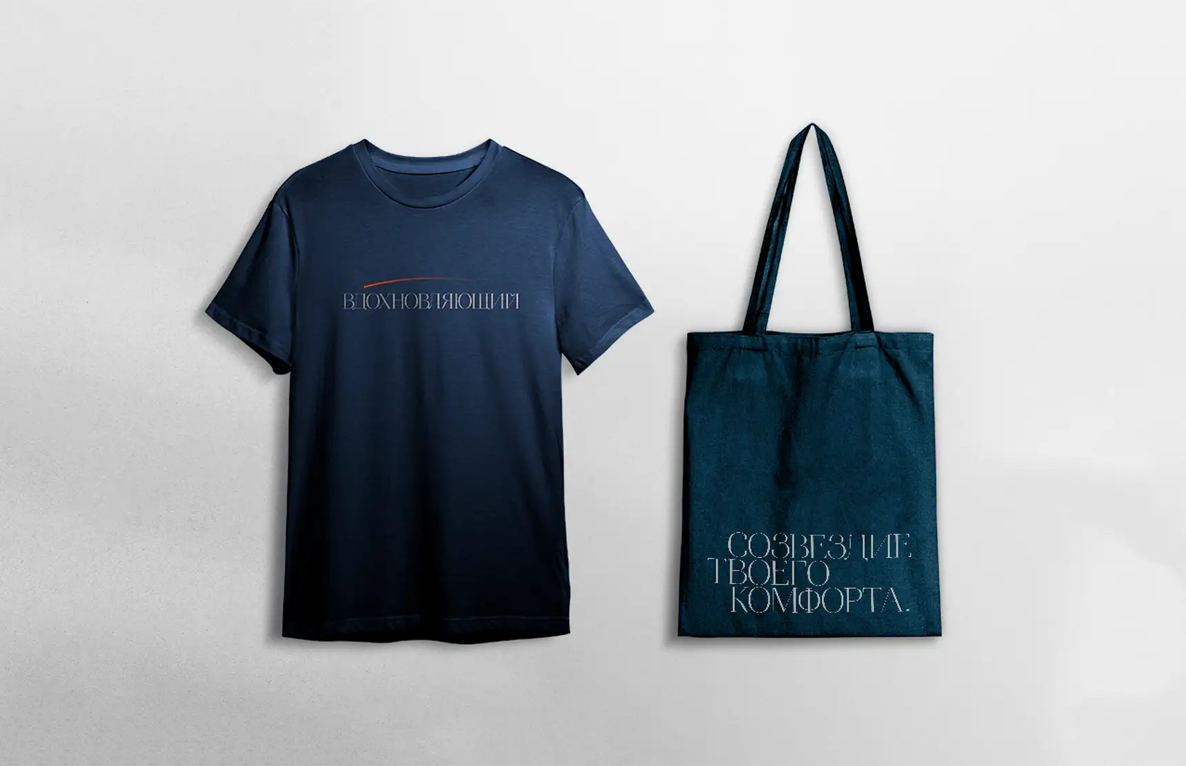
At the heart of the brand’s verbal and visual system lies the idea of infinite inspiration embodied in the stars.
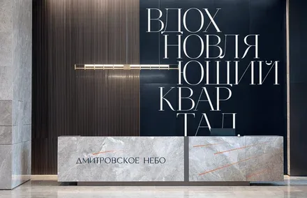
The descriptor “An Inspiring Neighbourhood” emphasises the project’s positioning as a space that gives residents the opportunity and the incentive to fulfil their own desires. And the brand line “The Constellation of Your Comfort” draws attention to the future scale of the project, its internal infrastructure, and the coherence of every decision taken, all aimed at the comfort and well-being of future residents.
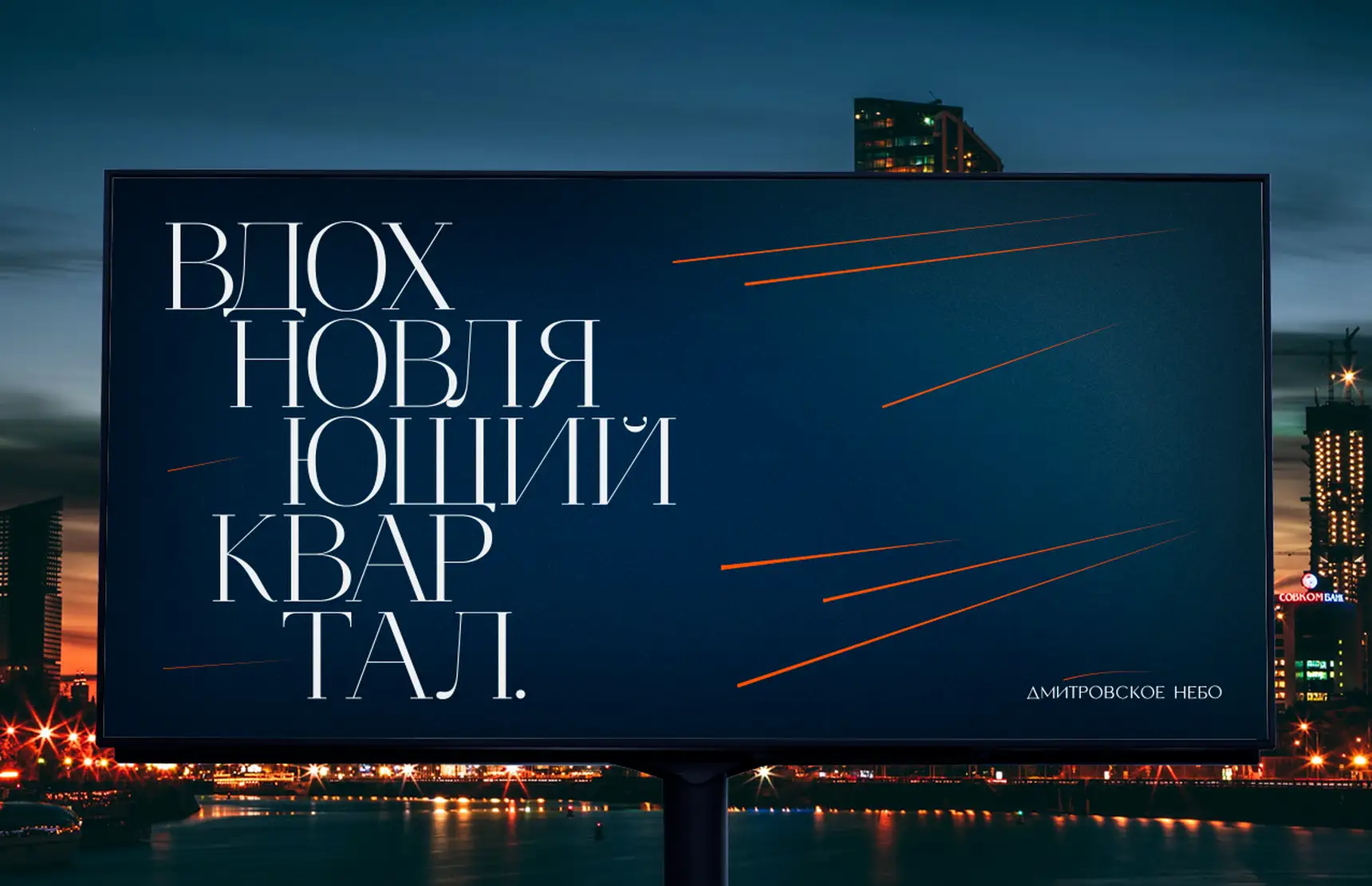
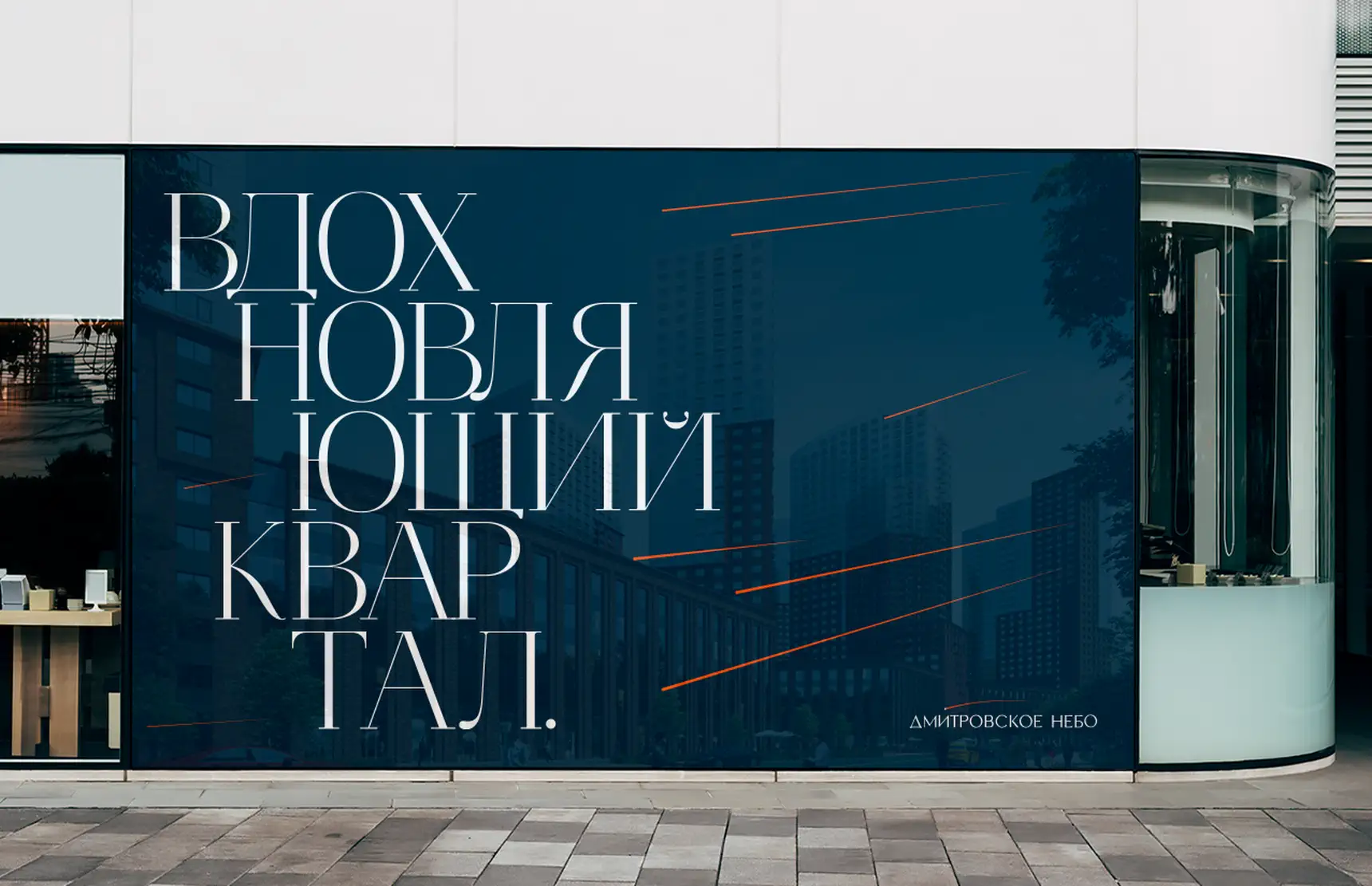
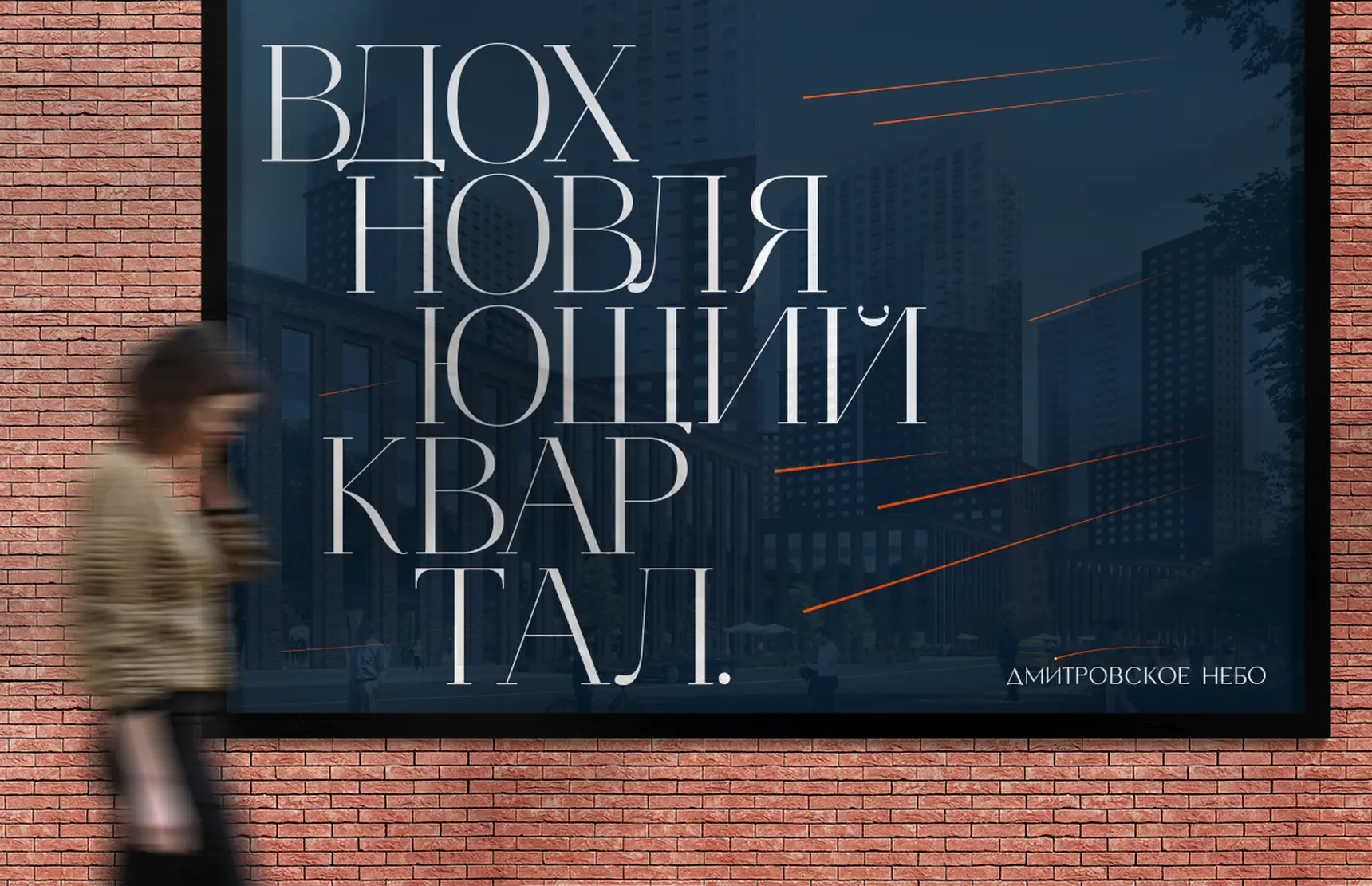
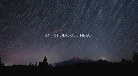
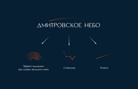
The brand graphics are built on the idea of the night sky shot in timelapse. The sky moves while the viewer remains at rest, thus achieving the necessary contrast between dynamics and stillness.
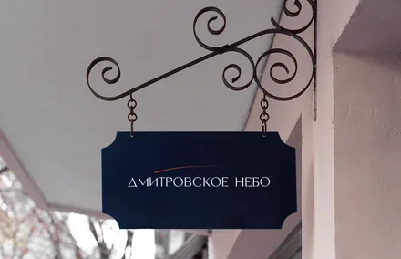
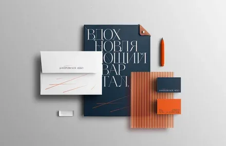
The deep blue colour symbolising the sky is complemented by contrasting graphic elements that evoke moving stars. The same approach is used in the logo: an elegant typographic wordmark is complemented by a stylised image of a star. The colour scheme is built on celestial colours – deep blue and white – complemented by red, a colour well known to every Moscow resident.