All the best on Tricolor for Kids
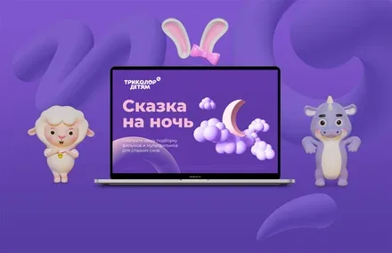
The launch of the «Tricolor for Kids» project was a response to the request of young viewers and their parents for a safe and convenient environment for watching children's content.
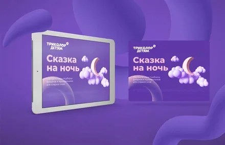
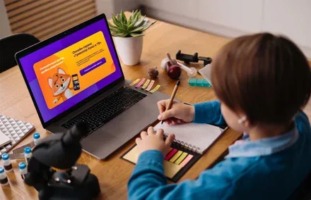
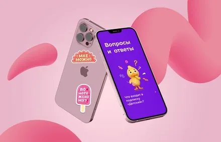
We developed the visual image of the sub-brand and thought about how to make it appealing to children.
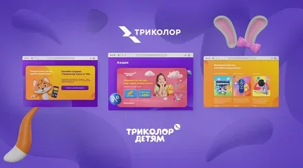
Tricolor is a multi-platform operator developing a unified information space of entertainment and services for the whole family across Russia. In 2021, a study was conducted whose results showed that 40% of the operator's customers are families with children, and 69% of them watch children's content every day. These findings prompted the operator to create a separate family brand from Tricolor.
«Among our customers are around 6 million young viewers. This is a large and very important part of Tricolor's user base. We always pay close attention to the needs of our audience, so the launch of the «Tricolor for Kids» project was a response to the request of young viewers and their parents for a safe and convenient environment for watching children's content», — comments Marina Gasparyan, Content Director at Tricolor.
Developing the family brand became the agency's main task, which also included defining the position of the new brand within Tricolor's brand architecture and creating its verbal and visual attributes.
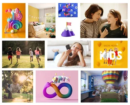
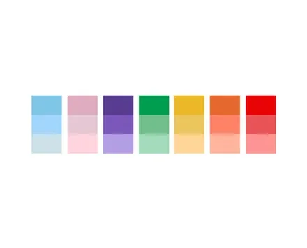
The Brandson team conducted an in-depth analysis of the existing Tricolor brand, which revealed the brand's strategic advantage – its accessibility, embodied in easy access to content anywhere in Russia and from any device. This conclusion was also confirmed by data on consumer perception of the brand, with consumers defining Tricolor as an accessible operator.
Deeper audience research showed that Tricolor families are large families with traditions of watching together. The core of the target audience turned out to be represented mainly by the traditionalist psychotype, for whom family values and their preservation and strengthening are extremely important. Thus, the key prerequisites were formulated for creating a family brand that should unite the family, convey reliability and have a legible, friendly form for children.
Competitor analysis showed that family brands or products are narrowly tied to functionality, but make little use of «family-ness» as an element of positioning. Family imagery, as the results of the analysis showed, turned out to be unfocused and extremely blurred.
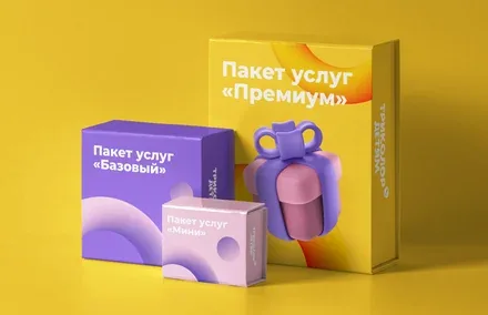
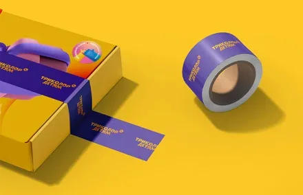
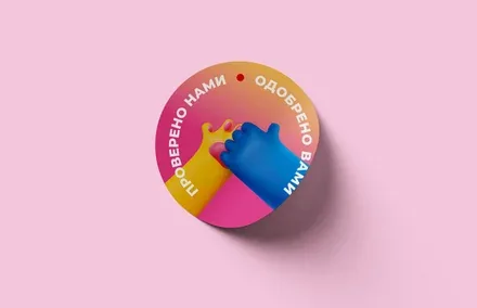
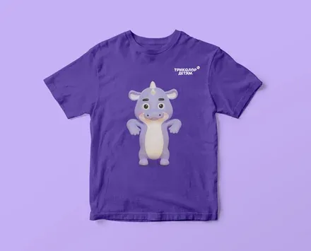
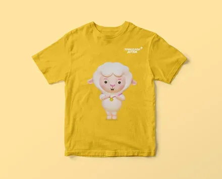
The new family brand was assigned the role of a recommender brand that unites a number of products aimed at family consumption. The brand focuses on the traditional idea of a family with a large number of relatives. The brand's positioning is built around knowledge of the real experience of families with children and an understanding of their needs, which enables the brand to recommend or create services and experiences that let people forget about difficulties, worries and anxieties. The new brand became a family tool that creates additional opportunities to show attention to one another and to devote time both to family traditions and to oneself.
The brand guarantees that the «Kids Package» is a set of specially selected channels, and the «Kids Interface» is a mechanism for convenient parental supervision.
The family brand from Tricolor can be compared to that family friend whom the whole family looks forward to visiting: with the parents he shares his experience, and for the children he always brings gifts and tells fascinating stories. He is on warm terms with you and knows you and your children well, so you can be sure that his advice will never be upsetting or unsafe for your loved ones.
The name of the new brand – «Tricolor for Kids» – is a space where children can enjoy entertaining and educational content in a fun and safe way, while their parents – if they wish – can set their own limits on the content their children consume. The name's continuity emphasises that the service is part of a large ecosystem and offers the best solutions for families with children.
The descriptor «A Space of Kids' Services» refers to the diversity of the product offering and shows that the new service is designed as a comfortable and safe space for children, so adults need not worry about them when leaving them alone with the screen.
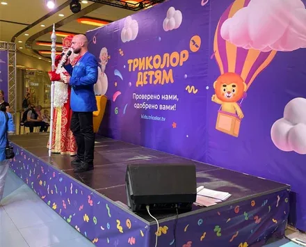
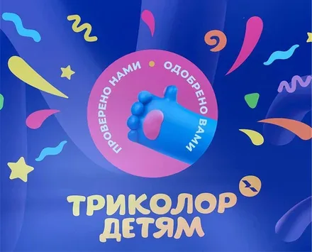
The brandline «Checked by us, approved by you» carries a recommendation component and emphasises Tricolor's expertise in selecting products for children and parents.
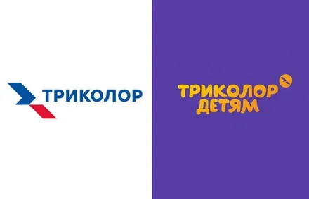
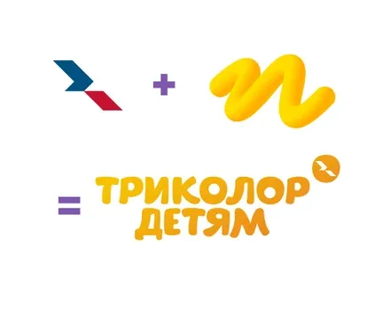
The logo of the new brand first and foremost emphasises its connection with the parent Tricolor brand, while visually moving in a softer, more child-friendly direction. The link to the main logo is made through colour (the gradient) and the parent brand's signature «bird», executed in a softer form, while the lettering uses rounder typefaces characteristic of children's themes. The logo creates an association with fun and joy, but does not have a pronounced children's message, since it is aimed at both children and parents.
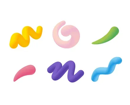
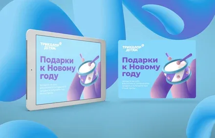
Three-dimensional elements resembling modelling clay are used as elements of the corporate identity. In this way, an understandable and, most importantly, familiar visual communication with Tricolor's children's audience was created.
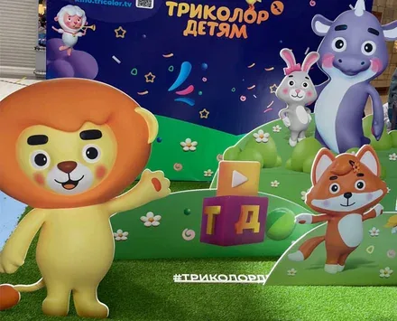
Specially designed characters also perform a supporting role in engaging with children.
Three-dimensional elements resembling modelling clay are used as elements of the corporate identity. In this way, an understandable and, most importantly, familiar visual communication with Tricolor's children's audience was created. Specially designed characters also perform a supporting role in engaging with children.
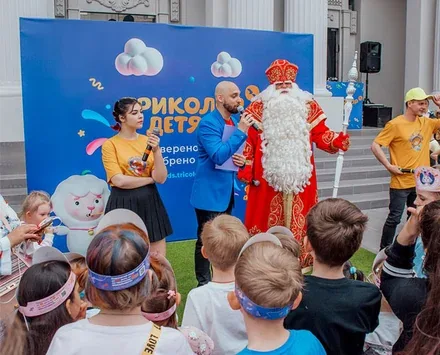
The project was successfully implemented and launched on 1 June 2022.