A Rich Lifestyle: Branding for the Enfield Quarter
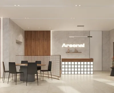
Arsenal Real Estate is one of the pioneers in creating an integrated residential environment in the St. Petersburg real estate market – a company inspired by opportunities rather than limitations, one that thinks in terms of environment rather than square metres, and strives to set standards rather than conform to them.
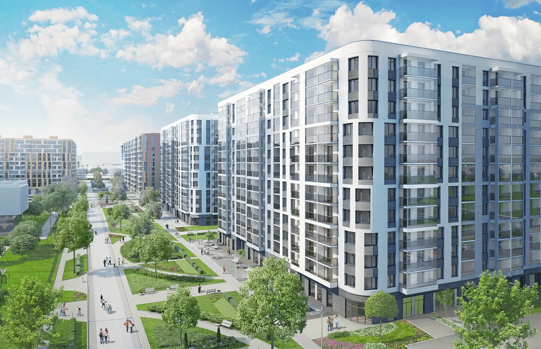
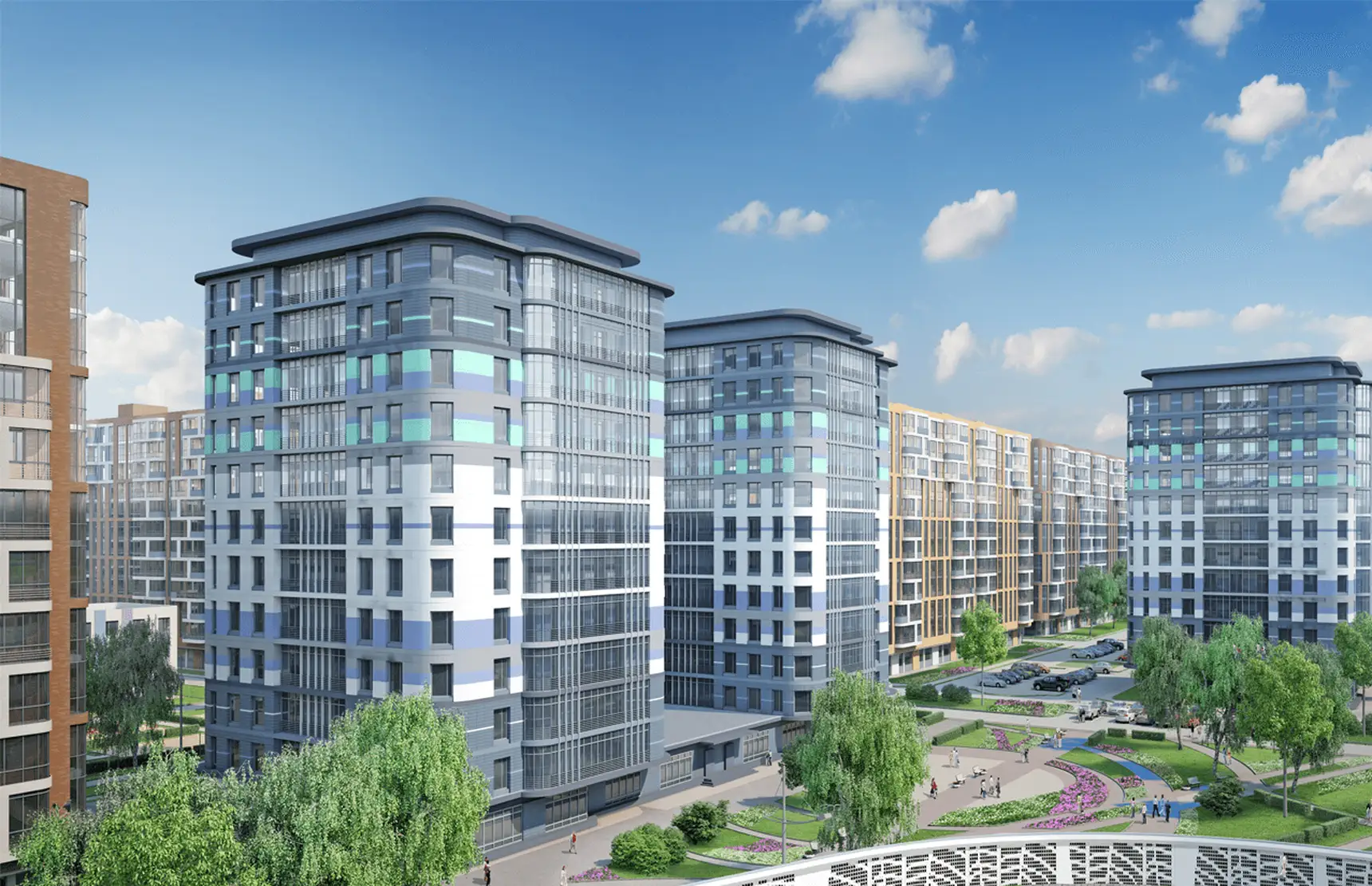
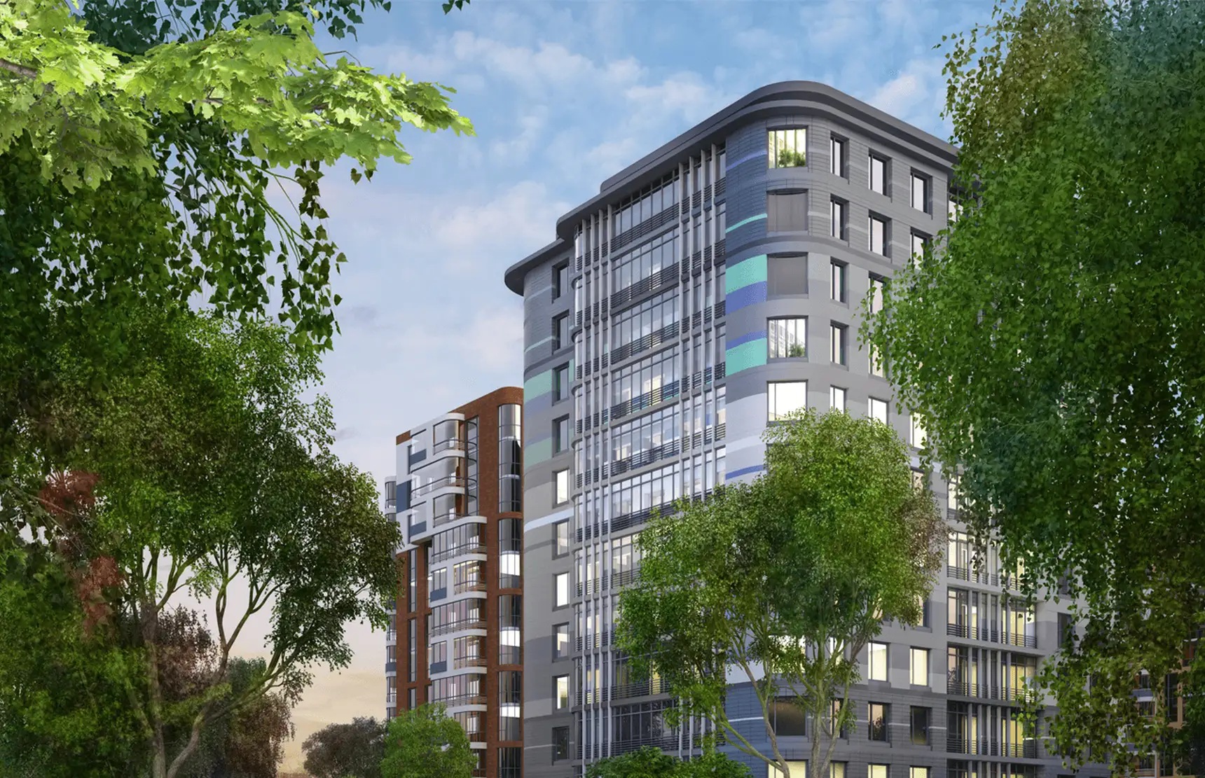
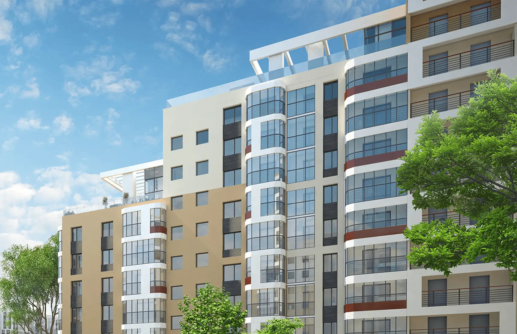
In 2015 the developer rethought the comfort-class category by creating a new-generation residential complex in the emerging “Murino-Bugry” district in the north of St. Petersburg. “Enfield”, whose brand was developed by the Brandson team, promised its first residents opportunities for sport, socialising and leisure.
Thanks to its infrastructure, “Enfield” was meant to become an active source of energy for them, which was reflected in its positioning.
Over 7 years the St. Petersburg real estate market has changed significantly: Murino has acquired its present-day look, and “Enfield” has built the infrastructure it promised. The pandemic changed the role of housing in people’s lifestyles – the emphasis on the living environment became even more relevant. The blue ocean began to change colour.
The main goal of the audit was to take stock of the changes affecting the competitive landscape of the real estate market, the image of the location, the developer’s offering, and new trends in the Russian and international markets.
A strategic session, backed by a team visit to the residential complex, confirmed that the developer had not only kept its promises but exceeded them, creating its own school with teaching in foreign languages.
After 7 years of the project’s existence, the motif of perceiving housing as an integrated environment had lost its uniqueness. The competitive analysis identified several comfort-class projects in Murino and other districts of the city offering residents a developed, well-thought-out environment. However, a careful comparison established that “Enfield”’s offering had not exhausted its potential for differentiation.
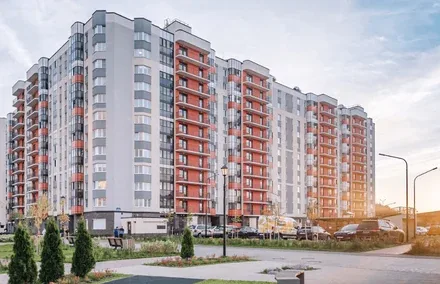
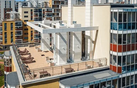
“Arsenal”’s residential complex remained the product leader, with a number of unique features – such as a communal rooftop terrace, a school with teaching in English, and two-level apartments.
But most importantly – “Enfield” was ahead of its competitors in purely physical terms. Their quarters exist only on paper, whereas “Enfield” has already brought everything it promised to life.
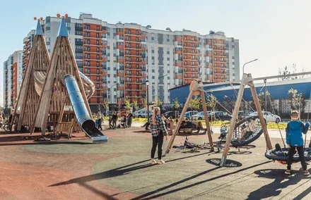
The exterior is almost complete, and the playgrounds and hobby centre can be tried out right now. This difference is especially important for people who follow trends that have already become conventional, choosing modern, progressive but life-tested solutions (in contrast to the trendsetters who moved into “Enfield” at the dawn of its existence and who are the target of most competitors).
Our team took a careful approach to editing the brand character, endowing it with elements of the developer’s new brand character (“responsible”, “relevant”) and gently shifting certain accents in line with the change in the psychological profile of the target audience. The change in audience called for a change in positioning. “Enfield” now appeared as a symbol of aspirations fulfilled, a space where people do not dream but make their dreams come true – and the quarter’s completed infrastructure helps them do so. The residential complex itself, built exactly as the developer envisioned it, also serves as an example of aspirations fulfilled.
With the rebranding, the same key concepts acquired a new meaning. Thus, the image of Europe in “Enfield” is now revealed through orderliness rather than progressiveness, and time spent together is defined not by the initiative characteristic of new residents but by the conditions created by a caring developer: “free” became “open” (absolute freedom is a source of risk for traditionalists), and “active” became “energetic” (new residents are no longer required to show the former level of proactivity).
The new brand metaphor (“a European university campus”) figuratively presents its consumer value (“everything you need for a full life just steps from home”), conveys the look of the quarter with its sports and educational cluster, and is readily associated with open communication, energy and good neighbourliness. The shift from a British image (“the Northern East End”) to a European one was driven by the need to broaden the audience and, accordingly, to appeal to universal stereotypes.

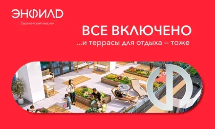
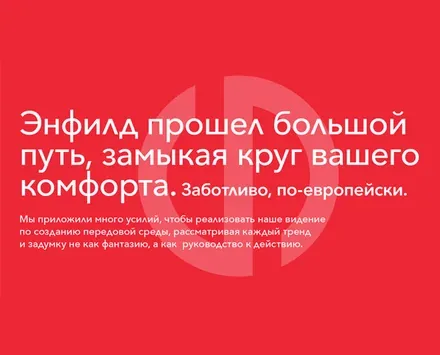
The brand’s creative concept is based on the notion of a “circle of comfort” that “Enfield” creates around its residents.
The change of the project’s slogan best illustrates the changes the brand has undergone. “Surround yourself with the real” – this is how “Enfield” addressed the “pioneers” who were ready to take a risk for a new concept of living. “Surrounded by the real” – this is how “Enfield” conveys its readiness to provide future residents with all the infrastructure from the very moment they move in.
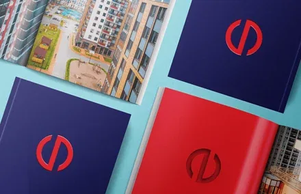
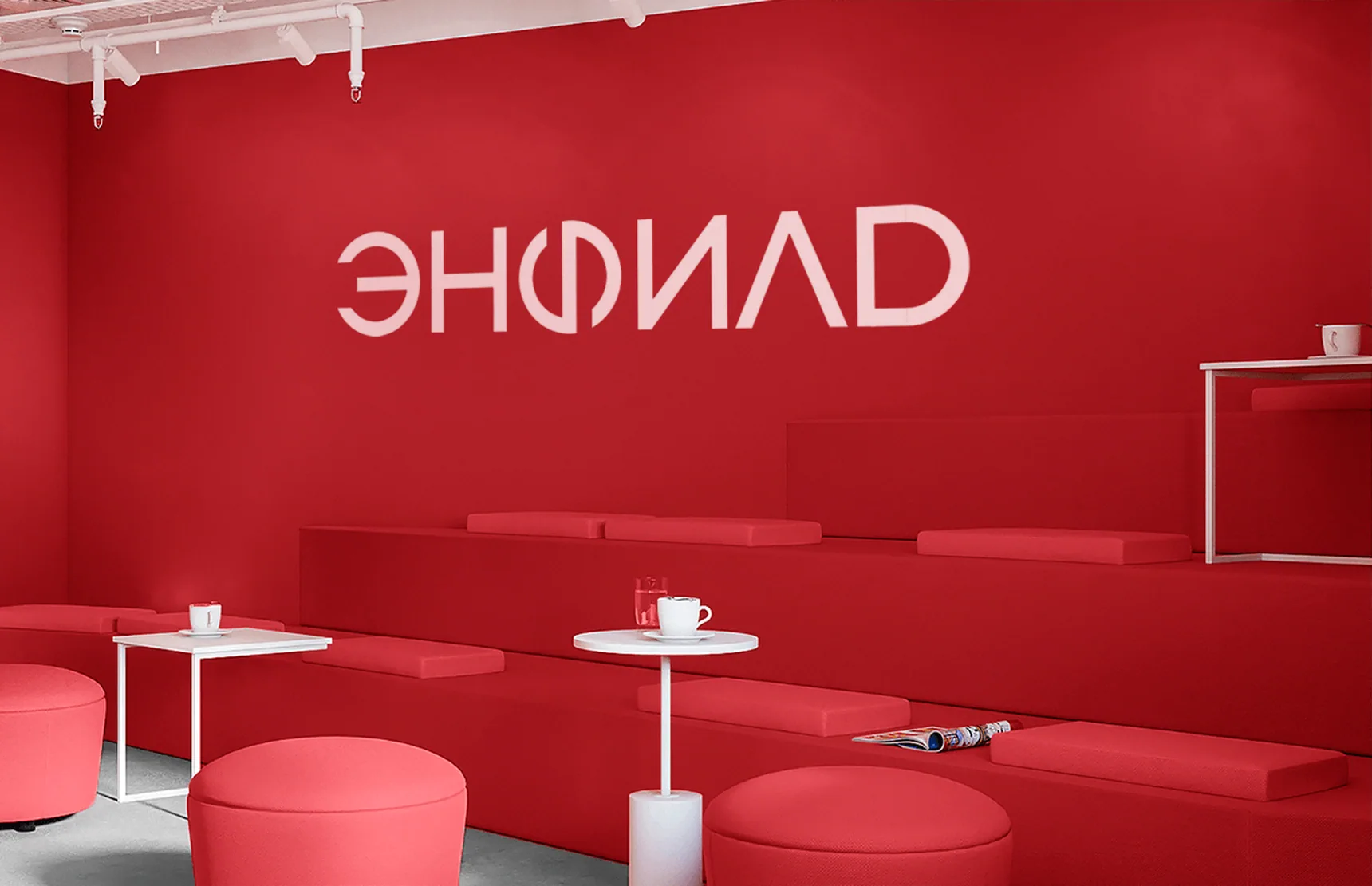
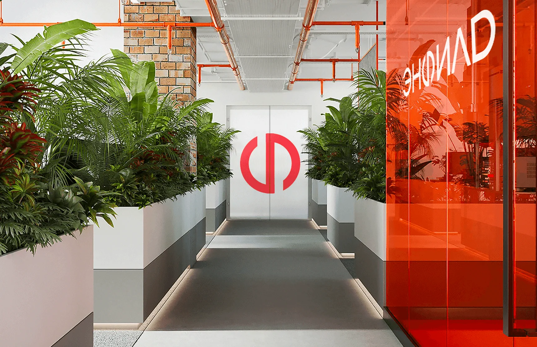
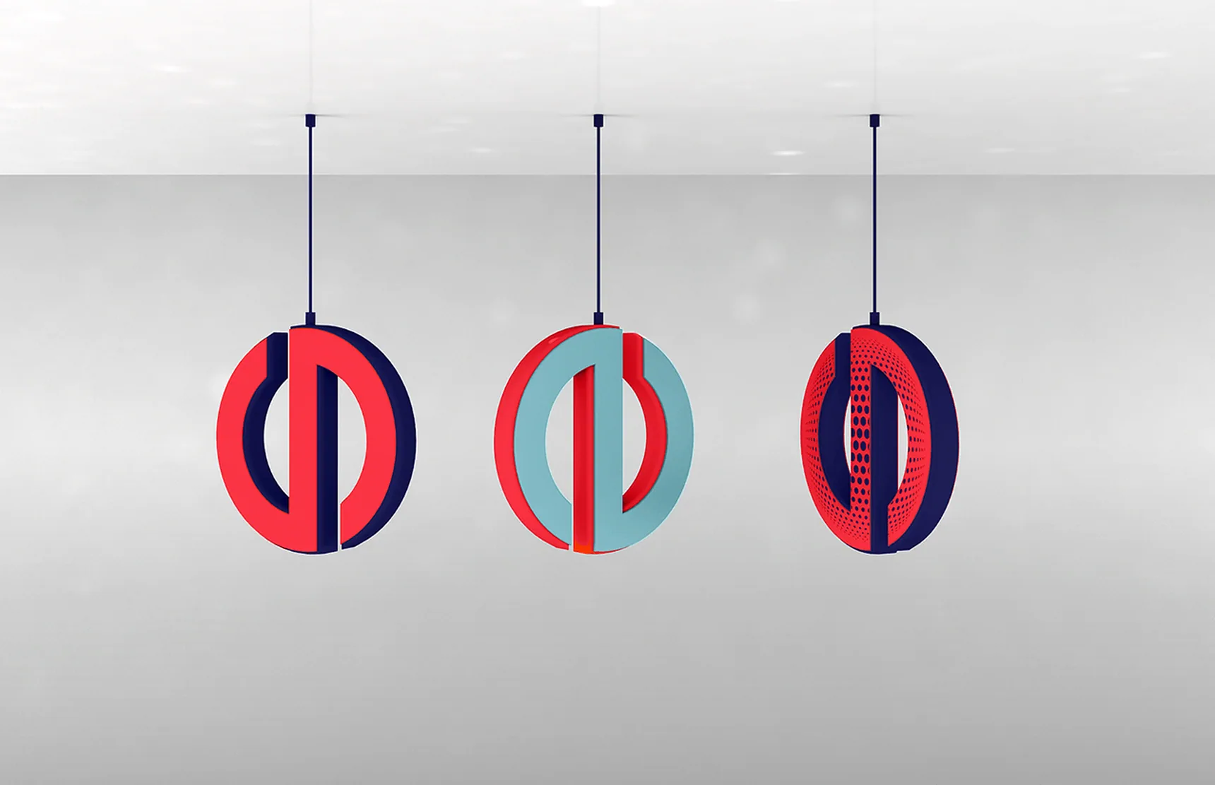
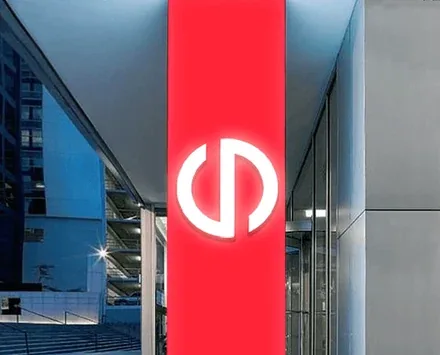
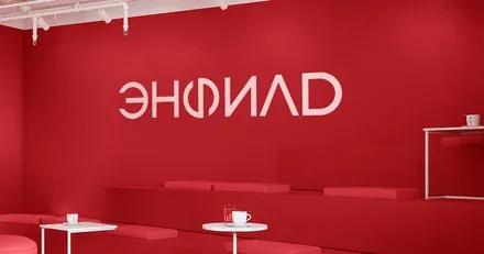
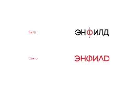
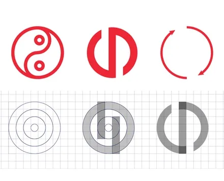
The original mark combines a defined outline with openness – just as the “Enfield” environment is fully formed yet open to new solutions and new residents. The mark is balanced and stable, matching the image of an established, successful quarter.
Taking the plasticity of the Cyrillic letter “Ф” as its basis, the logo maintains continuity with its predecessor.
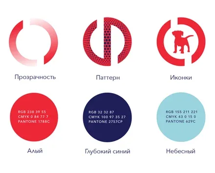
The brand’s new colour palette retains its brightness but makes the image of “Enfield” calmer and more solid, in line with the expected increase in the price premium after the rebranding.
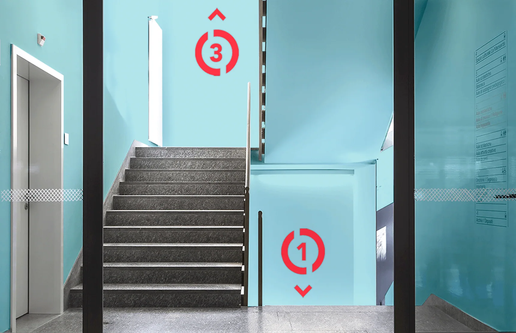
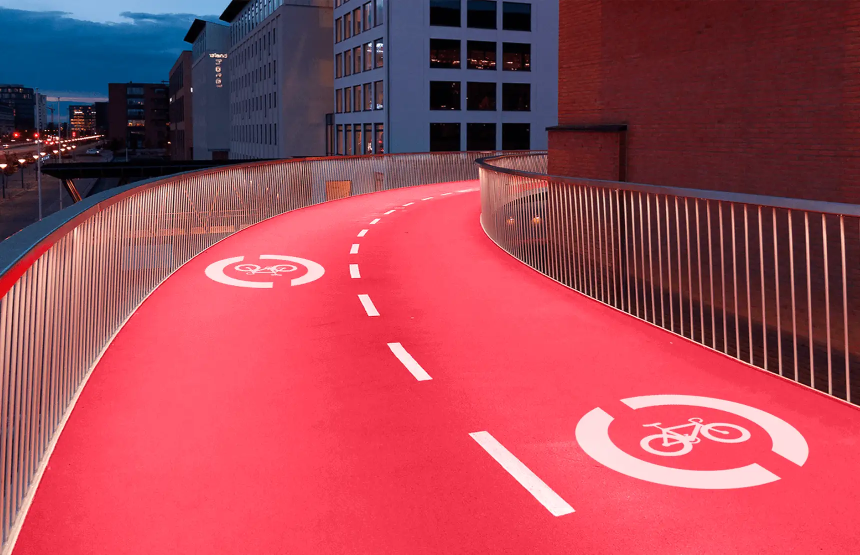
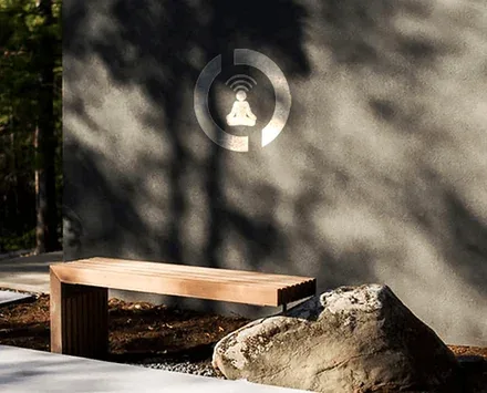
The shape of the logo becomes a container for various elements – from a pattern symbolising diversity to inspiring verbal messages.