Racionika dietary products brand
Racionika is a brand of dietary products for healthy eating and weight loss. Deep-rooted misconceptions prevent people from realising that eating a balanced, high-quality diet is easy and simple.
In Russia, products in the healthy eating segment are often associated with medicinal, pharmacy products and dietary supplements of dubious composition. We needed to steer the brand away from this perception and to reinforce its positioning as a high-quality premium product for a health-conscious audience.
How did we do it? See the case study!

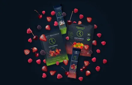
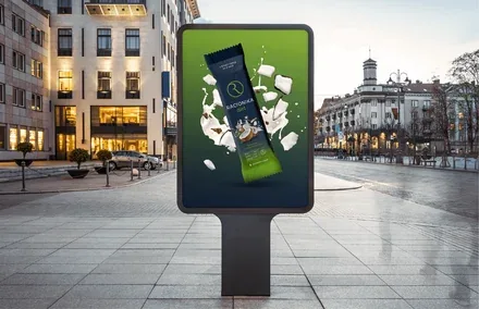
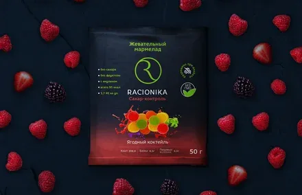
In order to confirm that the products belong to the high price segment, attract a new target audience of "advanced" consumers of healthy products, increase brand awareness and use the visual image to distance the brand from its competitors, it was necessary to restyle the packaging of the RACIONIKA brand's products. The agency team carried out an express audit of the competitive field and developed a creative packaging concept, adapting it across the brand touchpoints.
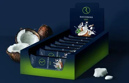
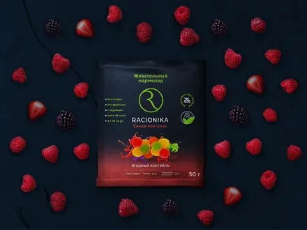
The core target audience, women aged 28 to 40, is characterised by two main drivers for buying "wellness bars".
The first motive is the need for freedom: "I consume Racionika to feel light, full of energy and ready to take on a challenge, so that I can ultimately become the best version of myself".
The second is status: "I consume Racionika because it is the right choice and it looks prestigious; everyone understands that I am one of the chosen few". At the same time, a visual analysis of the competitive field showed that the brand environment differs across sales channels, ranging from bright, appealing graphics in the premium retail segment to the deliberately austere, functional design of "pharmacy" products.
The existing design of the Racionika brand was relevant only to the "pharmacy" format, which was at odds with the product's characteristics and positioning. A study of market trends and the competitive field showed that consumers place a higher value on niche products, paying particular attention to their benefits. Based on this insight, the "eco-premium" strategy was chosen for implementation.
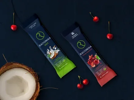
Looking after your health does not have to mean boredom and self-denial. The modern lifestyle makes it possible to combine great taste, an aesthetic appearance and healthy content. Style, vibrancy and elegance are your new energy.
Choosing healthy products is an expression of love and care for your body, giving you the strength for new achievements. The visual style combines maximum contrast, an easily legible brand mark, and refinement and individuality. The functional lines – diet, "immuno" and "sugar control" – are differentiated by colour.