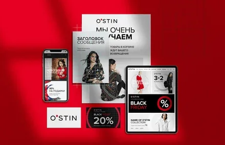
Fashion brand OSTIN expands the boundaries of its brand online
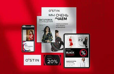
O’STIN is an international clothing brand and one of the leaders of the Fashion Retail segment in Russia. The company has been producing men’s, women’s and children’s casual clothing for more than 17 years.
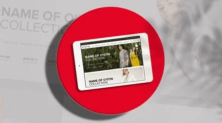
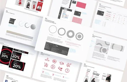
The retailer approached the agency to refresh the company’s online image in a way that would increase brand recognition, expand the boundaries of the identity and move it from rules to possibilities, from uniformity to inspiration, from the external to experience and impressions. The agency team needed to systematise all communications, develop a verbal and visual concept for the design of all the brand’s online materials, adapt it to the relevant touchpoints and create a new brand book dedicated to the rules for using the corporate identity in the company’s online communications.

The Brandson team analysed the brand’s competitive environment and identified the main focal points of competitors’ online communications. It emerged that their visual identity was defined mainly by photographic style, with no additional corporate identity elements to increase brand recognition. In the course of the research, O’STIN’s current brand communications, brand platform and target audience were studied and systematised. The agency’s creative team concluded that there were a number of problems with engaging users in a dialogue with the brand. This factor, together with the absence of unique templates for each social network, created a barrier to the brand’s perception by its core target audience on social media.
Brandson’s specialists identified the reasons for the current dissatisfaction with the communications and the prospects for development, and on the basis of these findings the direction for further creative work was determined.

Based on the results of the audit, a “formula” for the O’STIN brand was derived: it combines lightness, clarity, sincerity, self-sufficiency and individuality. “The simple formula of your style” is an accurate description of the result the consumer receives. O’STIN is everyday style that carries airy inspiration and brings freedom and serenity.

The key element of the visual identity – the dot – symbolises the origin of coordinates, the search for meaning, style, ideas and identity. Much of our life is devoted to asserting our identity. It matters to us to assert it, because identity encompasses the experience of our wholeness, our continuity and our being true to ourselves. The circle symbolises potential and embodies such life values as communication, comfort, wholeness and overall well-being. The strong qualities conveyed through the visual communications of the corporate identity are non-confrontation, tolerance, sociability and kindness. The concept of verbal communications proposed by the agency team is aimed at all of the brand’s audiences and calls for a friendly tone of messaging and an invitation to dialogue.
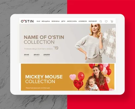
Brandson’s specialists developed a section of the brand book containing the rules for using the corporate identity in the company’s advertising and other online communications, created a grid layout system for building banners of every possible size, laid out the advertising materials according to the content placement rules developed at the agency, and brought the company’s online communications to a consistent standard.