The brand of Modum, a neighbourhood of new perspectives
Modum ― is a comfort-class project by the real estate developer Arsenal. The project’s architecture is built on the principles of respect for personal space and privacy. Every detail of the neighbourhood speaks of status and genuine quality, changing the outdated perception of the Primorsky District. Today it is the leading contender for the status of the new heart of the Northern Capital.
The Modum project is a daring combination of ancient philosophy and the functionality of post-constructivism. For the strong. The free. The dynamic. Modum changes the quality of life for those who will no longer settle for less. Which modus of life will you choose?
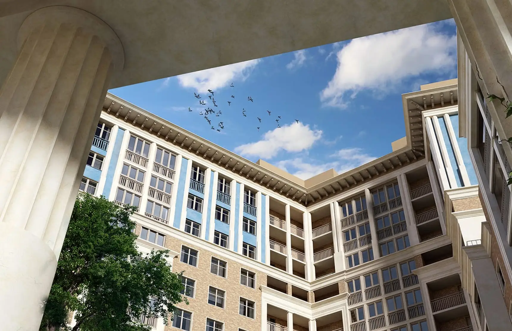
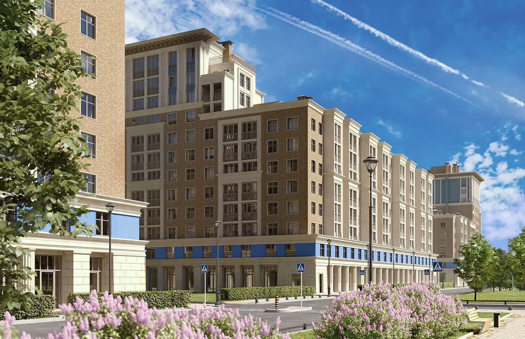
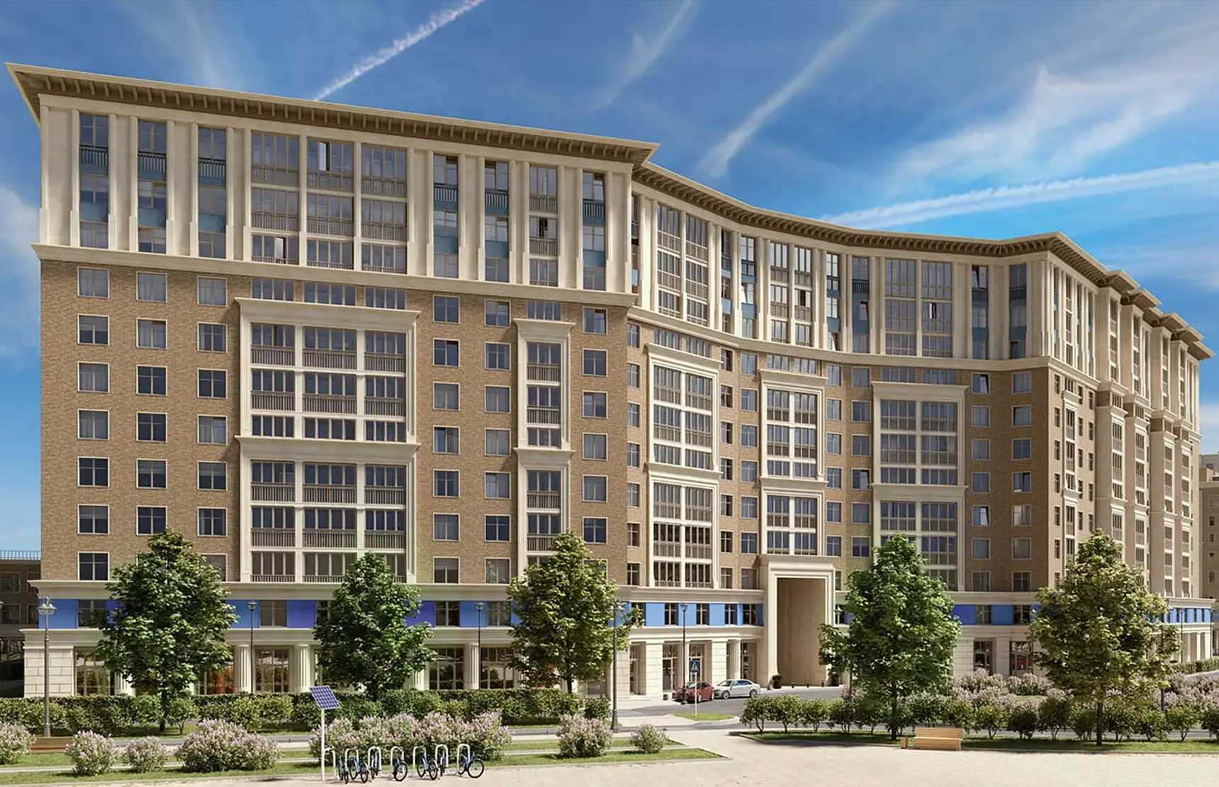
In 2020, Arsenal Real Estate launched a new project – a business-class residential neighbourhood in the north of the Primorsky District, in a location not traditionally associated with a business-class audience.
To develop a brand for a residential neighbourhood distinguished by an architectural solution unusual for the location and by high-end infrastructure that includes its own SPA complex.
Having analysed the situation in the development area at the time of the project, the agency team confirmed the client’s hypothesis that the location had the potential for a project in the upper price segment.
Despite its remoteness, the north of St. Petersburg’s Primorsky District is developing dynamically and outpaces the southern part in many respects: the south has already exhausted its potential for infill development and is in many ways outdated, as construction there began back in the 1980s.
The influx of a new affluent audience wishing to raise its level of comfort without leaving its home district will ensure steady demand for housing above the “comfort” price segment, while the development of transport arteries and infrastructure, together with the proximity of extensive green areas, will make it possible to substantiate the project’s advantages for potential buyers from other parts of the city.
In order to differentiate from competitors relying on the standard set of functional advantages – eco-friendliness, a well-developed residential environment and modern technical solutions – the agency team proposed focusing on the aspect that makes the project stand out most vividly, namely its architecture.
The look of the architecture is also an aspect of quality: it influences the approach to layouts, the overall perception of space and, importantly, the self-esteem of the buyer, who has become more sophisticated over time. The core of our target audience values the unique and the unusual, yet is cool towards attempts to justify the price through imaginary “exclusivity”. These are people with their own convictions and a broad outlook, conscious consumers who link the development of their beloved district with their own life trajectory and are looking for a project that matches their idea of beauty.
The north of Primorsky, a kind of Primorsky 2.0, is an atmospheric, “uncluttered” location that can be filled “from scratch”. It is their own κόσμος, a cosmos in the classical Greek sense – a plastically ordered, harmonious whole.
The project grows organically out of human nature and matches the way these people see things. It speaks their language, overcoming the attitude imposed on city dwellers of the home as a “machine for living”. The key image can be sketched in a few strokes as a self-assured individualist, a charismatic connoisseur of pleasures and an appreciator of aesthetics, attentive to nuances and shades.
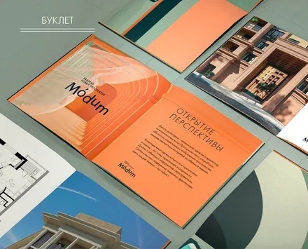
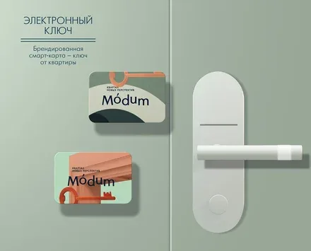
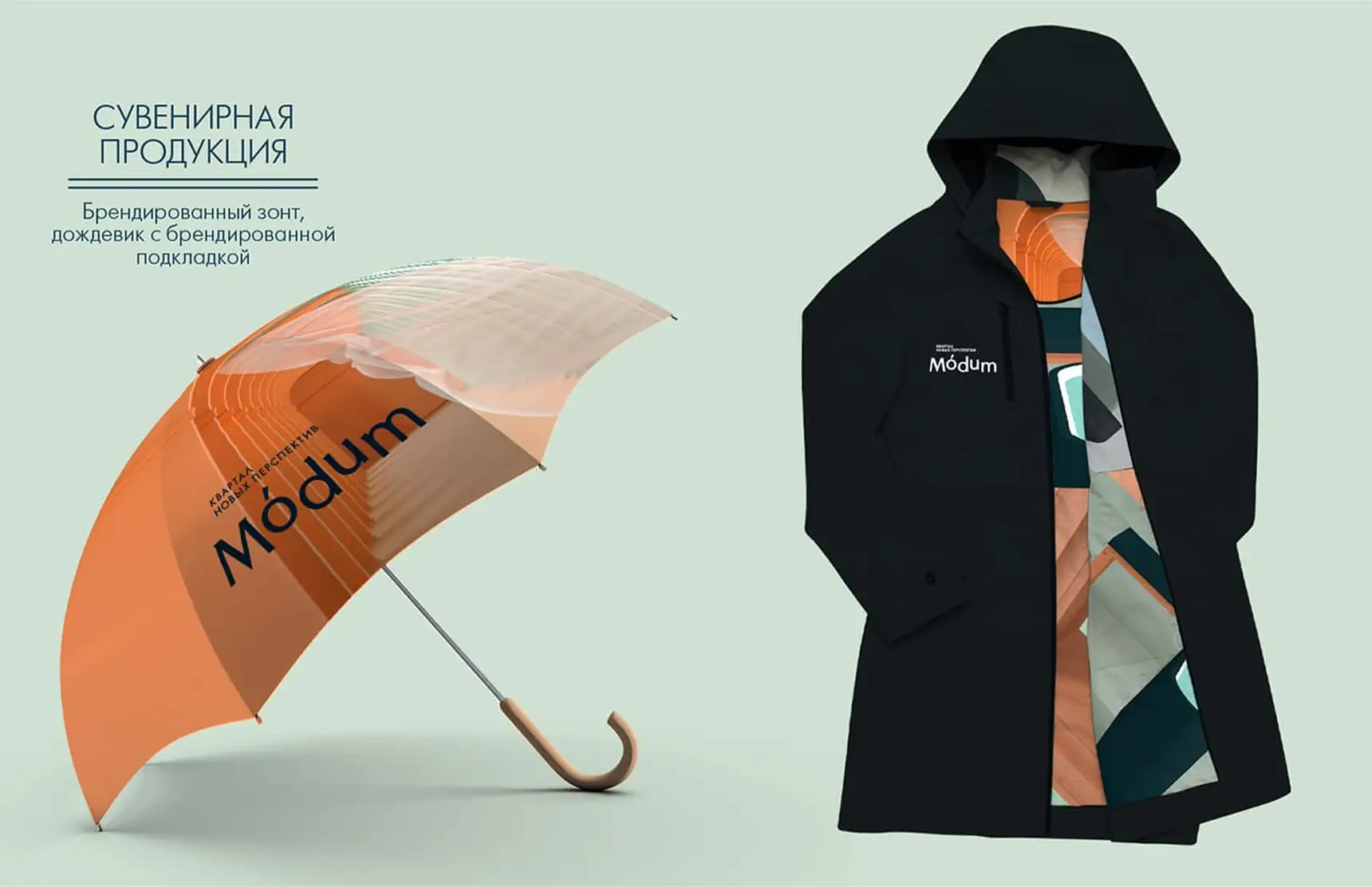
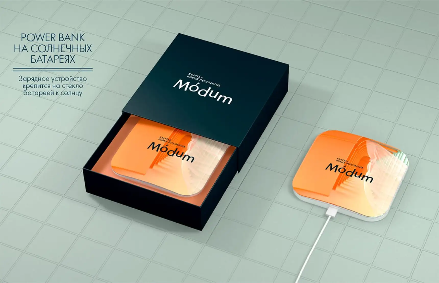
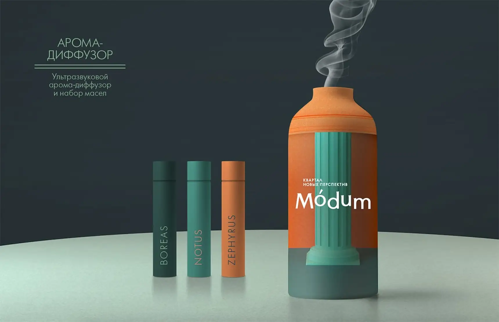
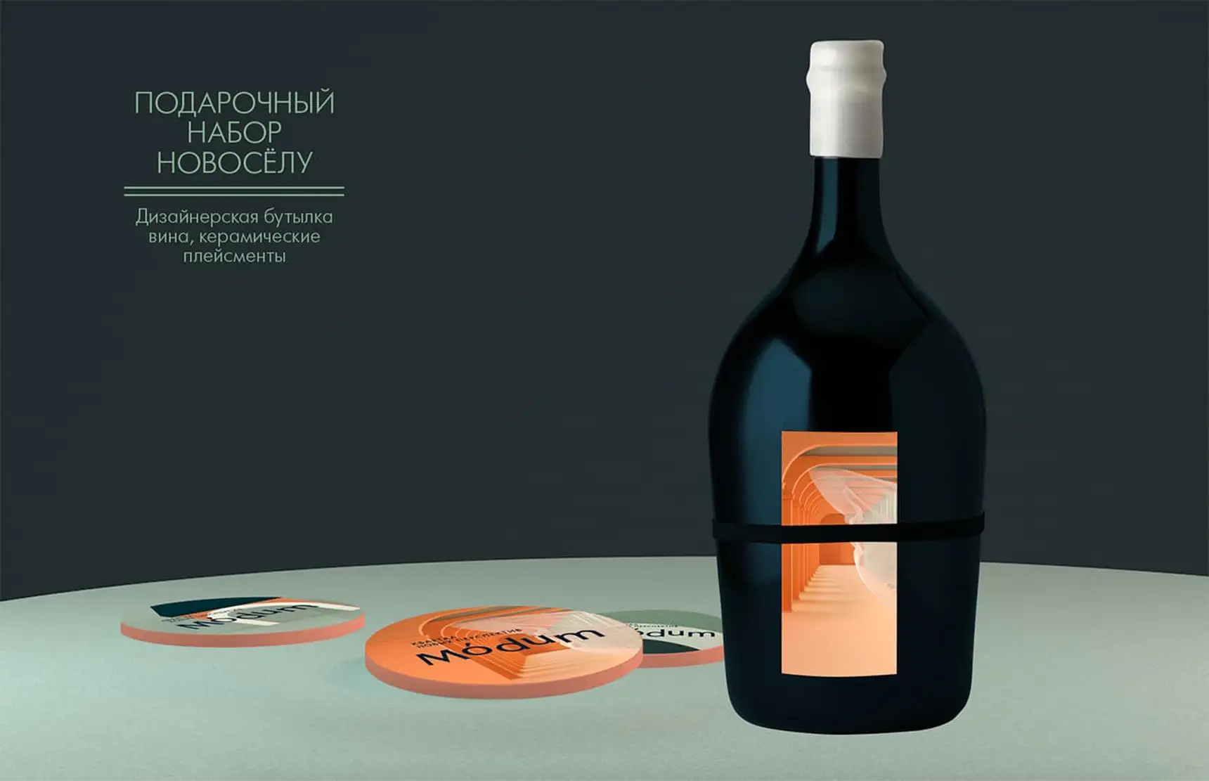
Modus (from the Latin modus) — a measure, manner, method, or mode of existence or action of something. Departing from the standard form of this word, we construct a neologism that recalls such words as “dom” (home) and “modny” (fashionable). Which modus of life will you choose? Which modality of perceiving your surroundings will suit you best?
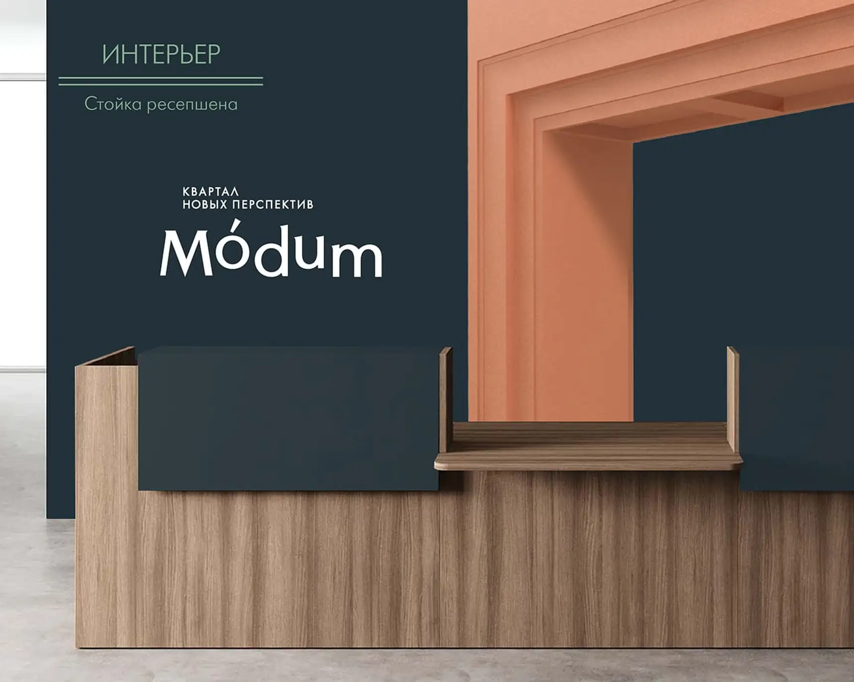
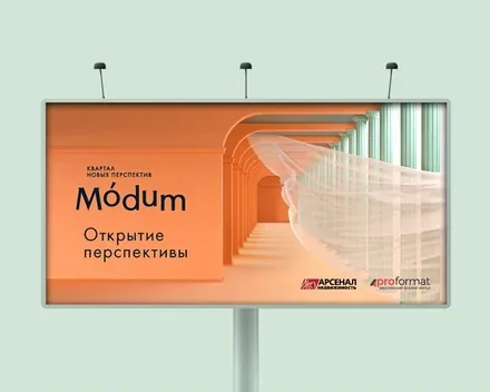
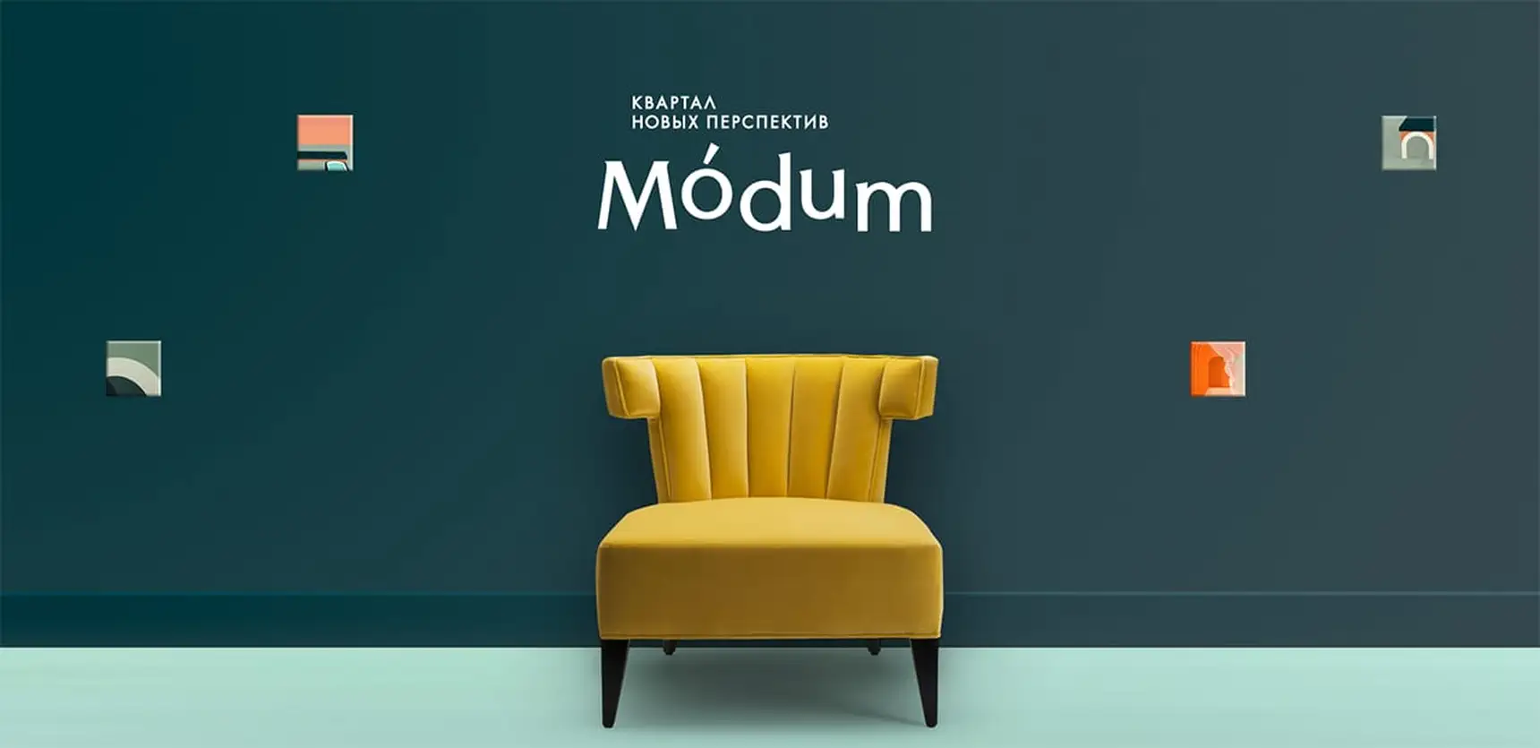
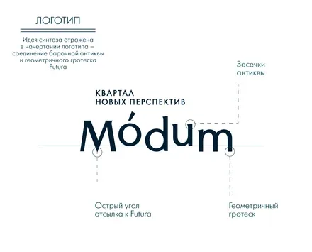
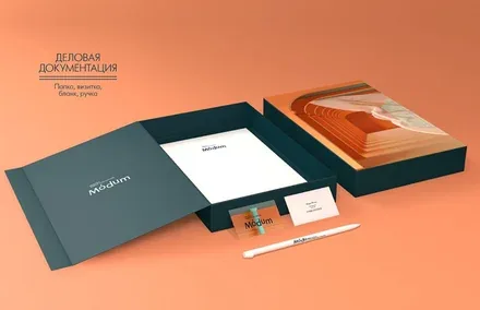
To realise the project’s concept we did not use ready-made typefaces: we created the logo on the basis of decorative fonts with a classical design and notes of Art Nouveau and Moderne.
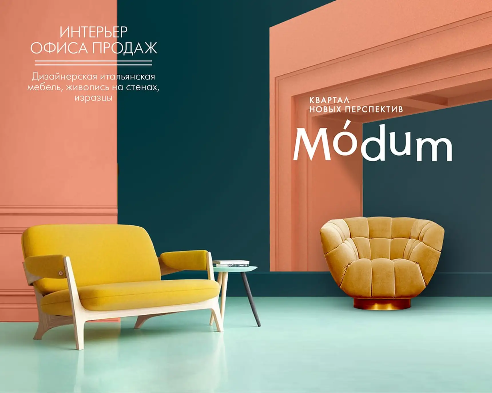
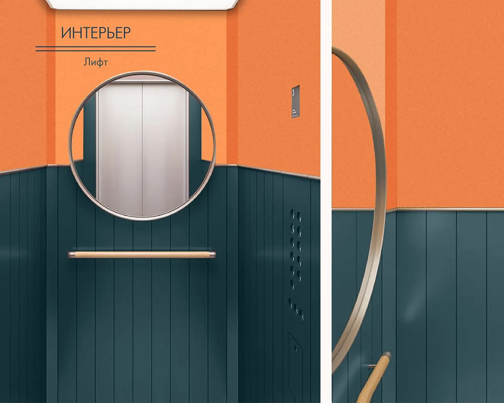
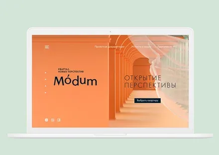
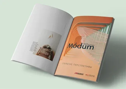
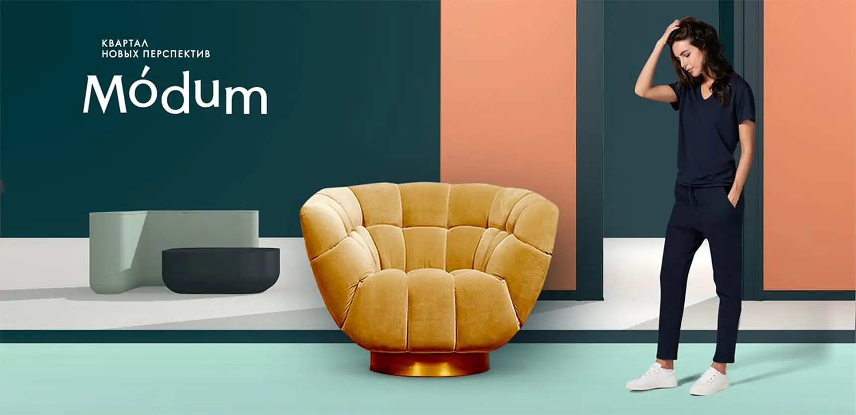
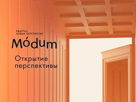
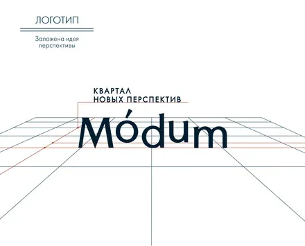
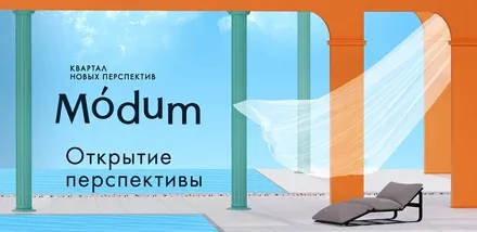
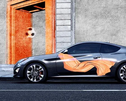
Fresh, non-trivial colours catch the eye and signal that the project is strikingly different from its surroundings. The brand lines “A Neighbourhood of New Perspectives” and “Opening Up Perspectives” not only point to the dynamic development of the location, but also emphasise such an architectural feature as the passageways that create an enfilade of receding perspectives.
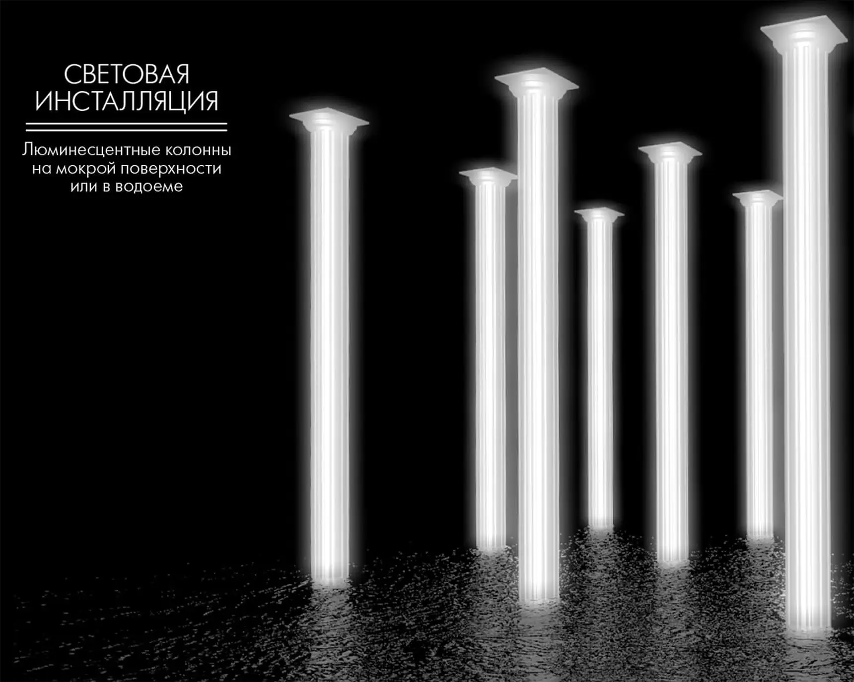
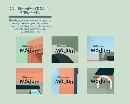
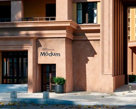
The special poetic atmosphere of the future neighbourhood has been artistically reinterpreted as almost metaphysical spaces, while the use of 3D graphics gives the style a contemporary feel. During the project, Brandson’s architectural designers developed a proposal for integrating elements of the corporate identity into the architectural concept of the property.