Let’s Live Better: Branding for SPb Renovation
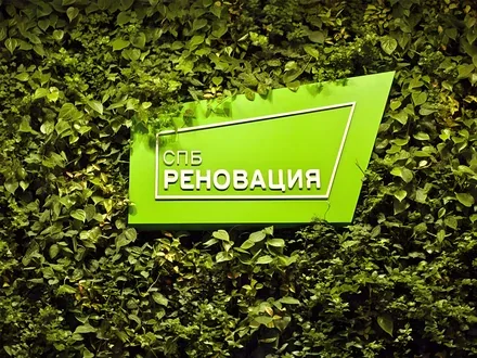
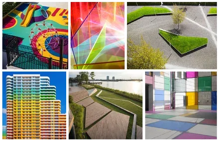
The SPb Renovation brand is bright, large-scale and unconventional. That is exactly what the brand of a construction company should be when it is called upon to radically change not only the face of the city but also the lives of many thousands of people. 300 years ago, when the city was just being born, houses were painted in bright colours “in the European manner”.
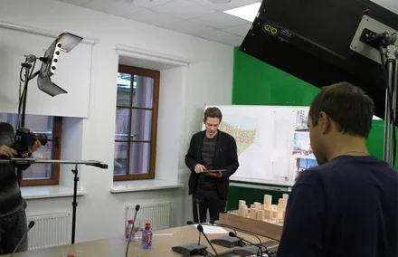
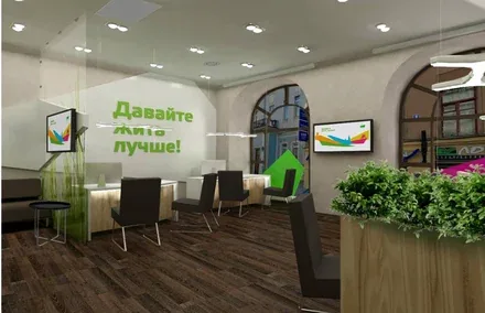
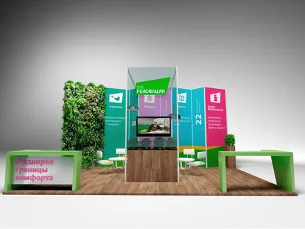
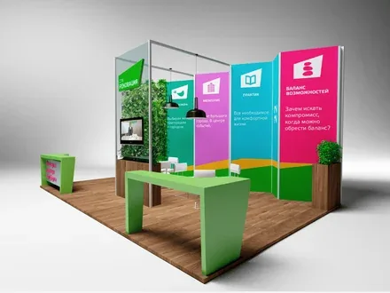
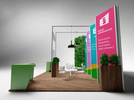
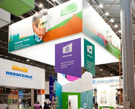
As part of the comprehensive branding project, our team developed an employer brand, an advertising campaign and a communication strategy, and even designed the exhibition pavilions. A particularly important part of the work was the design of the client office.

SPb Renovation is a real estate developer that will transform 22 neighbourhoods in 9 districts of St. Petersburg and create fundamentally new housing for a vibrant, comfortable life. Under the programme, 1,200 buildings will be constructed, and today’s residents of Khrushchev-era apartment blocks will move into new, cosy and modern apartments.
The volume of housing to be built will amount to 10% of the city’s existing housing stock. The scale of SPb Renovation is expressed not so much in the number of square metres built as in their quality – the company’s partners are leading European architectural bureaus, and the company itself employs Russia’s best specialists in residential construction.
The comprehensive urban development programme for the areas of St. Petersburg built up with first-generation mass-produced housing is the most important and ambitious project in the history of residential construction in Russia.

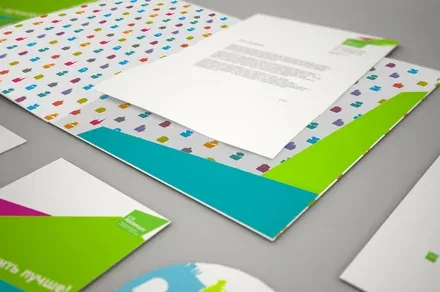
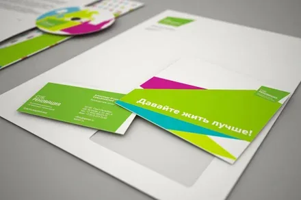

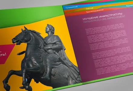

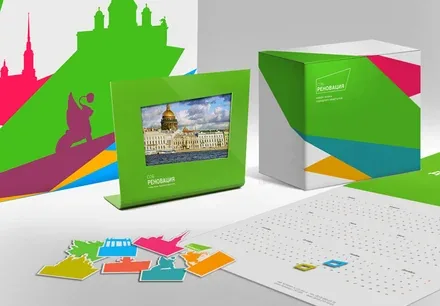
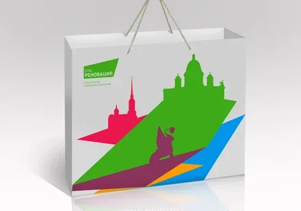
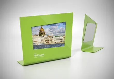

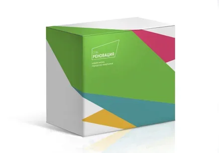
Before starting development, our team conducted comprehensive research into the real estate market, target and contact groups and the competitive environment, and studied market trends and international experience. Through surveys and questionnaires we identified how St. Petersburg residents felt about the project and the general level of awareness of the renovation programme, which allowed us to formulate expectations for the future housing.
Qualitative research based on our proprietary Brand Evolution methodology included the collection and analysis of statistical data as well as a series of expert interviews with the project’s ideologists, analysts, market experts and project partners. The research also produced a portrait of the target audience – a broad range of consumers represented by various social groups, each with its own consumption motives and needs. The brand platform and brand strategy were formed on the basis of the analytical stage.



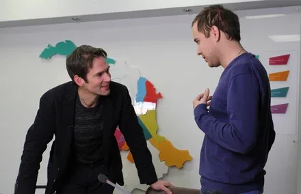
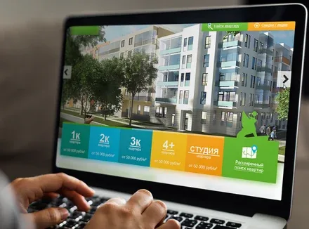
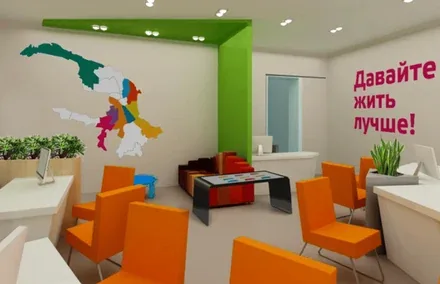
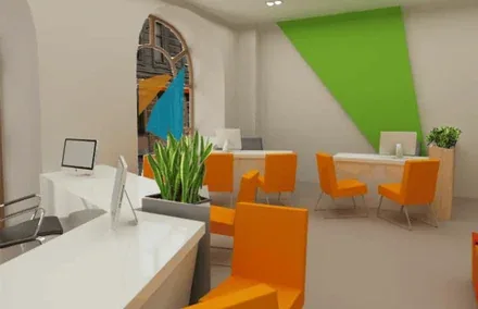
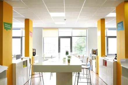
The brand’s character – innovative, bright, dynamic, European and at the same time truly St. Petersburg – had to be understandable to anyone and perceived by all target groups in the same way. The brand’s visual language adopts and develops this “historical” device, making life more colourful.
In creating it, we sought to speak a simple language that everyone can understand, and to find a simple, memorable form. A form that would reflect our idea as fully as possible and symbolise the renewed neighbourhood.


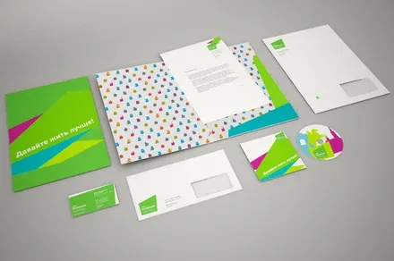
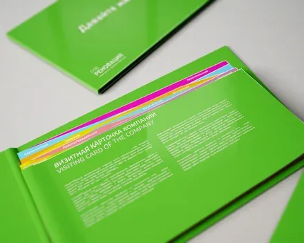
The SPb Renovation logo is the territory of a neighbourhood seen from above. The best colour to reflect novelty and rebirth is natural green, the colour of spring grass. The colour scheme of the logo conveys the idea of the city being divided into districts, which makes it possible to create individual advertising materials for each district.
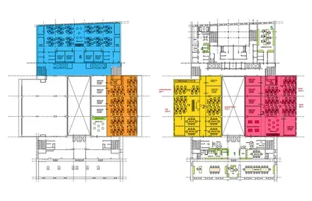
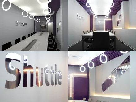
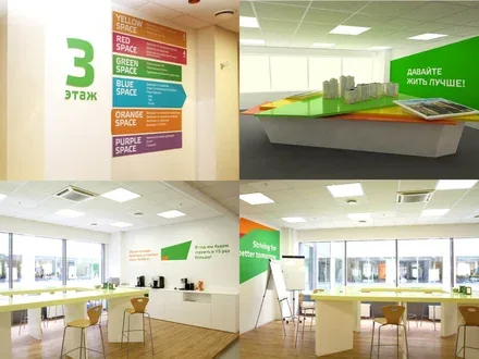
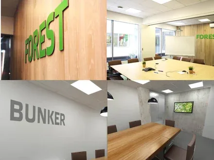
To create the right image inside the company, we developed an individual design for the office space. Thanks to the open-space concept, which communicates the ideas of openness and innovation, the office space became the main conduit of corporate values.
In addition to developing branded merchandise, our team worked on strengthening the company’s employer brand: employee events, office branding and workplace design. The interiors and accessories we developed helped turn SPb Renovation’s employees into brand ambassadors.
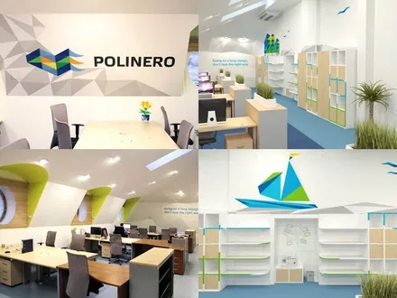
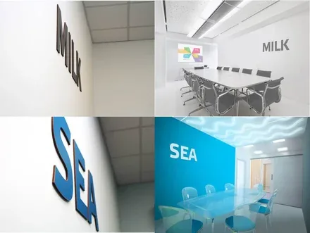
Special mention should be made of the Polinero zone – an office space designed in the spirit of the concept neighbourhood, with sea-related attributes as elements of its corporate identity. The faces of the advertising campaign were architects from London and Stockholm who collaborate with the company. The goal of SPb Renovation is to renew St. Petersburg in a meaningful way and bring it to a new flourishing. This is exactly the idea we wanted to convey through the development of the brand.