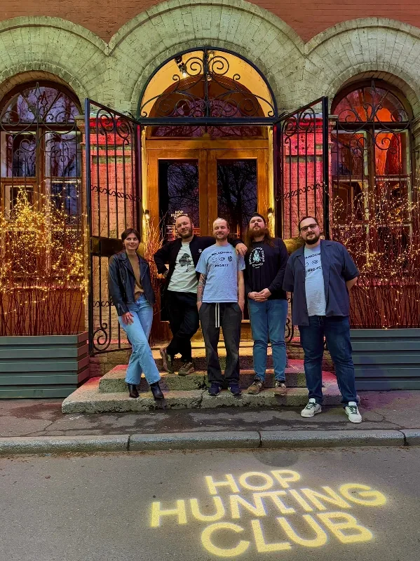
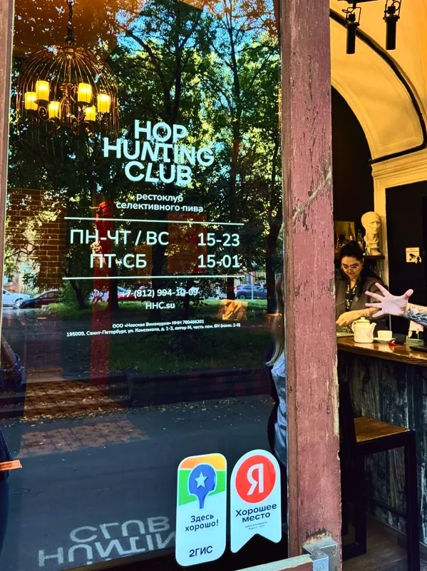
Hop Hunting Club. How we created a resto-club where the hoppy brew became the object of the hunt

Brandson (TSN) faced a strategic rebranding challenge: to turn a technically advanced but commercially ineffective beer bar into a resto-club for connoisseurs of selective beer. We had to create not just a new venue, but an entire category of premium beer consumption.
We developed the concept of "ethical hop hunting", creating a club for connoisseurs where the prize is a unique taste, status and an impeccable experience.

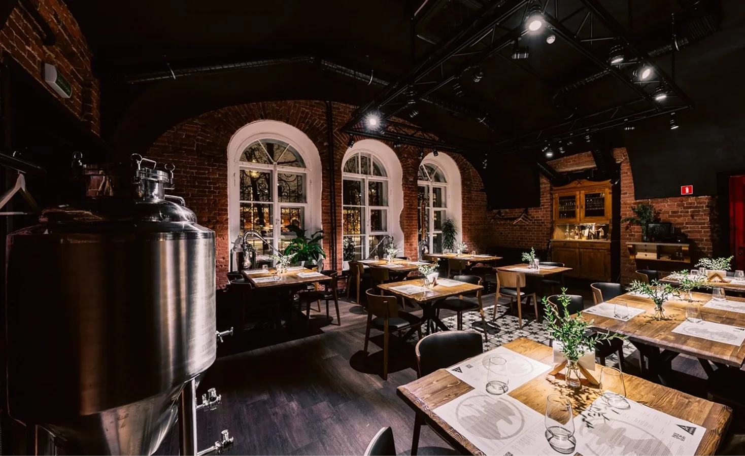
The client had three key assets: its own craft brewery "behind a glass wall" (guaranteeing absolute freshness and exclusivity), refined cuisine and a tour programme. However, these advantages had not been brought together into a single system. The venue was known under the name "Arsenal" but suffered from blurred positioning, trying to be both a party spot for young people and a destination for connoisseurs, which put off both audiences. The overall picture did not add up to an image worthy of the level of the product on offer: selective handcrafted beer and fine dining. The difficult, low-footfall location meant the bar had to become not a place people wandered into by chance, but the goal of a deliberate visit.
Thus, the client needed not a transformation of the product, but its competent packaging. The task was to create clear positioning, a strong image and a coherent vision of the business that would unite the brewery, the bar, the kitchen and the tours into a single ecosystem.
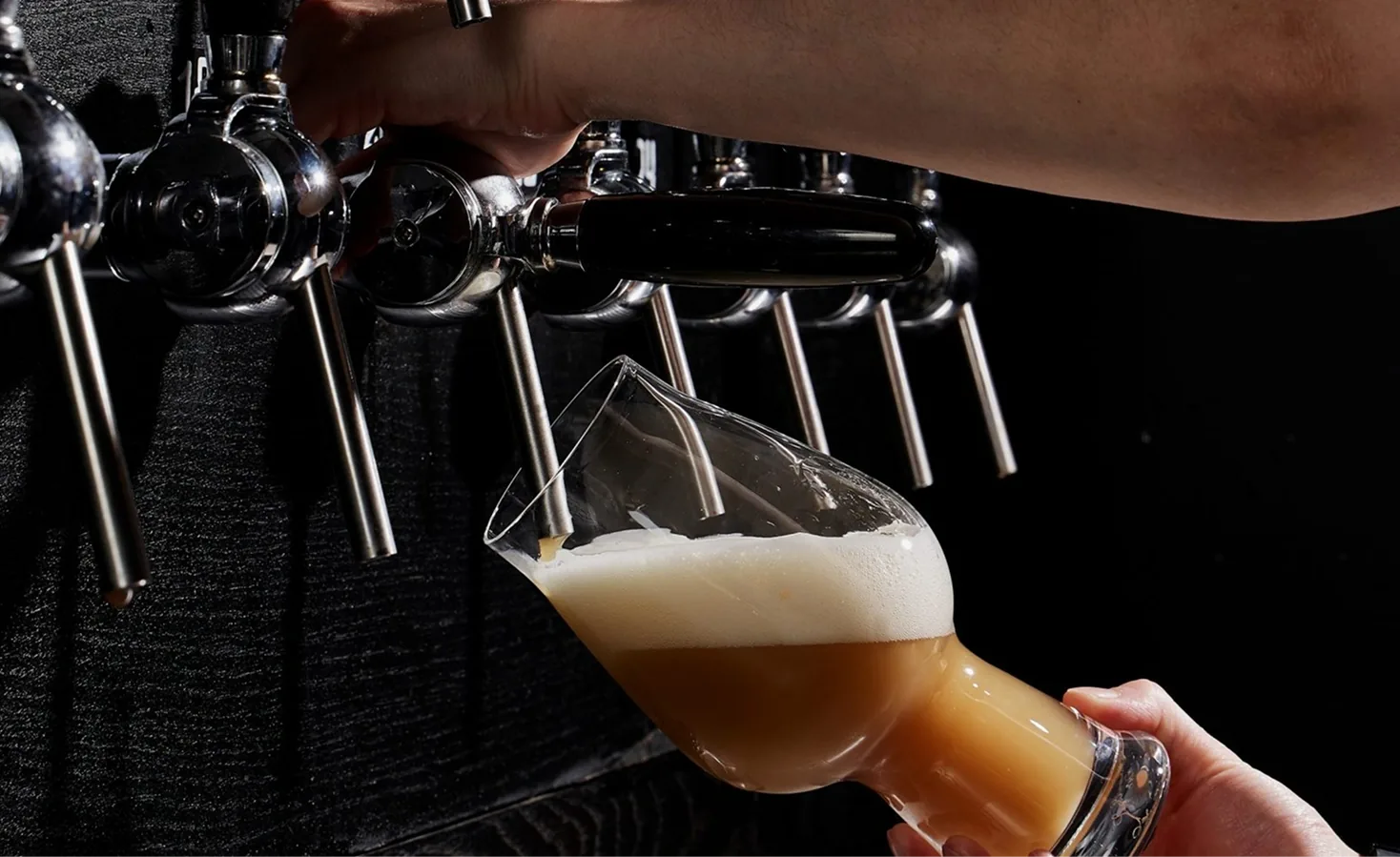
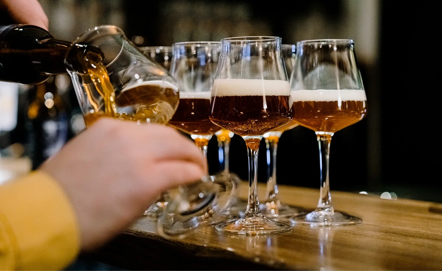
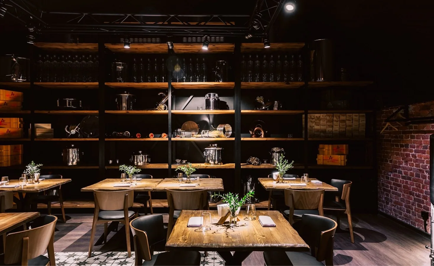
In-depth interviews with potential guests and market analysis confirmed the client's hypothesis of an unfilled niche and revealed a clear portrait of the target audience.
Within the craft beer market, we discovered a demand for a new quality of consumption: part of the audience was looking for a place where beer is treated with the same reverence as wine. The key insight from the client, which we confirmed: "Beer is not a backdrop for football, but a melody of flavour nuances that deserves to be savoured". We identified a strong motivation of status and belonging. It is critically important for the guest to feel part of a community of the chosen few. We also identified the value of personalised service: "Here they know what you want. You are in your element, here they know you".
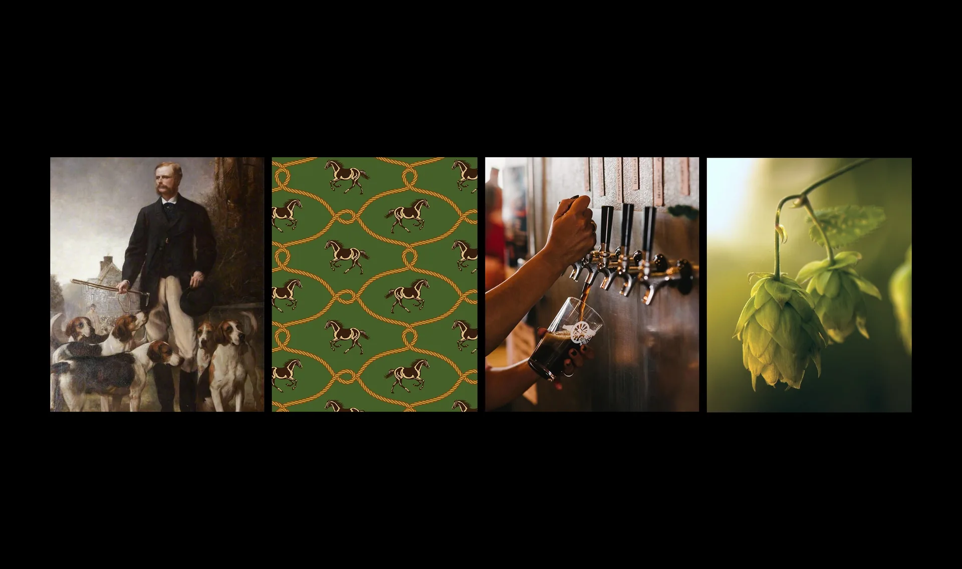

Based on the data obtained, a brand strategy was formulated that radically changed the positioning paradigm. We proposed to update and strengthen the existing advantages by creating a new category: the "selective beer resto-club".
The key brand idea became the statement: "Exceptional beer deserves an exceptional atmosphere". This made it possible to rethink beer, elevating it from the category of a democratic drink to the status of an object for collecting and savouring, and to justify the high level of service, gastronomy and prices.
The concept of "Ethical hop hunting" turned the process of consumption into an intellectual adventure: the search for rare varieties and perfect flavour pairings.
The name Hop Hunting Club was chosen for its perfect semantic load:
— Hop: a direct reference to the main raw material, hops, immediately pointing to the industry.
— Hunting: sets an active, noble, masculine metaphor of seeking and capturing trophies (flavours).
— Club: the key word, creating a sense of exclusivity, elitism and belonging to a community.

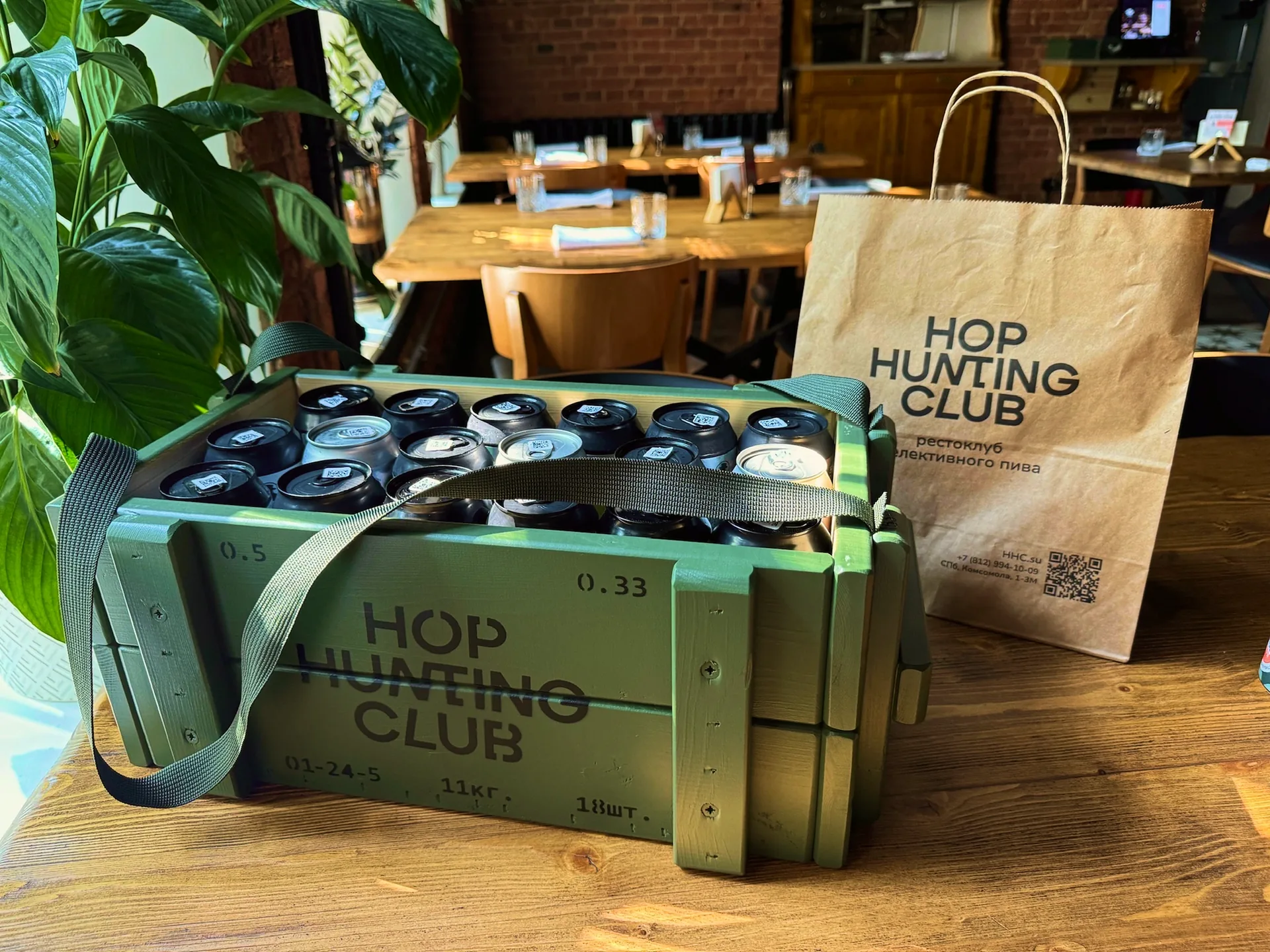
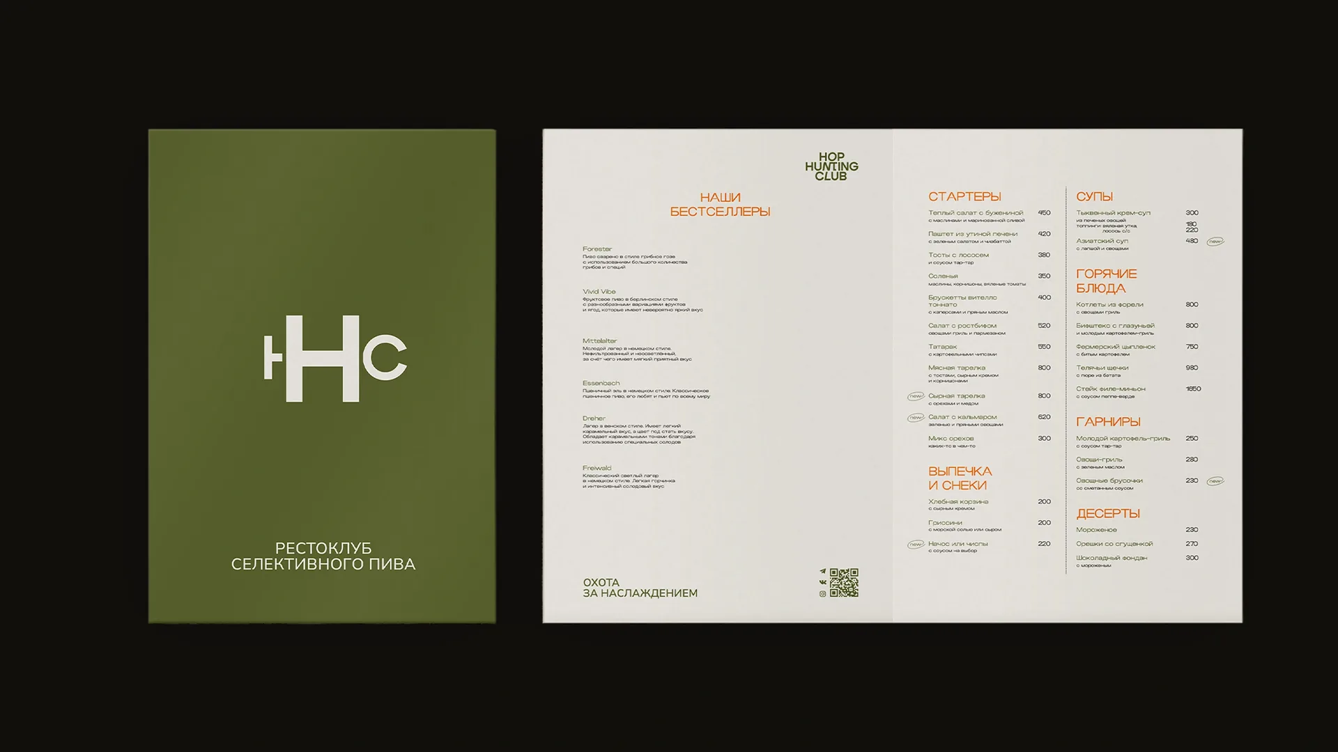
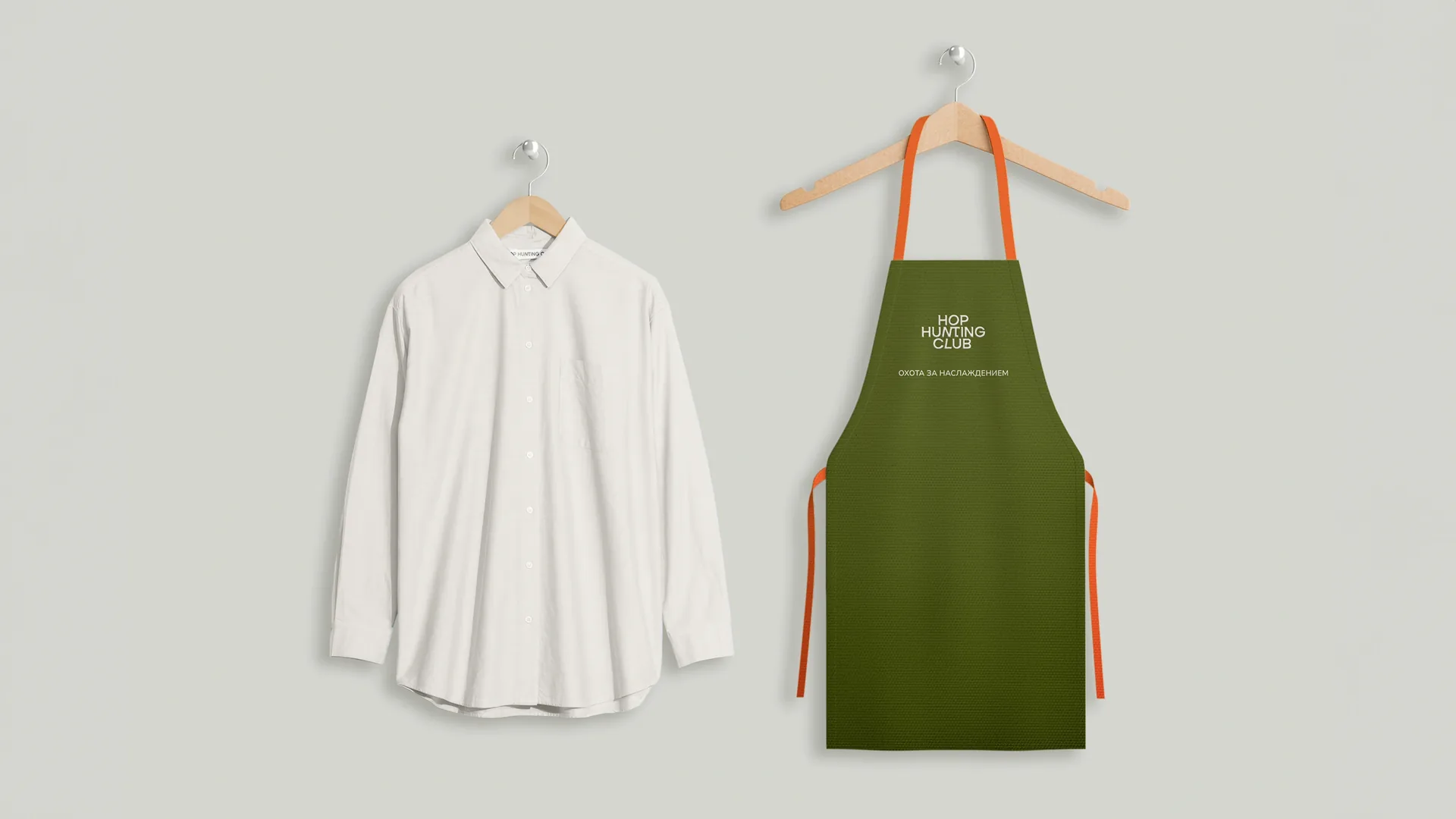
The visual and verbal identity were subordinated to the idea of a modern gentlemen's club. We developed a concise verbal platform with the slogan "Hunting for pleasure" and a legend built on a counterpoint to the stereotypical view of beer.
Visual identity:
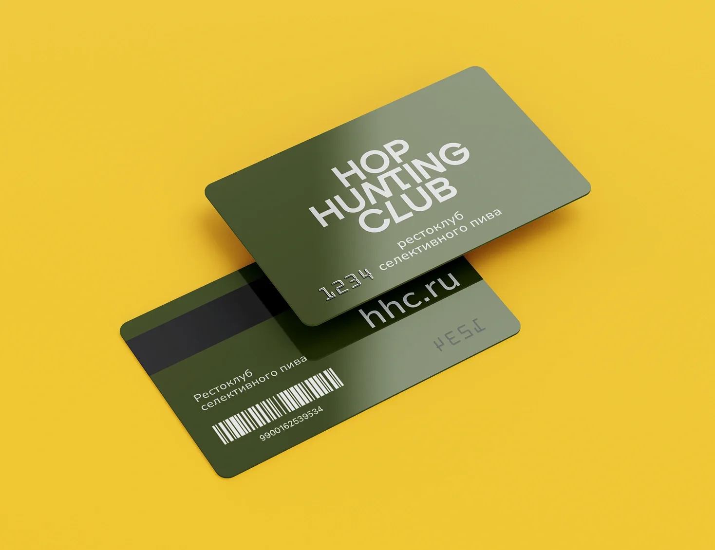
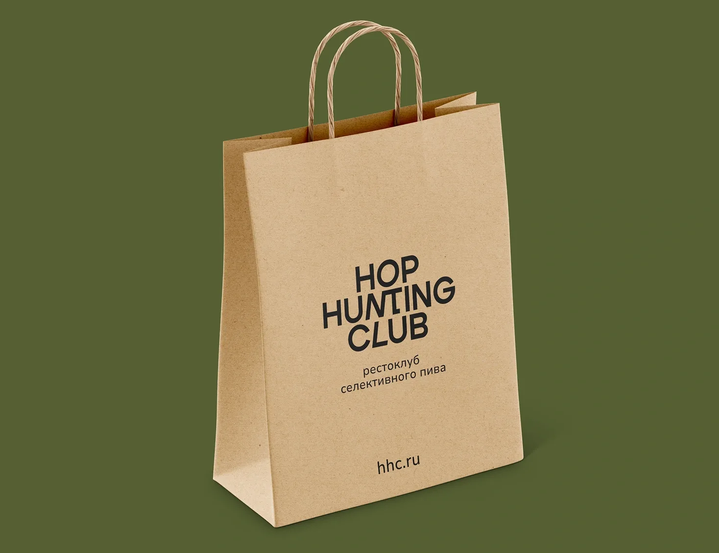
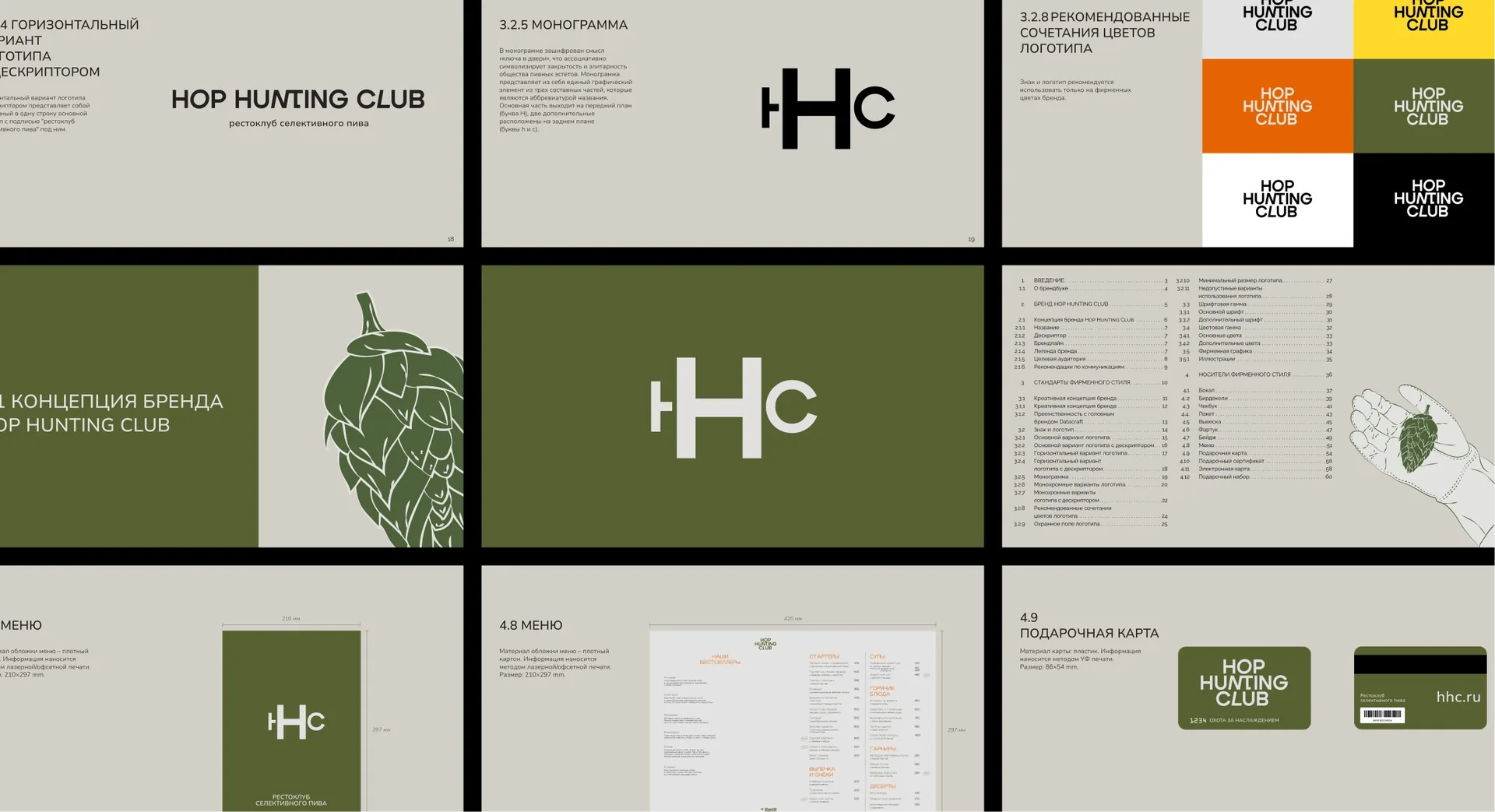
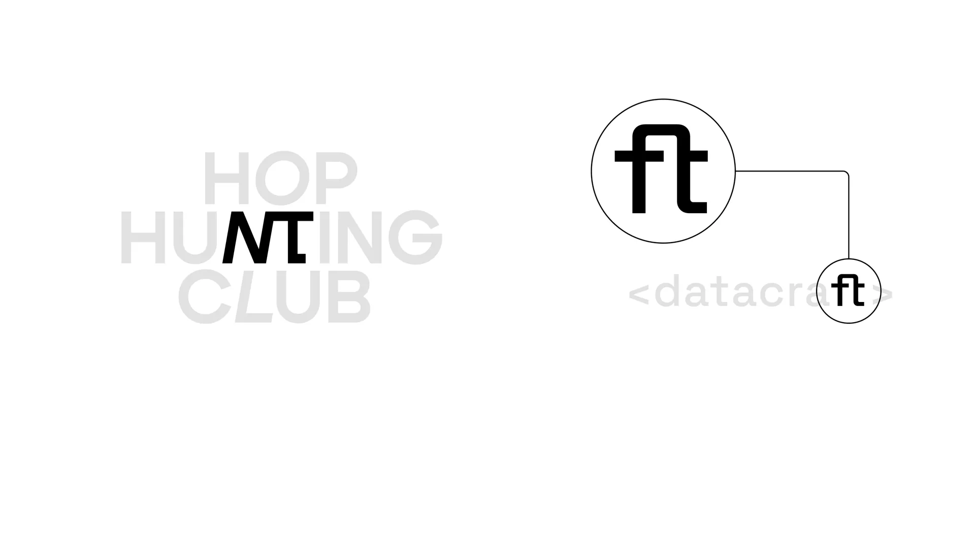
— The central-axis composition and typeface are a direct reference to the iconic British poster of the "Keep Calm and Carry On" era. This creates an instant association with British restraint, the resilience of tradition and club culture. The main detail is the hidden key in the crossbar of the letter "T", a visual symbol of a closed community accessible only to the initiated.
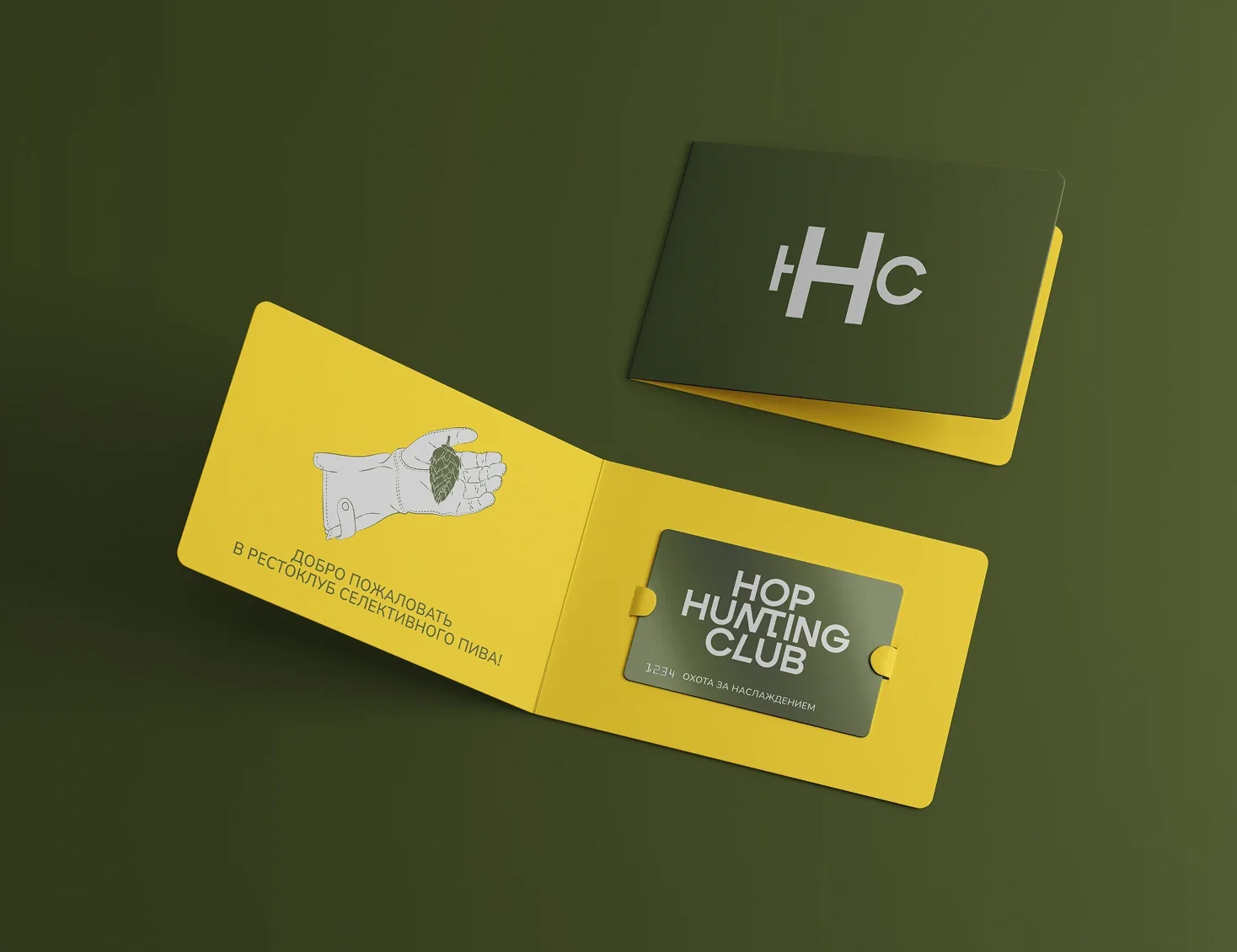
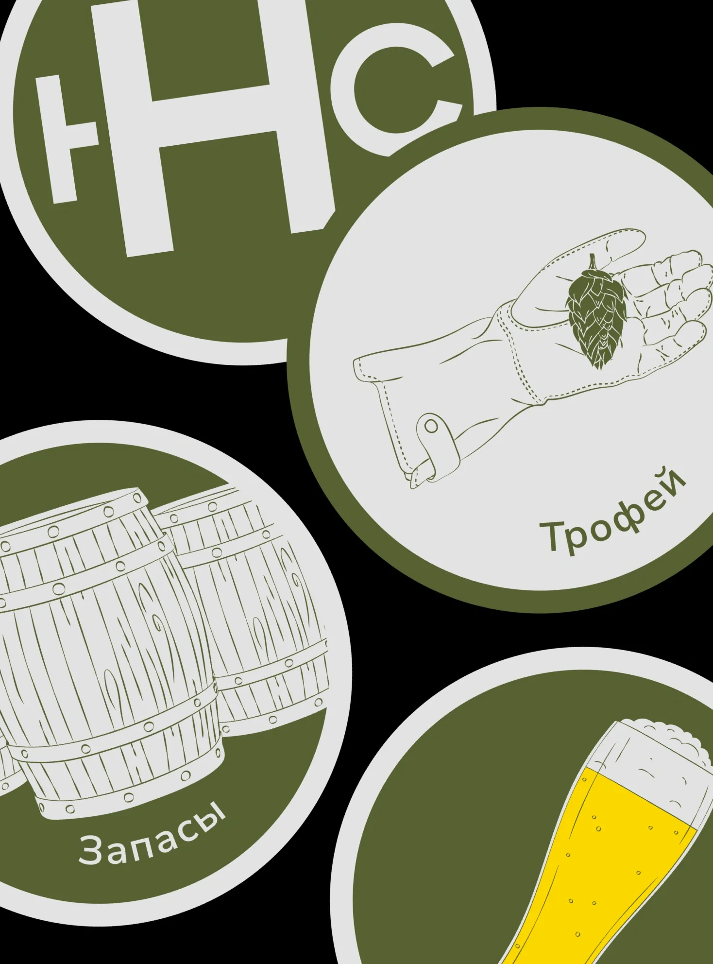
— A set of line illustrations was developed depicting scenes of "ethical hunting": harvesting hops, studying the map of varieties, contemplating a glass. The style combines elegance and light irony, avoiding literal and crude interpretations.
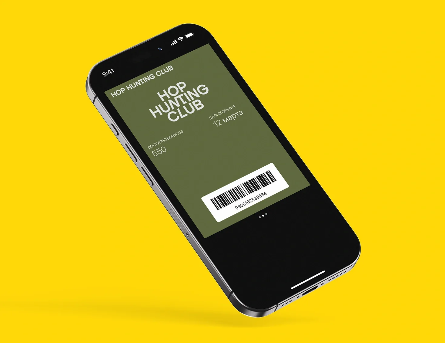
— The foundation is a deep, noble green, warm ochre, black and white. The palette is associated with nature, wood, leather and classic style.
— The combination of a classic serif for accents and a modern grotesque for body text provides a balance between tradition and relevance.
As a result of the transformation, Hop Hunting Club became not just a new name, but a strong standalone brand. The "club for hunting flavour" strategy made it possible to clearly differentiate from all competitors, build a loyal community of target guests and justify a premium pricing policy. The difficult location turned into an advantage: the place became a goal, a destination for those who value a unique experience, status and belonging to a select circle.