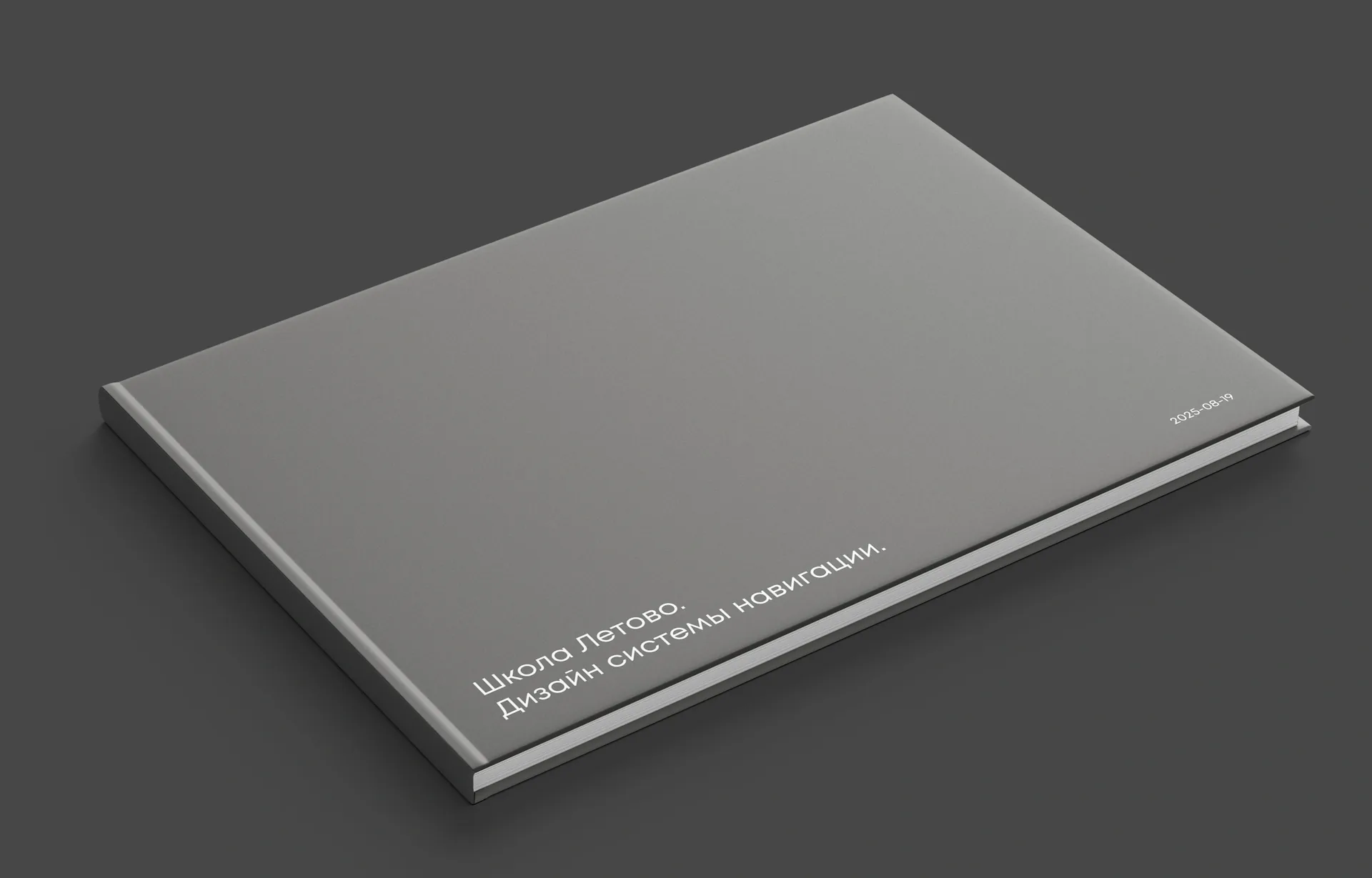
Letovo. How we created a wayfinding system for a new-generation school

Brandson developed a comprehensive wayfinding system for the Letovo school in New Moscow.
We created a concept that covers the campus's exterior and interior spaces, built the naming of zones and classrooms, and set the visual and typographic rules. As a result, the school received not only convenient landmarks but also a coherent visual language reflecting the scale and philosophy of the educational environment.
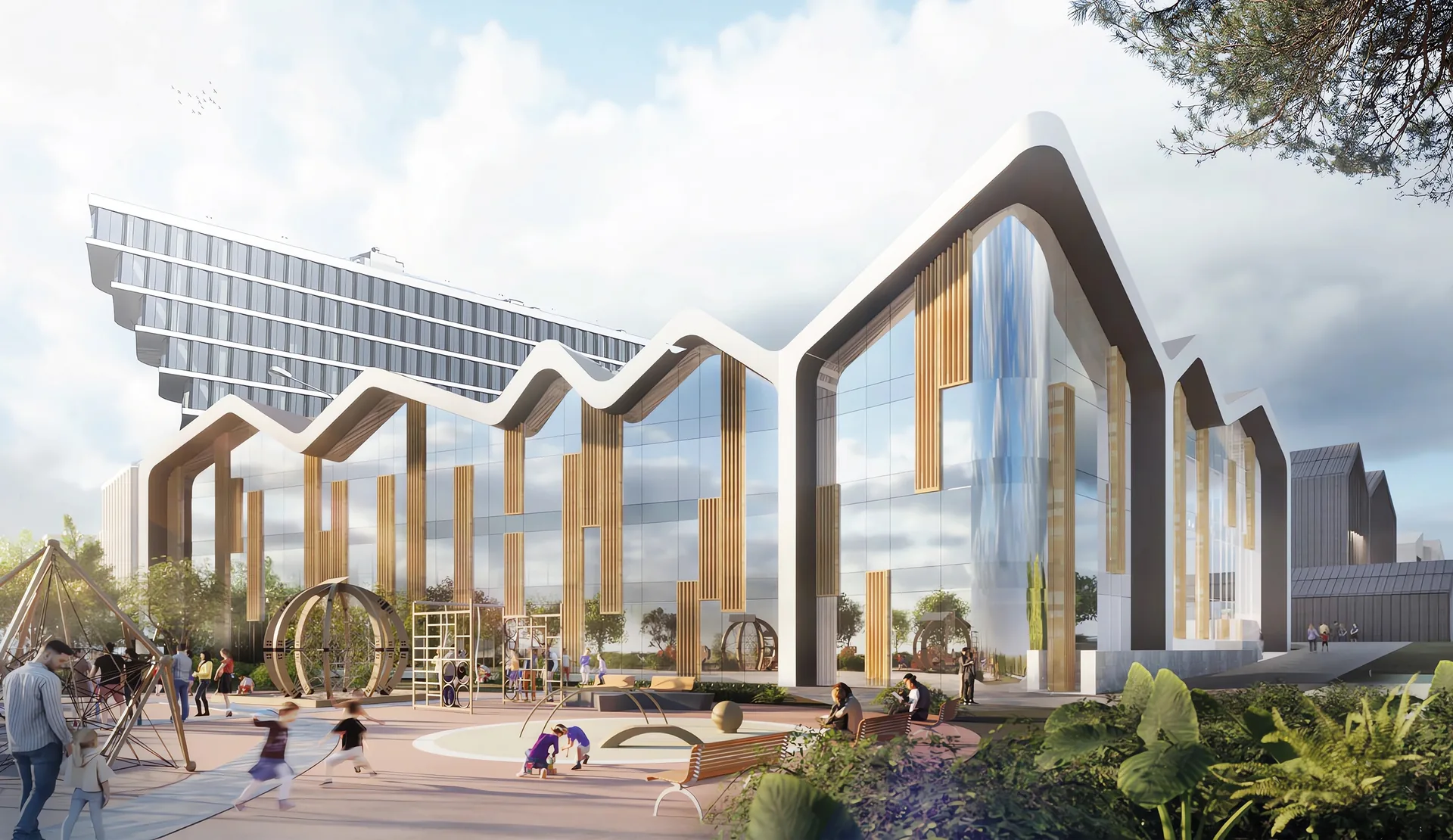
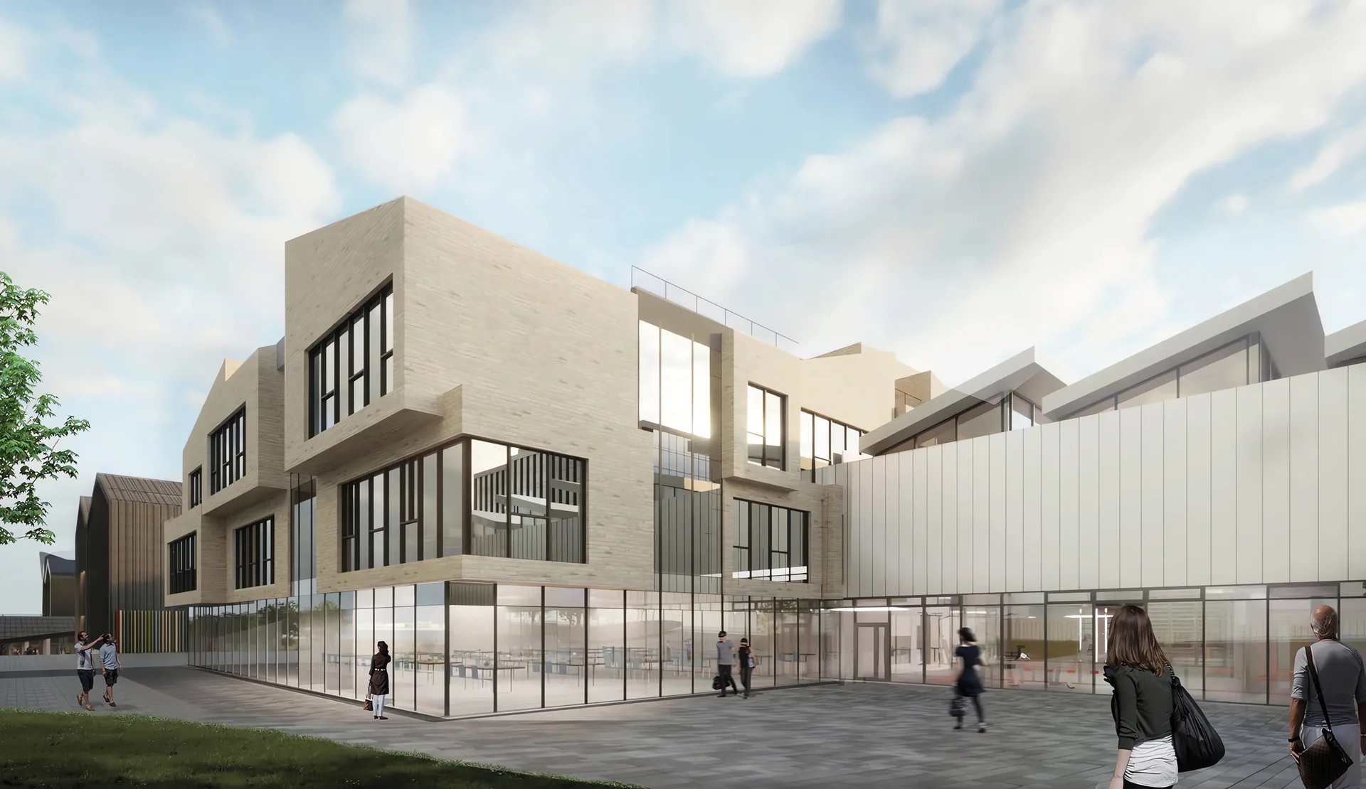
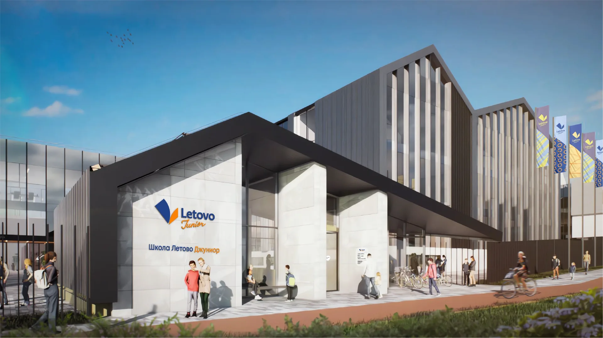
The Letovo Junior educational project is designed for children from preschool to middle school age. The school's infrastructure includes separate blocks for different ages, science laboratories, technology hubs, a sports complex with transformable halls, and areas for recreation and creativity.
In the few years of its existence, it has become a landmark educational centre visited by school principals and administrators from all over the world who come to learn from its experience. The campus architecture combines scale and minimalism, and its infrastructure encompasses a multitude of spaces of very different character.
Already at the design stage it became clear that the unique concept of the campus as a "city within a city", with its complex layout and many functional zones, posed a challenge for wayfinding. Scattered signs would not have been able to form a coherent system, which would have led to orientation problems in this educational space.
The school approached us with a request to develop a corporate identity for wayfinding. The solution had to take into account the specifics of an educational space: it had to be understandable to children and teenagers, convenient for adults, and intuitive for foreign visitors.

We analysed the space and movement scenarios. It was important to identify potential problem areas: where a visitor gets lost, which routes require emphasis, and which are visually overloaded. In addition, we worked through the needs of different categories of users: students, teachers, parents, guests and staff.
The requirements identified:
— simplicity and clarity of wayfinding for all ages;
— integration with the architectural environment and the school's style;
— universality and flexibility for scaling;
— emotional expressiveness that makes the signs not merely utilitarian but meaningful elements of the environment.
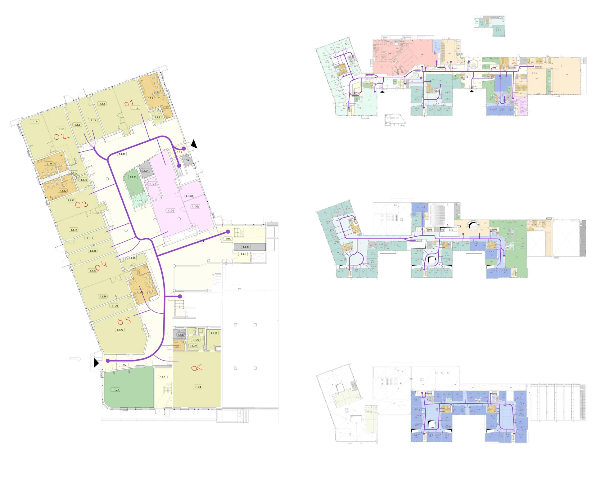
Based on the analysis, we proposed a system in which wayfinding becomes part of the school's visual code.
The following were developed:
— a naming system for classrooms and zones;
— a colour palette and unified typography;
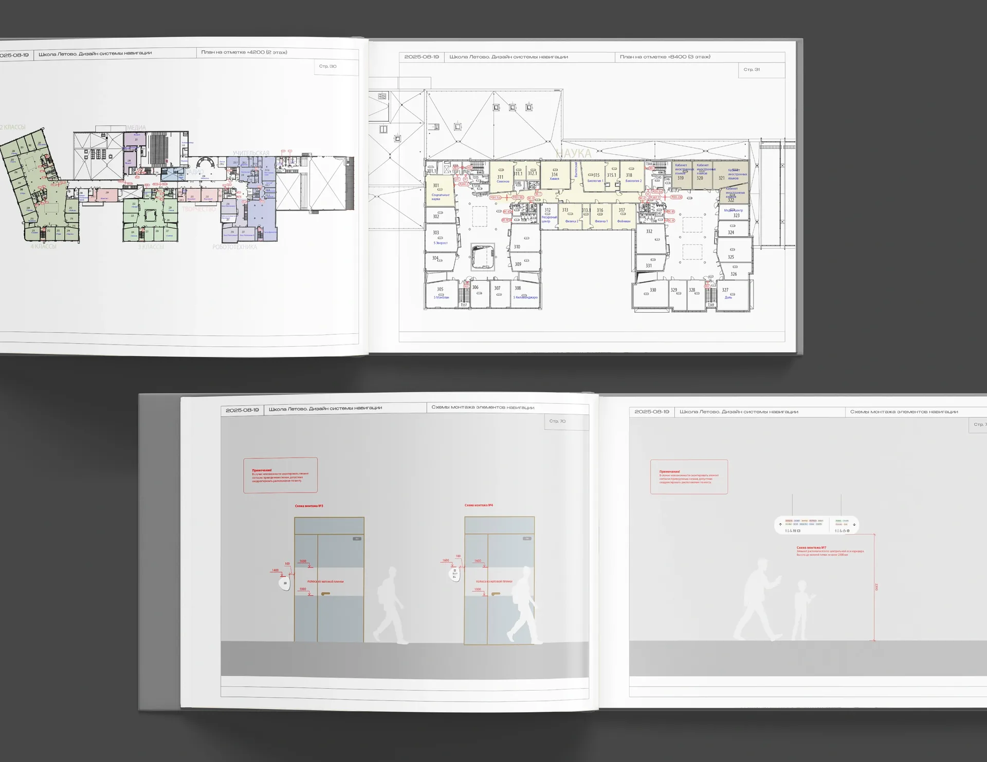
— typographic rules and recommendations on materials;
— a CJM describing the movement of users within the campus.
The main approach was to combine minimalism, functionality and expressiveness. Wayfinding must work equally well for quick routes and for those entering the space for the first time. The concept had to be universal, yet unique to Letovo, emphasising its modernity and openness.
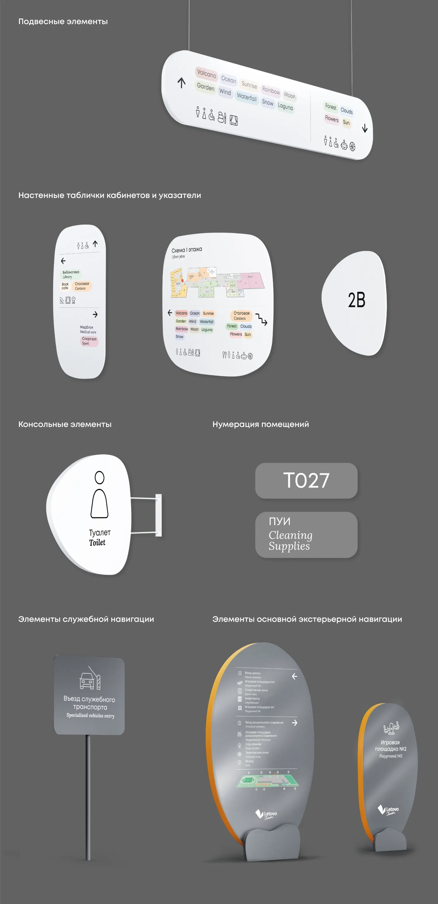
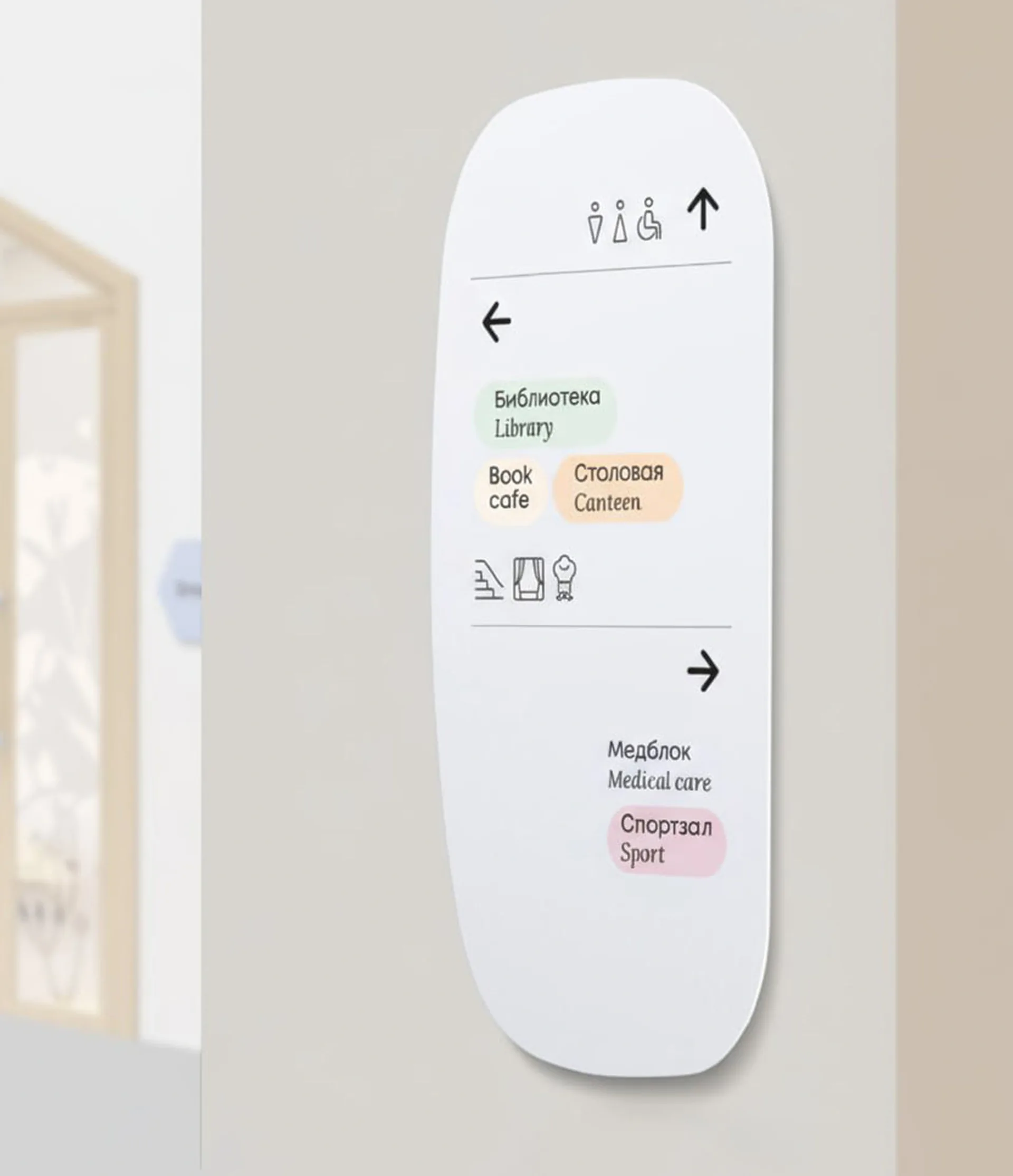
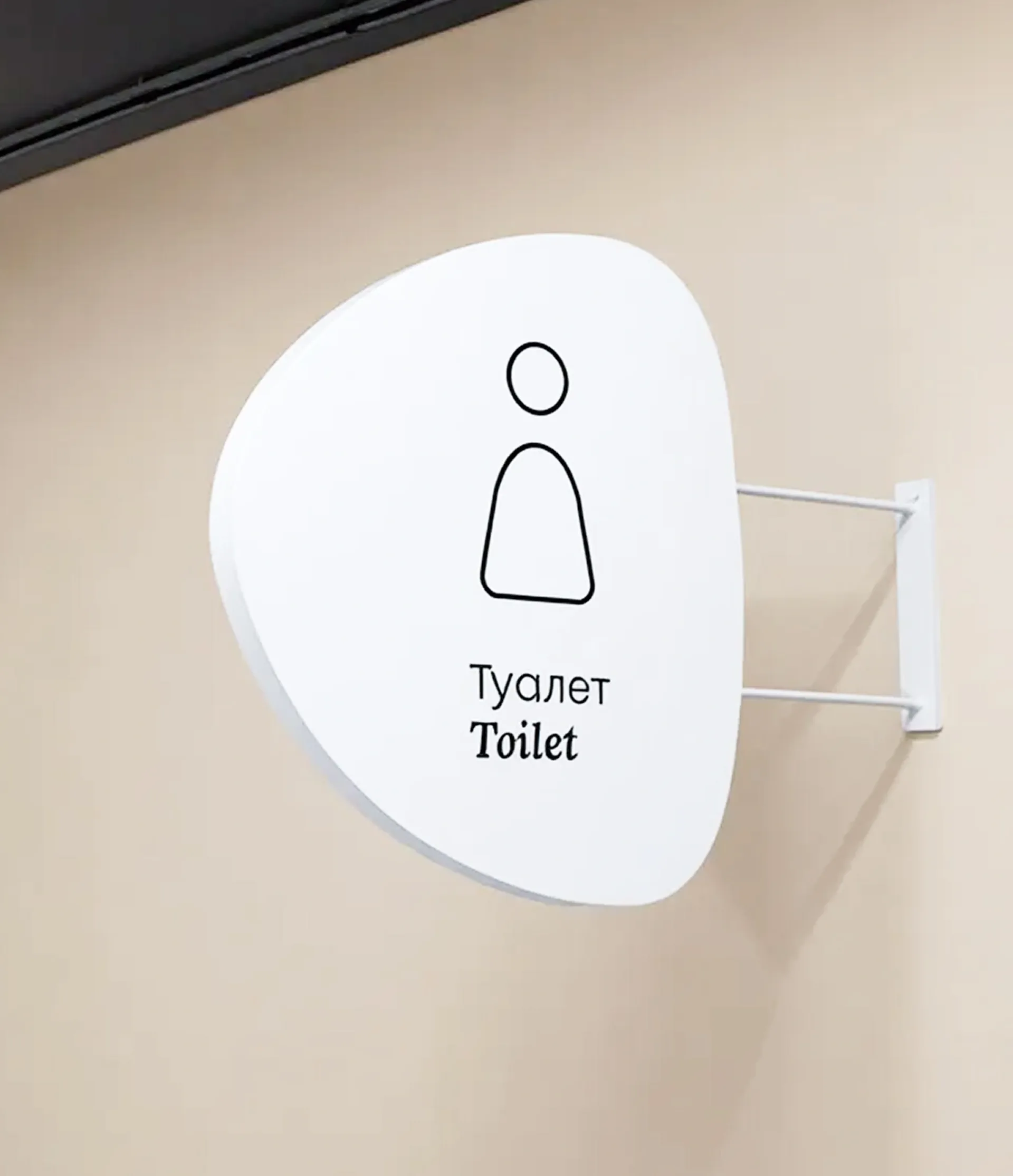
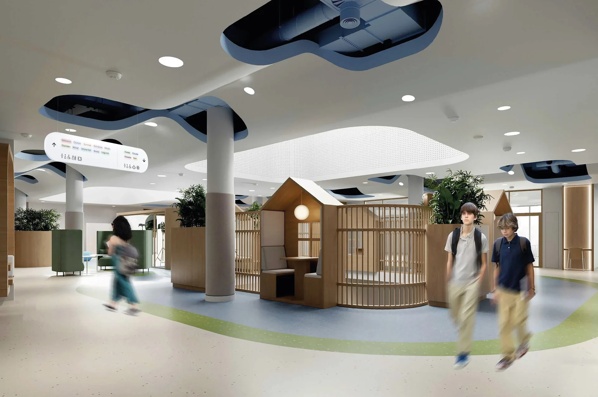
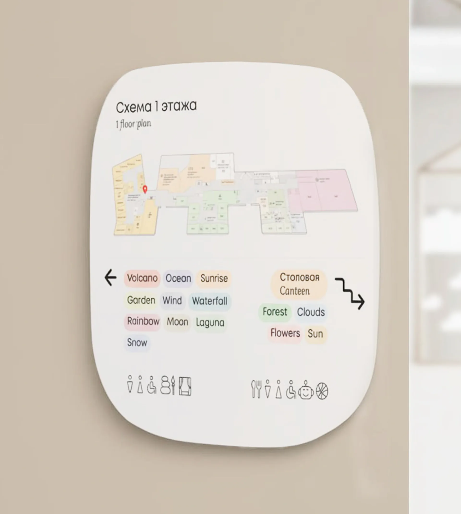
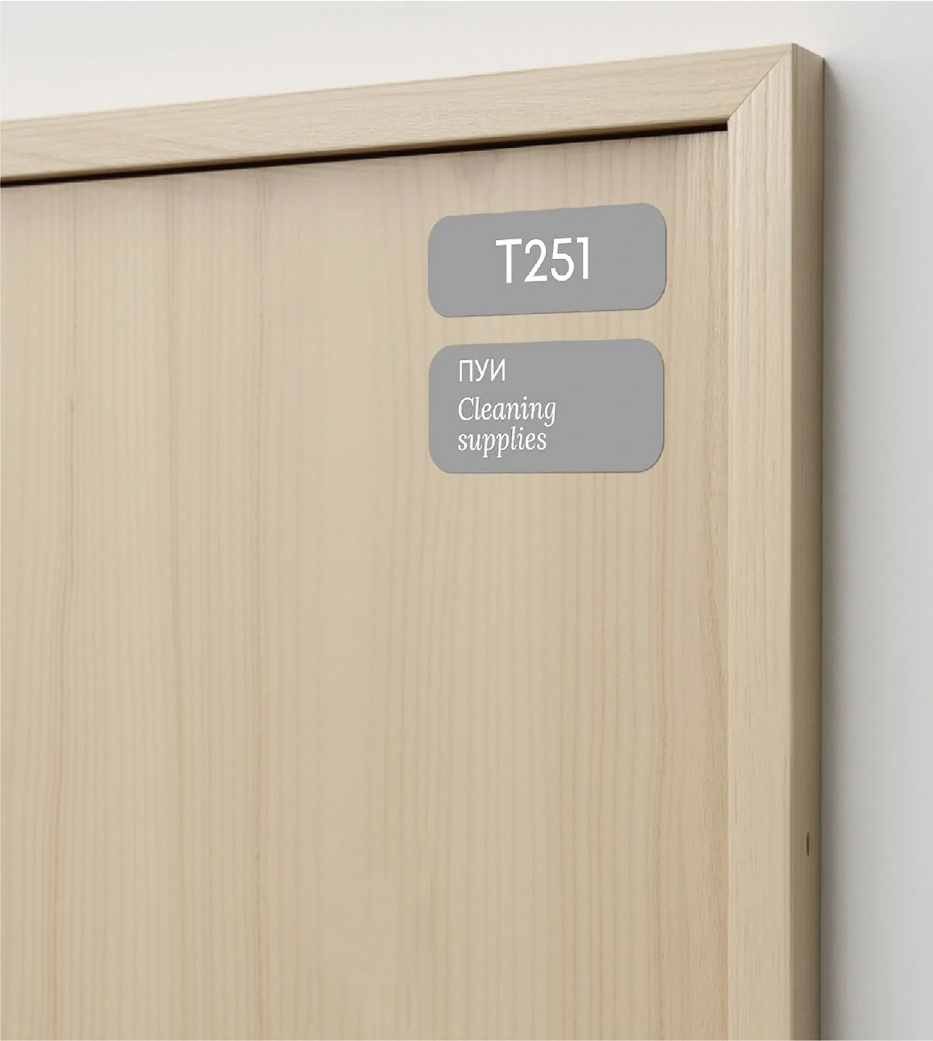
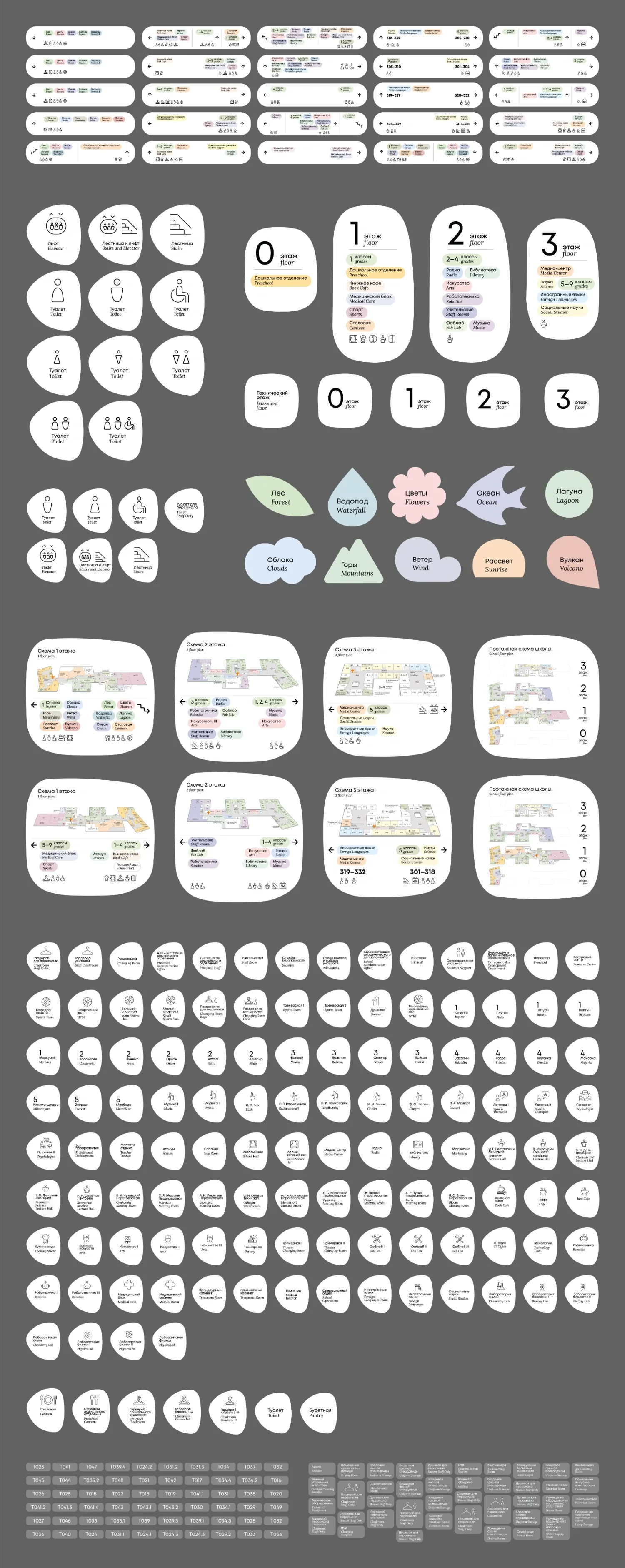
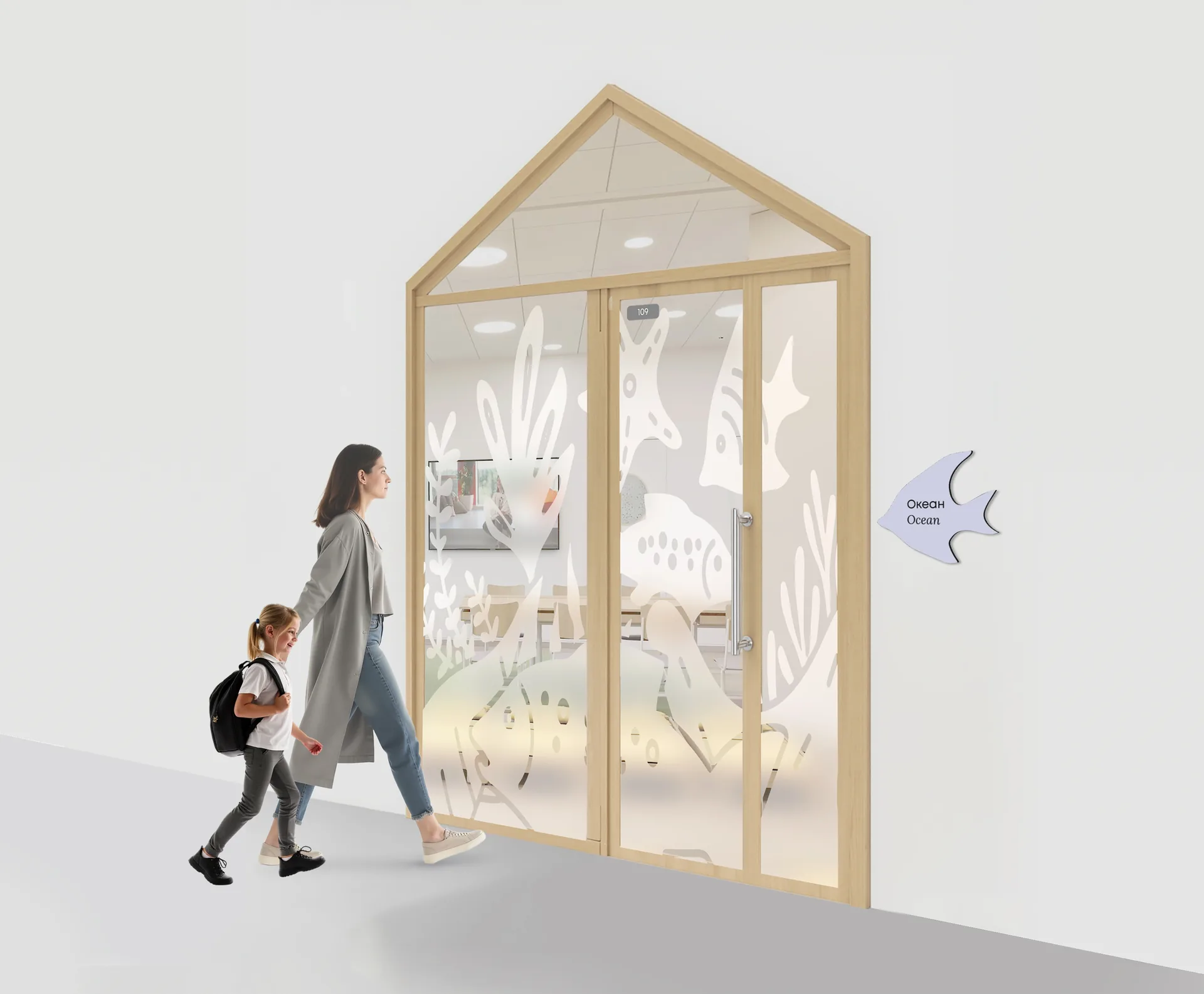
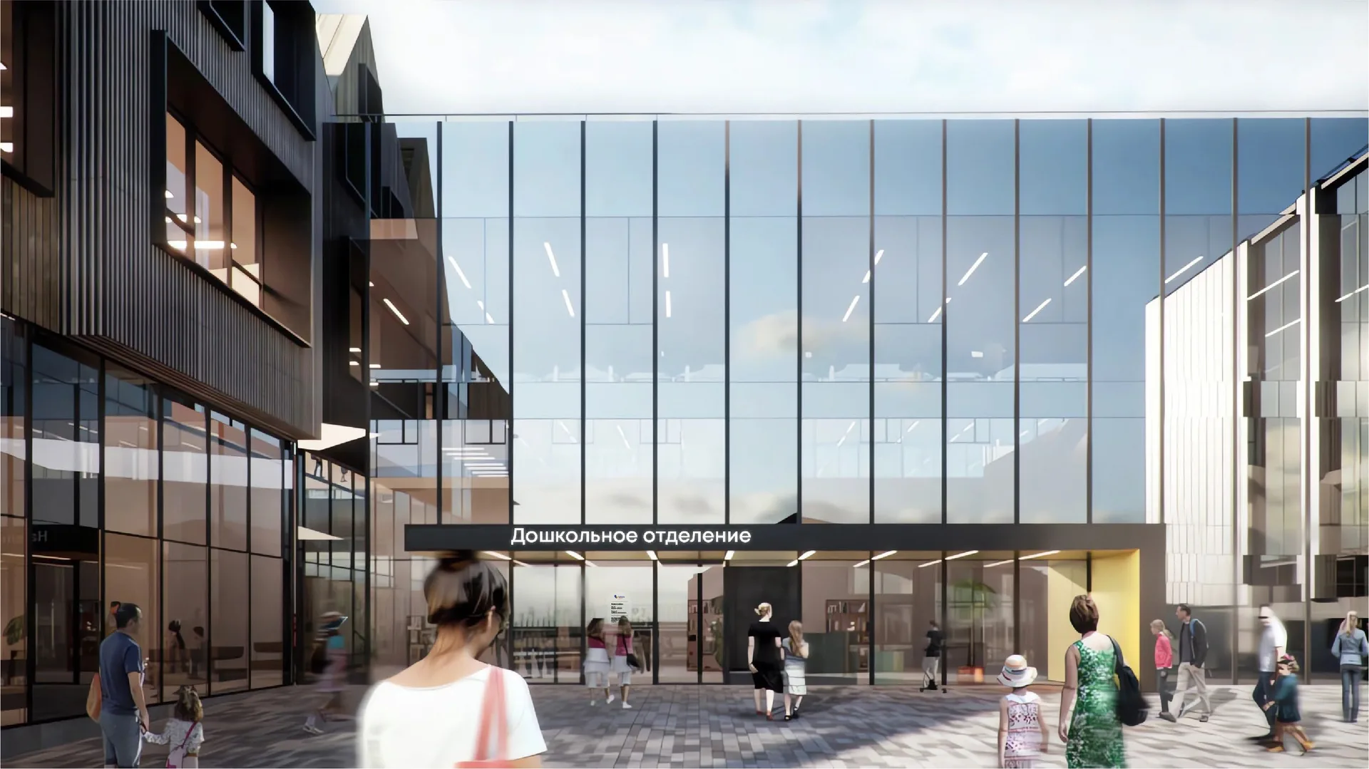
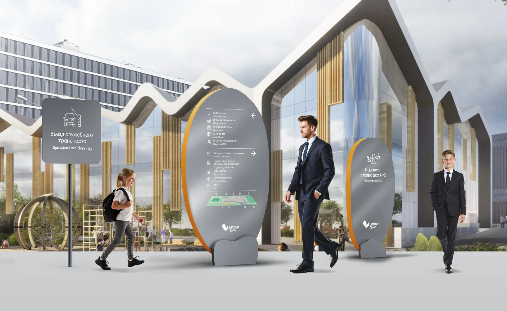
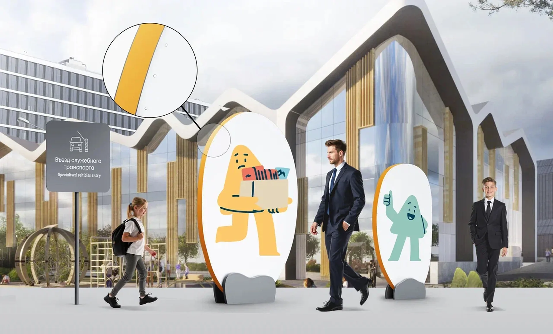
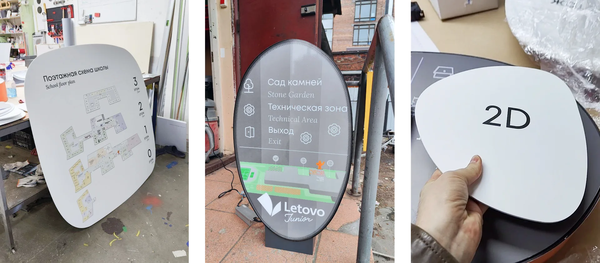
We built the system on bionic forms that contrast with the geometric facades of the buildings. In the outdoor areas these elements take on the scale of sculptures, turning wayfinding into architectural accents and landmarks. Inside the building, dynamic forms are combined with the strict graphics of text and pictograms, making the signs both noticeable and easy to read.
The colour scheme is kept in a calm palette so as not to overload the space or distract attention from the architecture. At the same time, the large scale, the plasticity of the forms and the variety of carriers create visual interest and hold attention. The system covers four floors and the outdoor areas, ensuring the integrity of the environment and maintaining a balance between functionality and aesthetics.