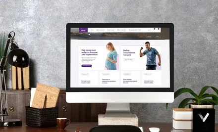
The trajectory of a healthy life with Trives

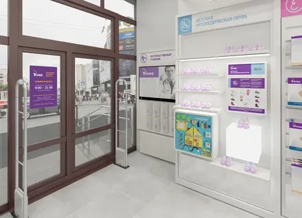
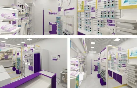
Trives is the branded chain of orthopaedic stores of the St. Petersburg manufacturer of the same name, producing orthopaedic and medical products. For more than 30 years, Trives has been successfully manufacturing and selling health products.

Trives was founded in 1992 in St. Petersburg and has been growing successfully for many years in the market of orthopaedic, medical and therapeutic-preventive products. Having gone through the stages of establishing itself and finding its own niche, the Russian company has become a fully-fledged competitor to foreign manufacturers, matching them in quality and in the meticulous detailing of every product.

As part of the project research, the agency’s working group identified the trends and specifics of the orthopaedic products market, defined the key competitors and market players, as well as the key insights and motivations of the target audience.

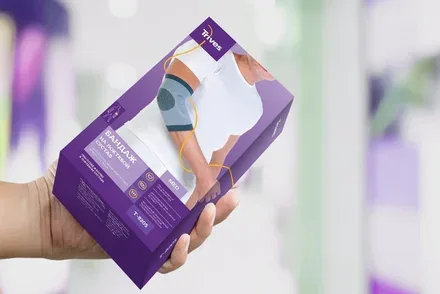
Instead of trying to mimic the “Europeans” or trading in cheap, throwaway goods in competition with Chinese manufacturers, the company was advised to focus on its strengths – proven quality and close attention to people’s needs. Like an advocate, Trives stands up for the health and good physical condition of its customers, demonstrating the effectiveness of its products in practice.
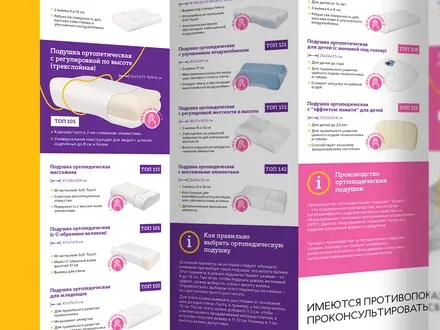
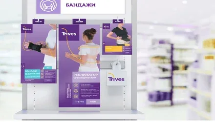
Health reveals itself in many aspects – from a comfortable orthopaedic pillow for a restful sleep to insoles that relieve the strain on the foot, from a brace that fits the body perfectly to compression tights that are both aesthetic and contemporary. Like sunlight and fresh air, health should be present in every moment of life. Whoever the users of the company’s orthopaedic products may be, they are all united by the desire to live actively and move forward while feeling the freedom of movement. Trives supports anyone striving to achieve the perfect balance of their abilities.
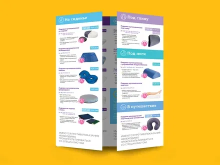
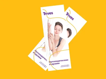
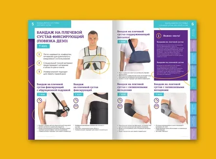
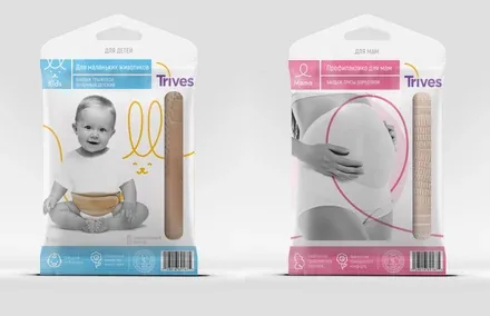
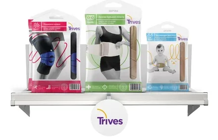
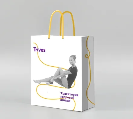
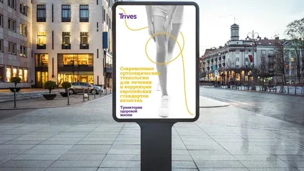
The key element of the new logo – the line – runs through the entire corporate identity, connecting the brand with its target audience. It is an allegory of orthopaedic products that support well-being and restore users’ health, as well as a symbol of flexibility and continuous positive change. Attending to the smallest details, Trives aligns the processes of developing, manufacturing and selling its wellness products into a single line designed to provide not only treatment and prevention, but also everyday comfort.