Values through branding: Danish bathroom fixtures manufacturer Berholm
"First water design", or how we revealed the unique symbolism of the Scandinavian brand Berholm.
The key values of the Danish bathroom fixtures brand are modernity, technology and status. We developed the brand platform and created identification systems that reflect them. The laconic packaging style we created conveys the austere beauty of the northern latitudes.
Clearly, the Nordic cross did not appear in the logo by chance either: details in the case description!
We had two tasks: developing the brand platform and creating an identification system reflecting the key values of the future brand — modernity, technology and status. The development stage was preceded by a comprehensive analysis of the market and of the communication strategies of the company's competitors.
The choice of Russia as the main sales market for Berholm bathroom products is due to the relatively low concentration of competitors in the segment of imported "premium" bathroom goods, as well as the high demand for goods of this class. In the course of the analytical work, research was conducted into the Russian bathroom products market, the target audience, and the structure of supply and demand.
The goals of this stage — determining the company's competitiveness, identifying a vacant market niche and shaping the positioning. The research was based on qualitative and quantitative assessments of market potential, as well as the collection and analysis of information using the agency's proprietary methodology — brand evolution. After the analytical stage, we developed the brand platform and created identification systems reflecting the key values of the future brand — modernity, technology and status.
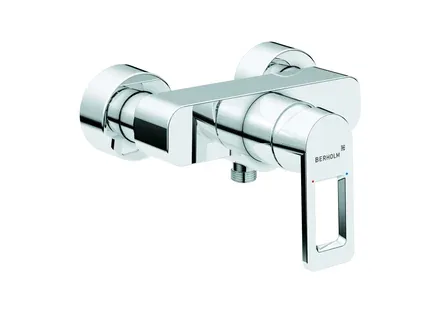
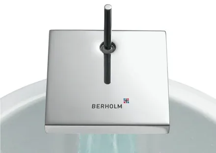
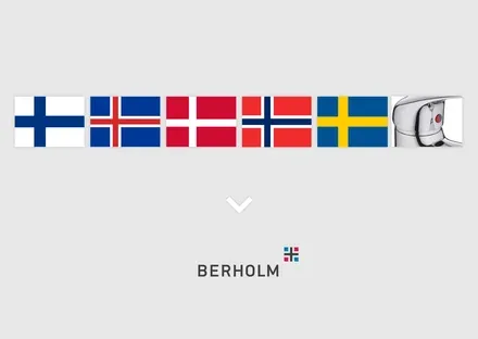
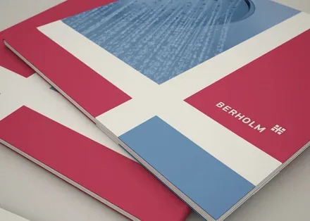
The Berholm logo consists of two parts: the company name and a mark symbolising the "Nordic cross", which appears on the flags of all the Scandinavian countries. Together they form the company's unique symbolism.
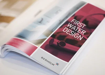
The brandline proposed by the agency — First water design — reflects the outstanding precision with which Berholm's Scandinavian designers express their ideas. It uses the idiom "First water", meaning "of the purest water", which is used when speaking of the purity of precious stones. The Russian-language version of the brandline reads "Design of the purest water".
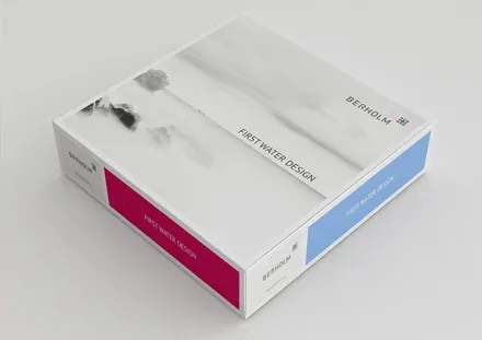
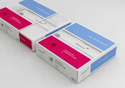
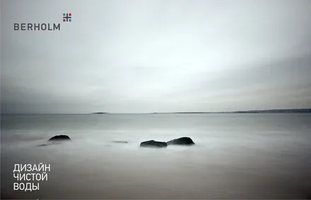
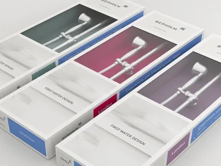
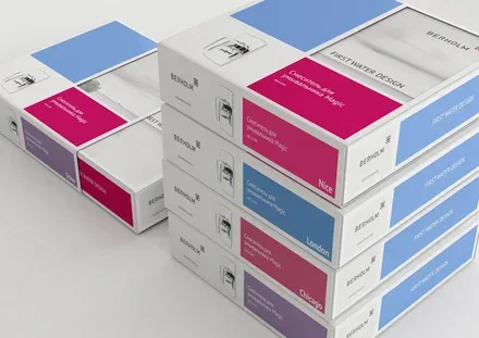
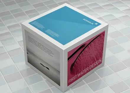
To strengthen the brand image and convey its mood, we developed corporate imagery that reflects the austere beauty of the northern latitudes. The laconic and rigorous packaging style developed by the agency for the company's products is also reminiscent of the "Nordic cross". A Berholm presentation brochure with a detailed description of the products, the technologies used and excellent photography.
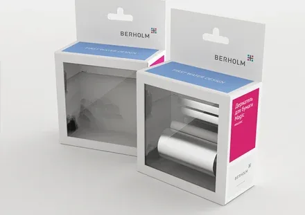
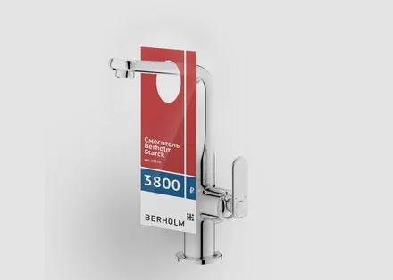
Branded packaging was created for various types of quality products: mixer taps, shower heads, bathroom accessories, etc.